
The search box using Bootstrap
In this post, a search box based on Bootstrap is created along with additional filters in the dropdown. By default, only the textbox to enter the search term with a button is displayed. There is a dropdown option towards the right corner of the search box that allows filtering the results.
You may change the dropdown options as per the needs of your website. For example, if this is an e-commerce website, you may add pricing options, categories filters, etc.
Have a look in the section below for a live demo and to get the code for Bootstrap search box.
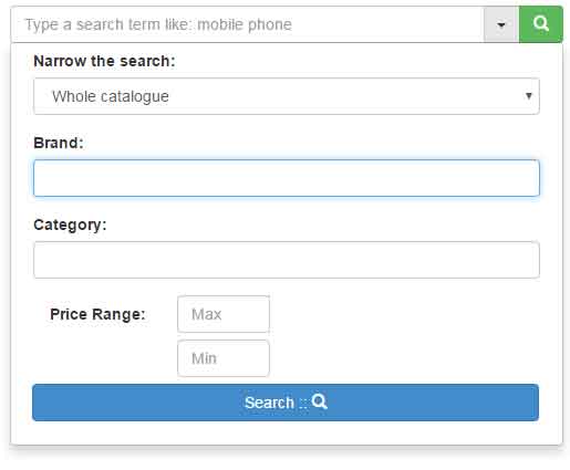
A demo of search in Bootstrap
In this demo, I have used a few search filters for illustration purposes only. The main search box along with a dropdown to open the added filters is given. Inside the main dropdown, another dropdown to narrow the search is used. After that, a few textboxes for the category, brand, and price filters are used.
Complete code that you may run on your editor/system
<!DOCTYPE html>
<html lang="en">
<head>
    <link rel="stylesheet" href="https://maxcdn.bootstrapcdn.com/bootstrap/3.3.0/css/bootstrap.min.css">
    <style>
body {
    padding-top: 50px;
}
.dropdown.dropdown-lg .dropdown-menu {
    margin-top: -1px;
    padding: 4px 15px;
}

.btn-group .btn {
    border-radius: 0;
    margin-left: -1px;
}
.form-horizontal .form-group {
    margin-left: 0;
    margin-right: 0;
}


@media screen and (min-width: 768px) {
    #boot-search-box {
        width: 500px;
        margin: 0 auto;
    }
    .dropdown.dropdown-lg {
        position: static !important;
    }
    .dropdown.dropdown-lg .dropdown-menu {
        min-width: 500px;
    }
}
    </style>

</head>
<body>

<div class="container">
	<div class="row">
		<div class="col-md-12">
            <div class="input-group" id="boot-search-box">
                <input type="text" class="form-control" placeholder="Type a search term like: mobile phone" />
                <div class="input-group-btn">
                    <div class="btn-group" role="group">
                        <div class="dropdown dropdown-lg">
                            <button type="button" class="btn btn-default dropdown-toggle" data-toggle="dropdown" aria-expanded="false"><span class="caret"></span></button>
                            <div class="dropdown-menu dropdown-menu-right" role="menu">
                                <form class="form-horizontal" role="form">
                                  <div class="form-group">
                                    <label for="filter">Narrow the search:</label>
                                    <select class="form-control">
                                        <option value="catalogue" selected>Whole catalogue</option>
                                        <option value="modal">Modal</option>
                                        <option value="price">Price</option>
                                        <option value="popular">Most Popular</option>
                                    </select>
                                  </div>
                                  <div class="form-group">
                                    <label for="contain">Brand:</label>
                                    <input class="form-control" type="text" />
                                  </div>
                                  <div class="form-group">
                                    <label for="contain">Category:</label>
                                    <input class="form-control" type="text" />
                                  </div>

                                 <div class="form-group">
                                    <label for="password1" class="col-sm-3 control-label">Price Range:</label>
                                <div class="col-sm-3">
                                    <input type="text" class="form-control" id="max-price" placeholder="Max"> <br /><br />
                                    <input type="text" class="form-control" id="min-price" placeholder="Min">
                                </div>
                                  <br /><br /><br /><br />
                                  <button type="submit" class="btn btn-primary btn-block">Search :: <span class="glyphicon glyphicon-search" aria-hidden="true"></span></button>
                                </form>
                            </div>
                        </div>
                        <button type="button" class="btn btn-success "><span class="glyphicon glyphicon-search" aria-hidden="true"></span></button>
                    </div>
                </div>
            </div>
          </div>
        </div>
	</div>
</div>

    <script src="//code.jquery.com/jquery-1.11.0.min.js"></script>
    <script src="//netdna.bootstrapcdn.com/bootstrap/3.3.2/js/bootstrap.min.js"></script>
</body>
</html>
You need to include the following dependency files in order to make it work:
- Bootstrap CSS file
- Bootstrap JS file
- jQuery library
Most probably, you are already using this for your Bootstrap-based web project.
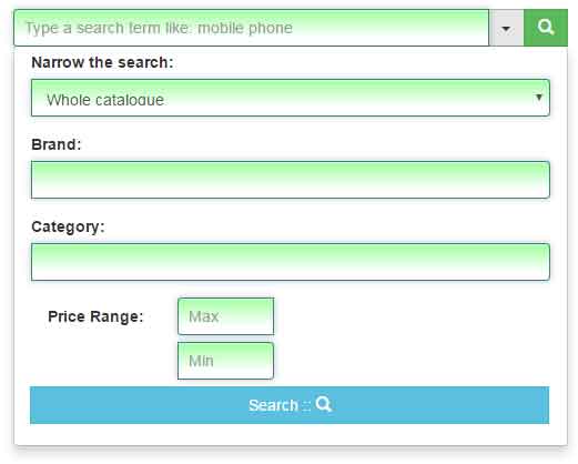
Style number 2 for search box demo
By simply adding a class for input fields with the background and box-shadow properties using gradient, see the same example with different style of boxes including the search box:
The CSS used in the demo:
.dropdown.dropdown-lg .dropdown-menu {

    margin-top: -1px;

    padding: 4px 15px;

}


.btn-group .btn {

    border-radius: 0;

    margin-left: -1px;

}

.form-horizontal .form-group {

    margin-left: 0;

    margin-right: 0;

}


.search-box-style {

    padding: 9px;

    border: solid 1px #408080;

    outline: 0;

    background: -webkit-gradient(linear, left top, left 25, from(#FFFFFF), color-stop(4%, #A4FFA4), to(#FFFFFF));

    background: -moz-linear-gradient(top, #FFFFFF, #A4FFA4 1px, #FFFFFF 25px);

    box-shadow: rgba(0,64,64, 0.3) 0px 0px 8px;

    -moz-box-shadow: rgba(0,64,64, 0.3) 0px 0px 8px;

    -webkit-box-shadow: rgba(0,64,64, 0.3) 0px 0px 8px;;


    }

@media screen and (min-width: 768px) {

    #boot-search-box {

        width: 500px;

        margin: 0 auto;

    }

    .dropdown.dropdown-lg {

        position: static !important;

    }

    .dropdown.dropdown-lg .dropdown-menu {

        min-width: 500px;

    }

}
While markup almost remains the same as in the above example.