
This is highly likely that you will use navigation menu whether it is a top, left or right menu as using the Bootstrap framework or any other website that contain links to the main pages, categories etc.
Adding cool hovering effects as a user brings the mouse over any menu item adds good user experience. In this tutorial, I am going to use a jQuery plug-in that is used for adding such effects in the navs that can be Bootstrap navs as well.
See the following section for different types of effects in various menus including menus with dropdowns using Bootstrap framework.
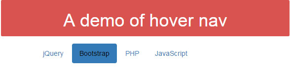
In this example, a few menu items are created by using the <ul>, <li> tags. In each item, the role data attribute, role=”presentation”, is added. Have a look at the hove effect:
See online demo and code
In order to use this plug-in, you need to include a few resources including plug-in JS and CSS files. See the <head> section in the demo page along with </body> closing tag.
In the <head> section:
<link rel=”stylesheet” href=”https://maxcdn.bootstrapcdn.com/bootstrap/3.3.4/css/bootstrap.min.css”>
<link rel=”stylesheet” href=”css/hoverifyBootnav/hoverifyBootnav.css”>
Above the </body> tag:
<script src=”http://code.jquery.com/jquery-1.11.3.min.js”></script>
<script src=”https://maxcdn.bootstrapcdn.com/bootstrap/3.3.4/js/bootstrap.min.js”></script>
<script src=”https://cdnjs.cloudflare.com/ajax/libs/jquery-easing/1.3/jquery.easing.min.js”></script>
<script type=”text/javascript” src=”js/hoverifyBootnav/hoverifyBootnav.js”></script>
<script type=”text/javascript” src=”js/hoverifyBootnav/init.js”></script>
You may download the plug-in files here or view source the demo page and download respective JS/CSS file to your system.
The following markup is used for creating links with hover effect:
    <div class="row">

         <ul style="margin-bottom: 15px;" class="nav nav-pills col-xs-12">

            <li role="presentation" class="active"><a style="color: white;" href="/">Home</a></li>

            <li role="presentation"><a href="https://www.jquery-az.com/jquery-tips/">jQuery</a></li>

            <li role="presentation"><a href="https://www.jquery-az.com/bootstrap-tips-tutorials/">Bootstrap</a></li>

            <li role="presentation"><a href="https://www.jquery-az.com/php-tutorials/">PHP</a></li>

            <li role="presentation"><a href="https://www.jquery-az.com/javascript-tutorials/">JavaScript</a></li>

        </ul>

    </div>
Get the complete code from the demo page.
You may also use dropdowns as using this hover effect plug-in. In this demo, nav nav-tabs are used for creating a navigation that also uses a dropdown menu. Have a look, as you hover over the dropdown, it gives the same effect as other navs:

Following is the markup used:
<div class="separator col-xs-12 col-sm-6">

            <ul class="nav nav-tabs">

                <li role="presentation" class="active"><a href="https://www.jquery-az.com">Home</a></li>

                <li role="presentation"><a href="https://www.jquery-az.com/jquery-tips/">jQuery</a></li>

                <li role="presentation"><a href="https://www.jquery-az.com/php-tutorials/">PHP</a></li>

                <li role="presentation" class="dropdown">

                    <a class="dropdown-toggle" data-toggle="dropdown" href="https://www.jquery-az.com/bootstrap-tips-tutorials/" role="button" aria-expanded="false">

                        Bootstrap <span class="caret"></span>

                    </a>

                    <ul class="dropdown-menu" role="menu">

                        <li><a href="https://www.jquery-az.com/free-themes/">Free Themes</a></li>

                        <li><a href="https://www.jquery-az.com/bootstrap-carousel-5-single-multiple-horizontal-and-vertical-sliding-demos/">Carousel</a></li>

                        <li><a href="https://www.jquery-az.com/bootstrap-tooltip-simple-and-customized-tooltips-demos/">Bootstrap Tooltip</a></li>

                        <li class="divider"></li>

                        <li><a href="https://www.jquery-az.com/bootstrap-datepicker-set-up-guide-with-8-online-demos-and-code/">Bootstrap datepicker</a></li>

                    </ul>

                </li>

            </ul>

 </div>
In the following demo, the same number of menu items with a dropdown are created as using the nav-pills. Have a look at the demo and complete code:

The markup for this menu remains the same except the class used in the main <ul> tag:
<ul class="nav nav-pills">
In above example, this class was used:
<ul class="nav nav-tabs">
Complete code:
<!DOCTYPE html>
<html>
<head>
    <link rel="stylesheet" href="https://maxcdn.bootstrapcdn.com/bootstrap/3.3.4/css/bootstrap.min.css">
    <link rel="stylesheet" href="css/hoverifyBootnav/hoverifyBootnav.css">


</head>

<body class="container">
<div class="container">
    <div class="row">
        <div class="col-xs-6 label label-info">
                <h3 style="">A demo of hover nav nav-pills</h3>
        </div>
    </div>
 <div class="separator col-xs-12 col-sm-6">
            <ul class="nav nav-pills">
                <li role="presentation" class="active"><a href="https://www.jquery-az.com">Home</a></li>
                <li role="presentation"><a href="https://www.jquery-az.com/jquery-tips/">jQuery</a></li>
                <li role="presentation"><a href="https://www.jquery-az.com/php-tutorials/">PHP</a></li>
                <li role="presentation" class="dropdown">
                    <a class="dropdown-toggle" data-toggle="dropdown" href="https://www.jquery-az.com/bootstrap-tips-tutorials/" role="button" aria-expanded="false">
                        Bootstrap <span class="caret"></span>
                    </a>
                    <ul class="dropdown-menu" role="menu">
                        <li><a href="https://www.jquery-az.com/free-themes/">Free Themes</a></li>
                        <li><a href="https://www.jquery-az.com/bootstrap-carousel-5-single-multiple-horizontal-and-vertical-sliding-demos/">Carousel</a></li>
                        <li><a href="https://www.jquery-az.com/bootstrap-tooltip-simple-and-customized-tooltips-demos/">Bootstrap Tooltip</a></li>
                        <li class="divider"></li>
                        <li><a href="https://www.jquery-az.com/bootstrap-datepicker-set-up-guide-with-8-online-demos-and-code/">Bootstrap datepicker</a></li>
                    </ul>
                </li>
            </ul>
 </div>


</div>

 <script src="https://code.jquery.com/jquery-1.11.3.min.js"></script>
    <script src="https://maxcdn.bootstrapcdn.com/bootstrap/3.3.4/js/bootstrap.min.js"></script>
    <script src="https://cdnjs.cloudflare.com/ajax/libs/jquery-easing/1.3/jquery.easing.min.js"></script>
    <script type="text/javascript" src="js/hoverifyBootnav/hoverifyBootnav.js"></script>
    <script type="text/javascript" src="js/hoverifyBootnav/init.js"></script>
</body>
</html>
In this example, a vertical menu is created with the few menu items. Have a look at the hover effect by copy/paste code below in your editor:
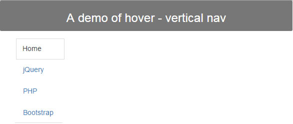
The markup for creating vertical navs with hover effect:
<div class="separator col-xs-12 col-sm-6">

            <ul class="nav nav-tabs nav-stacked" style="max-width: 300px;">

                <li role="presentation" class="active"><a href="https://www.jquery-az.com">Home</a></li>

                <li role="presentation"><a href="https://www.jquery-az.com/jquery-tips/">jQuery</a></li>

                <li role="presentation"><a href="https://www.jquery-az.com/php-tutorials/">PHP</a></li>

                <li role="presentation" ><a href="https://www.jquery-az.com/bootstrap-tips-tutorials/">Bootstrap</a></li>

            </ul>

</div>