
Creating animated modal and popovers with Bootstrap and velocity.js
I have covered a number of plug-ins for creating simple and advanced modal windows that are based on Bootstrap framework. You can read by visiting the links below:
Creating simple modals by using Bootstrap framework is written here. A nice jQuery plug-in (bootstrap3-dialog) is also covered here. Another tutorial for minimizing and maximizing the modal windows can be found here.
I also covered the popover enhancement plug-in for Bootstrap popovers here.
In this article, Bootstrap popovers and modals are created with animations of different styles by using the vanilla.js component.
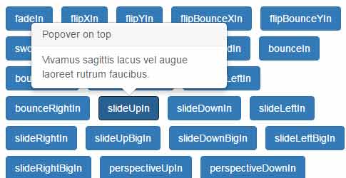
A demo of 31 animation styles of popovers by velocity.js
In this demo, a total 31 animated popovers are created by using the velocity.js. Just specify the animation style by using the data-easein data attribute as you create a popover. You can see the names of all animation values in the demo page’s code section. A sample popover code is given below:
 The markup for creating a popover:
<li><a data-original-title="Heading of the popover" data-animation="false" data-easein="flipXIn" href="#" class="btn btn-primary"
rel="popover" data-placement="right" data-content="The content of the popover comes here.">flipXIn</a></li>
Complete markup for the above example
<!doctype html>
<html>
<head>

<script src="https://s.codepen.io/assets/libs/modernizr.js" type="text/javascript"></script>

<link rel="stylesheet" href="https://netdna.bootstrapcdn.com/bootstrap/3.3.5/css/bootstrap.min.css">


<style>
body {
color: #5a5a5a;
}

.container {
padding-bottom: 140px;
}

.popover-example {
margin: 0 0 10px;
list-style: none;
}

.popover-example li {
display: inline-block;
margin: 4px;
padding: 0px;
}

.btn:focus {
outline: none;
}

.modExample .btn {
margin: 4px 8px 4px 0;
}
</style>
</head>

<body>
<div class="container">


<p>

<!-- popover examples -->
<h2>Bootstrap Popover with velocity.js animation</h2>
<div>
<ul class="popover-example">
<li>
<a data-original-title="Popover on top" data-animation="false" data-easein="fadeIn" href="#" class="btn btn-primary" rel="popover" data-placement="top" data-content="Vivamus sagittis lacus vel augue laoreet rutrum faucibus.">fadeIn</a>
</li>
<li><a data-original-title="Popover on right" data-animation="false" data-easein="flipXIn" href="#" class="btn btn-primary" rel="popover" data-placement="right" data-content="Vivamus sagittis lacus vel augue laoreet rutrum faucibus.">flipXIn</a></li>
<li><a data-original-title="Popover on bottom" data-animation="false" data-easein="flipYIn" href="#" class="btn btn-primary" rel="popover" data-placement="bottom" data-content="Vivamus sagittis lacus vel augue laoreet rutrum faucibus.">flipYIn</a></li>
<li><a data-original-title="Popover on left" data-animation="false" href="#" data-easein="flipBounceXIn" class="btn btn-primary" rel="popover" data-placement="left" data-content="Vivamus sagittis lacus vel augue laoreet rutrum faucibus.">flipBounceXIn</a></li>

<li><a data-original-title="Popover on bottom" data-animation="false" data-easein="flipBounceYIn" href="#" class="btn btn-primary" rel="popover" data-placement="bottom" data-content="Vivamus sagittis lacus vel augue laoreet rutrum faucibus.">flipBounceYIn</a></li>
<li><a data-original-title="Popover on right" data-animation="false" data-easein="swoopIn" href="#" class="btn btn-primary" rel="popover" data-placement="right" data-content="Vivamus sagittis lacus vel augue laoreet rutrum faucibus.">swoopIn</a></li>
<li><a data-original-title="Popover on top" data-animation="false" data-easein="whirlIn" href="#" class="btn btn-primary" rel="popover" data-placement="top" data-content="Vivamus sagittis lacus vel augue laoreet rutrum faucibus.">whirlIn</a></li>
<li><a data-original-title="Popover on left" data-animation="false" href="#" data-easein="shrinkIn" class="btn btn-primary" rel="popover" data-placement="left" data-content="Vivamus sagittis lacus vel augue laoreet rutrum faucibus.">shrinkIn</a></li>
<li>
<a data-original-title="Popover on top" data-animation="false" data-easein="expandIn" href="#" class="btn btn-primary" rel="popover" data-placement="top" data-content="Vivamus sagittis lacus vel augue laoreet rutrum faucibus.">expandIn</a>
</li>
<li><a data-original-title="Popover on right" data-animation="false" data-easein="bounceIn" href="#" class="btn btn-primary" rel="popover" data-placement="right" data-content="Vivamus sagittis lacus vel augue laoreet rutrum faucibus.">bounceIn</a></li>
<li><a data-original-title="Popover on bottom" data-animation="false" data-easein="bounceUpIn" href="#" class="btn btn-primary" rel="popover" data-placement="bottom" data-content="Vivamus sagittis lacus vel augue laoreet rutrum faucibus.">bounceUpIn</a></li>
<li><a data-original-title="Popover on left" data-animation="false" href="#" data-easein="bounceDownIn" class="btn btn-primary" rel="popover" data-placement="left" data-content="Vivamus sagittis lacus vel augue laoreet
rutrum faucibus.">bounceDownIn</a></li>

<li><a data-original-title="Popover on bottom" data-animation="false" data-easein="bounceLeftIn" href="#" class="btn btn-primary" rel="popover" data-placement="bottom" data-content="Vivamus sagittis lacus vel augue laoreet rutrum faucibus.">bounceLeftIn</a></li>
<li><a data-original-title="Popover on right" data-animation="false" data-easein="bounceRightIn" href="#" class="btn btn-primary" rel="popover" data-placement="right" data-content="Vivamus sagittis lacus vel augue laoreet rutrum faucibus.">bounceRightIn</a></li>
<li><a data-original-title="Popover on top" data-animation="false" data-easein="slideUpIn" href="#" class="btn btn-primary" rel="popover" data-placement="top" data-content="Vivamus sagittis lacus vel augue laoreet rutrum faucibus.">slideUpIn</a></li>
<li><a data-original-title="Popover on left" data-animation="false" href="#" data-easein="slideDownIn" class="btn btn-primary" rel="popover" data-placement="left" data-content="Vivamus sagittis lacus vel augue laoreet
rutrum faucibus.">slideDownIn</a></li>

<li><a data-original-title="Popover on right" data-animation="false" data-easein="slideLeftIn" href="#" class="btn btn-primary" rel="popover" data-placement="right" data-content="Vivamus sagittis lacus vel augue laoreet rutrum faucibus.">slideLeftIn</a></li>
<li><a data-original-title="Popover on left" data-animation="false" data-easein="slideRightIn" href="#" class="btn btn-primary" rel="popover" data-placement="left" data-content="Vivamus sagittis lacus vel augue laoreet rutrum faucibus.">slideRightIn</a></li>
<li><a data-original-title="Popover on left" data-animation="false" data-easein="slideUpBigIn" href="#" class="btn btn-primary" rel="popover" data-placement="left" data-content="Vivamus sagittis lacus vel augue laoreet rutrum faucibus.">slideUpBigIn</a></li>
<li><a data-original-title="Popover on top" data-animation="false" data-easein="slideDownBigIn" href="#" class="btn btn-primary" rel="popover" data-placement="top" data-content="Vivamus sagittis lacus vel augue laoreet rutrum faucibus.">slideDownBigIn</a></li>
<li><a data-original-title="Popover on left" data-animation="false" data-easein="slideLeftBigIn" href="#" class="btn btn-primary" rel="popover" data-placement="left" data-content="Vivamus sagittis lacus vel augue laoreet rutrum faucibus.">slideLeftBigIn</a></li>
<li><a data-original-title="Popover on top" data-animation="false" data-easein="slideRightBigIn" href="#" class="btn btn-primary" rel="popover" data-placement="top" data-content="Vivamus sagittis lacus vel augue laoreet rutrum faucibus.">slideRightBigIn</a></li>
<li><a data-original-title="Popover on left" data-animation="false" data-easein="perspectiveUpIn" href="#" class="btn btn-primary" rel="popover" data-placement="left" data-content="Vivamus sagittis lacus vel augue laoreet rutrum faucibus.">perspectiveUpIn</a></li>
<li><a data-original-title="Popover on left" data-animation="false" data-easein="perspectiveDownIn" href="#" class="btn btn-primary" rel="popover" data-placement="left" data-content="Vivamus sagittis lacus vel augue laoreet rutrum faucibus.">perspectiveDownIn</a></li>
<li><a data-original-title="Popover on left" data-animation="false" data-easein="perspectiveLeftIn" href="#" class="btn btn-primary" rel="popover" data-placement="left" data-content="Vivamus sagittis lacus vel augue laoreet rutrum faucibus.">perspectiveLeftIn</a></li>
<li><a data-original-title="Popover on left" data-animation="false" data-easein="perspectiveRightIn" href="#" class="btn btn-primary" rel="popover" data-placement="left" data-content="Vivamus sagittis lacus vel augue laoreet rutrum faucibus.">perspectiveRightIn</a></li>

<li><a data-original-title="Popover on left" data-animation="false" data-easein="tada" href="#" class="btn btn-primary" rel="popover" data-placement="top" data-content="Vivamus sagittis lacus vel augue laoreet rutrum faucibus.">tada</a></li>
<li><a data-original-title="Popover on left" data-animation="false" data-easein="flash" href="#" class="btn btn-primary" rel="popover" data-placement="top" data-content="Vivamus sagittis lacus vel augue laoreet rutrum faucibus.">flash</a></li>
<li><a data-original-title="Popover on left" data-animation="false" data-easein="pulse" href="#" class="btn btn-primary" rel="popover" data-placement="left" data-content="Vivamus sagittis lacus vel augue laoreet rutrum faucibus.">pulse</a></li>
<li><a data-original-title="Popover on left" data-animation="false" data-easein="swing" href="#" class="btn btn-primary" rel="popover" data-placement="top" data-content="Vivamus sagittis lacus vel augue laoreet rutrum faucibus.">swing</a></li>
<li><a data-original-title="Popover on left" data-animation="false" data-easein="bounce" href="#" class="btn btn-primary" rel="popover" data-placement="top" data-content="Vivamus sagittis lacus vel augue laoreet rutrum faucibus.">bounce</a></li>

</ul>
</div>


</div>
<!-- end of container -->

<script src="https://cdnjs.cloudflare.com/ajax/libs/jquery/2.2.4/jquery.min.js"></script>
<script src="https://maxcdn.bootstrapcdn.com/bootstrap/3.3.6/js/bootstrap.min.js"></script>
<script src="https://cdnjs.cloudflare.com/ajax/libs/velocity/1.2.2/velocity.min.js"></script>
<script src="https://cdnjs.cloudflare.com/ajax/libs/velocity/1.2.2/velocity.ui.min.js"></script>
<script>
// add the animation to the popover
$('a[rel=popover]').popover().click(function(e) {
e.preventDefault();
var open = $(this).attr('data-easein');
if (open == 'shake') {
$(this).next().velocity('callout.' + open);
} else if (open == 'pulse') {
$(this).next().velocity('callout.' + open);
} else if (open == 'tada') {
$(this).next().velocity('callout.' + open);
} else if (open == 'flash') {
$(this).next().velocity('callout.' + open);
} else if (open == 'bounce') {
$(this).next().velocity('callout.' + open);
} else if (open == 'swing') {
$(this).next().velocity('callout.' + open);
} else {
$(this).next().velocity('transition.' + open);
}

});

</script>

</body>
</html>
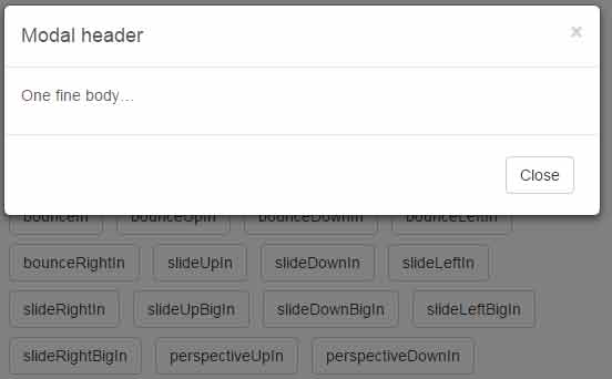
A demo of animated modals
Similarly, the modal windows with animation are created by using the data-easein data attribute. The rest remains the same as creating other ordinary modal windows using the Bootstrap framework. See this demo page with a number of modal windows with different animation styles:
The sample code for creating a modal with animation:
<!doctype html>
<html>
<head>

<script src="https://s.codepen.io/assets/libs/modernizr.js" type="text/javascript"></script>

<link rel="stylesheet" href="https://netdna.bootstrapcdn.com/bootstrap/3.3.5/css/bootstrap.min.css">


<style>
body {
color: #5a5a5a;
}

.container {
padding-bottom: 140px;
}

.popover-example {
margin: 0 0 10px;
list-style: none;
}

.popover-example li {
display: inline-block;
margin: 4px;
padding: 0px;
}

.btn:focus {
outline: none;
}

.modExample .btn {
margin: 4px 8px 4px 0;
}
</style>
</head>

<body>
<div class="container">

<!-- modal examples -->
<div class="modExample">
<h2>Bootstrap Modal with velocity.js animation</h2>
<a href="#myModal1" role="button" data-target="#myModal1" class="btn btn-default" data-toggle="modal">fadeIn</a>
<div id="myModal1" class="modal" data-easein="fadeIn" tabindex="-1" role="dialog" aria-labelledby="myModalLabel" aria-hidden="false">
<div class="modal-dialog">
<div class="modal-content">
<div class="modal-header">
<button type="button" class="close" data-dismiss="modal" aria-hidden="true">�</button>
<h4 class="modal-title" id="myModalLabel">Modal header 1</h4>
</div>
<div class="modal-body">
<p>One fine body�</p>
</div>
<div class="modal-footer">
<button class="btn btn-default" data-dismiss="modal" aria-hidden="true">Close</button>
<button class="btn btn-primary">Save changes</button>
</div>
</div>
</div>
</div>

<a href="#myModal2" role="button" class="btn btn-default" data-toggle="modal">flipXIn</a>
<div id="myModal2" class="modal" data-easein="flipXIn" tabindex="-1" role="dialog" aria-labelledby="myModalLabel" aria-hidden="true">
<div class="modal-dialog">
<div class="modal-content">
<div class="modal-header">
<button type="button" class="close" data-dismiss="modal" aria-hidden="true">�</button>
<h4 class="modal-title">Modal header 2</h4>
</div>
<div class="modal-body">
<p>One fine body�</p>
</div>
<div class="modal-footer">
<button class="btn btn-default" data-dismiss="modal" aria-hidden="true">Close</button>
<button class="btn btn-primary">Save changes</button>
</div>
</div>
</div>
</div>

<a href="#myModal3" role="button" class="btn btn-default" data-toggle="modal">flipYIn</a>
<div id="myModal3" class="modal" data-easein="flipYIn" tabindex="-1" role="dialog" aria-labelledby="myModalLabel" aria-hidden="true">
<div class="modal-dialog">
<div class="modal-content">
<div class="modal-header">
<button type="button" class="close" data-dismiss="modal" aria-hidden="true">�</button>
<h4 class="modal-title">Modal header</h4>
</div>
<div class="modal-body">
<p>One fine body�</p>
</div>
<div class="modal-footer">
<button class="btn btn-default" data-dismiss="modal" aria-hidden="true">Close</button>
</div>
</div>
</div>
</div>

<a href="#myModal4" role="button" class="btn btn-default" data-toggle="modal">flipBounceXIn</a>
<div id="myModal4" class="modal" data-easein="flipBounceXIn" tabindex="-1" role="dialog" aria-labelledby="myModalLabel" aria-hidden="true">
<div class="modal-dialog">
<div class="modal-content">
<div class="modal-header">
<button type="button" class="close" data-dismiss="modal" aria-hidden="true">�</button>
<h4 class="modal-title">Modal header</h4>
</div>
<div class="modal-body">
<p>One fine body�</p>
</div>
<div class="modal-footer">
<button class="btn btn-default" data-dismiss="modal" aria-hidden="true">Close</button>
</div>
</div>
</div>
</div>

<br />

<a href="#myModal5" role="button" class="btn btn-default" data-toggle="modal">flipBounceYIn</a>
<div id="myModal5" class="modal" data-easein="flipBounceYIn" tabindex="-1" role="dialog" aria-labelledby="myModalLabel" aria-hidden="true">
<div class="modal-dialog">
<div class="modal-content">
<div class="modal-header">
<button type="button" class="close" data-dismiss="modal" aria-hidden="true">�</button>
<h4 class="modal-title">Modal header 1</h4>
</div>
<div class="modal-body">
<p>One fine body�</p>
</div>
<div class="modal-footer">
<button class="btn btn-default" data-dismiss="modal" aria-hidden="true">Close</button>
<button class="btn btn-primary">Save changes</button>
</div>
</div>
</div>
</div>

<a href="#myModal6" role="button" class="btn btn-default" data-toggle="modal">swoopIn</a>
<div id="myModal6" class="modal" data-easein="swoopIn" tabindex="-1" role="dialog" aria-labelledby="myModalLabel" aria-hidden="true">
<div class="modal-dialog">
<div class="modal-content">
<div class="modal-header">
<button type="button" class="close" data-dismiss="modal" aria-hidden="true">�</button>
<h4 class="modal-title">Modal header 2</h4>
</div>
<div class="modal-body">
<p>One fine body�</p>
</div>
<div class="modal-footer">
<button class="btn btn-default" data-dismiss="modal" aria-hidden="true">Close</button>
<button class="btn btn-primary">Save changes</button>
</div>
</div>
</div>
</div>

<a href="#myModal7" role="button" class="btn btn-default" data-toggle="modal">whirlIn</a>
<div id="myModal7" class="modal" data-easein="whirlIn" tabindex="-1" role="dialog" aria-labelledby="myModalLabel" aria-hidden="true">
<div class="modal-dialog">
<div class="modal-content">
<div class="modal-header">
<button type="button" class="close" data-dismiss="modal" aria-hidden="true">�</button>
<h4 class="modal-title">Modal header</h4>
</div>
<div class="modal-body">
<p>One fine body�</p>
</div>
<div class="modal-footer">
<button class="btn btn-default" data-dismiss="modal" aria-hidden="true">Close</button>
</div>
</div>
</div>
</div>

<a href="#myModal8" role="button" class="btn btn-default" data-toggle="modal">shrinkIn</a>
<div id="myModal8" class="modal" data-easein="shrinkIn" tabindex="-1" role="dialog" aria-labelledby="myModalLabel" aria-hidden="true">
<div class="modal-dialog">
<div class="modal-content">
<div class="modal-header">
<button type="button" class="close" data-dismiss="modal" aria-hidden="true">�</button>
<h4 class="modal-title">Modal header</h4>
</div>
<div class="modal-body">
<p>One fine body�</p>
</div>
<div class="modal-footer">
<button class="btn btn-default" data-dismiss="modal" aria-hidden="true">Close</button>
</div>
</div>
</div>
</div>

<a href="#myModal9" role="button" class="btn btn-default" data-toggle="modal">expandIn</a>
<div id="myModal9" class="modal" data-easein="expandIn" tabindex="-1" role="dialog" aria-labelledby="myModalLabel" aria-hidden="true">
<div class="modal-dialog">
<div class="modal-content">
<div class="modal-header">
<button type="button" class="close" data-dismiss="modal" aria-hidden="true">�</button>
<h4 class="modal-title">Modal header 1</h4>
</div>
<div class="modal-body">
<p>One fine body�</p>
</div>
<div class="modal-footer">
<button class="btn btn-default" data-dismiss="modal" aria-hidden="true">Close</button>
<button class="btn btn-primary">Save changes</button>
</div>
</div>
</div>
</div>

<a href="#myModal10" role="button" class="btn btn-default" data-toggle="modal">bounceIn</a>
<div id="myModal10" class="modal" data-easein="bounceIn" tabindex="-1" role="dialog" aria-labelledby="myModalLabel" aria-hidden="true">
<div class="modal-dialog">
<div class="modal-content">
<div class="modal-header">
<button type="button" class="close" data-dismiss="modal" aria-hidden="true">�</button>
<h4 class="modal-title">Modal header 2</h4>
</div>
<div class="modal-body">
<p>One fine body�</p>
</div>
<div class="modal-footer">
<button class="btn btn-default" data-dismiss="modal" aria-hidden="true">Close</button>
<button class="btn btn-primary">Save changes</button>
</div>
</div>
</div>
</div>

<a href="#myModal11" role="button" class="btn btn-default" data-toggle="modal">bounceUpIn</a>
<div id="myModal11" class="modal" data-easein="bounceUpIn" tabindex="-1" role="dialog" aria-labelledby="myModalLabel" aria-hidden="true">
<div class="modal-dialog">
<div class="modal-content">
<div class="modal-header">
<button type="button" class="close" data-dismiss="modal" aria-hidden="true">�</button>
<h4 class="modal-title">Modal header</h4>
</div>
<div class="modal-body">
<p>One fine body�</p>
</div>
<div class="modal-footer">
<button class="btn btn-default" data-dismiss="modal" aria-hidden="true">Close</button>
</div>
</div>
</div>
</div>

<a href="#myModal12" role="button" class="btn btn-default" data-toggle="modal">bounceDownIn</a>
<div id="myModal12" class="modal" data-easein="bounceDownIn" tabindex="-1" role="dialog" aria-labelledby="myModalLabel" aria-hidden="true">
<div class="modal-dialog">
<div class="modal-content">
<div class="modal-header">
<button type="button" class="close" data-dismiss="modal" aria-hidden="true">�</button>
<h4 class="modal-title">Modal header</h4>
</div>
<div class="modal-body">
<p>One fine body�</p>
</div>
<div class="modal-footer">
<button class="btn btn-default" data-dismiss="modal" aria-hidden="true">Close</button>
</div>
</div>
</div>
</div>

<a href="#myModal13" role="button" class="btn btn-default" data-toggle="modal">bounceLeftIn</a>
<div id="myModal13" class="modal" data-easein="bounceLeftIn" tabindex="-1" role="dialog" aria-labelledby="myModalLabel" aria-hidden="true">
<div class="modal-dialog">
<div class="modal-content">
<div class="modal-header">
<button type="button" class="close" data-dismiss="modal" aria-hidden="true">�</button>
<h4 class="modal-title">Modal header</h4>
</div>
<div class="modal-body">
<p>One fine body�</p>
</div>
<div class="modal-footer">
<button class="btn btn-default" data-dismiss="modal" aria-hidden="true">Close</button>
</div>
</div>
</div>
</div>

<a href="#myModal15" role="button" class="btn btn-default" data-toggle="modal">bounceRightIn</a>
<div id="myModal15" class="modal" data-easein="bounceRightIn" tabindex="-1" role="dialog" aria-labelledby="myModalLabel" aria-hidden="true">
<div class="modal-dialog">
<div class="modal-content">
<div class="modal-header">
<button type="button" class="close" data-dismiss="modal" aria-hidden="true">�</button>
<h4 class="modal-title">Modal header 1</h4>
</div>
<div class="modal-body">
<p>One fine body�</p>
</div>
<div class="modal-footer">
<button class="btn btn-default" data-dismiss="modal" aria-hidden="true">Close</button>
<button class="btn btn-primary">Save changes</button>
</div>
</div>
</div>
</div>

<a href="#myModal16" role="button" class="btn btn-default" data-toggle="modal">slideUpIn</a>
<div id="myModal16" class="modal" data-easein="slideUpIn" tabindex="-1" role="dialog" aria-labelledby="myModalLabel" aria-hidden="true">
<div class="modal-dialog">
<div class="modal-content">
<div class="modal-header">
<button type="button" class="close" data-dismiss="modal" aria-hidden="true">�</button>
<h4 class="modal-title">Modal header 2</h4>
</div>
<div class="modal-body">
<p>One fine body�</p>
</div>
<div class="modal-footer">
<button class="btn btn-default" data-dismiss="modal" aria-hidden="true">Close</button>
<button class="btn btn-primary">Save changes</button>
</div>
</div>
</div>
</div>

<a href="#myModal17" role="button" class="btn btn-default" data-toggle="modal">slideDownIn</a>
<div id="myModal17" class="modal" data-easein="slideDownIn" tabindex="-1" role="dialog" aria-labelledby="myModalLabel" aria-hidden="true">
<div class="modal-dialog">
<div class="modal-content">
<div class="modal-header">
<button type="button" class="close" data-dismiss="modal" aria-hidden="true">�</button>
<h4 class="modal-title">Modal header</h4>
</div>
<div class="modal-body">
<p>One fine body�</p>
</div>
<div class="modal-footer">
<button class="btn btn-default" data-dismiss="modal" aria-hidden="true">Close</button>
</div>
</div>
</div>
</div>

<a href="#myModal18" role="button" class="btn btn-default" data-toggle="modal">slideLeftIn</a>
<div id="myModal18" class="modal" data-easein="slideLeftIn" tabindex="-1" role="dialog" aria-labelledby="myModalLabel" aria-hidden="true">
<div class="modal-dialog">
<div class="modal-content">
<div class="modal-header">
<button type="button" class="close" data-dismiss="modal" aria-hidden="true">�</button>
<h4 class="modal-title">Modal header</h4>
</div>
<div class="modal-body">
<p>One fine body�</p>
</div>
<div class="modal-footer">
<button class="btn btn-default" data-dismiss="modal" aria-hidden="true">Close</button>
</div>
</div>
</div>
</div>

<a href="#myModal14" role="button" class="btn btn-default" data-toggle="modal">slideRightIn</a>
<div id="myModal14" class="modal" data-easein="slideRightIn" tabindex="-1" role="dialog" aria-labelledby="myModalLabel" aria-hidden="true">
<div class="modal-dialog">
<div class="modal-content">
<div class="modal-header">
<button type="button" class="close" data-dismiss="modal" aria-hidden="true">�</button>
<h4 class="modal-title">Modal header</h4>
</div>
<div class="modal-body">
<p>One fine body�</p>
</div>
<div class="modal-footer">
<button class="btn btn-default" data-dismiss="modal" aria-hidden="true">Close</button>
</div>
</div>
</div>
</div>

<a href="#myModal19" role="button" class="btn btn-default" data-toggle="modal">slideUpBigIn</a>
<div id="myModal19" class="modal" data-easein="slideUpBigIn" tabindex="-1" role="dialog" aria-labelledby="myModalLabel" aria-hidden="true">
<div class="modal-dialog">
<div class="modal-content">
<div class="modal-header">
<button type="button" class="close" data-dismiss="modal" aria-hidden="true">�</button>
<h4 class="modal-title">Modal header</h4>
</div>
<div class="modal-body">
<p>One fine body�</p>
</div>
<div class="modal-footer">
<button class="btn btn-default" data-dismiss="modal" aria-hidden="true">Close</button>
</div>
</div>
</div>
</div>

<a href="#myModal20" role="button" class="btn btn-default" data-toggle="modal">slideDownBigIn</a>
<div id="myModal20" class="modal" data-easein="slideDownBigIn" tabindex="-1" role="dialog" aria-labelledby="myModalLabel" aria-hidden="true">
<div class="modal-dialog">
<div class="modal-content">
<div class="modal-header">
<button type="button" class="close" data-dismiss="modal" aria-hidden="true">�</button>
<h4 class="modal-title">Modal header</h4>
</div>
<div class="modal-body">
<p>One fine body�</p>
</div>
<div class="modal-footer">
<button class="btn btn-default" data-dismiss="modal" aria-hidden="true">Close</button>
</div>
</div>
</div>
</div>

<a href="#myModal21" role="button" class="btn btn-default" data-toggle="modal">slideLeftBigIn</a>
<div id="myModal21" class="modal" data-easein="slideLeftBigIn" tabindex="-1" role="dialog" aria-labelledby="myModalLabel" aria-hidden="true">
<div class="modal-dialog">
<div class="modal-content">
<div class="modal-header">
<button type="button" class="close" data-dismiss="modal" aria-hidden="true">�</button>
<h4 class="modal-title">Modal header</h4>
</div>
<div class="modal-body">
<p>One fine body�</p>
</div>
<div class="modal-footer">
<button class="btn btn-default" data-dismiss="modal" aria-hidden="true">Close</button>
</div>
</div>
</div>
</div>

<a href="#myModal22" role="button" class="btn btn-default" data-toggle="modal">slideRightBigIn</a>
<div id="myModal22" class="modal" data-easein="slideRightBigIn" tabindex="-1" role="dialog" aria-labelledby="myModalLabel" aria-hidden="true">
<div class="modal-dialog">
<div class="modal-content">
<div class="modal-header">
<button type="button" class="close" data-dismiss="modal" aria-hidden="true">�</button>
<h4 class="modal-title">Modal header</h4>
</div>
<div class="modal-body">
<p>One fine body�</p>
</div>
<div class="modal-footer">
<button class="btn btn-default" data-dismiss="modal" aria-hidden="true">Close</button>
</div>
</div>
</div>
</div>

<a href="#myModal23" role="button" class="btn btn-default" data-toggle="modal">perspectiveUpIn</a>
<div id="myModal23" class="modal" data-easein="perspectiveUpIn" tabindex="-1" role="dialog" aria-labelledby="myModalLabel" aria-hidden="true">
<div class="modal-dialog">
<div class="modal-content">
<div class="modal-header">
<button type="button" class="close" data-dismiss="modal" aria-hidden="true">�</button>
<h4 class="modal-title">Modal header</h4>
</div>
<div class="modal-body">
<p>One fine body�</p>
</div>
<div class="modal-footer">
<button class="btn btn-default" data-dismiss="modal" aria-hidden="true">Close</button>
</div>
</div>
</div>
</div>

<a href="#myModal24" role="button" class="btn btn-default" data-toggle="modal">perspectiveDownIn</a>
<div id="myModal24" class="modal" data-easein="perspectiveDownIn" tabindex="-1" role="dialog" aria-labelledby="myModalLabel" aria-hidden="true">
<div class="modal-dialog">
<div class="modal-content">
<div class="modal-header">
<button type="button" class="close" data-dismiss="modal" aria-hidden="true">�</button>
<h4 class="modal-title">Modal header</h4>
</div>
<div class="modal-body">
<p>One fine body�</p>
</div>
<div class="modal-footer">
<button class="btn btn-default" data-dismiss="modal" aria-hidden="true">Close</button>
</div>
</div>
</div>
</div>

<a href="#myModal25" role="button" class="btn btn-default" data-toggle="modal">perspectiveLeftIn</a>
<div id="myModal25" class="modal" data-easein="perspectiveLeftIn" tabindex="-1" role="dialog" aria-labelledby="myModalLabel" aria-hidden="true">
<div class="modal-dialog">
<div class="modal-content">
<div class="modal-header">
<button type="button" class="close" data-dismiss="modal" aria-hidden="true">�</button>
<h4 class="modal-title">Modal header</h4>
</div>
<div class="modal-body">
<p>One fine body�</p>
</div>
<div class="modal-footer">
<button class="btn btn-default" data-dismiss="modal" aria-hidden="true">Close</button>
</div>
</div>
</div>
</div>

<a href="#myModal26" role="button" class="btn btn-default" data-toggle="modal">perspectiveRightIn</a>
<div id="myModal26" class="modal" data-easein="perspectiveRightIn" tabindex="-1" role="dialog" aria-labelledby="myModalLabel" aria-hidden="true">
<div class="modal-dialog">
<div class="modal-content">
<div class="modal-header">
<button type="button" class="close" data-dismiss="modal" aria-hidden="true">�</button>
<h4 class="modal-title">Modal header</h4>
</div>
<div class="modal-body">
<p>One fine body�</p>
</div>
<div class="modal-footer">
<button class="btn btn-default" data-dismiss="modal" aria-hidden="true">Close</button>
</div>
</div>
</div>
</div>
<a href="#myModal27" role="button" class="btn btn-default" data-toggle="modal">shake</a>
<div id="myModal27" class="modal" data-easein="shake" tabindex="-1" role="dialog" aria-labelledby="myModalLabel" aria-hidden="true">
<div class="modal-dialog">
<div class="modal-content">
<div class="modal-header">
<button type="button" class="close" data-dismiss="modal" aria-hidden="true">�</button>
<h4 class="modal-title">Modal header</h4>
</div>
<div class="modal-body">
<p>One fine body�</p>
</div>
<div class="modal-footer">
<button class="btn btn-default" data-dismiss="modal" aria-hidden="true">Close</button>
</div>
</div>
</div>
</div>
<a href="#myModal28" role="button" class="btn btn-default" data-toggle="modal">tada</a>
<div id="myModal28" class="modal" data-easein="tada" tabindex="-1" role="dialog" aria-labelledby="myModalLabel" aria-hidden="true">
<div class="modal-dialog">
<div class="modal-content">
<div class="modal-header">
<button type="button" class="close" data-dismiss="modal" aria-hidden="true">�</button>
<h4 class="modal-title">Modal header</h4>
</div>
<div class="modal-body">
<p>One fine body�</p>
</div>
<div class="modal-footer">
<button class="btn btn-default" data-dismiss="modal" aria-hidden="true">Close</button>
</div>
</div>
</div>
</div>
<a href="#myModal29" role="button" class="btn btn-default" data-toggle="modal">swing</a>
<div id="myModal29" class="modal" data-easein="swing" tabindex="-1" role="dialog" aria-labelledby="myModalLabel" aria-hidden="true">
<div class="modal-dialog">
<div class="modal-content">
<div class="modal-header">
<button type="button" class="close" data-dismiss="modal" aria-hidden="true">�</button>
<h4 class="modal-title">Modal header</h4>
</div>
<div class="modal-body">
<p>One fine body�</p>
</div>
<div class="modal-footer">
<button class="btn btn-default" data-dismiss="modal" aria-hidden="true">Close</button>
</div>
</div>
</div>
</div>
<a href="#myModal30" role="button" class="btn btn-default" data-toggle="modal">bounce</a>
<div id="myModal30" class="modal" data-easein="bounce" tabindex="-1" role="dialog" aria-labelledby="myModalLabel" aria-hidden="true">
<div class="modal-dialog">
<div class="modal-content">
<div class="modal-header">
<button type="button" class="close" data-dismiss="modal" aria-hidden="true">�</button>
<h4 class="modal-title">Modal header</h4>
</div>
<div class="modal-body">
<p>One fine body�</p>
</div>
<div class="modal-footer">
<button class="btn btn-default" data-dismiss="modal" aria-hidden="true">Close</button>
</div>
</div>
</div>
</div>
<a href="#myModal31" role="button" class="btn btn-default" data-toggle="modal">flash</a>
<div id="myModal31" class="modal" data-easein="flash" tabindex="-1" role="dialog" aria-labelledby="myModalLabel" aria-hidden="true">
<div class="modal-dialog">
<div class="modal-content">
<div class="modal-header">
<button type="button" class="close" data-dismiss="modal" aria-hidden="true">�</button>
<h4 class="modal-title">Modal header</h4>
</div>
<div class="modal-body">
<p>One fine body�</p>
</div>
<div class="modal-footer">
<button class="btn btn-default" data-dismiss="modal" aria-hidden="true">Close</button>
</div>
</div>
</div>
</div>
<a href="#myModal32" role="button" class="btn btn-default" data-toggle="modal">pulse</a>
<div id="myModal32" class="modal" data-easein="pulse" tabindex="-1" role="dialog" aria-labelledby="myModalLabel" aria-hidden="true">
<div class="modal-dialog">
<div class="modal-content">
<div class="modal-header">
<button type="button" class="close" data-dismiss="modal" aria-hidden="true">�</button>
<h4 class="modal-title">Modal header</h4>
</div>
<div class="modal-body">
<p>One fine body�</p>
</div>
<div class="modal-footer">
<button class="btn btn-default" data-dismiss="modal" aria-hidden="true">Close</button>
</div>
</div>
</div>
</div>


</div>


</div>
<!-- end of container -->

<script src="https://cdnjs.cloudflare.com/ajax/libs/jquery/2.2.4/jquery.min.js"></script>
<script src="https://maxcdn.bootstrapcdn.com/bootstrap/3.3.6/js/bootstrap.min.js"></script>
<script src="https://cdnjs.cloudflare.com/ajax/libs/velocity/1.2.2/velocity.min.js"></script>
<script src="https://cdnjs.cloudflare.com/ajax/libs/velocity/1.2.2/velocity.ui.min.js"></script>
<script>
// add the animation to the modal
$(".modal").each(function(index) {
$(this).on('show.bs.modal', function(e) {
var open = $(this).attr('data-easein');
if (open == 'shake') {
$('.modal-dialog').velocity('callout.' + open);
} else if (open == 'pulse') {
$('.modal-dialog').velocity('callout.' + open);
} else if (open == 'tada') {
$('.modal-dialog').velocity('callout.' + open);
} else if (open == 'flash') {
$('.modal-dialog').velocity('callout.' + open);
} else if (open == 'bounce') {
$('.modal-dialog').velocity('callout.' + open);
} else if (open == 'swing') {
$('.modal-dialog').velocity('callout.' + open);
} else {
$('.modal-dialog').velocity('transition.' + open);
}

});
});
</script>

</body>
</html>
List of values of animation
The following animation values can be set as creating a popover or modal window:
- fadeIn
- flipXIn
- flipYIn
- flipBounceXIn
- flipBounceYIn
- swoopIn
- whirlIn
- shrinkIn
- expandIn
- bounceIn
- bounceUpIn
- bounceDownIn
- bounceLeftIn
- bounceRightIn
- slideUpIn
- slideDownIn
- slideLeftIn
- slideRightIn
- slideUpBigIn
- slideDownBigIn
- slideLeftBigIn
- slideRightBigIn
- perspectiveUpIn
- perspectiveDownIn
- perspectiveLeftIn
- perspectiveRightIn
- tada
- flash
- pulse
- swing
- bounce
How to setup these popovers and modals into your website?
As your project is based on Bootstrap, so it is highly likely that you have included the CSS and JS files of Bootstrap along with a reference for the jQuery library. For creating animated popover and modals, you also need to include the references of velocity.min.js and velocity.ui.min.js.
One such CDN based links are shown below:
<script src=”https://cdnjs.cloudflare.com/ajax/libs/velocity/1.2.2/velocity.min.js”></script>
<script src=”https://cdnjs.cloudflare.com/ajax/libs/velocity/1.2.2/velocity.ui.min.js”></script>
Credit: Mike Sozanski