
What is a modal dialog?
The modal window is a smart dialog that is displayed over the parent window to interact with the users of the website.
This is quite useful and gets users’ attention fully to convey some message or get user’s feedback.
For example, to conduct a survey you may use the modal window.
Similarly, to get users’ feedback or announce a seminar or some other event, etc.
Also See:
Bootstrap 5 Modal without jQuery | Bootstrap 4 Modals
How to create Bootstrap Modal
Creating modal dialogs by using Bootstrap framework is quite simple and requires the least coding. For that, you simply need to include the modal.js plug-in. If you already included the JS library of Bootstrap framework, then you do not need to include plug-in separately.
Following are a few examples of creating the Modals in Bootstrap along with demo and code online.
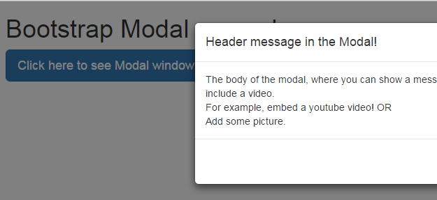
A basic modal example
A modal window generally has three sections that are divided into div elements. The sections include a header that contains the main heading of the dialog. After that, the body of the modal window will show the message in detail and finally, the last section is the footer. This is where actions are included.
For example, if the modal is taking the Name/Email then the footer section may contain Subscribe/Cancel actions.
The div elements contain the modal related classes provided by the framework. See a simple dialog below.
The markup:
<!DOCTYPE html>
<html>
<head>
<title>A simple Bootstrap modal example</title>
<link rel="stylesheet" href="https://maxcdn.bootstrapcdn.com/bootstrap/3.3.5/css/bootstrap.min.css" integrity="sha512-dTfge/zgoMYpP7QbHy4gWMEGsbsdZeCXz7irItjcC3sPUFtf0kuFbDz/ixG7ArTxmDjLXDmezHubeNikyKGVyQ==" crossorigin="anonymous">
<meta name="viewport" content="width=device-width, initial-scale=1.0">
<script src="https://ajax.googleapis.com/ajax/libs/jquery/1.10.2/jquery.min.js"></script>
<script src="https://maxcdn.bootstrapcdn.com/bootstrap/3.3.5/js/bootstrap.min.js" integrity="sha512-K1qjQ+NcF2TYO/eI3M6v8EiNYZfA95pQumfvcVrTHtwQVDG+aHRqLi/ETn2uB+1JqwYqVG3LIvdm9lj6imS/pQ==" crossorigin="anonymous"></script>
</head>
<body>
<div class="container">
<h1>Bootstrap Modal demo</h1>

<!-- Button trigger modal -->
<button type="button" class="btn btn-primary btn-lg" data-toggle="modal" data-target="#myModal">
Click here to see Modal window
</button>

<!-- Modal -->
<div class="modal fade" id="myModal" tabindex="-1" role="dialog" aria-labelledby="myModalLabel">
<div class="modal-dialog" role="document">
<div class="modal-content">
<div class="modal-header">
<button type="button" class="close" data-dismiss="modal" aria-label="Close"><span aria-hidden="true">×</span></button>
<h4 class="modal-title" id="myModalLabel">Header message in the Modal!</h4>
</div>
<div class="modal-body">
The body of the modal, where you can show a message in single or multi-line. Even include a video. <br />
For example, embed a youtube video! OR <br />
Add some picture.


</div>
<div class="modal-footer">
<button type="button" class="btn btn-default" data-dismiss="modal">I got it! Close</button>
</div>
</div>
</div>
</div>

</body>

</html>
You can see that as the demo page is loaded, it is showing a button to click in order to show the modal window. You can do it as the webpage loads as well (shown in the last example).
As you click the button, the modal will be launched with three sections. As you look into the code, the first div specifies the .modal class along with the .fade class. If you want Bootstrap modal dialog to appear without fading effect or animation, remove that class.
The id of the div is also specified, which is referred in the button element to launch it.
The next div specifies the size of the dialog that uses the .modal-dialog class. You may specify two additional classes there to specify the size of the dialog:
- For large dialog, use .modal-lg
- For small dialog, use .modal-sm
The next div element specifies the content of the modal dialog that includes the header containing the action buttons like close along with the header message.
It also includes the .modal-body class where you will display the message. You may even include videos or pictures there.
The final div in the main content div is for the footer that contains the .modal-footer class. This is where the footer action buttons are given, like “I got it, close” in this example is used.
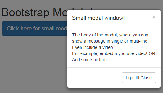
An example of smaller modal window
The following demo shows a small-sized modal dialog with a button in the footer section. See the demo and a little description below:
 The markup:
<div class="container">
<h1>Bootstrap Modal demo</h1>

<!-- Button trigger modal -->
<button type="button" class="btn btn-primary btn-lg" data-toggle="modal" data-target="#myModal">
Click here for small modal
</button>

<!-- Modal -->
<div class="modal fade" id="myModal" tabindex="-1" role="dialog" aria-labelledby="myModalLabel">
<div class="modal-dialog modal-sm" role="document">
<div class="modal-content">
<div class="modal-header">
<button type="button" class="close" data-dismiss="modal" aria-label="Close"><span aria-hidden="true">×</span></button>
<h4 class="modal-title" id="myModalLabel">Small modal window!</h4>
</div>
<div class="modal-body">
The body of the modal, where you can show a message in single or multi-line. Even include a video. <br />
For example, embed a youtube video! OR <br />
Add some picture.


</div>
<div class="modal-footer">
<button type="button" class="btn btn-default" data-dismiss="modal">I got it! Close</button>
</div>
</div>
</div>
</div>
As mentioned earlier, I simply used the .modal-dialog and .modal-sm in the second div to make the dialog small in size.
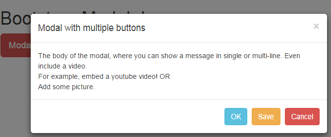
The above two examples simply used a button to let user close the modal window after seeing the message. You may include more buttons in the footer section as shown in the example below:
The Markup:
<div class="container">
<h1>Bootstrap Modal demo</h1>

<!-- Button trigger modal -->
<button type="button" class="btn btn-danger btn-lg" data-toggle="modal" data-target="#myModal">
Modal with multiple actions
</button>

<!-- Modal -->
<div class="modal fade" id="myModal" tabindex="-1" role="dialog" aria-labelledby="myModalLabel">
<div class="modal-dialog" role="document">
<div class="modal-content">
<div class="modal-header">
<button type="button" class="close" data-dismiss="modal" aria-label="Close"><span aria-hidden="true">×</span></button>
<h4 class="modal-title" id="myModalLabel">Modal with multiple buttons</h4>
</div>
<div class="modal-body">
The body of the modal, where you can show a message in single or multi-line. Even include a video. <br />
For example, embed a youtube video! OR <br />
Add some picture.


</div>
<div class="modal-footer">
<button type="button" class="btn btn btn-info" data-dismiss="modal">OK</button>
<button type="button" class="btn btn btn-warning" data-dismiss="modal">Save</button>
<button type="button" class="btn btn-danger" data-dismiss="modal">Cancel</button>
</div>
</div>
</div>
</div>
You can see in the footer div, the modal dialog includes three buttons with different styles i.e. Ok, Save and Cancel buttons. Different button classes provided by Bootstrap framework are used for all the buttons.
Custom-colored bootstrap modal
Until now, we have used the default colors that are set in the Bootstrap framework for the modal window, which is whitish. Generally, you will need your own color scheme that matches the theme of your web design for the modal windows.
In the following demo, I used the custom color for the header section of the modal window.
Complete HTML code
<!DOCTYPE html>
<html>
<head>
<title>A simple Bootstrap modal example</title>
<link rel="stylesheet" href="https://maxcdn.bootstrapcdn.com/bootstrap/3.3.5/css/bootstrap.min.css" integrity="sha512-dTfge/zgoMYpP7QbHy4gWMEGsbsdZeCXz7irItjcC3sPUFtf0kuFbDz/ixG7ArTxmDjLXDmezHubeNikyKGVyQ==" crossorigin="anonymous">
<meta name="viewport" content="width=device-width, initial-scale=1.0">
<script src="https://ajax.googleapis.com/ajax/libs/jquery/1.10.2/jquery.min.js"></script>
<script src="https://maxcdn.bootstrapcdn.com/bootstrap/3.3.5/js/bootstrap.min.js" integrity="sha512-K1qjQ+NcF2TYO/eI3M6v8EiNYZfA95pQumfvcVrTHtwQVDG+aHRqLi/ETn2uB+1JqwYqVG3LIvdm9lj6imS/pQ==" crossorigin="anonymous"></script>
<style>
.modal-header {
background-color: #C49F0F;
padding:9px 15px;
color:#FFF;
font-family:Verdana, sans-serif;
border-bottom:1px solid #eee;
border-top-left-radius: 15px;
border-top-right-radius: 15px;
}
</style>
</head>
<body>
<div class="container">
<h1>Bootstrap Modal demo</h1>

<!-- Button trigger modal -->
<button type="button" class="btn btn-danger btn-lg" data-toggle="modal" data-target="#myModal">
Custom colored Modal
</button>

<!-- Modal -->
<div class="modal fade" id="myModal" tabindex="-1" role="dialog" aria-labelledby="myModalLabel">
<div class="modal-dialog" role="document">
<div class="modal-content">
<div class="modal-header">
<button type="button" class="close" data-dismiss="modal" aria-label="Close"><span aria-hidden="true">×</span></button>
<h4 class="modal-title" id="myModalLabel">Custom colored Modal</h4>
</div>
<div class="modal-body">
The body of the modal, where you can show a message in single or multi-line. Even include a video. <br />
For example, embed a youtube video! OR <br />
Add some picture.


</div>
<div class="modal-footer">
<button type="button" class="btn btn btn-info" data-dismiss="modal">OK</button>
<button type="button" class="btn btn btn-warning" data-dismiss="modal">Save</button>
<button type="button" class="btn btn-danger" data-dismiss="modal">Cancel</button>
</div>
</div>
</div>
</div>

</body>

</html>
Output:
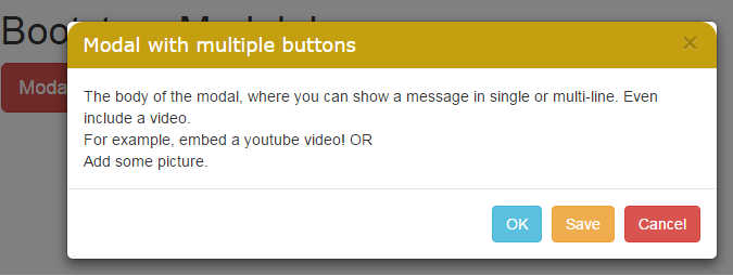
The color and other properties of the header are changed this way:
- First of all, a CSS class is created inside the head section of the webpage.
- You must place this class after referring to the Bootstrap framework CSS.
- Name the class as .modal-header in the style section.
- This will override the default style of modal Bootstrap.
- In the style, I have changed the background color, text color, and font family of the text and added a radius for the top left and top right.
- You can change/add more properties as needed by the website theme you are working on.
Customizing the body section of Modal
In this example, the body is also customized along with the header section of the modal window in Bootstrap. The .modal-body class in the header section after the Bootstrap CSS reference will override the default style.
The code:
<!DOCTYPE html>
<html>
<head>
<title>A simple Bootstrap modal example</title>
<link rel="stylesheet" href="https://maxcdn.bootstrapcdn.com/bootstrap/3.3.5/css/bootstrap.min.css" integrity="sha512-dTfge/zgoMYpP7QbHy4gWMEGsbsdZeCXz7irItjcC3sPUFtf0kuFbDz/ixG7ArTxmDjLXDmezHubeNikyKGVyQ==" crossorigin="anonymous">
<meta name="viewport" content="width=device-width, initial-scale=1.0">
<script src="https://ajax.googleapis.com/ajax/libs/jquery/1.10.2/jquery.min.js"></script>
<script src="https://maxcdn.bootstrapcdn.com/bootstrap/3.3.5/js/bootstrap.min.js" integrity="sha512-K1qjQ+NcF2TYO/eI3M6v8EiNYZfA95pQumfvcVrTHtwQVDG+aHRqLi/ETn2uB+1JqwYqVG3LIvdm9lj6imS/pQ==" crossorigin="anonymous"></script>
<style>
.modal-header {
background-color: #C49F0F;
padding:9px 15px;
color:#FFF;
font-family:Verdana, sans-serif;
border-bottom:1px solid #eee;
border-top-left-radius: 15px;
border-top-right-radius: 15px;
}
.modal-body {
background-color: #F8E69E;
padding:9px 15px;
color:#000;
font-family:Verdana, sans-serif;
border-bottom:4px solid #C49F0F;

}
</style>
</head>
<body>
<div class="container">
<h1>Bootstrap Modal demo</h1>

<!-- Button trigger modal -->
<button type="button" class="btn btn-danger btn-lg" data-toggle="modal" data-target="#myModal">
Custom body in Modal
</button>

<!-- Modal -->
<div class="modal fade" id="myModal" tabindex="-1" role="dialog" aria-labelledby="myModalLabel">
<div class="modal-dialog" role="document">
<div class="modal-content">
<div class="modal-header">
<button type="button" class="close" data-dismiss="modal" aria-label="Close"><span aria-hidden="true">×</span></button>
<h4 class="modal-title" id="myModalLabel">Custom body in Modal</h4>
</div>
<div class="modal-body">
An example of Bootstrap modal <br />
With custom header and <br />
content in the body.
</div>
<div class="modal-footer">
<button type="button" class="btn btn btn-info" data-dismiss="modal">OK</button>
<button type="button" class="btn btn btn-warning" data-dismiss="modal">Save</button>
<button type="button" class="btn btn-danger" data-dismiss="modal">Cancel</button>
</div>
</div>
</div>
</div>

</body>

</html>
Output:
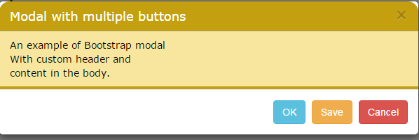
In the following example, the footer section is also customized by using the .modal-footer class. This class will override the default class for the footer.
Code:
<!DOCTYPE html>
<html>
<head>
<title>A simple Bootstrap modal example</title>
<link rel="stylesheet" href="https://maxcdn.bootstrapcdn.com/bootstrap/3.3.5/css/bootstrap.min.css" integrity="sha512-dTfge/zgoMYpP7QbHy4gWMEGsbsdZeCXz7irItjcC3sPUFtf0kuFbDz/ixG7ArTxmDjLXDmezHubeNikyKGVyQ==" crossorigin="anonymous">
<meta name="viewport" content="width=device-width, initial-scale=1.0">
<script src="https://ajax.googleapis.com/ajax/libs/jquery/1.10.2/jquery.min.js"></script>
<script src="https://maxcdn.bootstrapcdn.com/bootstrap/3.3.5/js/bootstrap.min.js" integrity="sha512-K1qjQ+NcF2TYO/eI3M6v8EiNYZfA95pQumfvcVrTHtwQVDG+aHRqLi/ETn2uB+1JqwYqVG3LIvdm9lj6imS/pQ==" crossorigin="anonymous"></script>
<style>
.modal-header {
background-color: #C49F0F;
padding:9px 15px;
color:#FFF;
font-family:Verdana, sans-serif;
border-bottom:1px solid #eee;
border-top-left-radius: 15px;
border-top-right-radius: 15px;
}
.modal-body {
background-color: #F8E69E;
padding:9px 15px;
color:#000;
font-family:Verdana, sans-serif;
border-bottom:4px solid #C49F0F;

}
.modal-footer {
background-color: #FAEDBC;
color:#FFF;
border-bottom-left-radius: 15px;
border-bottom-right-radius: 15px;
}
</style>
</head>
<body>
<div class="container">
<h1>Bootstrap Modal demo</h1>

<!-- Button trigger modal -->
<button type="button" class="btn btn-danger btn-lg" data-toggle="modal" data-target="#myModal">
Customized footer
</button>

<!-- Modal -->
<div class="modal fade" id="myModal" tabindex="-1" role="dialog" aria-labelledby="myModalLabel">
<div class="modal-dialog" role="document">
<div class="modal-content">
<div class="modal-header">
<button type="button" class="close" data-dismiss="modal" aria-label="Close"><span aria-hidden="true">×</span></button>
<h4 class="modal-title" id="myModalLabel">Customized footer Modal</h4>
</div>
<div class="modal-body">
An example of Bootstrap modal <br />
With custom header and <br />
content in the body.
</div>
<div class="modal-footer">
<button type="button" class="btn btn btn-info" data-dismiss="modal">OK</button>
<button type="button" class="btn btn btn-warning" data-dismiss="modal">Save</button>
<button type="button" class="btn btn-danger" data-dismiss="modal">Cancel</button>
</div>
</div>
</div>
</div>

</body>

</html>
Output:
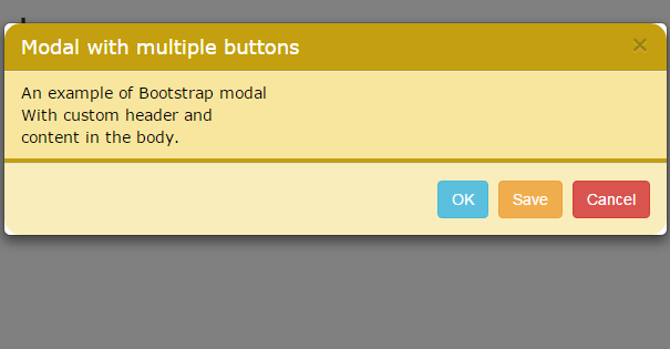 You can see the customized header, body, and footer in the above example. You may place all the style in an external CSS file as well. However, you must include this after referring the Bootstrap CSS file in order to override default styles.
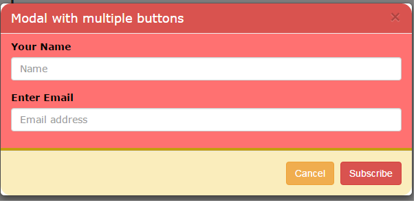
A modal example with form fields
In the following example, a form is used inside the body area of the modal window. In above example, we simply showed some text and allowed a user to close the window.
In this example, an email subscription form is used, where a user is asked to enter the Name and Email address. The footer section shows only two options: Subscribe and Cancel.
Unlike the above examples where the Bootstrap modal window only launched as you clicked on the button. In this example, the modal window will be shown as the example page loads.
Code:
<!DOCTYPE html>
<html>
<head>
<title>A simple Bootstrap modal example</title>
<link rel="stylesheet" href="https://maxcdn.bootstrapcdn.com/bootstrap/3.3.5/css/bootstrap.min.css" integrity="sha512-dTfge/zgoMYpP7QbHy4gWMEGsbsdZeCXz7irItjcC3sPUFtf0kuFbDz/ixG7ArTxmDjLXDmezHubeNikyKGVyQ==" crossorigin="anonymous">
<meta name="viewport" content="width=device-width, initial-scale=1.0">
<script src="https://ajax.googleapis.com/ajax/libs/jquery/1.10.2/jquery.min.js"></script>
<script src="https://maxcdn.bootstrapcdn.com/bootstrap/3.3.5/js/bootstrap.min.js" integrity="sha512-K1qjQ+NcF2TYO/eI3M6v8EiNYZfA95pQumfvcVrTHtwQVDG+aHRqLi/ETn2uB+1JqwYqVG3LIvdm9lj6imS/pQ==" crossorigin="anonymous"></script>
<script type="text/javascript" language="javascript">
$(document).ready(function() {
$("#myModal").modal('show');
});
</script>
<style>
.modal-header {
background-color: #D9534F;
padding:9px 15px;
color:#FFF;
font-family:Verdana, sans-serif;
border-bottom:1px solid #eee;
border-top-left-radius: 15px;
border-top-right-radius: 15px;
}
.modal-body {
background-color: #FF7171;
padding:9px 15px;
color:#000;
font-family:Verdana, sans-serif;
border-bottom:4px solid #C49F0F;

}
.modal-footer {
background-color: #FAEDBC;
color:#FFF;
border-bottom-left-radius: 15px;
border-bottom-right-radius: 15px;
}
</style>
</head>
<body>
<div class="container">
<h1>Bootstrap Modal demo</h1>

<!-- Button trigger modal -->
<button type="button" class="btn btn-danger btn-lg" data-toggle="modal" data-target="#myModal">
Subscribe Modal
</button>

<!-- Modal -->
<div class="modal fade" id="myModal" tabindex="-1" role="dialog" aria-labelledby="myModalLabel">
<div class="modal-dialog" role="document">
<div class="modal-content">
<div class="modal-header">
<button type="button" class="close" data-dismiss="modal" aria-label="Close"><span aria-hidden="true">×</span></button>
<h4 class="modal-title" id="myModalLabel">Modal with multiple buttons</h4>
</div>
<div class="modal-body">

<form role="form">
<div class="form-group">
<label for="exampleInputEmail1">Your Name</label>
<input type="name" class="form-control" id="name" placeholder="Name">
</div>
<div class="form-group">
<label for="exampleInputEmail1">Enter Email</label>
<input type="email" class="form-control" id="email1" placeholder="Email address">
</div>
</form>
</div>
<div class="modal-footer">
<button type="button" class="btn btn btn-warning" data-dismiss="modal">Cancel</button>
<button type="button" class="btn btn-danger" data-dismiss="modal">Subscribe</button>
</div>
</div>
</div>
</div>

</body>

</html>
Output:
The loading part is done in the head section by using jQuery. This code is used to show the modal dialog at startup:
<script type="text/javascript" language="javascript">

$(document).ready(function() {

$("#myModal").modal('show');

});

</script>
Where myModal is the main div id of the modal window.
Reference: http://getbootstrap.com/javascript/