
The tooltip plugin of Bootstrap Framework
By using the Tooltip.js plugin of Bootstrap framework, you may create tooltips for different elements like buttons, links, text boxes etc. quite easily.
I will show you how to create simple and customized tooltips with online examples in this tutorial.
You may click on any image or link below the image for seeing the live demos.
A simple example of Bootstrap tooltip
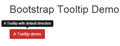
In this demo, a tooltip is attached to a button that uses the Bootstrap class. See this online which is followed by how to create it.
Online Demo
These are a few main points to create tooltips:
You have to include the jQuery library as well to call the tooltips along with Bootstrap CSS and JS libraries. By default, the direction of the tooltip is on top of the element.
<script type="text/javascript">

$(document).ready(function(){

$("#tooltipex").tooltip({

});

});

</script>
You may set the direction by using the placement option in the script section. See the next example that used placement option.
The title attribute of the element, in that case, a button, is used as the tooltip text.
<button type="button" id="tooltipex" class="btn btn-danger" title="A Tooltip with default direction">A Tooltip demo</button>
By default, the tooltip background color is black with white text.
You may also use the data attribute to set the options for tooltips, for example:
<button type="button" id="tooltipex" data-toggle="tooltip" data-placement="bottom" title="" data-original-title="A Tooltip with default direction" class="btn btn-danger" >A Tooltip demo</button>
However, you still need to trigger this in JavaScript section.
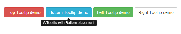
A demo of Bootstrap tooltips in all directions
In this demo, four buttons are used to show the tooltips in all directions i.e. top, bottom, left and right.
Complete code:
<!DOCTYPE html>
<html>
<head>
<meta name="viewport" content="width=device-width, initial-scale=1.0"/>
<title>Example of bootstrap tooltip on top</title>
    <link rel="stylesheet" href="https://maxcdn.bootstrapcdn.com/bootstrap/3.3.6/css/bootstrap.min.css" integrity="sha384-1q8mTJOASx8j1Au+a5WDVnPi2lkFfwwEAa8hDDdjZlpLegxhjVME1fgjWPGmkzs7" crossorigin="anonymous">
    <script src="https://ajax.googleapis.com/ajax/libs/jquery/1.10.2/jquery.min.js"></script>
    <script src="https://maxcdn.bootstrapcdn.com/bootstrap/3.3.6/js/bootstrap.min.js" integrity="sha384-0mSbJDEHialfmuBBQP6A4Qrprq5OVfW37PRR3j5ELqxss1yVqOtnepnHVP9aJ7xS" crossorigin="anonymous"></script>

    <script type="text/javascript">
    $(document).ready(function(){
        $("#toptip").tooltip({
            placement:"top"
        });

        $("#bottomtip").tooltip({
            placement:"bottom"
        });

        $("#lefttip").tooltip({
            placement:"left"
        });

        $("#righttip").tooltip({
            placement:"right"
        });
    });
    </script>

</head>
<body>
<div class="container">
<h1>Bootstrap Tooltip Demo</h1><br /><br />
<div>

<button type="button" id="toptip" class="btn btn-danger"  title="A Tooltip with Top placement">Top Tooltip demo</button>
<button type="button" id="bottomtip" class="btn btn-info"  title="A Tooltip with Bottom placement">Bottom Tooltip demo</button>
<button type="button" id="lefttip" class="btn btn-success"  title="A Tooltip with Left placement">Left Tooltip demo</button>
<button type="button" id="righttip" class="btn btn-default"  title="A Tooltip with Right placement">Right Tooltip demo</button>
</div>

</body>
</html>
The tooltip component has a few options that you may set in the script section. The placement is an option that can be used to set the direction of the tooltip. In the demo, I have used four placements for the buttons, one for each:
<script type="text/javascript">

$(document).ready(function(){

$("#toptip").tooltip({

placement:"top"

});


$("#bottomtip").tooltip({

placement:"bottom"

});


$("#lefttip").tooltip({

placement:"left"

});


$("#righttip").tooltip({

placement:"right"

});

});

</script>
Note: You may also use data attribute to pass the option rather than using JavaScript.
Tooltip Bootstrap in a textbox
You may also attach tooltips to the textboxes in Bootstrap forms. The process remains the same as I used in the buttons example.
The markup:
<!DOCTYPE html>
<html>
<head>
<meta name="viewport" content="width=device-width, initial-scale=1.0"/>
<title>Example of bootstrap tooltip on top</title>
    <link rel="stylesheet" href="https://maxcdn.bootstrapcdn.com/bootstrap/3.3.6/css/bootstrap.min.css" integrity="sha384-1q8mTJOASx8j1Au+a5WDVnPi2lkFfwwEAa8hDDdjZlpLegxhjVME1fgjWPGmkzs7" crossorigin="anonymous">
    <script src="https://ajax.googleapis.com/ajax/libs/jquery/1.10.2/jquery.min.js"></script>
    <script src="https://maxcdn.bootstrapcdn.com/bootstrap/3.3.6/js/bootstrap.min.js" integrity="sha384-0mSbJDEHialfmuBBQP6A4Qrprq5OVfW37PRR3j5ELqxss1yVqOtnepnHVP9aJ7xS" crossorigin="anonymous"></script>

    <script type="text/javascript">
    $(document).ready(function(){
        $("#name1").tooltip({

        });
    });
    </script>

</head>
<body>
<div class="container">
<h1>Bootstrap Tooltip Demo</h1><br /><br />
<div>

      <div class="form-group">
        <label for="name1" class="col-sm-2 control-label">Name:</label>
        <div class="col-sm-4">
          <input type="input" class="form-control" id="name1" title="Enter Your Full Name">
        </div>

</div>
</body>
</html>
Result:
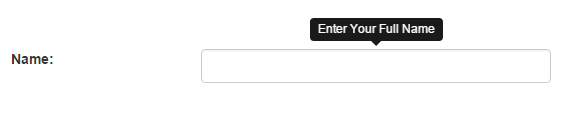
So, you just need to give a title in a textbox field and call it in the script section. The code for the textbox is:
<input type="input" class="form-control" id="name1" title="Enter Your Full Name">
Customizing the tooltips
Until now, you have seen only default tooltip styles as set in the Bootstrap CSS. By overriding the tooltip classes, you may customize the look of tooltips as per need or to match the website theme.
Following are a few examples of Bootstrap tooltip customization.
Tooltips with different colors for each direction
In this demo, each direction i.e. top, bottom, left and right are given different background colors. The tooltips are attached to button elements.
Code:
<!DOCTYPE html>
<html>
<head>
<meta name="viewport" content="width=device-width, initial-scale=1.0"/>
<title>Example of bootstrap tooltip on top</title>
    <link rel="stylesheet" href="https://maxcdn.bootstrapcdn.com/bootstrap/3.3.6/css/bootstrap.min.css" integrity="sha384-1q8mTJOASx8j1Au+a5WDVnPi2lkFfwwEAa8hDDdjZlpLegxhjVME1fgjWPGmkzs7" crossorigin="anonymous">
    <script src="https://ajax.googleapis.com/ajax/libs/jquery/1.10.2/jquery.min.js"></script>
    <script src="https://maxcdn.bootstrapcdn.com/bootstrap/3.3.6/js/bootstrap.min.js" integrity="sha384-0mSbJDEHialfmuBBQP6A4Qrprq5OVfW37PRR3j5ELqxss1yVqOtnepnHVP9aJ7xS" crossorigin="anonymous"></script>

<script type="text/javascript">
    $(document).ready(function(){
        $("#toptip").tooltip({
            placement:"top"
        });

        $("#bottomtip").tooltip({
            placement:"bottom"
        });

        $("#lefttip").tooltip({
            placement:"left"
        });

        $("#righttip").tooltip({
            placement:"right"
        });
    });
</script>


<style>
.tooltip{
    position:absolute;
    z-index:1020;
    display:block;
    visibility:visible;
    padding:5px;
    font-size:13px;
    opacity:0;
    filter:alpha(opacity=0)
}
.tooltip.in{
    opacity:.8;
    filter:alpha(opacity=80)
}

.tooltip.top .tooltip-arrow{
    bottom:0;
    left:50%;
    margin-left:-5px;
    border-left:3px solid transparent;
    border-right:3px solid transparent;
    border-top:3px solid #000
}
.tooltip.left .tooltip-arrow{
    top:50%;
    right:0;
    margin-top:-5px;
    border-top:5px solid transparent;
    border-bottom:5px solid transparent;
    border-left:5px solid #000
}
.tooltip.bottom .tooltip-arrow{
    top:0;
    left:50%;
    margin-left:-5px;
    border-left:5px solid transparent;
    border-right:5px solid transparent;
    border-bottom:5px solid #000
}
.tooltip.right .tooltip-arrow{
    top:50%;
    left:0;
    margin-top:-5px;
    border-top:5px solid transparent;
    border-bottom:5px solid transparent;
    border-right:5px solid #000
}
.tooltip.top .tooltip-inner{
    max-width:310px;
    padding:3px 8px;
    color:#000;
    text-align:center;
    background-color:red;
    -webkit-border-radius:5px;
    -moz-border-radius:5px;
    border-radius:5px
}

.tooltip.bottom .tooltip-inner{
    max-width:310px;
    padding:3px 8px;
    color:#fff;
    text-align:center;
    background-color:#245973;
    border-radius:5px
}

.tooltip.left .tooltip-inner{
    max-width:310px;
    padding:3px 8px;
    color:#000;
    text-align:center;
    background-color:#FF9A35;
    -webkit-border-radius:4px;
    -moz-border-radius:4px;
    border-radius:4px
}

.tooltip.right .tooltip-inner{
    max-width:310px;
    padding:3px 8px;
    color:#fff;
    text-align:center;
    background-color:#CC0000;
    -webkit-border-radius:4px;
    -moz-border-radius:4px;
    border-radius:4px
}

.tooltip-arrow{
    position:absolute;
    width:0;
    height:0
}
</style>
</head>
<body>
<div class="container">
<h1>Bootstrap Tooltip Demo</h1><br /><br /><br />
<div>

<button type="button" id="toptip" class="btn btn-danger"  title="A Tooltip with Top placement">Top Tooltip demo</button>
<button type="button" id="bottomtip" class="btn btn-info"  title="A Tooltip with Bottom placement">Bottom Tooltip demo</button>
<button type="button" id="lefttip" class="btn btn-success"  title="A Tooltip with Left placement">Left Tooltip demo</button>
<button type="button" id="righttip" class="btn btn-default"  title="A Tooltip with Right placement">Right Tooltip demo</button>
</div>

</div>
</body>
</html>
Result:
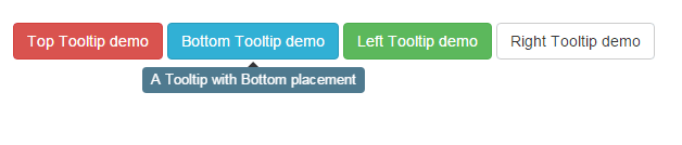
Following classes are used for each direction.
For top tooltip:
.tooltip.top .tooltip-inner{

max-width:310px;

padding:3px 8px;

color:#000;

text-align:center;

background-color:red;

-webkit-border-radius:5px;

-moz-border-radius:5px;

border-radius:5px

}
For bottom tooltip:
.tooltip.bottom .tooltip-inner{

max-width:310px;

padding:3px 8px;

color:#fff;

text-align:center;

background-color:#245973;

border-radius:5px

}
For the left tooltip:
.tooltip.left .tooltip-inner{

max-width:310px;

padding:3px 8px;

color:#000;

text-align:center;

background-color:#FF9A35;

-webkit-border-radius:4px;

-moz-border-radius:4px;

border-radius:4px

}
For the right tooltip:
.tooltip.right .tooltip-inner{

max-width:310px;

padding:3px 8px;

color:#fff;

text-align:center;

background-color:#CC0000;

-webkit-border-radius:4px;

-moz-border-radius:4px;

border-radius:4px

}
There are a few other classes as well to manage arrows or other properties. Have a look at the style tag in the head section in the demo page.
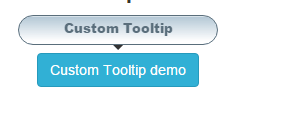
A custom tooltip with CSS3 properties
In this demo, more CSS 3 properties are used to customize the tooltip. I have added linear radiant background along with border-radius properties. See it online:
Code:
<!DOCTYPE html>
<html>
<head>
<meta name="viewport" content="width=device-width, initial-scale=1.0"/>
<title>Example of bootstrap tooltip on top</title>
    <link rel="stylesheet" href="https://maxcdn.bootstrapcdn.com/bootstrap/3.3.6/css/bootstrap.min.css" integrity="sha384-1q8mTJOASx8j1Au+a5WDVnPi2lkFfwwEAa8hDDdjZlpLegxhjVME1fgjWPGmkzs7" crossorigin="anonymous">
    <script src="https://ajax.googleapis.com/ajax/libs/jquery/1.10.2/jquery.min.js"></script>
    <script src="https://maxcdn.bootstrapcdn.com/bootstrap/3.3.6/js/bootstrap.min.js" integrity="sha384-0mSbJDEHialfmuBBQP6A4Qrprq5OVfW37PRR3j5ELqxss1yVqOtnepnHVP9aJ7xS" crossorigin="anonymous"></script>

<script type="text/javascript">
    $(document).ready(function(){
        $("#tooltipex").tooltip({
            placement:"auto"
        });
    });
</script>


<style>
.tooltip{
    position:absolute;
    z-index:1020;
    display:block;
    visibility:visible;
    padding:5px;
    font-size:13px;
    opacity:0;
    filter:alpha(opacity=0)
}
.tooltip.in{
    opacity:.8;
    filter:alpha(opacity=80)
}


.tooltip-inner{
    width:350px;
    height:30px;
    padding:3px 8px;
    color:#314A5B;
    text-align:center;
    font-weight:900;
    background: -webkit-gradient(linear, left top, left 25, from(#FFFFFF), color-stop(4%, #A2BBCC), to(#FFFFFF));
    background: -moz-linear-gradient(top, #FFFFFF, #A2BBCC 1px, #FFFFFF 25px);
    -webkit-border-radius:5px;
    -moz-border-radius:5px;
    border-radius:15px;
    border: 1px solid #314A5B;
}


.tooltip-arrow{
    position:absolute;
    width:0;
    height:0
}
</style>
</head>
<body>
<div class="container">
<h1>Tooltip Demo</h1><br /><br />
<div>

<button type="button" id="tooltipex" class="btn btn-info"  title="Custom Tooltip ">Custom Tooltip demo</button>
</div>

</div>
</body>
</html>
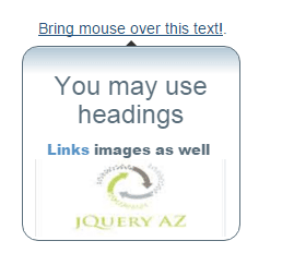
A tooltip with HTML elements
Moreover, you may add HTML elements like h1 heading, paragraphs, links, images etc. in Bootstrap tooltips.
The following demo shows how:
Code:
<!DOCTYPE html>
<html>
<head>
<meta name="viewport" content="width=device-width, initial-scale=1.0"/>
<title>Example of bootstrap tooltip on top</title>
    <link rel="stylesheet" href="https://maxcdn.bootstrapcdn.com/bootstrap/3.3.6/css/bootstrap.min.css" integrity="sha384-1q8mTJOASx8j1Au+a5WDVnPi2lkFfwwEAa8hDDdjZlpLegxhjVME1fgjWPGmkzs7" crossorigin="anonymous">
    <script src="https://ajax.googleapis.com/ajax/libs/jquery/1.10.2/jquery.min.js"></script>
    <script src="https://maxcdn.bootstrapcdn.com/bootstrap/3.3.6/js/bootstrap.min.js" integrity="sha384-0mSbJDEHialfmuBBQP6A4Qrprq5OVfW37PRR3j5ELqxss1yVqOtnepnHVP9aJ7xS" crossorigin="anonymous"></script>
<script type="text/javascript">
    $(document).ready(function(){
        $('.tooltip-demo').tooltip({
        selector: "a[rel=tooltip]",
        placement: "bottom"
})
 });
</script>

<style>
.tooltip{
    position:absolute;
    z-index:1020;
    display:block;
    visibility:visible;
    padding:5px;
    font-size:13px;
    opacity:0;
    filter:alpha(opacity=0)
}
.tooltip.in{
    opacity:.8;
    filter:alpha(opacity=80)
}


.tooltip-inner{

    padding:3px 8px;
    color:#314A5B;
    text-align:center;
    font-weight:900;
    background: -webkit-gradient(linear, left top, left 25, from(#FFFFFF), color-stop(4%, #A2BBCC), to(#FFFFFF));
    background: -moz-linear-gradient(top, #FFFFFF, #A2BBCC 1px, #FFFFFF 25px);
    -webkit-border-radius:5px;
    -moz-border-radius:5px;
    border-radius:15px;
    border: 1px solid #314A5B;
}


.tooltip-arrow{
    position:absolute;
    width:0;
    height:0
}
</style>


</head>
<body>
<div class="container">
<h1>Bootstrap Tooltip Demo</h1><br /><br /><br />
<div class="tooltip-demo">

<a title="<h3>You may use headings</h3> <a href='https://www.jquery-az.com/'>Links</a> images as well <img src='https://www.jquery-az.com/wp-content/uploads/2015/10/logo.jpg' width='175'>" data-html="true" rel="tooltip" href="#">Bring mouse over this text!</a>.

</div>


</div>
</div>
</body>
</html>
So what is done there?
I simply used HTML tags for the link, heading and image inside the title of a link that shows a tooltip.
<a title="<h3>You may use headings</h3> <a href='https://www.jquery-az.com/'>Links</a> images as well <img src='https://www.jquery-az.com/wp-content/uploads/2015/10/logo.jpg' width='175'>" data-html="true" rel="tooltip" href="#">Bring mouse over this text!</a>
The div element containing the link is called in the JavaScript section:
<script type="text/javascript">

$(document).ready(function(){

$('.tooltip-demo').tooltip({

selector: "a[rel=tooltip]",

placement: "bottom"

})

});

</script>
The same custom CSS is used to style the tooltip borders, background etc. as in the above example (See style section). That’s it! An HTML tooltip in Bootstrap forms is shown below with more details.
Custom Tooltips in Bootstrap form
The final demo is to show custom tooltips in Bootstrap form. As you enter the cursor or bring the mouse over a textbox, it will show a tooltip attached to it.

Online demo and code
Simple tooltips are attached to textboxes except for the password where it used HTML tooltip. To show the HTML tooltip you have to specify the selector in script section:
$(".col-sm-3").tooltip({

selector: "input[rel=tooltip]",

placement:"right"

});
While the field that is showing HTML tooltip uses data attributes:
data-html="true" rel="tooltip"
The complete password field is:
<input type="password" class="form-control inputstl" id="password1" title="<b>Enter password that must be:</b>

<br>6-24 characters long

<br>Must contain a number

<br>Must contain a capital letter" data-html="true" rel="tooltip">
You may use different HTML tags there to display tooltips.