
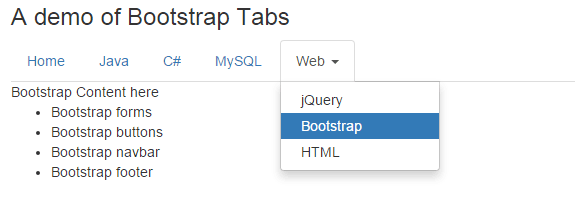
You may also add a dropdown menu in tabs of Bootstrap plug-in by using the dropdown class. In this tutorial, I will show you how you can add dropdown along with the custom look of the tabs of Bootstrap, including the dropdown menu.
In Bootstrap tabs tutorial, I showed you how simply you can create tabs by using a built-in plug-in in Bootstrap framework.
To add a dropdown menu, you simply need to use a few dropdown-related classes as shown in the demo below.
See the complete code below:
<!DOCTYPE html>
<html>
<head>
    <meta name="viewport" content="width=device-width, initial-scale=1.0">
    <script src="https://code.jquery.com/jquery-1.10.1.min.js"></script>
    <link rel="stylesheet" href="https://maxcdn.bootstrapcdn.com/bootstrap/3.3.5/css/bootstrap.min.css" integrity="sha512-dTfge/zgoMYpP7QbHy4gWMEGsbsdZeCXz7irItjcC3sPUFtf0kuFbDz/ixG7ArTxmDjLXDmezHubeNikyKGVyQ==" crossorigin="anonymous">
    <script src="https://maxcdn.bootstrapcdn.com/bootstrap/3.3.6/js/bootstrap.min.js" integrity="sha384-0mSbJDEHialfmuBBQP6A4Qrprq5OVfW37PRR3j5ELqxss1yVqOtnepnHVP9aJ7xS" crossorigin="anonymous"></script>
</head>

<body>
<div class="container">
<h3>A demo of Bootstrap Tabs</h3>

<!-- Nav tabs -->
<ul class="nav nav-tabs" role="tablist">
  <li class="active"><a href="#hometab" role="tab" data-toggle="tab">Home</a></li>
  <li><a href="#javatab" role="tab" data-toggle="tab">Java</a></li>
  <li><a href="#csharptab" role="tab" data-toggle="tab">C#</a></li>
  <li><a href="#mysqltab" role="tab" data-toggle="tab">MySQL</a></li>

  <li class="dropdown">
            <a class="dropdown-toggle" data-toggle="dropdown" href="#">Web <b class="caret"></b></a>
            <ul class="dropdown-menu">
                <li><a href="#jquerytab" role="tab" data-toggle="tab">jQuery</a></li>
                <li><a href="#bootstab" role="tab" data-toggle="tab">Bootstrap</a></li>
                <li><a href="#htmltab" role="tab" data-toggle="tab">HTML</a></li>
            </ul>
  </li>

</ul>
</li>

<!-- Tab panes -->
<div class="tab-content">
  <div class="tab-pane active" id="hometab">Write something for home tab</div>
  <div class="tab-pane" id="javatab">The Java is an object-oriented programming language that was developed by James Gosling from the Sun Microsystems in 1995.

  </div>
  <div class="tab-pane" id="csharptab">C# is also a programming language</div>
  <div class="tab-pane" id="mysqltab">MySQL is a databased mostly used for web applications.</div>

  <div class="tab-pane" id="jquerytab">jQuery content here </div>
  <div class="tab-pane" id="bootstab">Bootstrap Content here
  <ul>
  <li>Bootstrap forms</li>
  <li>Bootstrap buttons</li>
  <li>Bootstrap navbar</li>
  <li>Bootstrap footer</li>
  </ul>
  </div>
  <div class="tab-pane" id="htmltab">Hypertext Markup Language</div>

</div>

</body>
</html>
How did it work?
The tab is initiated by using a main <ul> that refers the nav nav-tabs Bootstrap CSS class.
<ul class="nav nav-tabs" role="tablist">
This is followed by <li> items that use the data-toggle=”tab”. The first four tabs are created simply that are Home, Java, C# and MySQL.
The next tab is another <li> that refers the .dropdown class.
<li class="dropdown">
This is followed by an <a> tag that uses dropdown-toggle class along with data-toggle=”dropdown”:
<a class="dropdown-toggle" data-toggle="dropdown" href="#">Web <b class="caret"></b></a>
After that, another <ul> tag is used to create its menu, so it is using the .dropdown-menu class.
<ul class="dropdown-menu">
The menu items in dropdpwn are created just like the first four tabs.
<li><a href="#jquerytab" role="tab" data-toggle="tab">jQuery</a></li>

<li><a href="#bootstab" role="tab" data-toggle="tab">Bootstrap</a></li>

<li><a href="#htmltab" role="tab" data-toggle="tab">HTML</a></li>
And finally, the tab panes are created for these menu items. These are again just like the normal tabs e.g.
<div class="tab-pane" id="bootstab">Bootstrap Content here

<ul>

<li>Bootstrap forms</li>

<li>Bootstrap buttons</li>

<li>Bootstrap navbar</li>

<li>Bootstrap footer</li>

</ul>

</div>
That’s it, as far as the dropdown menu in tabs is concerned.
The above example is using the default color scheme which is specified in the Bootstrap CSS. In order to customize the look of Bootstrap tabs along with the dropdown menu, you may either write your own classes and refer it in particular tags or simply override the CSS classes related to tabs with Bootstrap’s CSS.
In this demo, I am using the same classes in the <style> tag under <head> section to override the default CSS for tabs.
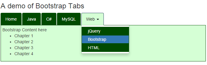
To give it a customized look and feel, I just overridden the default classes in the head section. The following classes are used:
- .nav-tabs
- .nav-tabs > li a
- .nav-tabs > li.active > a
- .nav-tabs > li > a:hover
- .tab-pane
You can see the complete code of HTML and CSS below:
<!DOCTYPE html>
<html>
<head>
    <meta name="viewport" content="width=device-width, initial-scale=1.0">
    <script src="https://code.jquery.com/jquery-1.10.1.min.js"></script>
    <link rel="stylesheet" href="https://maxcdn.bootstrapcdn.com/bootstrap/3.3.5/css/bootstrap.min.css" integrity="sha512-dTfge/zgoMYpP7QbHy4gWMEGsbsdZeCXz7irItjcC3sPUFtf0kuFbDz/ixG7ArTxmDjLXDmezHubeNikyKGVyQ==" crossorigin="anonymous">
    <script src="https://maxcdn.bootstrapcdn.com/bootstrap/3.3.6/js/bootstrap.min.js" integrity="sha384-0mSbJDEHialfmuBBQP6A4Qrprq5OVfW37PRR3j5ELqxss1yVqOtnepnHVP9aJ7xS" crossorigin="anonymous"></script>
<style>
.nav-tabs
 {
   border-color:#004A00;
   width:60%;
 }

.nav-tabs > li a {
    border: 1px solid #004A00;
    background-color:#004A00;
    color:#fff;
    }

.nav-tabs > li.active > a,
.nav-tabs > li.active > a:focus,
.nav-tabs > li.active > a:hover{
    background-color:#D5FFD5;
    color:#000;
    border: 1px solid #1A3E5E;
    border-bottom-color: transparent;
    }

.nav-tabs > li > a:hover{
  background-color: #D5FFD5 !important;
    border-radius: 5px;
    color:#000;

}

.tab-pane {
    border:solid 1px #004A00;
    border-top: 0;
    width:60%;
    background-color:#D5FFD5;
    padding:5px;
}
</style>
</head>

<body>
<div class="container">
<h3>A demo of Bootstrap Tabs</h3>

<!-- Nav tabs -->
<ul class="nav nav-tabs" role="tablist">
  <li class="active"><a href="#hometab" role="tab" data-toggle="tab">Home</a></li>
  <li><a href="#javatab" role="tab" data-toggle="tab">Java</a></li>
  <li><a href="#csharptab" role="tab" data-toggle="tab">C#</a></li>
  <li><a href="#mysqltab" role="tab" data-toggle="tab">MySQL</a></li>

  <li class="dropdown">
            <a class="dropdown-toggle" data-toggle="dropdown" href="#">Web <b class="caret"></b></a>
            <ul class="dropdown-menu">
                <li><a href="#jquerytab" role="tab" data-toggle="tab">jQuery</a></li>
                <li><a href="#bootstab" role="tab" data-toggle="tab">Bootstrap</a></li>
                <li><a href="#htmltab" role="tab" data-toggle="tab">HTML</a></li>
            </ul>
  </li>

</ul>
</li>

<!-- Tab panes -->
<div class="tab-content">
  <div class="tab-pane active" id="hometab">Write something for home tab</div>
  <div class="tab-pane" id="javatab">The Java is an object-oriented programming language that was developed by James Gosling from the Sun Microsystems in 1995.

  </div>
  <div class="tab-pane" id="csharptab">C# is also a programming language</div>
  <div class="tab-pane" id="mysqltab">MySQL is a databased mostly used for web applications.</div>

  <div class="tab-pane" id="jquerytab">jQuery content here </div>
  <div class="tab-pane" id="bootstab">Bootstrap Content here
  <ul>
  <li>Bootstrap forms</li>
  <li>Bootstrap buttons</li>
  <li>Bootstrap navbar</li>
  <li>Bootstrap footer</li>
  </ul>
  </div>
  <div class="tab-pane" id="htmltab">Hypertext Markup Language</div>

</div>

</body>
</html>
Just copy/paste this code in your editor.