
If your website or blog contains many pages and you want to display a title, a short description, and a thumbnail image in the home, category, or tag pages then pagination is the way of displaying a specific number of posts/pages e.g. 5, 10, 15 and giving users the option to navigate to the next or previous page.
Similarly, if you have a long web page with say 2000+ words, you may divide that single page into multiple pages and let users navigate via the pagination component.
Bootstrap 4 has a built-in pagination component that can be created by using a few CSS classes.
How to create pagination using Bootstrap 4
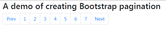
The recommended way is using the wrapper <nav> element for identifying it as the navigation component and using HTML list elements with .pagination built-in class for creating the pagination. See an example with the code below:
BS code:
<!DOCTYPE html>
<html>
<head>
<link rel="stylesheet" href="https://maxcdn.bootstrapcdn.com/bootstrap/4.0.0-beta.3/css/bootstrap.min.css" integrity="sha384-Zug+QiDoJOrZ5t4lssLdxGhVrurbmBWopoEl+M6BdEfwnCJZtKxi1KgxUyJq13dy" crossorigin="anonymous">

</head>

<body>
<div class="container">
  <h3>A demo of creating Bootstrap pagination</h2>

<nav aria-label="Demo of Bootstrap 4 Navigation">
  <ul class="pagination">
    <li class="page-item"><a class="page-link" href="#">Prev</a></li>
    <li class="page-item"><a class="page-link" href="#">1</a></li>
    <li class="page-item"><a class="page-link" href="#">2</a></li>
    <li class="page-item"><a class="page-link" href="#">3</a></li>
    <li class="page-item"><a class="page-link" href="#">4</a></li>
    <li class="page-item"><a class="page-link" href="#">5</a></li>
    <li class="page-item"><a class="page-link" href="#">6</a></li>
    <li class="page-item"><a class="page-link" href="#">7</a></li>
    <li class="page-item"><a class="page-link" href="#">Next</a></li>
  </ul>
</nav>
</div>
</body>
</html>
So you have to use the following classes for creating Bootstrap 4 pagination:
- In the main <ul>, use the .pagination class
- The <li> is given the .page-item class
- The link tag <a> inside the <li> is given .page-link
- You should use the aria-label in the <nav> element to define the purpose of the pagination component.
A demo of creating active state for current page number
Just use the .active class to make the current page number stand out from the others. You will use the .active class in the <li> element as shown in the example below:
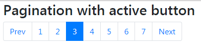
<nav aria-label="Demo of active current page number">

  <ul class="pagination">

    <li class="page-item"><a class="page-link" href="#">Prev</a></li>

    <li class="page-item"><a class="page-link" href="#">1</a></li>

    <li class="page-item"><a class="page-link" href="#">2</a></li>

    <li class="page-item active"><a class="page-link" href="#">3</a></li>

    <li class="page-item"><a class="page-link" href="#">4</a></li>

    <li class="page-item"><a class="page-link" href="#">5</a></li>

    <li class="page-item"><a class="page-link" href="#">6</a></li>

    <li class="page-item"><a class="page-link" href="#">7</a></li>

    <li class="page-item"><a class="page-link" href="#">Next</a></li>

  </ul>

</nav>
Using the disable class example
If a user is navigating link number 1 in the pagination component then you may want to disable the “Previous” link. Similarly, if pagination ends at 7 (as in the above demos), then making the Next link disabled as the user is at page number 7 makes sense.
To implement that, use the Bootstrap 4 .disable class in the <li> tag that you require to disable. In the following demo, I have used this in the ‘Next’ <li>:
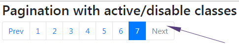
<nav aria-label="Demo of disable class">

  <ul class="pagination">

    <li class="page-item"><a class="page-link" href="#">Prev</a></li>

    <li class="page-item"><a class="page-link" href="#">1</a></li>

    <li class="page-item"><a class="page-link" href="#">2</a></li>

    <li class="page-item"><a class="page-link" href="#">3</a></li>

    <li class="page-item"><a class="page-link" href="#">4</a></li>

    <li class="page-item"><a class="page-link" href="#">5</a></li>

    <li class="page-item"><a class="page-link" href="#">6</a></li>

    <li class="page-item active"><a class="page-link" href="#">7</a></li>

    <li class="page-item disabled"><a class="page-link" href="#">Next</a></li>

  </ul>

</nav>
How to override the background color of active state?
You may want to use some other color than the default blue color for the active state of pagination.
By overriding the built-in .page-item.active .page-link classes, you may override the default blue color of the active state of the current page number.
See the following example where I used the red background color for the active number and yellow for the border color:
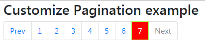
The following CSS is used in the <style> section. You must place this after the reference of the Bootstrap 4 CSS file:
<style>

.page-item.active .page-link {

  z-index: 1;

  color: #fff;

  background-color: #FF0000;

  border-color: #AEFF5E;

}

</style>
The same markup is used as in the above example.
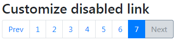
Customizing the disabled state example
Similarly, you may customize the disabled state of the link by overriding the built-in class. The classes that you need to use are:
.page-item.disabled .page-link
See the example below where I used the same markup as in above two examples. The default disable color which is a light grey border and white background is changed to a dark grey border color with a light grey background. Have a look:
The CSS in style section:
<style>

.page-item.disabled .page-link {

  color: #868e96;

  pointer-events: none;

  cursor: auto;

  background-color: #D6DBE0;

  border-color: #718393;

}

</style>
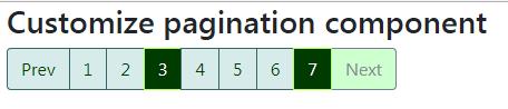
Customizing the entire pagination component example
Finally, you may customize the entire pagination component as well by using a few more CSS classes that override the default properties.
In this example, I have changed the normal state of page numbers, active number, disabled link, and hover/focus state of the page numbers.
The CSS used for this demo:
<style>

.page-link {

  position: relative;

  display: block;

  padding: 0.5rem 0.75rem;

  margin-left: -1px;

  line-height: 1.25;

  color: #003C00;

  background-color: #D8EBEB;

  border: 1px solid #346767;

}

.page-item.disabled .page-link {

  color: #868e96;

  pointer-events: none;

  cursor: auto;

  background-color: #CEFFCE;

  border-color: #718393;

}

.page-item.active .page-link {

  z-index: 1;

  color: #fff;

  background-color: #003C00;

  border-color: #AEFF5E;

}

.page-link:focus, .page-link:hover {

  color: #fff;

  text-decoration: none;

  background-color: #003C00;

  border-color: #AEFF5E;

}

</style>
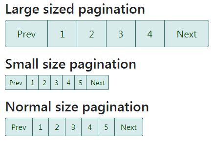
Dealing with the sizes of pagination
Bootstrap 4 has built-in classes to deal with the size of the pagination component. In all the above examples, we used the normal-sized pagination. You may also create large and small-sized pagination components by using:
- pagination-lg (for large size)
- pagination-sm (for small size)
Use any of these classes in the <ul> element with the .pagination class. For example:
<ul class=”pagination pagination-sm”>
See the following demo where you may see the difference among the normal, large, and small sized pagination:
The markup for this demo:
<div class="container">

  <h3>Large sized pagination</h2>


<nav aria-label="Pagination size example">

  <ul class="pagination pagination-lg">

    <li class="page-item "><a class="page-link" href="#">Prev</a></li>

    <li class="page-item"><a class="page-link" href="#">1</a></li>

    <li class="page-item"><a class="page-link" href="#">2</a></li>

    <li class="page-item"><a class="page-link" href="#">3</a></li>

    <li class="page-item"><a class="page-link" href="#">4</a></li>

    <li class="page-item"><a class="page-link" href="#">Next</a></li>

  </ul>

</nav>


<h3>Small size pagination</h2>

<nav aria-label="Pagination size example">

  <ul class="pagination pagination-sm">

    <li class="page-item "><a class="page-link" href="#">Prev</a></li>

    <li class="page-item"><a class="page-link" href="#">1</a></li>

    <li class="page-item"><a class="page-link" href="#">2</a></li>

    <li class="page-item"><a class="page-link" href="#">3</a></li>

    <li class="page-item"><a class="page-link" href="#">4</a></li>

    <li class="page-item"><a class="page-link" href="#">5</a></li>

    <li class="page-item"><a class="page-link" href="#">Next</a></li>

  </ul>

</nav>

<h3>Normal size pagination</h2>

<nav aria-label="Normal size example">

  <ul class="pagination">

    <li class="page-item "><a class="page-link" href="#">Prev</a></li>

    <li class="page-item"><a class="page-link" href="#">1</a></li>

    <li class="page-item"><a class="page-link" href="#">2</a></li>

    <li class="page-item"><a class="page-link" href="#">3</a></li>

    <li class="page-item"><a class="page-link" href="#">4</a></li>

    <li class="page-item"><a class="page-link" href="#">5</a></li>

    <li class="page-item"><a class="page-link" href="#">Next</a></li>

  </ul>

</nav>


</div>
You can see the complete code on the demo page including custom CSS.
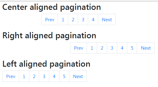
How to change the pagination alignment?
You may use the flexbox utilities to change the alignment of the pagination component. For example, to align pagination centrally, use the .justify-content-center class.
For aligning the right or end of content, use the .justify-content-end class.
In the following demo, I showed three different alignments for pagination, so you may compare easily:
The code:
<div class="container">

  <h3>Center aligned pagination</h2>


<nav aria-label="Pagination alignment">

  <ul class="pagination justify-content-center">

    <li class="page-item "><a class="page-link" href="#">Prev</a></li>

    <li class="page-item"><a class="page-link" href="#">1</a></li>

    <li class="page-item"><a class="page-link" href="#">2</a></li>

    <li class="page-item"><a class="page-link" href="#">3</a></li>

    <li class="page-item"><a class="page-link" href="#">4</a></li>

    <li class="page-item"><a class="page-link" href="#">Next</a></li>

  </ul>

</nav>


<h3>Right aligned pagination</h2>

<nav aria-label="Pagination alignment">

  <ul class="pagination justify-content-end">

    <li class="page-item "><a class="page-link" href="#">Prev</a></li>

    <li class="page-item"><a class="page-link" href="#">1</a></li>

    <li class="page-item"><a class="page-link" href="#">2</a></li>

    <li class="page-item"><a class="page-link" href="#">3</a></li>

    <li class="page-item"><a class="page-link" href="#">4</a></li>

    <li class="page-item"><a class="page-link" href="#">5</a></li>

    <li class="page-item"><a class="page-link" href="#">Next</a></li>

  </ul>

</nav>

<h3>Left aligned pagination</h2>

<nav aria-label="Pagination alignment">

  <ul class="pagination">

    <li class="page-item "><a class="page-link" href="#">Prev</a></li>

    <li class="page-item"><a class="page-link" href="#">1</a></li>

    <li class="page-item"><a class="page-link" href="#">2</a></li>

    <li class="page-item"><a class="page-link" href="#">3</a></li>

    <li class="page-item"><a class="page-link" href="#">4</a></li>

    <li class="page-item"><a class="page-link" href="#">5</a></li>

    <li class="page-item"><a class="page-link" href="#">Next</a></li>

  </ul>

</nav>


</div>
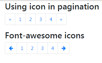
Using icons in place of Next / Previous texts example
You may also use icons in place of text in the pagination. For example, showing arrows for the next and previous texts.
In the following example, I used simple code and font-awesome icons in two pagination components.
The markup for font-awesome icons:
<!DOCTYPE html>
<html>
<head>
<link rel="stylesheet" href="https://maxcdn.bootstrapcdn.com/bootstrap/4.0.0-beta.3/css/bootstrap.min.css" integrity="sha384-Zug+QiDoJOrZ5t4lssLdxGhVrurbmBWopoEl+M6BdEfwnCJZtKxi1KgxUyJq13dy" crossorigin="anonymous">
<link rel="stylesheet" href="https://maxcdn.bootstrapcdn.com/font-awesome/4.7.0/css/font-awesome.min.css">

</head>
<body>
<div class="container">
  <h3>Using icon in pagination</h2>

<nav aria-label="Pagination with icon">
  <ul class="pagination">
    <li class="page-item">
      <a class="page-link" href="#" aria-label="Previous">
        <span aria-hidden="true">«</span>
        <span class="sr-only">Previous</span>
      </a>
    </li>
    <li class="page-item"><a class="page-link" href="#">1</a></li>
    <li class="page-item"><a class="page-link" href="#">2</a></li>
    <li class="page-item"><a class="page-link" href="#">3</a></li>
    <li class="page-item"><a class="page-link" href="#">4</a></li>
    <li class="page-item">
        <a class="page-link" href="#" aria-label="Next">
        <span aria-hidden="true">»</span>
        <span class="sr-only">Next</span>
      </a>
    </li>
  </ul>
</nav>
  <h3>Font-awesome icons</h2>
<nav aria-label="Pagination with font-awesome icons">
  <ul class="pagination">
    <li class="page-item">
      <a class="page-link" href="#" aria-label="Previous">
        <i class="fa fa-arrow-left" aria-hidden="true"></i>
        <span class="sr-only">Previous</span>
      </a>
    </li>
    <li class="page-item"><a class="page-link" href="#">1</a></li>
    <li class="page-item"><a class="page-link" href="#">2</a></li>
    <li class="page-item"><a class="page-link" href="#">3</a></li>
    <li class="page-item"><a class="page-link" href="#">4</a></li>
    <li class="page-item">
      <a class="page-link" href="#" aria-label="Previous">
        <i class="fa fa-arrow-right" aria-hidden="true"></i>
        <span class="sr-only">Previous</span>
      </a>
    </li>
  </ul>
</nav>


</div>
</body>
</html>
You may see the complete code on the example page with the CDN link for the font-awesome library.