
The tables in Bootstrap framework
The Bootstrap framework includes CSS classes for the HTML tables that you can use to display tables in your web pages quite easily that also look nice presentation-wise.
In this tutorial, I will show you how you can use those Bootstrap table classes along with adding your own style to customize according to the theme of your project.
You Might Also Like:
Bootstrap 4 Tables Tutorial is available.
You may also learn how to create Bootstrap 5 based tables
A simple table in Bootstrap
Let me start with a basic example that explains how you can include the table CSS in Bootstrap framework into the HTML table tag.
For that, simply create a table tag and refer the .table class which is included in the Bootstrap framework as follows:
<table class="table">

<tr>

<th>Product ID</th>

……..
The complete code:
<!DOCTYPE html>
<html>
<head>
<meta name="viewport" content="width=device-width, initial-scale=1.0"/>
<title>Bootstrap basic table example</title>
<link rel="stylesheet" href="https://maxcdn.bootstrapcdn.com/bootstrap/3.3.5/css/bootstrap.min.css" integrity="sha512-dTfge/zgoMYpP7QbHy4gWMEGsbsdZeCXz7irItjcC3sPUFtf0kuFbDz/ixG7ArTxmDjLXDmezHubeNikyKGVyQ==" crossorigin="anonymous">
<meta name="viewport" content="width=device-width, initial-scale=1.0">
</head>
<body>
<div class="container">
<table class="table">
<tr>
<th>Product ID</th>
<th>Product Name</th>
<th>Product Quality</th>
<th>Product Quantity</th>
</tr>
<tr>
<td>1</td>
<td>Wheat</td>
<td>Good</td>
<td>200 Bags</td>
</tr>
<tr>
<td>2</td>
<td>Rice</td>
<td>Good</td>
<td>250 Bags</td>
<tr>
<td>3</td>
<td>Sugar</td>
<td>Good</td>
<td>200 Bags</td>
</tr>
</table>
</div><br /><br />

</body>
</html>
Output:
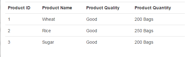
Note, this is just a basic table example with no borders or colors etc. This is responsive or mobile friendly as well. Let me move to adding more classes/features into this.

Also, I have assumed you included the CSS library from bootstrap as used in the demo code as well.
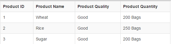
A bordered table with striped rows
In the following demo, a table with a border is created by using the table-bordered class of Bootstrap framework for tables.
The bootstrap tables CSS also includes another class, table-striped which can be used to make rows look like zebra-striping. The outlook of the table with three classes is as follows:
The markup:
<!DOCTYPE html>
<html>
<head>
<title>Bootstrap basic table example</title>
<meta name="viewport" content="width=device-width, initial-scale=1.0"/>
<link rel="stylesheet" href="https://maxcdn.bootstrapcdn.com/bootstrap/3.3.5/css/bootstrap.min.css" integrity="sha512-dTfge/zgoMYpP7QbHy4gWMEGsbsdZeCXz7irItjcC3sPUFtf0kuFbDz/ixG7ArTxmDjLXDmezHubeNikyKGVyQ==" crossorigin="anonymous">
<meta name="viewport" content="width=device-width, initial-scale=1.0">
</head>
<body>
<div class="container">
<table class="table table-bordered table-striped">
<tr>
<th>Product ID</th>
<th>Product Name</th>
<th>Product Quality</th>
<th>Product Quantity</th>
</tr>
<tr>
<td>1</td>
<td>Wheat</td>
<td>Good</td>
<td>200 Bags</td>
</tr>
<tr>
<td>2</td>
<td>Rice</td>
<td>Good</td>
<td>250 Bags</td>
<tr>
<td>3</td>
<td>Sugar</td>
<td>Good</td>
<td>200 Bags</td>
</tr>
</table>
</div><br /><br />

</body>
</html>
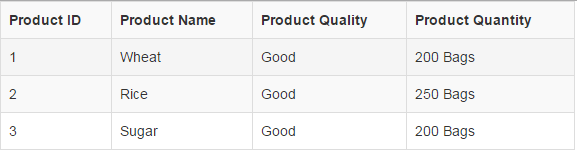
A table with hover state rows
As you bring the mouse over a table row or data, the color or background, etc. can be changed to make it stand out to the other rows of the table. This feature can be helpful for visitors to distinguish a row where a table contains many rows.
In this example, a table is created with hover state in rows by using the table-hover class. In the table tag, we have used the other classes as used in the above example, i.e.
- table: to include table class from the bootstrap framework.
- table-bordered: To add a border in the table.
- table-striped: To add stripped rows.
- table-hover: hover state for rows.
The Markup:
<!DOCTYPE html>
<html>
<head>
<title>Bootstrap basic table example</title>
<meta name="viewport" content="width=device-width, initial-scale=1.0"/>
<link rel="stylesheet" href="https://maxcdn.bootstrapcdn.com/bootstrap/3.3.5/css/bootstrap.min.css" integrity="sha512-dTfge/zgoMYpP7QbHy4gWMEGsbsdZeCXz7irItjcC3sPUFtf0kuFbDz/ixG7ArTxmDjLXDmezHubeNikyKGVyQ==" crossorigin="anonymous">
<meta name="viewport" content="width=device-width, initial-scale=1.0">
</head>
<body>
<div class="container">
<table class="table table-bordered table-striped table-hover">
<tr>
<th>Product ID</th>
<th>Product Name</th>
<th>Product Quality</th>
<th>Product Quantity</th>
</tr>
<tr>
<td>1</td>
<td>Wheat</td>
<td>Good</td>
<td>200 Bags</td>
</tr>
<tr>
<td>2</td>
<td>Rice</td>
<td>Good</td>
<td>250 Bags</td>
<tr>
<td>3</td>
<td>Sugar</td>
<td>Good</td>
<td>200 Bags</td>
</tr>
</table>
</div><br /><br />

</body>
</html>
Output of above code:
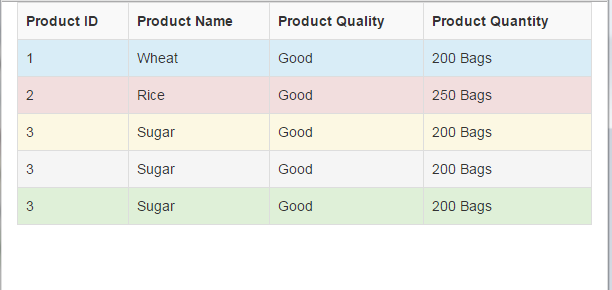
Coloring the Table in Bootstrap
You may add colors in the table by using the contextual classes. You may add those classes at the rows or even table data level.
These classes have its own color and description e.g. .success is a contextual class that depicts positive or success action.
The following table demo shows different classes applied to different rows.
Markup:
<div class="container ">
<table class="table table-bordered table-striped table-hover">
<tr>
<th>Product ID</th>
<th>Product Name</th>
<th>Product Quality</th>
<th>Product Quantity</th>
</tr>
<tr class="info">
<td>1</td>
<td>Wheat</td>
<td>Good</td>
<td>200 Bags</td>
</tr>
<tr class="danger">
<td>2</td>
<td>Rice</td>
<td>Good</td>
<td>250 Bags</td>
<tr class="warning">
<td>3</td>
<td>Sugar</td>
<td>Good</td>
<td>200 Bags</td>
</tr>
<tr class="active">
<td>3</td>
<td>Sugar</td>
<td>Good</td>
<td>200 Bags</td>
</tr>
<tr class="success">
<td>3</td>
<td>Sugar</td>
<td>Good</td>
<td>200 Bags</td>
</tr>
</table>
</div>
Make sure to include Bootstrap CSS in the <head> section.
You can see in the code, following classes are used in each row:
- The first row is assigned the .info class.
- The second row is given the .danger class.
- The third row is given the .warning class.
- The fourth row is assigned the .active contextual class.
- The last row is given the .success class.
An example of table in Bootstrap with custom color
Until now, we have used the default color that is set in the Bootstrap CSS file. Like in the above examples, the strip color is grayish. Similarly, we are only able to use pre-defined colors by using the contextual classes for the rows or table data, as shown in the above example.
In the following table with bootstrap framework, I am going to show you that how you can change the color of strips.
For that, you simply need to add some CSS style after including the bootstrap CSS in the head section. You can also place the custom CSS in an external CSS file but include it after the bootstrap CSS file.
HTML
<!DOCTYPE html>
<html>
<head>
<title>Bootstrap basic table example</title>
<meta name="viewport" content="width=device-width, initial-scale=1.0"/>
<link rel="stylesheet" href="https://maxcdn.bootstrapcdn.com/bootstrap/3.3.5/css/bootstrap.min.css" integrity="sha512-dTfge/zgoMYpP7QbHy4gWMEGsbsdZeCXz7irItjcC3sPUFtf0kuFbDz/ixG7ArTxmDjLXDmezHubeNikyKGVyQ==" crossorigin="anonymous">
<meta name="viewport" content="width=device-width, initial-scale=1.0">
<style>
.table-striped>tbody>tr:nth-child(odd)>td,
.table-striped>tbody>tr:nth-child(odd)>th {
background-color: #C49F0F;
}
</style>
</head>
<body>
<div class="container ">
<table class="table table-bordered table-striped table-hover table-responsive">
<tr>
<th>Product ID</th>
<th>Product Name</th>
<th>Product Quality</th>
<th>Product Quantity</th>
</tr>
<tr>
<td>1</td>
<td>Wheat</td>
<td>Good</td>
<td>200 Bags</td>
</tr>
<tr>
<td>2</td>
<td>Rice</td>
<td>Good</td>
<td>250 Bags</td>
<tr>
<td>3</td>
<td>Sugar</td>
<td>Good</td>
<td>200 Bags</td>
</tr>
<tr>
<td>3</td>
<td>Sugar</td>
<td>Good</td>
<td>200 Bags</td>
</tr>
<tr>
<td>3</td>
<td>Sugar</td>
<td>Good</td>
<td>200 Bags</td>
</tr>
</table>
</div><br /><br />

</body>
</html>
This is how our table looks after using the custom CSS, which is responsive and mobile-friendly:
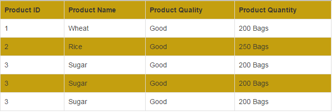
Basically, I added this style in the head section of the page:
.table-striped>tbody>tr:nth-child(odd)>td,

.table-striped>tbody>tr:nth-child(odd)>th {

background-color: #C49F0F;

}
If you want to change the second row then use the “even” instead of odd value.
Change the hover color of table example
Not only can you change the striped color of the table as shown in the above example but the hover state color as well.
The following example shows how the color in the hover state is changed that overridden the default Bootstrap CSS color.
Complete Markup:
<!DOCTYPE html>
<html>
<head>
<title>Bootstrap basic table example</title>
<meta name="viewport" content="width=device-width, initial-scale=1.0"/>
<link rel="stylesheet" href="https://maxcdn.bootstrapcdn.com/bootstrap/3.3.5/css/bootstrap.min.css" integrity="sha512-dTfge/zgoMYpP7QbHy4gWMEGsbsdZeCXz7irItjcC3sPUFtf0kuFbDz/ixG7ArTxmDjLXDmezHubeNikyKGVyQ==" crossorigin="anonymous">
<meta name="viewport" content="width=device-width, initial-scale=1.0">
<style>
.table-striped>tbody>tr:nth-child(odd)>td,
.table-striped>tbody>tr:nth-child(odd)>th {
background-color: #C49F0F;
}

.table-hover tbody tr:hover td, .table-hover tbody tr:hover th {
background-color: #FF9F9F;
}
</style>
</head>
<body>
<div class="container ">
<table class="table table-striped table-hover">
<tr>
<th>Product ID</th>
<th>Product Name</th>
<th>Product Quality</th>
<th>Product Quantity</th>
</tr>
<tr>
<td>1</td>
<td>Wheat</td>
<td>Good</td>
<td>200 Bags</td>
</tr>
<tr>
<td>2</td>
<td>Rice</td>
<td>Good</td>
<td>250 Bags</td>
<tr>
<td>3</td>
<td>Sugar</td>
<td>Good</td>
<td>200 Bags</td>
</tr>
<tr>
<td>3</td>
<td>Sugar</td>
<td>Good</td>
<td>200 Bags</td>
</tr>
<tr>
<td>3</td>
<td>Sugar</td>
<td>Good</td>
<td>200 Bags</td>
</tr>
</table>
</div><br /><br />

</body>
</html>
Output:
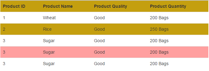
You can see in the code, the .table-hover class in the head section will override the default color of the hover state. Whereas, the example also shows the strip color as well.
Also note that you must include the table-striped and table-hover classes in the table tag in order for this to work.
References: http://getbootstrap.com/css/