The star rating plug-in
In this tutorial, a star rating plug-in is used that is developed in jQuery while it uses the Bootstrap CSS classes.
So if you are developing a Bootstrap-based project and need to integrate nice looking rating or favorite level system for any kind of website then it worth’s a try.
The jQuery start rating plug-in is light-weight, only about 24Kb JS or 12 Kb JS minified file while the CSS file size is only 3Kb. You may use this plug-in with Bootstrap’s CSS (as the demos is also using) as well as your custom CSS. So, even if your project is not based on the Bootstrap framework, you may still use this star-rating plug-in.
A demo of using and setting up star rating plug-in
The following demo is for the decimal point rating system. The rating starts from 1 to 5 which a user may also choose e.g. 1.4, 4.5 etc.. The minimum rating is 1 and the maximum is 5. The selected rating is also displayed after a user has chosen while the user may also clear the rating by pressing the left icon. See the demonstration online:

See online demo and code
Follow these steps for creating a star rating component on your web page.
Step 1:
Include the Bootstrap, font-awesome, and star-rating CSS files in the <head> section.
<link rel=”stylesheet” href=”http://maxcdn.bootstrapcdn.com/bootstrap/3.3.5/css/bootstrap.min.css” rel=”stylesheet”>
<link rel=”stylesheet” href=”http://maxcdn.bootstrapcdn.com/font-awesome/4.4.0/css/font-awesome.min.css”>
<link rel=”stylesheet” href=”css/bootstrap-star-rating/star-rating.css” media=”all” rel=”stylesheet” type=”text/css”/>
Step2:
Also, include the JS files of jQuery library and star-rating plug-in:
<script src=”http://ajax.googleapis.com/ajax/libs/jquery/2.1.1/jquery.min.js”></script>
<script src=”js/bootstrap-star-rating/star-rating.js” type=”text/javascript”></script>
Step 3:
For this simple star rating component, just create an input type with type = number, assign it the rating class and also specify the min, max, and step attributes. For example:
<input id="star-rating-demo" value="4" type="number" class="rating" min=0 max=5 step=0.1 data-size="lg">
The value of 4 means, the initial rating will be four. The min = 0 specifies rating should start from 0 and max specifies the maximum rating, which is 5.
The step attribute specifies the gap between each rating point.
For this demo, you do not need to write any jQuery code. The coming examples will also show how to get the selected rating so you may get and store into the database.
A demo of ten stars with small sized stars
In this demo, ten stars are used as a rating while the size of the stars is kept small. You may use different sizes by using the data-size attribute, for example:
- sm for small
- lg for large
- xl for extra large
- xs for extra small
See the demo and code online:

Complete code
<!DOCTYPE html>
<html>
<head>

    <link rel="stylesheet"  href="https://maxcdn.bootstrapcdn.com/bootstrap/3.3.5/css/bootstrap.min.css" rel="stylesheet">
    <link rel="stylesheet" href="https://maxcdn.bootstrapcdn.com/font-awesome/4.4.0/css/font-awesome.min.css">
    <link rel="stylesheet" href="css/bootstrap-star-rating/star-rating.css" media="all" rel="stylesheet" type="text/css"/>

    <script src="https://ajax.googleapis.com/ajax/libs/jquery/2.1.1/jquery.min.js"></script>
    <script src="js/bootstrap-star-rating/star-rating.js" type="text/javascript"></script>


</head>

<body>
<div class="container">
<div class="page-header">
<h2>A demo of star rating plug-in</h2>
</div>


    <input id="input-21c" value="0" type="number" class="rating" min=0 max=10 step=0.5 data-size="sm" data-stars="10">

</body>
</html>
A demo of showing rating from right to left (rtl)
By using the data-rtl=1 and data-container-class=’text-right’ data attributes, you may set the plug-in showing stars from right to left. See the following output:

The markup:
<input id="star-rating-rtl" value="0" type="number" class="rating" min=0 max=5 step=0.5 data-rtl=1 data-container-class='text-right' data-glyphicon=0>
An example of displaying the selected rating
As mentioned earlier, you may need the selected rating by the user so you may store this in a database for future use.
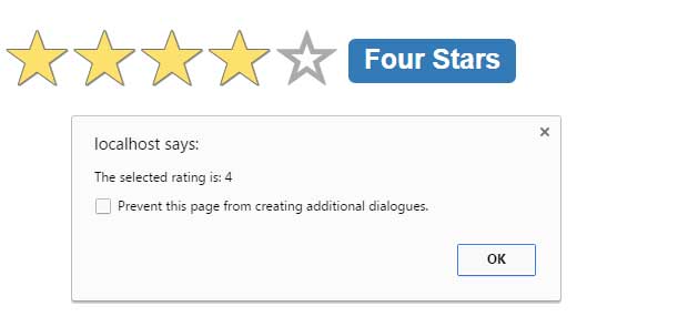
To get the selected rating value, you may use the $.val method of jQuery with the input type that is used as the rating component. See the following demo where an alert will be shown as you press a rating star:

You may notice two things in the code of this demo below; the first thing is options are set in the jQuery code. In the markup, only a simple input type is created:
<input id=”star-rating-value” type=”number” />
The jQuery code defines the min, max, step, size and showClear options. The other part is showing an alert by using jQuery code.
Code for this example:
<body>
<div class="container">
<div class="page-header">
<h2>A demo of star rating plug-in</h2>
</div>
    <input id="star-rating-value" type="number" />

<script>
    jQuery(document).ready(function () {
        $('#star-rating-value').rating({
              min: 0,
              max: 5,
              step: 1,
              size: 'lg',
              showClear: false
           });

        $('#star-rating-value').on('rating.change', function() {
            alert("The selected rating is: " + $('#star-rating-value').val());
        });

    });
</script>
</body>
Practically, you may assign this value to a variable or store by using the $.ajax call.
For more about this useful plug-in, visit the site here.
