
In the dropdown menu tutorial of Bootstrap, I showed seven demos of the menus that appeared as you clicked the dropdown (buttons or links). This is the default behaviour of the dropdown component that comes with the Bootstrap framework. If you want to open the dropdown menu as the mouse hovers over the button or link, you may use a plug-in.
In this tutorial, I am going to show you such a plug-in that will open the dropdown menu as you bring the mouse over a button, button group or split button.
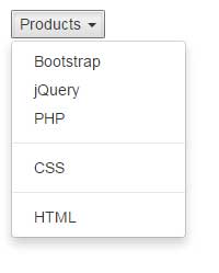
A simple demo of Bootstrap dropdown at hover state
To enable the menu to open in the hover state, you need to include the hover plug-in’s JS file besides Bootstrap and jQuery libraries. You may download this JS file by going to the plug-in page and download the package or simply go to any demo page below, view source on the demo page, and locate the bootstrap-hover-dropdown.js file. Save it in your system.
See the following demo online where a menu is created with a few items. Bring over the mouse over Products and it will open the dropdown:
Online Demo
So, after including the libraries and plug-in file, the only difference between simple menu that opens by clicking and this one is the data-hover=”dropdown” data attribute:
<button class="dropdown dropdown-toggle" data-toggle="dropdown" data-hover="dropdown">Products <b class="caret"></b></button>
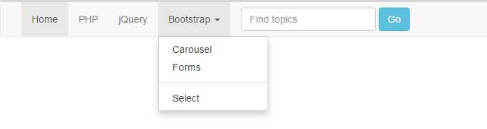
This time, rather than using a simple button as used in above example, I have created a top navbar with a few main and inner menu items. Among those, as you bring the mouse over the “Bootstrap” item, it will open up the dropdown at hover state. The purpose is to show the hover dropdown menu in an “actual” navbar:
Complete code:
<!DOCTYPE html>
<html lang="en">
<head>
  <link href="https://netdna.bootstrapcdn.com/bootstrap/3.1.1/css/bootstrap.min.css" rel="stylesheet">

</head>
<body>
<nav class="navbar navbar-default">
  <div class="container-fluid">

    <div class="collapse navbar-collapse" id="bs-example-navbar-collapse-1">
      <ul class="nav navbar-nav">
        <li class="active"><a href="#">Home <span class="sr-only">(current)</span></a></li>
        <li><a href="https://www.jquery-az.com/php-tutorials/">PHP</a></li>
        <li><a href="https://www.jquery-az.com/jquery-tips/">jQuery</a></li>

        <!-- First dropdown menu here-->
        <li class="dropdown">
          <a href="https://www.jquery-az.com/bootstrap-tips-tutorials/" class="dropdown-toggle" data-toggle="dropdown" role="button" data-hover="dropdown" aria-haspopup="true" aria-expanded="false">Bootstrap <span class="caret"></span></a>
          <ul class="dropdown-menu">
            <li><a href="https://www.jquery-az.com/bootstrap-carousel-5-single-multiple-horizontal-and-vertical-sliding-demos/">Carousel</a></li>
            <li><a href="https://www.jquery-az.com/bootstrap-form-customized-styles-6-online-examples/">Forms</a></li>
            <li role="separator" class="divider"></li>
            <li><a href="https://www.jquery-az.com/bootstrap-select-5-beautiful-styles/">Select</a></li>
          </ul>
        </li>
        <!-- Dropdown ending here-->
      </ul>
      <form class="navbar-form navbar-left" role="search">
        <div class="form-group">
          <input type="text" class="form-control" placeholder="Find topics">
        </div>
        <button type="submit" class="btn btn-info">Go</button>
      </form>
      <ul class="nav navbar-nav navbar-right">
      <!-- The right dropdown menu -->
        <li class="dropdown">
          <a href="#" class="dropdown-toggle" data-toggle="dropdown" role="button" aria-haspopup="true" aria-expanded="false">About <span class="caret"></span></a>
          <ul class="dropdown-menu">
            <li><a href="https://www.jquery-az.com/about-us/">Terms</a></li>
            <li><a href="https://www.jquery-az.com/contact/">Contact</a></li>
          </ul>
        </li>
      <!-- Dropdown ending here-->
      </ul>
    </div><!-- /.navbar-collapse -->
  </div><!-- /.container-fluid -->

  <script src="https://ajax.googleapis.com/ajax/libs/jquery/1.10.2/jquery.min.js"></script>
  <script src="https://netdna.bootstrapcdn.com/bootstrap/3.1.1/js/bootstrap.min.js"></script>
  <script src="js/bootstrap-hover-dropdown/bootstrap-hover-dropdown.js"></script>


</body>
</html>
You can see, that Bootstrap is showing the dropdown menu at hover state while “About” is not. This is because the data-hover=”dropdown” is only used in the “Bootstrap” markup:
<li class="dropdown">

<a href="https://www.jquery-az.com/bootstrap-tips-tutorials/" class="dropdown-toggle" data-toggle="dropdown" role="button" data-hover="dropdown" aria-haspopup="true" aria-expanded="false">Bootstrap <span class="caret"></span></a>

<ul class="dropdown-menu">

<li><a href="https://www.jquery-az.com/bootstrap-carousel-5-single-multiple-horizontal-and-vertical-sliding-demos/">Carousel</a></li>

<li><a href="https://www.jquery-az.com/bootstrap-form-customized-styles-6-online-examples/">Forms</a></li>

<li role="separator" class="divider"></li>

<li><a href="https://www.jquery-az.com/bootstrap-select-5-beautiful-styles/">Select</a></li>

</ul>

</li>
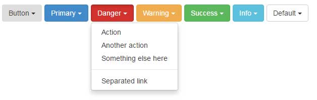
In this demo, the button dropdowns are created by using Bootstrap standard classes. In addition, the data-hover=”dropdown” data attribute is also added in each button so it opens up at mouse hover state. See the demo and code online:
Code:
<body>

  <div class="container">

     <h3>A demo of using with buttons</h3>

      <div class="btn-toolbar">
        <div class="btn-group">
          <button class="btn dropdown-toggle" data-toggle="dropdown" data-hover="dropdown">Button <span class="caret"></span></button>
          <ul class="dropdown-menu">
            <li><a href="#">Action</a></li>
            <li><a href="#">Another action</a></li>
            <li><a href="#">Something else here</a></li>
            <li class="divider"></li>
            <li><a href="#">Separated link</a></li>
          </ul>
        </div> <!-- .btn-group -->
        <div class="btn-group">
          <button class="btn btn-primary dropdown-toggle" data-toggle="dropdown" data-hover="dropdown">Primary <span class="caret"></span></button>
          <ul class="dropdown-menu">
            <li><a href="#">Action</a></li>
            <li><a href="#">Another action</a></li>
            <li><a href="#">Something else here</a></li>
            <li class="divider"></li>
            <li><a href="#">Separated link</a></li>
          </ul>
        </div> <!-- .btn-group -->
        <div class="btn-group">
          <button class="btn btn-danger dropdown-toggle" data-toggle="dropdown" data-hover="dropdown">Danger <span class="caret"></span></button>
          <ul class="dropdown-menu">
            <li><a href="#">Action</a></li>
            <li><a href="#">Another action</a></li>
            <li><a href="#">Something else here</a></li>
            <li class="divider"></li>
            <li><a href="#">Separated link</a></li>
          </ul>
        </div> <!-- .btn-group -->
        <div class="btn-group">
          <button class="btn btn-warning dropdown-toggle" data-toggle="dropdown" data-hover="dropdown">Warning <span class="caret"></span></button>
          <ul class="dropdown-menu">
            <li><a href="#">Action</a></li>
            <li><a href="#">Another action</a></li>
            <li><a href="#">Something else here</a></li>
            <li class="divider"></li>
            <li><a href="#">Separated link</a></li>
          </ul>
        </div> <!-- .btn-group -->
        <div class="btn-group">
          <button class="btn btn-success dropdown-toggle" data-toggle="dropdown" data-hover="dropdown">Success <span class="caret"></span></button>
          <ul class="dropdown-menu">
            <li><a href="#">Action</a></li>
            <li><a href="#">Another action</a></li>
            <li><a href="#">Something else here</a></li>
            <li class="divider"></li>
            <li><a href="#">Separated link</a></li>
          </ul>
        </div> <!-- .btn-group -->
        <div class="btn-group">
          <button class="btn btn-info dropdown-toggle" data-toggle="dropdown" data-hover="dropdown">Info <span class="caret"></span></button>
          <ul class="dropdown-menu">
            <li><a href="#">Action</a></li>
            <li><a href="#">Another action</a></li>
            <li><a href="#">Something else here</a></li>
            <li class="divider"></li>
            <li><a href="#">Separated link</a></li>
          </ul>
        </div> <!-- .btn-group -->
        <div class="btn-group">
          <button class="btn btn-default dropdown-toggle" data-toggle="dropdown" data-hover="dropdown">Default <span class="caret"></span></button>
          <ul class="dropdown-menu">
            <li><a href="#">Action</a></li>
            <li><a href="#">Another action</a></li>
            <li><a href="#">Something else here</a></li>
            <li class="divider"></li>
            <li><a href="#">Separated link</a></li>
          </ul>
        </div> <!-- .btn-group -->
      </div> <!-- .btn-toolbar -->
  </div><!-- /.container-fluid -->

  <script src="https://ajax.googleapis.com/ajax/libs/jquery/1.10.2/jquery.min.js"></script>
  <script src="https://netdna.bootstrapcdn.com/bootstrap/3.1.1/js/bootstrap.min.js"></script>
  <script src="js/bootstrap-hover-dropdown/bootstrap-hover-dropdown.js"></script>


</body>
You may use this plugin with button groups as well. The process remains the same, simply add the data-hover=”dropdown” to the dropdown button in a group of buttons.
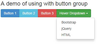
The following markup is used for creating button group hover dropdown:
<div class="btn-group">

<button type="button" class="btn btn-success dropdown-toggle" data-toggle="dropdown" data-hover="dropdown">

Hover Dropdown

<span class="caret"></span>

</button>

<ul class="dropdown-menu">

<li><a href="#">Bootstrap</a></li>

<li><a href="#">jQuery</a></li>

<li><a href="#">HTML</a></li>

</ul>

</div>
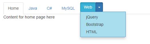
A demo of using in Bootstrap tabs
And of course, you may use this hover state in tabs of Bootstrap that contains dropdown buttons. Again, simply add the data-hover=”dropdown” attribute in the button tag where you intend to open the menu in the hover state. See this demonstration:
Complete code:
<!DOCTYPE html>
<html lang="en">
<head>
  <link href="https://netdna.bootstrapcdn.com/bootstrap/3.1.1/css/bootstrap.min.css" rel="stylesheet">

<style>
.dropdown-menu{
    background-color: #A8DEEE;
    border: 1px solid #428BCA;
}
.divider{
    border: 1px dashed #428BCA;
}
</style>
</head>
<body>

  <div class="container">

     <h3>A demo of using with button group</h3>


<!-- Nav tabs -->
<ul class="nav nav-tabs" role="tablist">
  <li class="active"><a href="#home" role="tab" data-toggle="tab">Home</a></li>
  <li><a href="#java" role="tab" data-toggle="tab">Java</a></li>
  <li><a href="#csharp" role="tab" data-toggle="tab">C#</a></li>
  <li><a href="#mysql" role="tab" data-toggle="tab">MySQL</a></li>

<li class="dropdown">
            <div class="btn-group">
            <button class="dropdown-toggle btn btn-info" data-toggle="dropdown" href="#">Web</button>
            <button type="button" class="btn btn-primary dropdown-toggle" data-toggle="dropdown" data-hover="dropdown" aria-haspopup="true" aria-expanded="false">
            <span class="caret"></span>
             <span class="sr-only"></span>
            </button>
            <ul class="dropdown-menu">
                <li><a href="#jquery" role="tab" data-toggle="tab">jQuery</a></li>
                <li><a href="#boots" role="tab" data-toggle="tab">Bootstrap</a></li>
                <li><a href="#html" role="tab" data-toggle="tab">HTML</a></li>
            </ul>
            </div>
</li>

</ul>
</li>

<!-- Tab panes -->
<div class="tab-content">
  <div class="tab-pane active" id="home">Content for home page here</div>
  <div class="tab-pane" id="java">Java is a programming language!</div>
  <div class="tab-pane" id="csharp">C# is also a programming language</div>
  <div class="tab-pane" id="mysql">MySQL is a databased mostly used for web applications.</div>
  <div class="tab-pane" id="jquery">jQuery content here </div>
  <div class="tab-pane" id="boots">Bootstrap Content here</div>
  <div class="tab-pane" id="html">Hypertext Markup Language</div>
  </div>

  <script src="https://ajax.googleapis.com/ajax/libs/jquery/1.10.2/jquery.min.js"></script>
  <script src="https://netdna.bootstrapcdn.com/bootstrap/3.1.1/js/bootstrap.min.js"></script>
  <script src="js/bootstrap-hover-dropdown/bootstrap-hover-dropdown.js"></script>


</body>
</html>
A split button is created in the tabs where the split part is given the data-hover=”dropdown” attribute. As you bring the mouse over the split part of the button, it will open the menu at hover state. If you want to open for both buttons, just add this attribute to the other button as well.