
Forms in Bootstrap Framework
The Bootstrap framework has classes related to working with HTML forms on your website. By using those classes, you may create forms with default and customized styles quite easily.
In this tutorial, I will show you how to create forms with different controls like text boxes, textarea, checkbox, radio, file selection, select dropdown, etc. with default and customized styles.
Let me start with a basic form demo by using the Bootstrap framework.
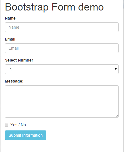
A basic Bootstrap form example
Following is a basic form that simply uses the Bootstrap default classes. The form includes two textboxes, a select dropdown, a textarea, a checkbox, and a submit button. The form is mobile friendly which means form control sizes will adjust with the screen.
See online demo and code
The markup for form
<div class="container">
<h1>Bootstrap Form demo</h1>
<form>
<div class="form-group">
<label for="Name">Name</label>
<input type="name" class="form-control" id="Name" placeholder="Name">
</div>
<div class="form-group">
<label for="Email1">Email</label>
<input type="email" class="form-control" id="Email1" placeholder="Email">
</div>
<div class="form-group">
<label for="Inputselect">Select Number</label>
<select class="form-control" >
<option>1</option>
<option>2</option>
<option>3</option>
</select>
</div>
<div class="form-group">
<label for=" Email1msg">Message:</label>
<!-- add text area here -->

</div>
<div class="checkbox">
<label>
<input type="checkbox" id="yesno"> Yes / No
</label>
</div>

<button type="submit" class="btn btn-info">Submit Information</button>
</form>
</div>
You can see in the code, the textboxes are taking the available space (100%) which is the default. Any input text field with the “form-control” class (a bootstrap built-in class) will take the 100% space.
Similarly, the select dropdown and textarea are taking the 100% width as they are using form-control class.
The submit button is given to the btn btn-info class. You may replace other class names to use some other color for the button.
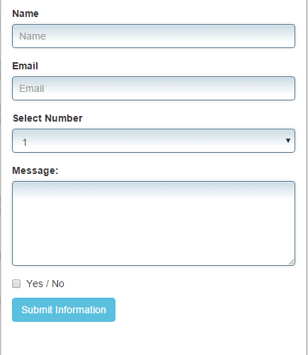
Adding custom styles in the Bootstrap form example
The Bootstrap framework makes it quite easier for us to design HTML forms. By using a few classes, you may create good-looking form fields like shown in the above example.
Apart from that, you can mix up custom CSS to change the default look and feel to match the Bootstrap forms to website’s theme.
In the following example, I have created a custom CSS class that is placed in the head section of the page. The class is assigned to different elements as shown below:
Complete code:
<!DOCTYPE html>
<html>
<head>
<link rel="stylesheet" href="https://maxcdn.bootstrapcdn.com/bootstrap/3.3.5/css/bootstrap.min.css" integrity="sha512-dTfge/zgoMYpP7QbHy4gWMEGsbsdZeCXz7irItjcC3sPUFtf0kuFbDz/ixG7ArTxmDjLXDmezHubeNikyKGVyQ==" crossorigin="anonymous">
<meta name="viewport" content="width=device-width, initial-scale=1.0">

<style>
.inputstl {
padding: 9px;
border: solid 1px #4B718B;
outline: 0;
background: -webkit-gradient(linear, left top, left 25, from(#FFFFFF), color-stop(4%, #CDDBE4), to(#FFFFFF));
background: -moz-linear-gradient(top, #FFFFFF, #CDDBE4 1px, #FFFFFF 25px);
box-shadow: rgba(0,0,0, 0.1) 0px 0px 8px;
-moz-box-shadow: rgba(0,0,0, 0.1) 0px 0px 8px;
-webkit-box-shadow: rgba(0,0,0, 0.1) 0px 0px 8px;

}

</style>

</head>

<body>
<div class="container">
<h1>Bootstrap Form demo</h1>
<form>
<div class="form-group">
<label for="Name">Name</label>
<input type="name" class="form-control inputstl" id="Name" placeholder="Name">
</div>
<div class="form-group">
<label for="Email1">Email</label>
<input type="email" class="form-control inputstl" id="Email1" placeholder="Email">
</div>
<div class="form-group">
<label for="Inputselect">Select Number</label>
<select class="form-control inputstl" >
<option>1</option>
<option>2</option>
<option>3</option>
</select>
</div>
<div class="form-group">
<label for="Email1msg">Message:</label>
<!-- Add textarea here -->
</div>
<div class="checkbox">
<label>
<input type="checkbox" id="yesno"> Yes / No
</label>
</div>

<button type="submit" class="btn btn-info">Submit Information</button>
</form>
</div>
</body>
</html>
In the demo, you see I have used the same fields as in the above example. In the head section, the following custom CSS class is created:
.inputstl {

padding: 9px;

border: solid 1px #4B718B;

outline: 0;

background: -webkit-gradient(linear, left top, left 25, from(#FFFFFF), color-stop(4%, #CDDBE4), to(#FFFFFF));

background: -moz-linear-gradient(top, #FFFFFF, #CDDBE4 1px, #FFFFFF 25px);

box-shadow: rgba(0,0,0, 0.1) 0px 0px 8px;

-moz-box-shadow: rgba(0,0,0, 0.1) 0px 0px 8px;

-webkit-box-shadow: rgba(0,0,0, 0.1) 0px 0px 8px;

}
This CSS class is assigned to the text boxes, select dropdown and textarea that added a border, padding, and background to these elements. Also note, the inputstl class is added ahead of the form-control class, which is a Bootstrap default class. So these elements will take those properties as well as custom CSS.
An inline Bootstrap form demo
Sometimes, you have a smaller area for the form with fewer fields. For example, a sign-in form or subscription form. You may create inline forms for this kind of scenario where the form fields and a submit/Signup button appear at the same line and takes much less space.
Bootstrap has built-in class to develop these forms. The class name is form-inline which is used in the following example.
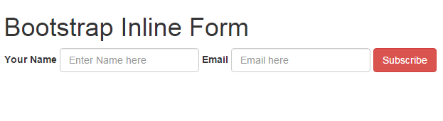
The markup for the inline form:
<div class="container">
<h1>Bootstrap Form demo</h1>
<form class="form-inline">
<div class="form-group">
<label for="Name2">Your Name</label>
<input type="text" class="form-control" id="Name2" placeholder="Enter Name here">
</div>
<div class="form-group">
<label for="Email2">Email</label>
<input type="email" class="form-control" id="Email2" placeholder="Email here">
</div>
<button type="submit" class="btn btn-danger">Subscribe</button>
</form>
</div>
The first div is using the form-inline class, which is again a Bootstrap built-in class. You may remove the labels to make it more compact like this:
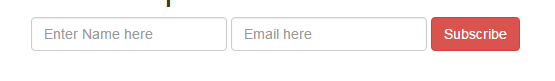
Note: This will work for devices with more than 768px wide. If a screen is less than this width the form fields will occupy the full available width just like in the above example.
You may get the complete code of both above examples by visiting the demo pages that include references of required files.
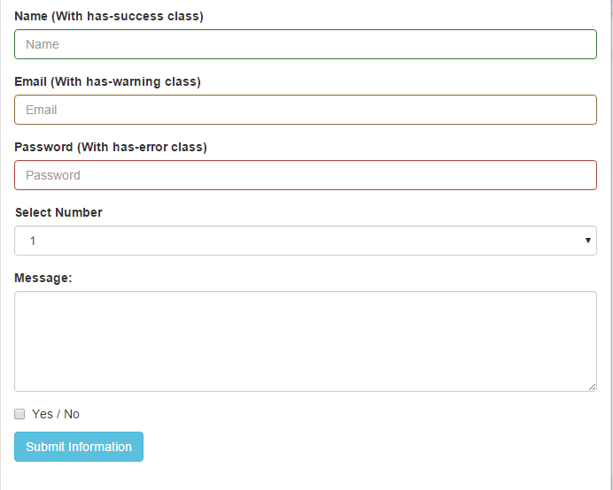
A form with validation states demo
In the following demo, I will show you to create a Bootstrap form with certain validation states in the text fields.
The validation states add good user experience, for example, in the account creation process you may let the user know if an account id exists or not by using the validation state.
Similarly, to create a valid password you may indicate by green lining as long as a password is acceptable by following the guidelines. The same could be applied to enter an email address to validate the email format.
See the following demo for creating a form:
The code:
<div class="container">
<h1>Bootstrap Form demo</h1>
<form>
<div class="form-group has-success">
<label for="Name">Name (With has-success class)</label>
<input type="name" class="form-control" id="Name" placeholder="Name">
</div>
<div class="form-group has-warning">
<label for="Email1">Email (With has-warning class)</label>
<input type="email" class="form-control" id="Email1" placeholder="Email">
</div>
<div class="form-group has-error">
<label for="Password1">Password (With has-error class)</label>
<input type="password" class="form-control" id="Password1" placeholder="Password">
</div>
<div class="form-group">
<label for="Inputselect">Select Number</label>
<select class="form-control" >
<option>1</option>
<option>2</option>
<option>3</option>
</select>
</div>
<div class="checkbox">
<label>
<input type="checkbox" id="yesno"> Yes / No
</label>
</div>

<button type="submit" class="btn btn-info">Submit Information</button>
</form>

</div>
Basically, this is the same form as used in the first example except I added a few built-in classes provided by Bootstrap Framework.
All the fields are using the form-group class along with:
- The Name text field is using the: has-success class
- The Email is using the: has-warning class
- And password field is using: has-error class
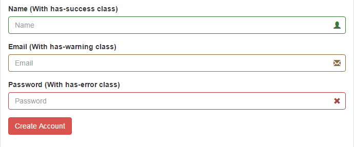
To add an even better user experience, you may include icons in the text fields as shown in the following example.
Form fields with icons demo
In the following demo, the icons provided by Bootstrap are added to the text fields. Including descriptive icons adds a more pro look to the website.
See the following demo:
Along with using additional classes like has-success, has-warning etc., the textboxes are given the has-feedback class.
The markup with icons:
<div class="container">
<h1>Bootstrap Form demo</h1>
<form>
<div class="form-group has-success has-feedback">
<label for="Name">Name (With has-success class)</label>
<input type="name" class="form-control" id="Name" placeholder="Name" aria-describedby="Success2Status">
<span class="glyphicon glyphicon-user form-control-feedback" aria-hidden="true"></span>
<span id="Success2Status" class="sr-only">(success)</span>
</div>
<div class="form-group has-warning has-feedback">
<label for="Email1">Email (With has-warning class)</label>
<input type="email" class="form-control" id="Email1" placeholder="Email" aria-describedby="Warning2Status">
<span class="glyphicon glyphicon-envelope form-control-feedback" aria-hidden="true"></span>
<span id="Warning2Status" class="sr-only">(warning)</span>
</div>
<div class="form-group has-error has-feedback">
<label for="Password1">Password (With has-error class)</label>
<input type="password" class="form-control" id="Password1" placeholder="Password" aria-describedby="Error2Status">
<span class="glyphicon glyphicon-remove form-control-feedback" aria-hidden="true"></span>
<span id="Error2Status" class="sr-only">(error)</span>
</div>

<button type="submit" class="btn btn-danger">Create Account</button>
</form>
</div>
The span elements are used with each field where the glyphicon are specified. For example:
- The name is assigned the: glyphicon-user class
- Email is assigned: glyphicon-envelope
- Password is assigned: glyphicon-remove
You may have a look at the complete list of icons here.
A bootstrap form with different size text fields
In the final demo of this tutorial, I will show you how to create different sizes of textboxes by using Bootstrap grid columns.
You may use classes like col-sm-5, col-sm-3 etc. in the div that contains the input controls.
Complete code:
<!DOCTYPE html>
<html>
<head>
<link rel="stylesheet" href="https://maxcdn.bootstrapcdn.com/bootstrap/3.3.5/css/bootstrap.min.css" integrity="sha512-dTfge/zgoMYpP7QbHy4gWMEGsbsdZeCXz7irItjcC3sPUFtf0kuFbDz/ixG7ArTxmDjLXDmezHubeNikyKGVyQ==" crossorigin="anonymous">
<meta name="viewport" content="width=device-width, initial-scale=1.0">

<style>
.inputstl {
padding: 9px;
border: solid 1px #B3FFB3;
outline: 0;
background: -webkit-gradient(linear, left top, left 25, from(#FFFFFF), color-stop(4%, #A4FFA4), to(#FFFFFF));
background: -moz-linear-gradient(top, #FFFFFF, #A4FFA4 1px, #FFFFFF 25px);
box-shadow: rgba(0,0,0, 0.1) 0px 0px 8px;
-moz-box-shadow: rgba(0,0,0, 0.1) 0px 0px 8px;
-webkit-box-shadow: rgba(0,0,0, 0.1) 0px 0px 8px;

}

</style>

</head>

<body>
<div class="container">
<h1>Bootstrap Form demo</h1>
<form class="form-horizontal" role="form">
<div class="form-group">
<label for="name1" class="col-sm-2 control-label">Name:</label>
<div class="col-sm-4">
<input type="email" class="form-control inputstl" id="name1" placeholder="Enter Your Full Name">
</div>
</div>
<div class="form-group">
<label for="gender1" class="col-sm-2 control-label">Gender:</label>
<div class="col-sm-2">
<select class="form-control inputstl" id="gender1">
<option>Male</option>
<option>Female</option>
</select>

</div>
</div>
<div class="form-group">
<label for="email1" class="col-sm-2 control-label">Email:</label>
<div class="col-sm-5">
<input type="email" class="form-control inputstl" id="email1" placeholder="Enter Email">
</div>
</div>
<div class="form-group">
<label for="password1" class="col-sm-2 control-label">Password:</label>
<div class="col-sm-3">
<input type="password" class="form-control inputstl" id="password1" placeholder="Password here">
</div>
</div>
<div class="form-group">
<label for="address1" class="col-sm-2 control-label">Address:</label>
<div class="col-sm-5">
<input type="email" class="form-control inputstl" id="address1" placeholder="Full Address">
</div>
</div>
<div class="form-group">
<div class="col-sm-offset-2 col-sm-10">
<div class="checkbox">
<label>
<input type="checkbox" class="inputstl"> Remember me
</label>
</div>
</div>
</div>
<div class="form-group">
<div class="col-sm-offset-2 col-sm-4">
<button type="submit" class="btn btn-lg btn-block btn-success">Create Account</button>
</div>
</div>
</form>
</div>
</body>
</html>
Output:
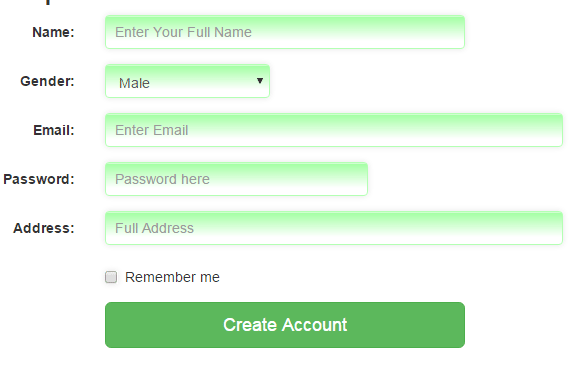
You can see the name field is using the col-sm-4 class in the div. The gender select dropdown is given the col-sm-2 class. Next is an email that uses the col-sm-5 grid class. The password generally requires less space so I used the col-sm-5 for that field.
The point is, you may use these classes to control the sizes of the input fields while using the Bootstrap framework to develop forms. The form fields adjust according to the size of the screen. In mobile or smartphones, all controls will get equal in size as this is responsive.
In the example, I also used a custom CSS style, which is placed in the head section, and its class is added to the above-mentioned fields to change the look and feel of the form. You may style it as per the theme of your website.
The custom CSS class is inputstl.
Finally, a Create Account button is given a few classes:
btn btn-lg btn-block btn-success
Where the btn-lg means it’s a large button, btn-success will define its color and btn-block means the button should take the block like width.