
Like the Bootstrap 3 buttons, Bootstrap 4 also has built-in classes for creating buttons according to context.
You may use button’s contextual classes e.g. “Delete Account” button can be given a red color by btn-danger, “Create Account” button can be given green color by btn-success class, deleting a record with the redo option can use an orange color depicting “warning” by btn-warning class and so on.
In this tutorial, I will show you examples of creating simple buttons, in forms, modal dialogs, etc by using pre-defined CSS classes. I will also show you customize the buttons by overriding the built-in classes – so if you want to use the same names as Bootstrap 4 but desire to add/change the style; this is also covered.
Update: Learn how to create Bootstrap 5 Buttons
- 1. Bootstrap 4 buttons example with all pre-defined classes
- 2. Buttons without background colors by btn-outline class
- 3. Creating large and small sized buttons in Bootstrap 4
- 4. Block level buttons example
- 5. The example of small, large, and block-sized button with outline class
- 6. Using button classes in <a> tag example
- 7. Creating button Bootstrap as a link example
- 8. Using button classes in form submit button
- 9. Create active state buttons example
- 10. A demo of disabled buttons
- 11. A demo of using buttons in a modal dialog
- 12. An example of a button dropdown
- 13. A demo of creating rounded Bootstrap 4 buttons
- 14. Rounded buttons for btn-outline style demo
- 15. Creating buttons with font-awesome icons demo
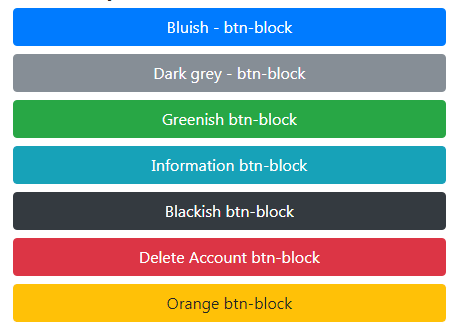
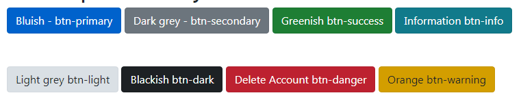
Primarily, the buttons are created by using the <button> tag and using the main class .btn. This is followed by using a semantic style as per the purpose or context of the button. See the following example online by clicking the link or image below where I utilized all built-in classes for creating normal-sized buttons:
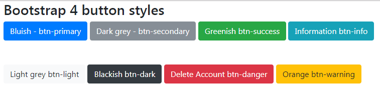
The markup for buttons:
<!DOCTYPE html>
<html>
<head>
<link rel="stylesheet" href="https://maxcdn.bootstrapcdn.com/bootstrap/4.0.0-beta.3/css/bootstrap.min.css" integrity="sha384-Zug+QiDoJOrZ5t4lssLdxGhVrurbmBWopoEl+M6BdEfwnCJZtKxi1KgxUyJq13dy" crossorigin="anonymous">

</head>
<body>
<div class="container">
<h3>Bootstrap 4 button styles</h3>
<button type="button" class="btn btn-primary">Bluish - btn-primary</button>
<button type="button" class="btn btn-secondary">Dark grey - btn-secondary</button>
<button type="button" class="btn btn-success">Greenish  btn-success</button>
<button type="button" class="btn btn-info">Information  btn-info</button> <br /><br /><br />
<button type="button" class="btn btn-light">Light grey  btn-light</button>
<button type="button" class="btn btn-dark">Blackish  btn-dark</button>
<button type="button" class="btn btn-danger">Delete Account btn-danger</button>
<button type="button" class="btn btn-warning">Orange btn-warning</button>

</div>
</body>
</html>
If you only use the .btn class then a grey-colored button is created without any mouse hover effect. On the other hand, using contextual classes makes button darker background, dark borders and with inset shadow as you hover over the button.
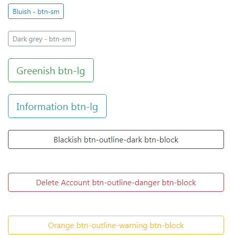
Buttons without background colors by btn-outline class
This is something new in Bootstrap 4 that enables creating beautiful looking buttons without background colors in normal states. For that, use the “btn-outline-“ class preceded by context name e.g.
btn-outline-primary, btn-outline-info etc.
See the example below for the outline styles:
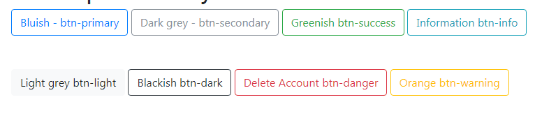
The code for buttons:
<div class="container">

<h3>Bootstrap 4 buttons with outline class</h3>

<button type="button" class="btn btn-outline-primary">Bluish - btn-outline-primary</button>

<button type="button" class="btn btn-outline-secondary">Dark grey - btn-outline-secondary</button>

<button type="button" class="btn btn-outline-success">Greenish  btn-outline-success</button>

<button type="button" class="btn btn-outline-info">Information  btn-outline-info</button> <br /><br /><br />

<button type="button" class="btn btn-outline-light">Light grey  btn-outline-light</button>

<button type="button" class="btn btn-outline-dark">Blackish  btn-outline-dark</button>

<button type="button" class="btn btn-outline-danger">Delete Account btn-outline-danger</button>

<button type="button" class="btn btn-outline-warning">Orange btn-outline-warning</button>


</div>
Bootstrap 4 also has built-in classes for creating large or small-sized buttons by using the following built-in classes:
- .btn-lg – add this class for large sized buttons
- btn-sm – for small sized buttons
You have to use any of these classes with .btn and button’s context class e.g. btn btn-primary btn-sm. See the demos of various sized buttons:
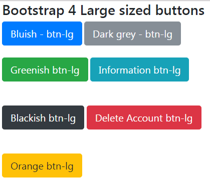
The code:
<button type="button" class="btn btn-primary btn-lg">Bluish - btn-lg</button>

<button type="button" class="btn btn-secondary btn-lg">Dark grey - btn-lg</button><br /><br />

<button type="button" class="btn btn-success btn-lg">Greenish  btn-lg</button>

<button type="button" class="btn btn-info btn-lg">Information  btn-lg</button> <br /><br /><br />

<button type="button" class="btn btn-dark btn-lg">Blackish  btn-lg</button>

<button type="button" class="btn btn-danger btn-lg">Delete Account btn-lg</button><br /><br /><br />

<button type="button" class="btn btn-warning btn-lg">Orange btn-lg</button>
Small sized buttons
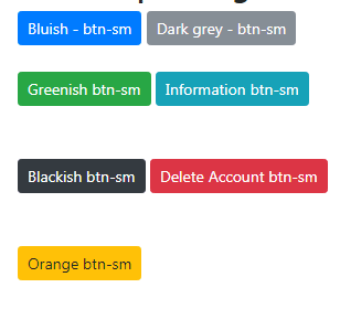
The small sized buttons code:
<button type="button" class="btn btn-primary btn-sm">Bluish - btn-sm</button>

<button type="button" class="btn btn-secondary btn-sm">Dark grey - btn-sm</button><br /><br />

<button type="button" class="btn btn-success btn-sm">Greenish  btn-sm</button>

<button type="button" class="btn btn-info btn-sm">Information  btn-sm</button> <br /><br /><br />

<button type="button" class="btn btn-dark btn-sm">Blackish  btn-sm</button>

<button type="button" class="btn btn-danger btn-sm">Delete Account btn-sm</button><br /><br /><br />

<button type="button" class="btn btn-warning btn-sm">Orange btn-sm</button>
For creating buttons that span the width of the parent element, you may use the btn-block class. Just like large and small buttons, use the btn-block class with .btn and context related button class. For example:
btn btn-dark btn-block
For this example, I have used a div with grid class and see how buttons take the full width:
The code for creating block-sized buttons:
<div class="container">

<h3>Bootstrap 4 Block size buttons</h3>

<div class="col-sm-5">

<button type="button" class="btn btn-primary btn-block">Bluish - btn-block</button>

<button type="button" class="btn btn-secondary btn-block">Dark grey - btn-block</button>

<button type="button" class="btn btn-success btn-block">Greenish  btn-block</button>

<button type="button" class="btn btn-info btn-block">Information  btn-block</button>

<button type="button" class="btn btn-dark btn-block">Blackish  btn-block</button>

<button type="button" class="btn btn-danger btn-block">Delete Account btn-block</button>

<button type="button" class="btn btn-warning btn-block">Orange btn-block</button>

</div>

</div>
Similarly, you may create small, large, and block-level buttons for outline style. See the following example:
The markup:
<div class="container">

<h3>Bootstrap 4 outline button sizes</h3>

<div class="col-sm-5">

<button type="button" class="btn btn-outline-primary btn-sm">Bluish - btn-sm</button><br /><br />

<button type="button" class="btn btn-outline-secondary btn-sm">Dark grey - btn-sm</button><br /><br />

<button type="button" class="btn btn-outline-success btn-lg">Greenish  btn-lg</button><br /><br />

<button type="button" class="btn btn-outline-info btn-lg">Information  btn-lg</button> <br /><br />

<button type="button" class="btn btn-outline-dark btn-block">Blackish  btn-outline-dark btn-block</button><br /><br />

<button type="button" class="btn btn-outline-danger btn-block">Delete Account btn-outline-danger btn-block</button><br /><br />

<button type="button" class="btn btn-outline-warning btn-block">Orange btn-outline-warning btn-block</button><br />

</div>

</div>
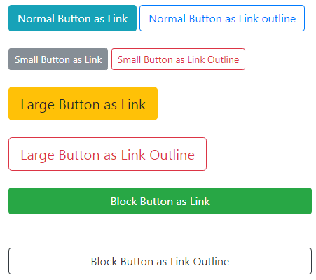
You may also create links as buttons. That means using the button classes in the <a> tag for creating link buttons. As you hover the mouse over that link, the ordinary hand icon should displays. However, the appearance of the link is just like the buttons as we have seen in the above examples:
The links with button styles markup:
<div class="container">

<h3>Bootstrap 4 Links as buttons</h3>

<div class="col-sm-5">

<a href="#" class="btn btn-info" role="button">Normal Button as Link</a>

<a href="#" class="btn btn-outline-primary" role="button">Normal Button as Link outline</a><br /><br />

<a href="#" class="btn btn-secondary btn-sm" role="button">Small Button as Link</a>

<a href="#" class="btn btn-outline-danger btn-sm" role="button">Small Button as Link Outline</a><br /><br />

<a href="#" class="btn btn-warning btn-lg" role="button">Large Button as Link</a><br /><br />

<a href="#" class="btn btn-outline-danger btn-lg" role="button">Large Button as Link Outline</a><br /><br />

<a href="#" class="btn btn-success btn-block" role="button">Block Button as Link</a><br /><br />

<a href="#" class="btn btn-outline-dark btn-block" role="button">Block Button as Link Outline</a>


</div>
You can see that the <a> tag is used and .btn class is assigned along with btn-info, btn-success, etc. The demo also shows you may use the small, large, and block level button classes in link tags for the same appearance as in <button> tag.
I also showed using the btn-outline class for links without background colors in the normal state.
Note: You should give role=”button” in the <a> tag to convey its purpose to assistive technologies.
The button can also be styled to look as a link by using the btn-link class of the Bootstrap 4 framework. For example:
<button type=”button” class=”btn btn-link”>A Button as Link</button>
It will appear like a link and display the hand icon as you bring the mouse over that “button”.
You may also use button classes of Bootstrap 4 in form’s submit button. This should give the same appearance as with <button> tags.
See the following example of the submit button in forms with different button classes:
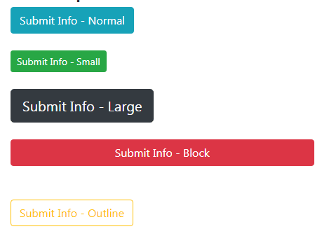
The markup for submit buttons:
<div class="container">

<h3>Bootstrap 4 Submit Buttons</h3>

<div class="col-sm-5">


<input type="submit" class="btn btn-info" value="Submit Info - Normal"><br /><br />

<input type="submit" class="btn btn-success btn-sm" value="Submit Info - Small"><br /><br />

<input type="submit" class="btn btn-dark btn-lg" value="Submit Info - Large"><br /><br />

<input type="submit" class="btn btn-danger btn-block" value="Submit Info - Block"><br /><br />

<input type="submit" class="btn btn-outline-warning" value="Submit Info - Outline"><br /><br />


</div>

</div>
In the above examples, the button comes in an active state as you hover over the buttons i.e. button with a darker background, dark border, and inset shadow. You may create buttons active permanently by using the .active class along with including aria-pressed=”true” attribute. Have a look at the example online:
The markup:
<div class="container">

<h3>Bootstrap 4 button styles</h3>

<button type="button" class="btn btn-primary active" aria-pressed="true">Bluish - btn-primary</button>

<button type="button" class="btn btn-secondary active" aria-pressed="true">Dark grey - btn-secondary</button>

<button type="button" class="btn btn-success active" aria-pressed="true">Greenish  btn-success</button>

<button type="button" class="btn btn-info active" aria-pressed="true">Information  btn-info</button> <br /><br /><br />

<button type="button" class="btn btn-light active" aria-pressed="true">Light grey  btn-light</button>

<button type="button" class="btn btn-dark active" aria-pressed="true">Blackish  btn-dark</button>

<button type="button" class="btn btn-danger active" aria-pressed="true">Delete Account btn-danger</button>

<button type="button" class="btn btn-warning active" aria-pressed="true">Orange btn-warning</button>


</div>
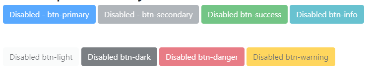
Make any button visually disabled by using the .disabled class.
The markup:
<div class="container">

<h3>Bootstrap 4 button disabled</h3>

<button type="button" class="btn btn-primary disabled" >Disabled - btn-primary</button>

<button type="button" class="btn btn-secondary disabled">Disabled - btn-secondary</button>

<button type="button" class="btn btn-success disabled">Disabled  btn-success</button>

<button type="button" class="btn btn-info disabled">Disabled  btn-info</button> <br /><br /><br />

<button type="button" class="btn btn-light disabled">Disabled  btn-light</button>

<button type="button" class="btn btn-dark disabled" >Disabled  btn-dark</button>

<button type="button" class="btn btn-danger disabled">Disabled btn-danger</button>

<button type="button" class="btn btn-warning disabled">Disabled btn-warning</button>


</div>
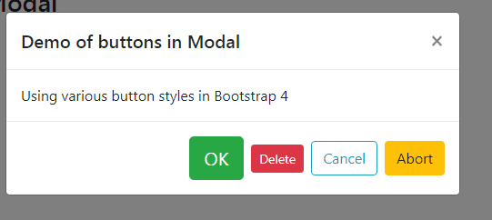
The following example shows using various buttons in a modal component of Bootstrap 4. To see the demo only, open the demo page and press the button to launch the modal with four buttons used in the footer section:
The markup for the demo:
<div class="container"> <h3>Bootstrap 4 button in Modal</h3> <!-- Button trigger modal --> <button type="button" class="btn btn-dark" data-toggle="modal" data-target="#ButtonModal"> Open Modal with buttons </button> <!-- Modal --> <div class="modal fade" id="ButtonModal" tabindex="-1" role="dialog" aria-labelledby="ButtonModalLabel" aria-hidden="true"> <div class="modal-dialog" role="document"> <div class="modal-content"> <div class="modal-header"> <h5 class="modal-title" id="ButtonModalLabel">Demo of buttons in Modal</h5> <button type="button" class="close" data-dismiss="modal" aria-label="Close"> <span aria-hidden="true">×</span> </button> </div> <div class="modal-body"> Using various button styles in Bootstrap 4 </div> <div class="modal-footer"> <button type="button" class="btn btn-success btn-lg" data-dismiss="modal">OK</button> <button type="button" class="btn btn-danger btn-sm" data-dismiss="modal">Delete</button> <button type="button" class="btn btn-outline-info ">Cancel</button> <button type="button" class="btn btn-warning ">Abort</button> </div> </div> </div> </div> </div>
You also need to include the Bootstrap JS file after the jQuery library for the modal component to work. Learn more about Bootstrap 4 Modals.
The following example shows creating button dropdowns by using BS 4 button classes. In addition to .btn and .btn-[context] classes, the dropdown-toggle class is also used along with certain attributes.
See the dropdown button demos with different styles:
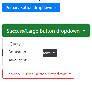
The markup for various sizes, styles (danger, primary, etc.), and outline dropdown buttons:
<div class="container">

<h3>Button Dropdown Demo</h3>

<div class="dropdown">

  <button class="btn btn-primary dropdown-toggle" type="button" id="dropdownMenuButton" data-toggle="dropdown" aria-haspopup="true" aria-expanded="false">

    Primary Button dropdown

  </button>

  <div class="dropdown-menu" aria-labelledby="dropdownMenuButton">

    <a class="dropdown-item" href="https://www.jquery-az.com/">jQuery</a>

    <a class="dropdown-item" href="https://www.jquery-az.com/">Bootstrap</a>

    <a class="dropdown-item" href="https://www.jquery-az.com/">JavaScript</a>

  </div>

</div>

<br /><br />

<div class="dropdown">

  <button class="btn btn-success btn-lg dropdown-toggle" type="button" id="dropdownMenuButton" data-toggle="dropdown" aria-haspopup="true" aria-expanded="false">

    Success/Large Button dropdown

  </button>

  <div class="dropdown-menu" aria-labelledby="dropdownMenuButton">

    <a class="dropdown-item" href="https://www.jquery-az.com/">jQuery</a>

    <a class="dropdown-item" href="https://www.jquery-az.com/">Bootstrap</a>

    <a class="dropdown-item" href="https://www.jquery-az.com/">JavaScript</a>

  </div>

</div>

<br /><br />

<div class="dropdown">

  <button class="btn btn-dark btn-sm dropdown-toggle" type="button" id="dropdownMenuButton" data-toggle="dropdown" aria-haspopup="true" aria-expanded="false">

    Dark/Small Button dropdown

  </button>

  <div class="dropdown-menu" aria-labelledby="dropdownMenuButton">

    <a class="dropdown-item" href="https://www.jquery-az.com/">jQuery</a>

    <a class="dropdown-item" href="https://www.jquery-az.com/">Bootstrap</a>

    <a class="dropdown-item" href="https://www.jquery-az.com/">JavaScript</a>

  </div>

</div>

<br /><br />

<div class="dropdown">

  <button class="btn btn-outline-danger dropdown-toggle" type="button" id="dropdownMenuButton" data-toggle="dropdown" aria-haspopup="true" aria-expanded="false">

    Danger/Outline Button dropdown

  </button>

  <div class="dropdown-menu" aria-labelledby="dropdownMenuButton">

    <a class="dropdown-item" href="https://www.jquery-az.com/">jQuery</a>

    <a class="dropdown-item" href="https://www.jquery-az.com/">Bootstrap</a>

    <a class="dropdown-item" href="https://www.jquery-az.com/">JavaScript</a>

  </div>

</div>

</div>
Grab the complete code from the demo page.
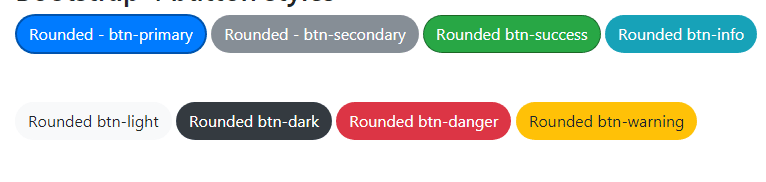
Although, there is no built-in class for creating the rounded buttons in Bootstrap 4. You may easily override the existing classes and customize them as per the need or desire of your project.
In this demo, I have taken the built-in classes of btn-danger, btn-warning, btn-dark, etc. and created the rounded buttons as shown below:
Following is the CSS that I used in the <style> section after the Bootstrap CSS file reference:
.btn-primary {

  color: #fff;

  background-color: #007bff;

  border-radius: 35px;

  border: 2px solid rgba(0, 70, 147, 0.75);

}

.btn-success {

  color: #fff;

  background-color: #28a745;

  border-radius: 35px;

  border: 1px solid rgba(21, 87, 36, 0.75);

}

.btn-secondary {

  color: #fff;

  background-color: #868e96;

  border-radius: 35px;

  border: 1px solid rgba(134, 142, 150, 0.75);

}

.btn-info {

  color: #fff;

  background-color: #17a2b8;

  border-radius: 35px;

  border: 1px solid rgba(23, 162, 184, 0.75);

}

.btn-dark {

  color: #fff;

  background-color: #343a40;

  border-color: #343a40;

  border-radius: 35px;

  border: 1px solid rgba(52, 58, 64, 0.75);

}

.btn-danger {

  color: #fff;

  background-color: #dc3545;

  border-radius: 35px;

  border: 1px solid rgba(220, 53, 69, 0.75);

}

.btn-warning {

  color: #212529;

  background-color: #ffc107;

  border-radius: 35px;

  border: 1px solid rgba(255, 193, 7, 0.75);

}

.btn-light {

  color: #212529;

  background-color: #f8f9fa;

  border-radius: 35px;

  border: 1px solid rgba(248, 249, 250, 0.75);

}
The markup remains the same i.e. using the same class names as in the first demo:
<button type="button" class="btn btn-primary">Rounded - btn-primary</button>

<button type="button" class="btn btn-secondary">Rounded - btn-secondary</button>

<button type="button" class="btn btn-success">Rounded  btn-success</button>

<button type="button" class="btn btn-info">Rounded  btn-info</button> <br /><br /><br />

<button type="button" class="btn btn-light">Rounded  btn-light</button>

<button type="button" class="btn btn-dark">Rounded  btn-dark</button>

<button type="button" class="btn btn-danger">Rounded btn-danger</button>

<button type="button" class="btn btn-warning">Rounded btn-warning</button>
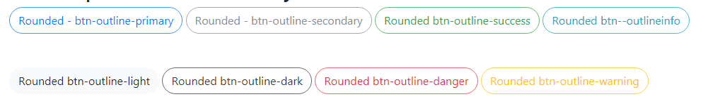
In the same way, you may customize the buttons with .btn-outline class in a round shape or as per the requirement.
See this demo where I have created round buttons with outline class:
The CSS:
.btn-outline-primary {

  color: #007bff;

  background-color: transparent;

  background-image: none;

  border-color: #007bff;

  border-radius: 35px;

  border: 1px solid rgba(0, 123, 255, 0.75);

}

.btn-outline-success {

  color: #28a745;

  background-color: transparent;

  background-image: none;

  border-radius: 35px;

  border: 1px solid rgba(40, 167, 69, 0.75);

}

.btn-outline-secondary {

  color: #868e96;

  background-color: transparent;

  background-image: none;

  border-radius: 35px;

  border: 1px solid rgba(134, 142, 150, 0.75);

}

.btn-outline-info {

  color: #17a2b8;

  background-color: transparent;

  background-image: none;

  border-radius: 35px;

  border: 1px solid rgba(23, 162, 184, 0.75);

}

.btn-outline-dark {

  color: #343a40;

  background-color: transparent;

  background-image: none;

  border-radius: 35px;

  border: 1px solid rgba(52, 58, 64, 0.75);

}

.btn-outline-danger {

  color: #dc3545;

  background-color: transparent;

  background-image: none;

  border-color: #dc3545;

  border-radius: 35px;

  border: 1px solid rgba(220, 53, 69, 0.75);

}

.btn-outline-warning {

  color: #ffc107;

  background-color: transparent;

  background-image: none;

  border-radius: 35px;

  border: 1px solid rgba(255, 193, 7, 0.75);

}

.btn-outline-light {

  color: #f8f9fa;

  background-color: transparent;

  background-image: none;

  border-radius: 35px;

  border: 1px solid rgba(248, 249, 250, 0.75);

}
The markup:
<button type="button" class="btn btn-outline-primary">Rounded - btn-outline-primary</button>

<button type="button" class="btn btn-outline-secondary">Rounded - btn-outline-secondary</button>

<button type="button" class="btn btn-outline-success">Rounded  btn-outline-success</button>

<button type="button" class="btn btn-outline-info">Rounded  btn--outlineinfo</button> <br /><br /><br />

<button type="button" class="btn btn-outline-light">Rounded  btn-outline-light</button>

<button type="button" class="btn btn-outline-dark">Rounded  btn-outline-dark</button>

<button type="button" class="btn btn-outline-danger">Rounded btn-outline-danger</button>

<button type="button" class="btn btn-outline-warning">Rounded btn-outline-warning</button>
You can see the complete code with output on the example page.
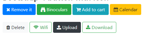
You may also use icons in the buttons for describing the purpose by way of text as well as images. In the following example, I have used a few icons of the font-awesome library in the buttons of Bootstrap 4.
Complete code:
<!DOCTYPE html>
<html>
<head>
<link rel="stylesheet" href="https://maxcdn.bootstrapcdn.com/bootstrap/4.0.0-beta.3/css/bootstrap.min.css" integrity="sha384-Zug+QiDoJOrZ5t4lssLdxGhVrurbmBWopoEl+M6BdEfwnCJZtKxi1KgxUyJq13dy" crossorigin="anonymous">
<link rel="stylesheet" href="https://maxcdn.bootstrapcdn.com/font-awesome/4.7.0/css/font-awesome.min.css">

</head>
<body>
<div class="container">
<h3>Bootstrap 4 button with icon</h3>
<button type="button" class="btn btn-primary"><i class="fa fa-times" aria-hidden="true"></i>  Remove it</button>
<button type="button" class="btn btn-success"><i class="fa fa-binoculars" aria-hidden="true"></i>  Binoculars</button>
<button type="button" class="btn btn-info"><i class="fa fa-cart-plus" aria-hidden="true"></i>  Add to cart</button>
<button type="button" class="btn btn-warning"><i class="fa fa-calendar" aria-hidden="true"></i>  Calendar</button><br /><br />
<button type="button" class="btn btn-light"><i class="fa fa-trash" aria-hidden="true"></i>  Delete</button>
<button type="button" class="btn btn-outline-success"><i class="fa fa-wifi" aria-hidden="true"></i>  Wifi</button>
<button type="button" class="btn btn-dark"><i class="fa fa-upload" aria-hidden="true"></i>  Upload</button>
<button type="button" class="btn btn-outline-success"><i class="fa fa-download" aria-hidden="true"></i>  Download</button>


</div>
</body>
</html>
You need to include the font-awesome library. The example used the CDN link.