
As a complete package, Bulma framework provides a variety of built-in button classes for creating buttons of various styles, sizes, colors and also allows customization by using Sass variables.
You may create normal buttons with default styles, color classes, large, medium, small sizes, outline buttons and many more as using the Bulma CSS framework.
Besides, lots of customization options are available if you have an idea of how to work with Sass variables.
In the following section, I am going to show you many examples with code snippets for creating the buttons in Bulma.
The Bulma classes for buttons can be used with the following:
- <button> tags
- <input type=”submit”> button (form input buttons)
- <input type=”reset”>
- <a> – i.e. links
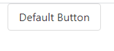
A default button can be created by applying the simple button class to the button (or other supported tags). The default button is grayish as you can see below and on the example page.
See online demo and code
<!DOCTYPE html>

<html>

<head>

<link rel="stylesheet" href="https://cdn.jsdelivr.net/npm/bulma@0.8.0/css/bulma.min.css">


</head>

<body>


<div class="container">

  <button class="button">Default Button</button>

</div>


</body>

</html>
The demo of all available colors
For creating various color buttons that are available in the Bulma CSS, you simply need to apply the contextual class. For example, the red button can be created by applying the .is-danger class. Similarly, you may create the green button by .is-success class and so on.
The demo below shows various color buttons. Note that, you have to apply the main button class plus the contextual class for a specific color, have a look:

See online demo and code
<!DOCTYPE html>

<html>

<head>

<link rel="stylesheet" href="https://cdn.jsdelivr.net/npm/bulma@0.8.0/css/bulma.min.css">


</head>

<body>


<div class="container">

  <button class="button">Default</button>

  <button class="button is-primary">Primary Button</button>

  <button class="button is-link">Link as Button</button>

  <button class="button is-info">Info Button</button>

  <button class="button is-success">Success Button</button>

  <button class="button is-warning">Warning Button</button>

  <button class="button is-danger">Danger Button</button>

</div>


</body>

</html>
Also, note that you may customize the button color as you want by using the $colors Sass map. For that, you should know how the Sass variable works.
The outline button removes the background color and gives a button lighter look. You may use the outline button as the secondary action that complements the primary action.
Bulma makes it quite easier for creating the outline buttons. Just add the .is-outlined class to the above code with various colors:

See online demo and code
<!DOCTYPE html>

<html>

<head>

<link rel="stylesheet" href="https://cdn.jsdelivr.net/npm/bulma@0.8.0/css/bulma.min.css">


</head>

<body>


<div class="container">

  <button class="button is-outlined">Default</button>

  <button class="button is-primary is-outlined">Primary Outlined</button>

  <button class="button is-link is-outlined">Link as Outlined</button>

  <button class="button is-info is-outlined">Info Outlined</button>

  <button class="button is-success is-outlined">Success Outlined</button>

  <button class="button is-warning is-outlined">Warning Outlined</button>

  <button class="button is-danger is-outlined">Danger Outlined</button>

</div>


</body>

</html>
You may notice, the contextual background color becomes the outline color while the background of the buttons is transparent.
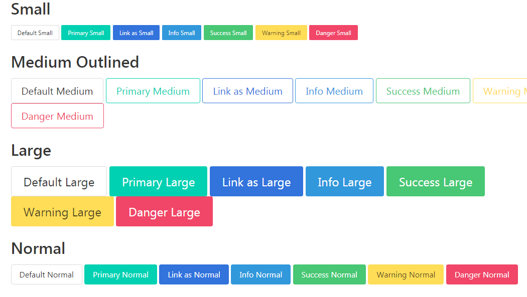
Bulma has four sizes for buttons that you may create by using the following modifiers:
- is-small //For small size button
- is-normal //Normal size button. This is the default So, if you do not specify, this size is applied as in above examples.
- is-medium //For medium-size buttons
- is-large //Large buttons
See online demo and code
<!DOCTYPE html>

<html>

<head>

<link rel="stylesheet" href="https://cdn.jsdelivr.net/npm/bulma@0.8.0/css/bulma.min.css">


</head>

<body>

<div class="container">


<div class="content">

<h1>Small</h1>

  <button class="button is-small">Default Small</button>

  <button class="button is-primary is-small">Primary Small</button>

  <button class="button is-link is-small">Link as Small</button>

  <button class="button is-info is-small">Info Small</button>

  <button class="button is-success is-small">Success Small</button>

  <button class="button is-warning is-small">Warning Small</button>

  <button class="button is-danger is-small">Danger Small</button>

</div>

<div class="content">

    <h1>Medium Outlined</h1>

  <button class="button is-outlined is-medium">Default Medium</button>

  <button class="button is-primary is-outlined is-medium">Primary Medium</button>

  <button class="button is-link is-outlined is-medium">Link as Medium</button>

  <button class="button is-info is-outlined is-medium">Info Medium</button>

  <button class="button is-success is-outlined is-medium">Success Medium</button>

  <button class="button is-warning is-outlined is-medium">Warning Medium</button>

  <button class="button is-danger is-outlined is-medium">Danger Medium</button>

</div>


<div class="content">

<h1>Large</h1>

  <button class="button is-large">Default Large</button>

  <button class="button is-primary is-large">Primary Large</button>

  <button class="button is-link is-large">Link as Large</button>

  <button class="button is-info is-large">Info Large</button>

  <button class="button is-success is-large">Success Large</button>

  <button class="button is-warning is-large">Warning Large</button>

  <button class="button is-danger is-large">Danger Large</button>

</div>


<div class="content">

<h1>Normal</h1>

  <button class="button is-normal">Default Normal</button>

  <button class="button is-primary is-normal">Primary Normal</button>

  <button class="button is-link is-normal">Link as Normal</button>

  <button class="button is-info is-normal">Info Normal</button>

  <button class="button is-success is-normal">Success Normal</button>

  <button class="button is-warning is-normal">Warning Normal</button>

  <button class="button is-danger is-normal">Danger Normal</button>

</div>


</div>


</body>

</html>
As mentioned earlier, if you do not specify any modifier class then a normal sized button is created. The reason for providing the .is-normal class is to let you resize the button to normal (if required).
So, if you have a group of buttons with small or large sizes then you may create those same sized buttons at once. For that, wrap all the buttons in the parent “buttons” without specifying the sizes. Then, you have three classes’ options to specify the size i.e.
- are-small
- are-medium
- are-large
See the large-sized button in the demo below:
See online demo and code
<!DOCTYPE html>

<html>

<head>

<link rel="stylesheet" href="https://cdn.jsdelivr.net/npm/bulma@0.8.0/css/bulma.min.css">


</head>

<body>

<div class="container">


<div class="buttons are-small">


  <button class="button">Default Small</button>

  <button class="button is-primary">Primary Small</button>

  <button class="button is-link">Link as Small</button>

  <button class="button is-info">Info Small</button>

  <button class="button is-success">Success Small</button>

  <button class="button is-warning">Warning Small</button>

  <button class="button is-danger">Danger Small</button>

</div>

<div class="buttons are-medium">


  <button class="button is-outlined">Default Medium</button>

  <button class="button is-primary is-outlined">Primary Medium</button>

  <button class="button is-link is-outlined">Link as Medium</button>

  <button class="button is-info is-outlined">Info Medium</button>

  <button class="button is-success is-outlined">Success Medium</button>

  <button class="button is-warning is-outlined">Warning Medium</button>

  <button class="button is-danger is-outlined">Danger Medium</button>

</div>


<div class="buttons are-large">


  <button class="button">Default Large</button>

  <button class="button is-primary">Primary Large</button>

  <button class="button is-link">Link as Large</button>

  <button class="button is-info">Info Large</button>

  <button class="button is-success">Success Large</button>

  <button class="button is-warning">Warning Large</button>

  <button class="button is-danger">Danger Large</button>

</div>

</div>

</body>

</html>
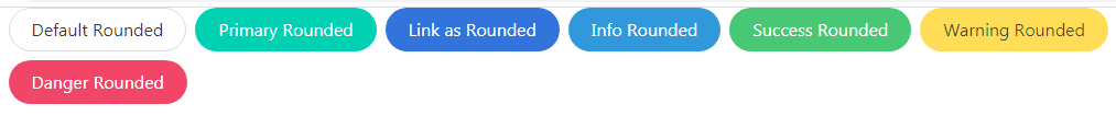
For creating the rounded button style, just apply the is-rounded class to simple or contextual buttons as shown in the example below:
See online demo and code
<!DOCTYPE html>

<html>

<head>

<link rel="stylesheet" href="https://cdn.jsdelivr.net/npm/bulma@0.8.0/css/bulma.min.css">


</head>

<body>

<div class="container">


  <button class="button is-rounded">Default Rounded</button>

  <button class="button is-primary is-rounded">Primary Rounded</button>

  <button class="button is-link is-rounded">Link as Rounded</button>

  <button class="button is-info is-rounded">Info Rounded</button>

  <button class="button is-success is-rounded">Success Rounded</button>

  <button class="button is-warning is-rounded">Warning Rounded</button>

  <button class="button is-danger is-rounded">Danger Rounded</button>


</div>


</body>

</html>
In the second example above, we have seen how to create various color buttons by using color modifiers. For creating the lighter version of those buttons, just add the is-light class for creating the lighter version of that button.
For example, if we created a red button by is-danger modifier then add the is-light for a light red color button. See various buttons light version below:

See online demo and code
<!DOCTYPE html>

<html>

<head>

<link rel="stylesheet" href="https://cdn.jsdelivr.net/npm/bulma@0.8.0/css/bulma.min.css">


</head>

<body>

<div class="container">


  <button class="button is-light">Default Light</button>

  <button class="button is-primary is-light">Primary Light</button>

  <button class="button is-link is-light">Link Light Rounded</button>

  <button class="button is-info is-rounded is-light">Info Rounded Light</button>

  <button class="button is-success is-rounded is-light">Success Rounded Light</button>

  <button class="button is-warning is-light">Warning Light</button>

  <button class="button is-danger is-light">Danger Light</button>


</div>


</body>

</html>
Just add the is-inverted modifier for inverting the background and text. So, if a danger button is created with is-inverted then red becomes the color of text and white is the background. Have a look:

See online demo and code
<!DOCTYPE html>

<html>

<head>

<link rel="stylesheet" href="https://cdn.jsdelivr.net/npm/bulma@0.8.0/css/bulma.min.css">


<style>

body {background-color: green;}

</style>

</head>

<body>

<div class="container" >


  <button class="button is-inverted">Default Inverted</button>

  <button class="button is-primary is-inverted">Primary Inverted</button>

  <button class="button is-link is-inverted">Link Light Inverted</button>

  <button class="button is-info is-inverted">Info Inverted</button>

  <button class="button is-success is-inverted">Success Inverted</button>

  <button class="button is-warning is-inverted">Warning Inverted</button>

  <button class="button is-danger is-inverted">Danger Inverted</button>


</div>


</body>

</html>
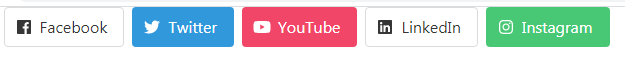
Buttons with font-awesome icons example
The font-awesome is a great font library that you may use with the buttons in Bulma. You have to include the font-awesome library along with Bulma CSS for using these icons.
The example below shows how to create buttons with icons:
See online demo and code
<!DOCTYPE html>

<html>

<head>

<link rel="stylesheet" href="https://cdn.jsdelivr.net/npm/bulma@0.8.0/css/bulma.min.css">

<script defer src="https://use.fontawesome.com/releases/v5.3.1/js/all.js"></script>

</head>

<body>

<div class="container">


<p class="buttons">

  <button class="button">

    <span class="icon">

      <i class="fab fa-facebook"></i>

    </span>

    <span>Facebook</span>

  </button>

  <button class="button is-info">

    <span class="icon">

      <i class="fab fa-twitter"></i>

    </span>

    <span>Twitter</span>

  </button>

  <button class="button is-danger">

    <span class="icon">

      <i class="fab fa-youtube"></i>

    </span>

    <span>YouTube</span>

  </button>

  <button class="button is-default">

    <span class="icon">

      <i class="fab fa-linkedin"></i>

    </span>

    <span>LinkedIn</span>

  </button>

  <button class="button is-success">

    <span class="icon">

      <i class="fab fa-instagram"></i>

    </span>

    <span>Instagram</span>

  </button>

</p>


</div>


</body>

</html>
Note: For best results, wrap the inner text in a separate span element.
Only icons example
You may omit the text completely for buttons with icons only. In that case, Bulma ensures that the button remains square. Have a look for different sizes:
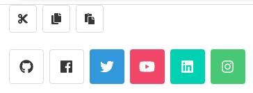
See online demo and code
<!DOCTYPE html>

<html>

<head>

<link rel="stylesheet" href="https://cdn.jsdelivr.net/npm/bulma@0.8.0/css/bulma.min.css">

<script defer src="https://use.fontawesome.com/releases/v5.3.1/js/all.js"></script>

</head>

<body>

<div class="container">


<p class="buttons">

  <button class="button">

    <span class="icon is-small">

      <i class="fas fa-cut"></i>

    </span>

  </button>

  <button class="button">

    <span class="icon is-small">

      <i class="fas fa-copy"></i>

    </span>

  </button>

  <button class="button">

    <span class="icon is-small">

      <i class="fas fa-paste"></i>

    </span>

  </button>

</p>


<p class="buttons are-medium">

  <button class="button">

    <span class="icon is-small">

      <i class="fab fa-github"></i>

    </span>

  </button>

  <button class="button">

    <span class="icon">

      <i class="fab fa-facebook"></i>

    </span>

  </button>

  <button class="button is-info">

    <span class="icon">

      <i class="fab fa-twitter"></i>

    </span>

  </button>

  <button class="button is-danger">

    <span class="icon is-medium">

      <i class="fab fa-youtube"></i>

    </span>

  </button>

  <button class="button is-primary">

    <span class="icon is-medium">

      <i class="fab fa-linkedin"></i>

    </span>

  </button>

  <button class="button is-success">

    <span class="icon is-medium">

      <i class="fab fa-instagram"></i>

    </span>

  </button>

</p>


</div>


</body>

</html>