
The Bootstrap grid columns plug-in
The Bootstrap grid system enables to create the columns with equal width quite easily. For example, if you need three three-column layouts then you may use three div elements with .col-md-4 class (in each div). If four columns in a row are required then you may use .col-md-3 class. Just distribute 12 12-column grid for developing the layout.
As Bootstrap is a mobile-first platform, the columns will adjust automatically in mobile phones or tablets.
So, achieving an equal width of columns in a row in the Bootstrap-based project is not the issue. However, if you want all the columns to have the same height as well, you need to manage this by custom CSS.
What if you need to have the same height for all columns in each row? In this tutorial, I am going to share a light-weight jQuery-based plugin that does this job for you.
It only requires adding a class (grid-columns) in the row where you want columns with the same height. The following section explains how. You may also see the live demonstration.
A demo of Bootstrap grid columns plug-in
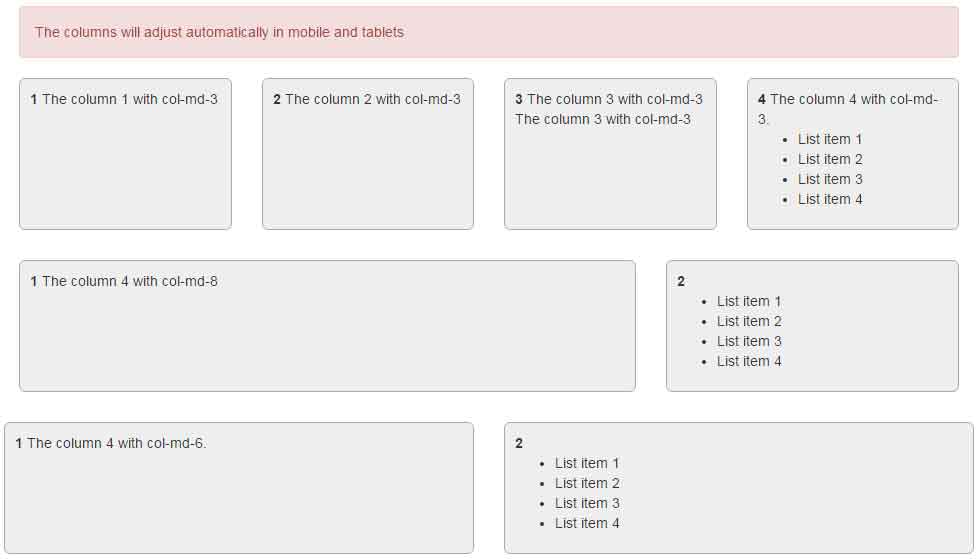
In this demo, I have created three rows with different number of columns. The first row contains four columns by using the col-md-3 class in each row. The second row is assigned the col-md-8 and col-md-4 classes while the third row is assigned col-md-6.
For demonstration, the content in various div elements is kept different to show how height is adjusted.
The markup:
<!DOCTYPE html>
<html lang="en">
<head>
    <link rel="stylesheet" href="https://maxcdn.bootstrapcdn.com/bootstrap/3.3.0/css/bootstrap.min.css">
        <style>
            .col {
                margin-bottom: 30px;
            }
            .col>div {
                background-color: #eee;
                height: 100%;
                padding: 10px;
                border-radius: 6px;
                border: 1px solid #aaa;
            }
        </style>

</head>
<body>

        <div class="container">

            <h1>A demo of same Columns height</h1>

            <div class="alert alert-danger">The columns will adjust automatically in mobile and tablets</div>

            <div class="row grid-columns">
                <div class="col-md-3 col">
                    <div>
                        <b>1</b>
                        The column 1 with col-md-3
                    </div>
                </div>
                <div class="col-md-3 col">
                    <div>
                        <b>2</b>
                        The column 2 with col-md-3
                    </div>
                </div>
                <div class="col-md-3 col">
                    <div>
                        <b>3</b>
                        The column 3 with col-md-3<br />
                        The column 3 with col-md-3
                    </div>
                </div>
                <div class="col-md-3 col ">
                    <div>
                        <b>4</b>
                        The column 4 with col-md-3.<br />
                        <ul>
                          <li>List item 1</li>
                          <li>List item 2</li>
                          <li>List item 3</li>
                          <li>List item 4</li>
                        </ul>
                    </div>
                </div>
            </div>

            <div class="row grid-columns">
                <div class="col-md-8 col">
                    <div>
                        <b>1</b>
                        The column 4 with col-md-8
                    </div>
                </div>
                <div class="col-md-4 col">
                    <div>
                        <b>2</b>
                        <ul>
                          <li>List item 1</li>
                          <li>List item 2</li>
                          <li>List item 3</li>
                          <li>List item 4</li>
                        </ul>
                    </div>
             </div>

            <div class="row grid-columns">
                <div class="col-md-6 col">
                    <div>
                        <b>1</b>
                        The column 4 with col-md-6.
                    </div>
                </div>
                <div class="col-md-6 col">
                    <div>
                        <b>2</b>
                        <ul>
                          <li>List item 1</li>
                          <li>List item 2</li>
                          <li>List item 3</li>
                          <li>List item 4</li>
                        </ul>
                    </div>
             </div>


            </div>

        </div>


        <script src="https://ajax.googleapis.com/ajax/libs/jquery/1.11.3/jquery.min.js"></script>
        <script src="https://maxcdn.bootstrapcdn.com/bootstrap/3.3.6/js/bootstrap.min.js" integrity="sha384-0mSbJDEHialfmuBBQP6A4Qrprq5OVfW37PRR3j5ELqxss1yVqOtnepnHVP9aJ7xS" crossorigin="anonymous"></script>
        <script src="js/bootstrap-grid-columns/bootstrap-grid-columns.js"></script>
</body>
</html>
A simple CSS class is also used in the <style> section.
For setting up this plug-in, simply download it from the Github page here. After that, include the bootstrap-grid-columns.js file after the references of Bootstrap and jQuery JS files:
<script src=”https://maxcdn.bootstrapcdn.com/bootstrap/3.3.6/js/bootstrap.min.js” integrity=”sha384-0mSbJDEHialfmuBBQP6A4Qrprq5OVfW37PRR3j5ELqxss1yVqOtnepnHVP9aJ7xS” crossorigin=”anonymous”></script>
<script src=”js/bootstrap-grid-columns/bootstrap-grid-columns.js”></script>
In the markup, simply use the grid-columns class in a div where the .row class is used.
What if the grid-columns class is not used?
See this demo where I have created three rows again. The third row is without the grid-columns class.
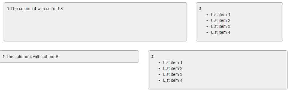
You can see that the third row’s column height is varied, depending on the content.