
- 1. The navbar in Bootstrap
- 2. A simple Bootstrap navbar demo
- 3. Changing the default colors provided by Bootstrap
- 4. Adding and styling forms in Bootstrap menu
- 5. Dealing with Bootstrap mobile menu icon
- 6. How to fix navigation bar on top?
- 7. A menu bar fixed at bottom demo
- 8. A fixed and static top menu
Generally, you require a top bar also called the navigation bar or header or top menu in your website that contains main links to the other parts of the website.
As using the Bootstrap framework, this is quite easy to create a header menu that contains links or other components like a small form, dropdowns, etc. The Bootstrap menu is quite easy to customize with your own CSS styles and more importantly menu is responsive as well.
Having a responsive navigation bar is important as it adds good marks as for as SEO and UI are concerned. Since more searchers are coming from smart devices or mobiles than desktops now and presenting your users adjusted menu to their screens is important for rankings as well as adding a good user experience.
I will show you different demos in this tutorial that are simple as well as customized with different components and styles.
You have to use a <nav> tag to initiate a navigation bar that contains the navbar class followed by a series of different classes for links or components in the navigation bar.
Complete include including header files
<!DOCTYPE html>
<html>
<head>
<title>navbar example</title>
<link rel="stylesheet" href="https://maxcdn.bootstrapcdn.com/bootstrap/3.3.6/css/bootstrap.min.css" integrity="sha384-1q8mTJOASx8j1Au+a5WDVnPi2lkFfwwEAa8hDDdjZlpLegxhjVME1fgjWPGmkzs7" crossorigin="anonymous">
<script src="https://ajax.googleapis.com/ajax/libs/jquery/1.10.2/jquery.min.js"></script>
<script src="https://maxcdn.bootstrapcdn.com/bootstrap/3.3.6/js/bootstrap.min.js" integrity="sha384-0mSbJDEHialfmuBBQP6A4Qrprq5OVfW37PRR3j5ELqxss1yVqOtnepnHVP9aJ7xS" crossorigin="anonymous"></script>
</head>
<body>
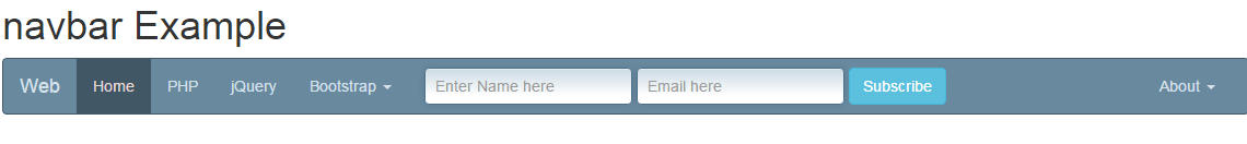
<h1>navbar Example</h1>
<nav class="navbar navbar-default">
<div class="container-fluid">
<!-- Brand and toggle get grouped for better mobile display -->
<div class="navbar-header">
<button type="button" class="navbar-toggle collapsed" data-toggle="collapse" data-target="#bs-example-navbar-collapse-1" aria-expanded="false">
<span class="sr-only">Toggle navigation</span>
<span class="icon-envelope"></span>
</button>
<a class="navbar-brand" href="#">Web</a>
</div>
<!-- Collect the nav links, forms, and other content for toggling -->
<div class="collapse navbar-collapse" id="bs-example-navbar-collapse-1">
<ul class="nav navbar-nav">
<li class="active"><a href="#">Home <span class="sr-only">(current)</span></a></li>
<li><a href="https://www.jquery-az.com/php-tutorials/">PHP</a></li>
<li><a href="https://www.jquery-az.com/jquery-tips/">jQuery</a></li>
<li class="dropdown">
<a href="https://www.jquery-az.com/bootstrap-tips-tutorials/" class="dropdown-toggle" data-toggle="dropdown" role="button" aria-haspopup="true" aria-expanded="false">Bootstrap <span class="caret"></span></a>
<ul class="dropdown-menu">
<li><a href="https://www.jquery-az.com/bootstrap-carousel-5-single-multiple-horizontal-and-vertical-sliding-demos/">Carousel</a></li>
<li><a href="https://www.jquery-az.com/bootstrap-form-customized-styles-6-online-examples/">Forms</a></li>
<li role="separator" class="divider"></li>
<li><a href="https://www.jquery-az.com/bootstrap-select-5-beautiful-styles/">Select</a></li>
</ul>
</li>
</ul>
<form class="navbar-form navbar-left" role="search">
<div class="form-group">
<input type="text" class="form-control" placeholder="Find topics">
</div>
<button type="submit" class="btn btn-info">Go</button>
</form>
<ul class="nav navbar-nav navbar-right">
<li class="dropdown">
<a href="#" class="dropdown-toggle" data-toggle="dropdown" role="button" aria-haspopup="true" aria-expanded="false">About <span class="caret"></span></a>
<ul class="dropdown-menu">
<li><a href="https://www.jquery-az.com/about-us/">Terms</a></li>
<li><a href="https://www.jquery-az.com/contact/">Contact</a></li>
</ul>
</li>
</ul>
</div><!-- /.navbar-collapse -->
</div><!-- /.container-fluid -->
</nav>
</div>
</body>
</html>
First of all, a nav tag is created that refers to the navbar class in Bootstrap framework. Next is the main div that acts as the container of the navigation bar which is assigned the container-fluid class.
The next section in the code is to deal with mobile/smartphones for better presentation. The next section is self-descriptive if you look at the code that created links, dropdown menu items, and a form to search the website.
Now let me move ahead with changing the color scheme or adding some style in the above example.
Changing the default colors provided by Bootstrap
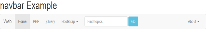
One of the default color schemes is shown in the above example that uses the navbar-default (specified in the <nav> tag.
The other scheme that you can use, which is set in the Bootstrap CSS is navbar-inverse class. The same demo will look like this if you change the navbar-default to navbar-inverse.
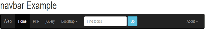
Only this line of code is changed in the above example:
<nav class="navbar navbar-inverse">
Generally, you need to design a theme of your own that matches the rest of the website. For that, you have to go through the Bootstrap navbar related classes in the Bootstrap CSS and override the default colors.
I will list a few classes here, the rest you can see on the demo pages. Let me show you a few designs first for the same Bootstrap menu as used in the above example.
See online demo and code
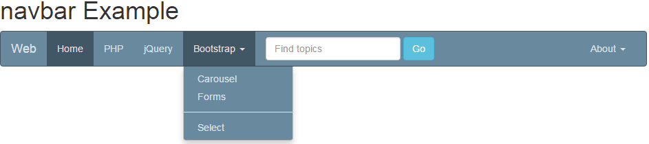
Basically, what is done in the above demo is that I have used the same class in the <nav> tag i.e. navbar-default. However, a new color scheme is used to handle different colors that are placed in the <style> section of the head tag.
You have to place this style (either external CSS or using style tag) after the Bootstrap’s CSS reference to override it.
Also, note that you do not necessarily need to use the navbar-default class name. Use any class name instead of navbar-default and refer it in the <nav> tag, as shown in the example below:
Online demo and code
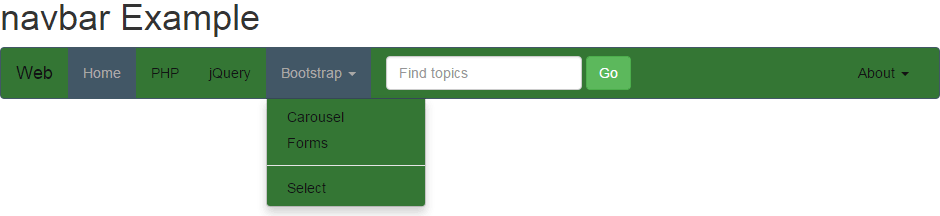
In the demo page’s code, you can see a custom class is created in the head section which is named as menucls. The same is referred in the <nav> tag:
<nav class=”navbar menucls”>
Following are a few important classes to change the main theme of navbar Bootstrap:
- .menucls To change the background color and border of the main navigation bar.
- .menucls .navbar-nav > li > a: To change the color of the text of menu items.
Just play with different classes to develop it according to the theme of your project or for testing purposes.
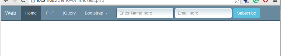
As shown in the above examples, a form is added to the menu. In all examples, it is using the same look of textbox while the button is changed, that uses Bootstrap classes.
You may use Bootstrap form’s style along with adding custom classes to match it with other sections of the website.
See the following example where textbox look is changed by adding a custom style:
Complete code:
<!DOCTYPE html>
<html>
<head>
    <title>navbar example</title>
    <link rel="stylesheet" href="https://maxcdn.bootstrapcdn.com/bootstrap/3.3.6/css/bootstrap.min.css" integrity="sha384-1q8mTJOASx8j1Au+a5WDVnPi2lkFfwwEAa8hDDdjZlpLegxhjVME1fgjWPGmkzs7" crossorigin="anonymous">
    <script src="https://ajax.googleapis.com/ajax/libs/jquery/1.10.2/jquery.min.js"></script>
    <script src="https://maxcdn.bootstrapcdn.com/bootstrap/3.3.6/js/bootstrap.min.js" integrity="sha384-0mSbJDEHialfmuBBQP6A4Qrprq5OVfW37PRR3j5ELqxss1yVqOtnepnHVP9aJ7xS" crossorigin="anonymous"></script>

<style>
.inputstl {
    padding: 9px;
    border: solid 1px #4B718B;
    outline: 0;
    background: -webkit-gradient(linear, left top, left 25, from(#FFFFFF), color-stop(4%, #CDDBE4), to(#FFFFFF));
    background: -moz-linear-gradient(top, #FFFFFF, #CDDBE4 1px, #FFFFFF 25px);
    box-shadow: rgba(0,0,0, 0.1) 0px 0px 8px;
    -moz-box-shadow: rgba(0,0,0, 0.1) 0px 0px 8px;
    -webkit-box-shadow: rgba(0,0,0, 0.1) 0px 0px 8px;

    }

.navbar-default {
  background-color: #69899f;
  border-color: #425766;
}
.navbar-default .navbar-brand {
  color: #d7e2e9;
}
.navbar-default .navbar-brand:hover, .navbar-default .navbar-brand:focus {
  color: #e5dbdb;
}
.navbar-default .navbar-text {
  color: #d7e2e9;
}
.navbar-default .navbar-nav > li > a {
  color: #d7e2e9;
}
.navbar-default .navbar-nav > li > a:hover, .navbar-default .navbar-nav > li > a:focus {
  color: #e5dbdb;
}
.navbar-default .navbar-nav > li > .dropdown-menu {
  background-color: #69899f;
}
.navbar-default .navbar-nav > li > .dropdown-menu > li > a {
  color: #d7e2e9;
}
.navbar-default .navbar-nav > li > .dropdown-menu > li > a:hover,
.navbar-default .navbar-nav > li > .dropdown-menu > li > a:focus {
  color: #e5dbdb;
  background-color: #425766;
}
.navbar-default .navbar-nav > li > .dropdown-menu > li > .divider {
  background-color: #69899f;
}
.navbar-default .navbar-nav > .active > a, .navbar-default .navbar-nav > .active > a:hover, .navbar-default .navbar-nav > .active > a:focus {
  color: #e5dbdb;
  background-color: #425766;
}
.navbar-default .navbar-nav > .open > a, .navbar-default .navbar-nav > .open > a:hover, .navbar-default .navbar-nav > .open > a:focus {
  color: #e5dbdb;
  background-color: #425766;
}
.navbar-default .navbar-toggle {
  border-color: #425766;
}
.navbar-default .navbar-toggle:hover, .navbar-default .navbar-toggle:focus {
  background-color: #425766;
}
.navbar-default .navbar-toggle .icon-bar {
  background-color: #d7e2e9;
}
.navbar-default .navbar-collapse,
.navbar-default .navbar-form {
  border-color: #d7e2e9;
}
.navbar-default .navbar-link {
  color: #d7e2e9;
}
.navbar-default .navbar-link:hover {
  color: #e5dbdb;
}

@media (max-width: 767px) {
  .navbar-default .navbar-nav .open .dropdown-menu > li > a {
    color: #d7e2e9;
  }
  .navbar-default .navbar-nav .open .dropdown-menu > li > a:hover, .navbar-default .navbar-nav .open .dropdown-menu > li > a:focus {
    color: #e5dbdb;
  }
  .navbar-default .navbar-nav .open .dropdown-menu > .active > a, .navbar-default .navbar-nav .open .dropdown-menu > .active > a:hover, .navbar-default .navbar-nav .open .dropdown-menu > .active > a:focus {
    color: #e5dbdb;
    background-color: #425766;
  }
}
</style>
</head>
<body>
<div class="container">
<h1>navbar Example</h1>
<nav class="navbar navbar-default">
  <div class="container-fluid">
    <!-- Brand and toggle get grouped for better mobile display -->
    <div class="navbar-header">
      <button type="button" class="navbar-toggle collapsed" data-toggle="collapse" data-target="#bs-example-navbar-collapse-1" aria-expanded="false">
        <span class="sr-only">Toggle navigation</span>
      <span class="icon-envelope"></span>
      </button>
      <a class="navbar-brand" href="#">Web</a>
    </div>

    <!-- Collect the nav links, forms, and other content for toggling -->
    <div class="collapse navbar-collapse" id="bs-example-navbar-collapse-1">
      <ul class="nav navbar-nav">
        <li class="active"><a href="#">Home <span class="sr-only">(current)</span></a></li>
        <li><a href="https://www.jquery-az.com/php-tutorials/">PHP</a></li>
        <li><a href="https://www.jquery-az.com/jquery-tips/">jQuery</a></li>
        <li class="dropdown">
          <a href="https://www.jquery-az.com/bootstrap-tips-tutorials/" class="dropdown-toggle" data-toggle="dropdown" role="button" aria-haspopup="true" aria-expanded="false">Bootstrap <span class="caret"></span></a>
          <ul class="dropdown-menu">
            <li><a href="https://www.jquery-az.com/bootstrap-carousel-5-single-multiple-horizontal-and-vertical-sliding-demos/">Carousel</a></li>
            <li><a href="https://www.jquery-az.com/bootstrap-form-customized-styles-6-online-examples/">Forms</a></li>
            <li role="separator" class="divider"></li>
            <li><a href="https://www.jquery-az.com/bootstrap-select-5-beautiful-styles/">Select</a></li>
          </ul>
        </li>
      </ul>


      <form class="navbar-form navbar-left" role="search">
        <div class="form-group">
          <input type="text" class="form-control inputstl" id="Name2" placeholder="Enter Name here">
          <input type="email" class="form-control inputstl" id="Email2" placeholder="Email here">

        </div>
        <button type="submit" class="btn btn-info">Subscribe</button>
      </form>


      <ul class="nav navbar-nav navbar-right">

        <li class="dropdown">
          <a href="#" class="dropdown-toggle" data-toggle="dropdown" role="button" aria-haspopup="true" aria-expanded="false">About <span class="caret"></span></a>
          <ul class="dropdown-menu">
            <li><a href="https://www.jquery-az.com/about-us/">Terms</a></li>
            <li><a href="https://www.jquery-az.com/contact/">Contact</a></li>
          </ul>
        </li>
      </ul>
    </div><!-- /.navbar-collapse -->
  </div><!-- /.container-fluid -->
</nav>
</div>
</body>
</html>
In the head section of the demo page, you can see a custom CSS class is created, .inputstl, which is assigned to the form controls – textboxes in that case. It added shadows in the text boxes.
Similarly, you may use other form controls in navbar of Bootstrap with customized styling. However, one thing to be considered while using this is the device size.
Since more and more searchers/visitors are coming from mobile devices, your site “must” be mobile friendly. As the size of the screen gets smaller your Bootstrap navbar should adjust accordingly and make sure it does not expand to look ugly. By default, form controls are responsive, though.
In the above examples, all menu bars are responsive and also using Toggle navigation. If you resize the screen or look at the demos on mobile devices, the navbar will be resized and adjusted to the screen. There you can see three horizontal lines to expand the menu:
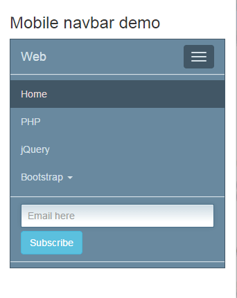
See online demo and code
If you are looking at this demo on a wide-screen (Chrome, Firefox, or some other browser), then resize the window to as much smaller as it looks like in the figure shown above. The section which is dealing with better mobile visibility is:
<!—For better mobile display-->

<div class="navbar-header">

<button type="button" class="navbar-toggle collapsed" data-toggle="collapse" data-target="#bs-example-navbar-collapse-1" aria-expanded="false">

<span class="sr-only">Toggle navigation</span>

<span class="icon-bar"></span>

<span class="icon-bar"></span>

<span class="icon-bar"></span>

</button>

<a class="navbar-brand" href="#">Web</a>

</div>
The three lines are due to the icon-bar class that is used three times in the span tag. If you want something else appearing here, for example, some other icon like an envelope or some other image, just modify it or override this class.
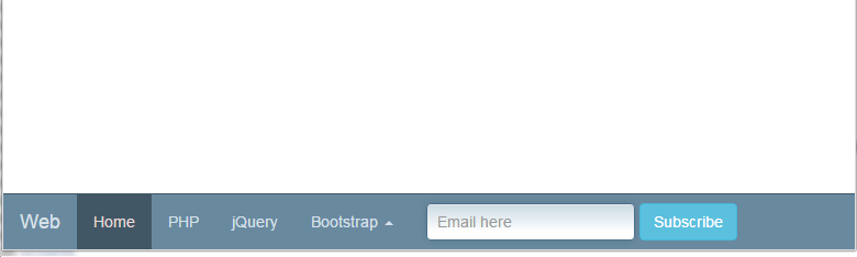
By using the .navbar-fixed-top class in the <nav> tag, you can fix the menu bar on top of the web page. The following examples show a fixed top bar:
See online demo and code
The following line in the body section is changed:
<nav class="navbar menucls navbar-fixed-top">
Similarly, you may fix the menu bar at the bottom of the webpage. The class to be used is navbar-fixed-bottom.
See the following online bottom menu bar:
Online demo and code
You can see, just the class navbar-fixed-bottom is used in the <nav> section of code.
In order to make a top bar menu that is fixed as well, that means, if you scroll down the page, the menu bar will be fixed and visible across.
For that, simply use the navbar-static-top class in the <nav> tag i.e.
<nav class="navbar navbar-static-top menucls">