
The Bootstrap select – option
The select–option dropdown can be added along with other form controls in Bootstrap forms by using built-in classes. You may use simple Bootstrap classes, customized CSS, or third party add-ons to create beautiful looking select dropdowns. I am going to show you both.
The simple select can be created by Bootstrap class in the select tag as follows:
class="form-control"
For example:
<!DOCTYPE html>
<html>
<head>
    <link rel="stylesheet" href="https://maxcdn.bootstrapcdn.com/bootstrap/3.3.5/css/bootstrap.min.css" integrity="sha512-dTfge/zgoMYpP7QbHy4gWMEGsbsdZeCXz7irItjcC3sPUFtf0kuFbDz/ixG7ArTxmDjLXDmezHubeNikyKGVyQ==" crossorigin="anonymous">
    <meta name="viewport" content="width=device-width, initial-scale=1.0">

</head>


<body>
<div class="container">
<h1>A Bootstrap Select</h1>

<div class="form-group">
        <label for="gender1" class="col-sm-2 control-label">Without Bootstrap:</label>
        <div class="col-sm-2">
        <select id="gender1">
          <option>Male</option>
          <option>Female</option>
        </select>

        </div>
</div>
<div class="form-group">
        <label for="gender1" class="col-sm-2 control-label">With Bootstrap:</label>
        <div class="col-sm-2">
        <select class="form-control" id="gender1">
          <option>Male</option>
          <option>Female</option>
        </select>

        </div>
</div>

</div>


</body>
</html>
Output:
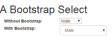
You can see the figure and demo page, the first select is created without using any class while the second is assigned the form-control Bootstrap class.
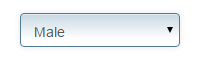
Adding custom style in Bootstrap select demo
You may assign the Bootstrap class as well as a custom style to change the look and feel of the select dropdown.
In the following example, I have created a custom class that is assigned in addition to the form-control class in the select tag. See online demo and code:
In the head section, a CSS class is created
<style>
.selcls {
    padding: 9px;
    border: solid 1px #517B97;
    outline: 0;
    background: -webkit-gradient(linear, left top, left 25, from(#FFFFFF), color-stop(4%, #CAD9E3), to(#FFFFFF));
    background: -moz-linear-gradient(top, #FFFFFF, #CAD9E3 1px, #FFFFFF 25px);
    box-shadow: rgba(0,0,0, 0.1) 0px 0px 8px;
    -moz-box-shadow: rgba(0,0,0, 0.1) 0px 0px 8px;
    -webkit-box-shadow: rgba(0,0,0, 0.1) 0px 0px 8px;

    }

</style>
This is assigned to the select dropdown as follows:
<select class="form-control selcls" id="gender1">

<option>Male</option>

<option>Female</option>

</select>
Related: Dropdown as a multi-select button using Bootstrap
Select in a Bootstrap form example
Let me show an example of using the select in a Bootstrap form along with other controls. The controls like textboxes, button and select are using Bootstrap as well as a custom class. First have a look at demo and code:
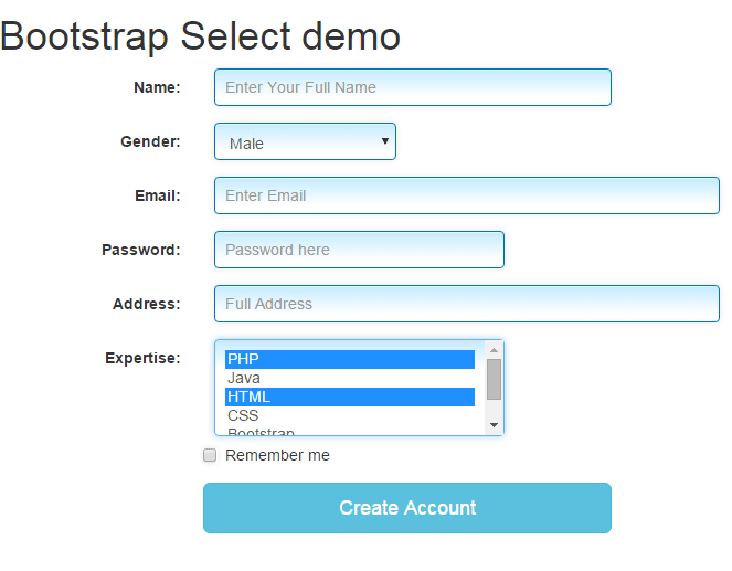
Two select tags are used that are assigned Bootstrap class, form-control. Along with it, both are assigned inputstl custom class to style along with other form fields.
The Gender select is created to choose only one option.
By using the multiple option in the Expertise select dropdown, you can choose multiple options:
<div class="form-group">

<label for="expertise" class="col-sm-2 control-label">Expertise:</label>

<div class="col-sm-3">

<select class="form-control inputstl" id="expertise" multiple>

<option>PHP</option>

<option>Java</option>

<option>HTML</option>

<option>CSS</option>

<option>Bootstrap</option>

<option>SQL</option>

</select>

</div>
Complete code of the example
<!DOCTYPE html>
<html>
<head>
    <link rel="stylesheet" href="https://maxcdn.bootstrapcdn.com/bootstrap/3.3.5/css/bootstrap.min.css" integrity="sha512-dTfge/zgoMYpP7QbHy4gWMEGsbsdZeCXz7irItjcC3sPUFtf0kuFbDz/ixG7ArTxmDjLXDmezHubeNikyKGVyQ==" crossorigin="anonymous">
    <meta name="viewport" content="width=device-width, initial-scale=1.0">

<style>
.inputstl {
    padding: 9px;
    border: solid 1px #0077B0;
    outline: 0;
    background: -webkit-gradient(linear, left top, left 25, from(#FFFFFF), color-stop(4%, #C6ECFF), to(#FFFFFF));
    background: -moz-linear-gradient(top, #FFFFFF, #C6ECFF 1px, #FFFFFF 25px);
    box-shadow: rgba(0,0,0, 0.1) 0px 0px 8px;
    -moz-box-shadow: rgba(0,0,0, 0.1) 0px 0px 8px;
    -webkit-box-shadow: rgba(0,0,0, 0.1) 0px 0px 8px;

    }

</style>

</head>

<body>
<div class="container">
<h1>Bootstrap Select demo</h1>
    <form class="form-horizontal" role="form">
      <div class="form-group">
        <label for="name1" class="col-sm-2 control-label">Name:</label>
        <div class="col-sm-4">
          <input type="email" class="form-control inputstl" id="name1" placeholder="Enter Your Full Name">
        </div>
      </div>
      <div class="form-group">
        <label for="gender1" class="col-sm-2 control-label">Gender:</label>
        <div class="col-sm-2">
        <select class="form-control inputstl" id="gender1">
          <option>Male</option>
          <option>Female</option>
        </select>

        </div>
      </div>
      <div class="form-group">
        <label for="email1" class="col-sm-2 control-label">Email:</label>
        <div class="col-sm-5">
          <input type="email" class="form-control inputstl" id="email1" placeholder="Enter Email">
        </div>
      </div>
      <div class="form-group">
        <label for="password1" class="col-sm-2 control-label">Password:</label>
        <div class="col-sm-3">
          <input type="password" class="form-control inputstl" id="password1" placeholder="Password here">
        </div>
      </div>
      <div class="form-group">
        <label for="address1" class="col-sm-2 control-label">Address:</label>
        <div class="col-sm-5">
          <input type="email" class="form-control inputstl" id="address1" placeholder="Full Address">
        </div>
      </div>
      <div class="form-group">
        <label for="expertise" class="col-sm-2 control-label">Expertise:</label>
        <div class="col-sm-3">
        <select class="form-control inputstl" id="expertise" multiple>
          <option>PHP</option>
          <option>Java</option>
          <option>HTML</option>
          <option>CSS</option>
          <option>Bootstrap</option>
          <option>SQL</option>
        </select>

        </div>

      <div class="form-group">
        <div class="col-sm-offset-2 col-sm-10">
          <div class="checkbox">
            <label>
              <input type="checkbox" class="inputstl"> Remember me
            </label>
          </div>
        </div>
      </div>
      <div class="form-group">
        <div class="col-sm-offset-2 col-sm-4">
          <button type="submit" class="btn btn-lg btn-block btn-info">Create Account</button>
        </div>
      </div>
    </form>
   </div>
</body>
</html>
You should also read: Bootstrap multi-select dropdown
Using a plug-in for select Bootstrap
Now, I will show you creating pretty looking select dropdowns by using the Bootstrap-select add-on. Not only the look and feel can be changed but it adds many useful features in select buttons. By using that, the user experience can be enhanced incredibly.
First, let me show you a few select button examples followed by step by step guide to set up to use for your project.
The code:
<!DOCTYPE html>
<html>
<head>
  <link rel="stylesheet" href="https://maxcdn.bootstrapcdn.com/bootstrap/3.3.4/css/bootstrap.min.css">
  <link rel="stylesheet" href="https://cdnjs.cloudflare.com/ajax/libs/bootstrap-select/1.7.5/css/bootstrap-select.min.css">
  <script src="https://ajax.googleapis.com/ajax/libs/jquery/1.11.3/jquery.min.js"></script>
  <script src="https://maxcdn.bootstrapcdn.com/bootstrap/3.3.4/js/bootstrap.min.js"></script>
  <script src="https://cdnjs.cloudflare.com/ajax/libs/bootstrap-select/1.7.5/js/bootstrap-select.min.js"></script>


</head>

<body>
<div class="container">
<h1>Bootstrap Select demo</h1>

<select class="selectpicker" data-style="btn-primary" multiple data-max-options="2">
    <option>PHP</option>
    <option>CSS</option>
    <option>HTML</option>
    <option>CSS 3</option>
    <option>Bootstrap</option>
    <option>JavaScript</option>
  </select>

</div>
</body>
</html>
The above select dropdown allows selecting multiple options while it also slides down just like the normal (single option) dropdown. However, you can see the demo page, how cool it is looking. It used the btn-primary button style of Bootstrap add-on.
The select tag is given the selectpicker class, that you can use after setting up the plug-in (explained below).
To give it a bluish look, the data-style attribute is used i.e. data-style=”btn-primary”. The user can make a maximum of two selection which is specified here:
data-max-options="2".
This is also the feature of this add-on.
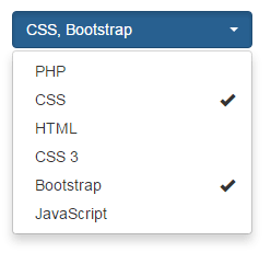
A select with option groups example
You may add option groups while using this plug-in as well. That means a separator will be added between groups. See below to better understand:

Code:
<!DOCTYPE html>
<html>
<head>
  <link rel="stylesheet" href="https://maxcdn.bootstrapcdn.com/bootstrap/3.3.4/css/bootstrap.min.css">
  <link rel="stylesheet" href="https://cdnjs.cloudflare.com/ajax/libs/bootstrap-select/1.7.5/css/bootstrap-select.min.css">
  <script src="https://ajax.googleapis.com/ajax/libs/jquery/1.11.3/jquery.min.js"></script>
  <script src="https://maxcdn.bootstrapcdn.com/bootstrap/3.3.4/js/bootstrap.min.js"></script>
  <script src="https://cdnjs.cloudflare.com/ajax/libs/bootstrap-select/1.7.5/js/bootstrap-select.min.js"></script>


</head>

<body>
<div class="container">
<h1>Bootstrap Select demo</h1>


<select class="selectpicker" data-style="btn-danger" multiple data-max-options="3">
    <optgroup label="Web">
        <option>PHP</option>
        <option>CSS</option>
        <option>HTML</option>
        <option>CSS 3</option>
        <option>Bootstrap</option>
        <option>JavaScript</option>
    </optgroup>
    <optgroup label="Programming">
      <option>Java</option>
      <option>C#</option>
      <option>Python</option>
    </optgroup>
  </select>

</div>
</body>
</html>
You can see in the demo, the “Web” section is separated from the “Programming” section in the dropdown. By removing the option data-max-options=”2″, you may allow to select only one option in the dropdown.
Adding search facility in select
Another great feature of this plug-in is the search box. If you have a long list of options in the dropdown, for example, the “select country” dropdown, this feature becomes really cool.
By adding this attribute:
data-live-search=”true”
in the select tag, a search textbox will be added in the dropdown. As a user enters a letter, it will filter the options accordingly.
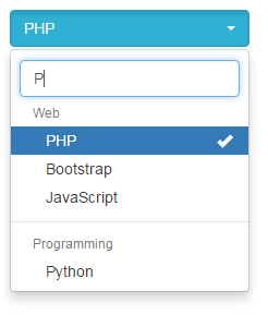
The code of the above example is changed slightly for the select tag as below:
<select class="selectpicker" data-style="btn-info" multiple data-max-options="3" data-live-search="true">

<optgroup label="Web">

<option>PHP</option>

<option>CSS</option>

<option>HTML</option>

<option>CSS 3</option>

<option>Bootstrap</option>

<option>JavaScript</option>

</optgroup>

<optgroup label="Programming">

<option>Java</option>

<option>C#</option>

<option>Python</option>

</optgroup>

</select>
There are many other features that you should go through if you intend to use this plug-in.
Setting up Bootstrap-select plug-in
To set up the Bootstrap-select plug-in, follow these steps:
Step 1:
Add the Bootstrap CSS and JS libraries (That you should already have while working with the Bootstrap framework). If not these are CDN links:
<link rel=”stylesheet” href=”https://maxcdn.bootstrapcdn.com/bootstrap/3.3.4/css/bootstrap.min.css”>
<script src=”https://maxcdn.bootstrapcdn.com/bootstrap/3.3.4/js/bootstrap.min.js”></script>
Step 2:
You also have to include jQuery library for that (if not already using it):
<script src=”https://ajax.googleapis.com/ajax/libs/jquery/1.11.3/jquery.min.js”></script>
Step 3:
Include plug-in files in the head section of the page as well (available from CDN):
The CSS file:
<link rel=”stylesheet” href=”https://cdnjs.cloudflare.com/ajax/libs/bootstrap-select/1.7.5/css/bootstrap-select.min.css”>
The JS file:
<script src=”https://cdnjs.cloudflare.com/ajax/libs/bootstrap-select/1.7.5/js/bootstrap-select.min.js”></script>
So basically you need these two additional files if you are already using Bootstrap framework and jQuery. These are small in size, so worth trying it.
Step 4:
Start adding select tags with plug-in classes like shown in the above examples. For instance:
A select with multi-select option code
<select class="selectpicker" data-style="btn-primary" multiple data-max-options="2">

<option>PHP</option>

<option>CSS</option>

<option>HTML</option>

<option>CSS 3</option>

<option>Bootstrap</option>

<option>JavaScript</option>

</select>
Select with option groups
<select class="selectpicker" data-style="btn-danger" multiple data-max-options="3">

<optgroup label="Web">

<option>PHP</option>

<option>CSS</option>

<option>HTML</option>

<option>CSS 3</option>

<option>Bootstrap</option>

<option>JavaScript</option>

</optgroup>

<optgroup label="Programming">

<option>Java</option>

<option>C#</option>

<option>Python</option>

</optgroup>

</select>
Select with search
<select class="selectpicker" data-style="btn-info" multiple data-max-options="3" data-live-search="true">

<optgroup label="Web">

<option>PHP</option>

<option>CSS</option>

<option>HTML</option>

<option>CSS 3</option>

<option>Bootstrap</option>

<option>JavaScript</option>

</optgroup>

<optgroup label="Programming">

<option>Java</option>

<option>C#</option>

<option>Python</option>

</optgroup>

</select>
For more info and documentation go to the following link:
Credits and source: plug-in page in github