
Checkbox in Bootstrap framework
The Bootstrap framework has built-in classes to use checkboxes in the forms of your web pages. By using those classes, the checkbox will take the default style as well.
You may include Bootstrap checkbox in a form independently, just like ordinary HTML forms, and also include this in textboxes to add functionality like enable/disable a textbox.
In this tutorial, I will show you examples of using single and multiple checkboxes along with other possibilities in Bootstrap related to the checkbox.
Also available: Bootstrap 5 Checkbox
A demo to use Bootstrap 3 checkbox in a form
In this example, a checkbox is created in a simple form of Bootstrap. A form is basically a sign-in form where a user is given an option to “Remember me” by clicking the checkbox.
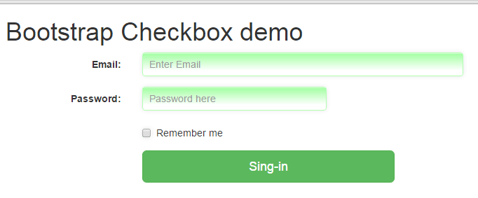
See online demo and code
In the code, you can see a checkbox is created by using the simple code:
<input type="checkbox"> Remember me
An example of multiple checkboxes
In this example, multiple checkboxes are created to allow users to make multiple selections.
The markup:
<!DOCTYPE html>
<html>
<head>
<link rel="stylesheet" href="https://maxcdn.bootstrapcdn.com/bootstrap/3.3.5/css/bootstrap.min.css" integrity="sha512-dTfge/zgoMYpP7QbHy4gWMEGsbsdZeCXz7irItjcC3sPUFtf0kuFbDz/ixG7ArTxmDjLXDmezHubeNikyKGVyQ==" crossorigin="anonymous">
<meta name="viewport" content="width=device-width, initial-scale=1.0">

</head>

<body>
<div class="container">
<form class="form-horizontal" role="form">
<h1>Choose expertise</h1>
<div class="checkbox">
<label>
<input type="checkbox" value="PHP">
PHP
</label>
</div>
<div class="checkbox">
<label>
<input type="checkbox" value="Java">
Java
</label>
</div>
<div class="checkbox">
<label>
<input type="checkbox" value="HTML">
HTML
</label>
</div>
<div class="checkbox">
<label>
<input type="checkbox" value="CSS">
CSS
</label>
</div>
<div class="checkbox disabled">
<label>
<input type="checkbox" value="Bootstrap" disabled>
Bootstrap
</label>
</div>
<div class="form-group">
<div class="col-sm-offset-2 col-sm-4">
<button type="submit" class="btn btn-lg btn-info">Save</button>
</div>
</div>
</form>
</div>
</body>
</html>
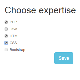
Multiple checkboxes are created by using the checkbox class in each div that contains checkboxes. The last checkbox is disabled.
In the active checkboxes, as you bring the mouse over the text or label, the hand icon will be shown. While in the “Bootstrap” checkbox, which is disabled, the ‘ban-circle’ icon is shown that represents it cannot be selected.
Inline Multiple checkboxes example
In this example of Bootstrap checkbox, I will use inline checkboxes rather than each at the new line (that I used in the above example).
Code:
<div class="container">
<h1>Choose expertise</h1>
<label class="checkbox-inline">
  <input type="checkbox" id="Check1" value="PHP"> PHP
</label>
<label class="checkbox-inline">
  <input type="checkbox" id="Check2" value="CSS"> CSS
</label>
<label class="checkbox-inline">
  <input type="checkbox" id="Check3" value="Java"> Java
</label>
<label class="checkbox-inline">
  <input type="checkbox" id="Check4" value="HTML"> HTML
</label>
<label class="checkbox-inline">
  <input type="checkbox" id="Check3" value="Bootstrap" disabled> Bootstrap
</label>
</div>
Output:
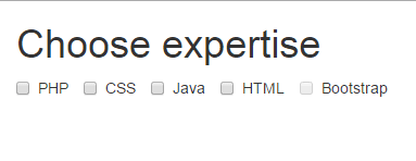
You can see in the output, the checkboxes are inline. This is done by using the class provided by Bootstrap: checkbox-inline.
The checkbox-inline class is used in the label tag for each checkbox. Just like in the above example, the first four checkboxes (PHP, CSS, Java and HTML) are enabled where the hand icon is shown as you bring the mouse over it. Whereas the last (Bootstrap checkbox) is disabled with a ban-circle icon.
Pretty looking checkboxes by Bootstrap
You may also apply customized styles in checkboxes as using the Bootstrap framework. For that, custom CSS can be designed, or available third party plug-ins can be used.
I will show you a few styles of designing checkboxes by a simple third party plug-in awesome-bootstrap-checkbox. It simply requires referring two CSS files in the head section where one is hosted at CDN and the second can be hosted at your own server.
Let me show you a few styles followed by step by step instructions to set up this.
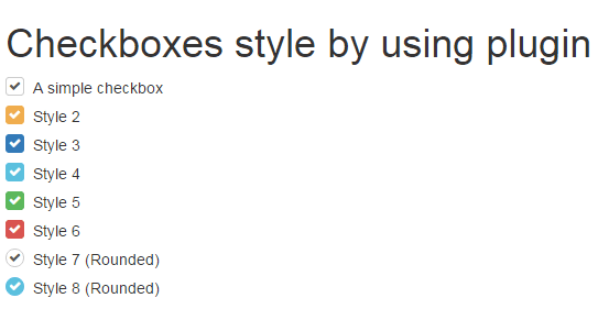
You can see a list of different styles that look nice by using the plug-in.
This is how you may set up this plug-in to create Bootstrap checkboxes:
Step 1:
Refer the font-awesome.min.css CSS file:
<link rel=”stylesheet” href=”//netdna.bootstrapcdn.com/font-awesome/4.2.0/css/font-awesome.min.css”>
Step 2:
Also, refer build.css file in the head section:
<link rel=”stylesheet” href=”build.css”>
You may get the style in the github website, here. This is a small file that you can host in your own server.
Step 3:
Refer classes in the input checkbox tag’s div elements. The class names match the pattern of Bootstrap style, for example:
checkbox-warning, checkbox-primary etc.
The complete code to create a checkbox can be:
<div class="checkbox checkbox-primary">

<input id="checkbox2" class="styled" type="checkbox" checked>

<label for="checkbox2">

Style 3

</label>

</div>
Another style:
               <div class="checkbox checkbox-info checkbox-circle">

<input id="checkbox2" class="styled" type="checkbox" checked>

<label for="checkbox2">

Style 8 (Rounded)

</label>

</div>
The complete code of example using different styles:
<!DOCTYPE html>
<html>
<head>
<link rel="stylesheet" href="//netdna.bootstrapcdn.com/bootstrap/3.3.0/css/bootstrap.min.css">
<link rel="stylesheet" href="//netdna.bootstrapcdn.com/font-awesome/4.2.0/css/font-awesome.min.css">
<link rel="stylesheet" href="build.css">


  <script src="bootstrap-checkbox.min.js" defer></script>
</head>

<body>
<div class="container">
<h1>Checkboxes style by using plugin</h1>
                    <div class="checkbox">
                        <input id="check1" type="checkbox" class="styled" checked>
                        <label for="check1">
                            A simple checkbox
                        </label>
                    </div>
                    <div class="checkbox checkbox-warning">
                        <input id="check2" type="checkbox" class="styled" checked>
                        <label for="check2">
                            Style 2
                        </label>
                    </div>

                    <div class="checkbox checkbox-primary">
                        <input id="check3" class="styled" type="checkbox" checked>
                        <label for="check3">
                            Style 3
                        </label>
                    </div>

                    <div class="checkbox checkbox-info">
                        <input id="check4" class="styled" type="checkbox" checked>
                        <label for="check4">
                            Style 4
                        </label>
                    </div>

                    <div class="checkbox checkbox-success">
                        <input id="check5" class="styled" type="checkbox" checked>
                        <label for="check5">
                            Style 5
                        </label>
                    </div>

                    <div class="checkbox checkbox-danger">
                        <input id="check6" class="styled" type="checkbox" checked>
                        <label for="check6">
                            Style 6
                        </label>
                    </div>

                    <div class="checkbox checkbox-circle">
                        <input id="check7" class="styled" type="checkbox" checked>
                        <label for="check7">
                            Style 7 (Rounded)
                        </label>
                    </div>
                    <div class="checkbox checkbox-info checkbox-circle">
                        <input id="check8" class="styled" type="checkbox" checked>
                        <label for="check8">
                            Style 8 (Rounded)
                        </label>
                    </div>

</div>


</body>
</html>
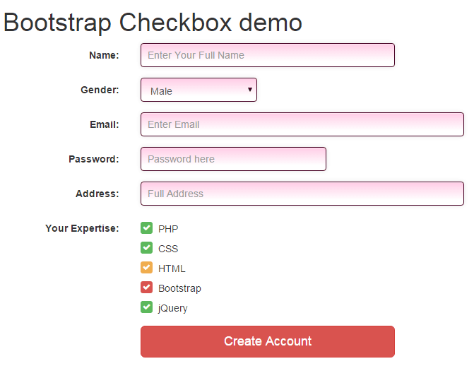
An example of using checkbox in a form
In this example, I will use a few above-created checkbox styles in a Bootstrap form. So checkbox code mixes up with some other controls of the form to show how it looks.
Complete markup with custom CSS
<!DOCTYPE html>
<html>
<head>
    <link rel="stylesheet" href="https://maxcdn.bootstrapcdn.com/bootstrap/3.3.5/css/bootstrap.min.css" integrity="sha512-dTfge/zgoMYpP7QbHy4gWMEGsbsdZeCXz7irItjcC3sPUFtf0kuFbDz/ixG7ArTxmDjLXDmezHubeNikyKGVyQ==" crossorigin="anonymous">
<link rel="stylesheet" href="//netdna.bootstrapcdn.com/bootstrap/3.3.0/css/bootstrap.min.css">
<link rel="stylesheet" href="//netdna.bootstrapcdn.com/font-awesome/4.2.0/css/font-awesome.min.css">
<link rel="stylesheet" href="build.css">

    <meta name="viewport" content="width=device-width, initial-scale=1.0">

<style>
.inputstl {
    padding: 9px;
    border: solid 1px #460023;
    outline: 0;
    background: -webkit-gradient(linear, left top, left 25, from(#FFFFFF), color-stop(4%, #FFCEE7), to(#FFFFFF));
    background: -moz-linear-gradient(top, #FFFFFF, #FFCEE7 1px, #FFFFFF 25px);
    box-shadow: rgba(0,0,0, 0.1) 0px 0px 8px;
    -moz-box-shadow: rgba(0,0,0, 0.1) 0px 0px 8px;
    -webkit-box-shadow: rgba(0,0,0, 0.1) 0px 0px 8px;

    }

</style>

</head>

<body>
<div class="container">
<h1>Bootstrap Checkbox demo</h1>
    <form class="form-horizontal" role="form">
      <div class="form-group">
        <label for="name1" class="col-sm-2 control-label">Name:</label>
        <div class="col-sm-4">
          <input type="email" class="form-control inputstl" id="name1" placeholder="Enter Your Full Name">
        </div>
      </div>
      <div class="form-group">
        <label for="gender1" class="col-sm-2 control-label">Gender:</label>
        <div class="col-sm-2">
        <select class="form-control inputstl" id="gender1">
          <option>Male</option>
          <option>Female</option>
        </select>

        </div>
      </div>
      <div class="form-group">
        <label for="email1" class="col-sm-2 control-label">Email:</label>
        <div class="col-sm-5">
          <input type="email" class="form-control inputstl" id="email1" placeholder="Enter Email">
        </div>
      </div>
      <div class="form-group">
        <label for="password1" class="col-sm-2 control-label">Password:</label>
        <div class="col-sm-3">
          <input type="password" class="form-control inputstl" id="password1" placeholder="Password here">
        </div>
      </div>
      <div class="form-group">
        <label for="address1" class="col-sm-2 control-label">Address:</label>
        <div class="col-sm-5">
          <input type="email" class="form-control inputstl" id="address1" placeholder="Full Address">
        </div>
      </div>

      <div class="form-group">
      <label for="Email1msg" class="col-sm-2 control-label">Your Expertise:</label>
        <div class="col-sm-5">

        <div class="checkbox checkbox-success">
              <input id="chkphp" class="styled" type="checkbox" checked>
                  <label for="chkphp">
                       PHP
                   </label>
        </div>
        <div class="checkbox checkbox-success">
              <input id="chkcss" class="styled" type="checkbox" checked>
                  <label for="chkcss">
                       CSS
                   </label>
        </div>
        <div class="checkbox checkbox-warning">
              <input id="chkhtml" class="styled" type="checkbox" checked>
                  <label for="chkhtml">
                       HTML
                   </label>
        </div>
        <div class="checkbox checkbox-danger">
              <input id="chkboot" class="styled" type="checkbox" checked>
                  <label for="chkboot">
                       Bootstrap
                   </label>
        </div>
        <div class="checkbox checkbox-success">
              <input id="chkjquery" class="styled" type="checkbox" checked>
                  <label for="chkjquery">
                       jQuery
                   </label>
        </div>


        </div>
      </div>
      <div class="form-group">
        <div class="col-sm-offset-2 col-sm-4">
          <button type="submit" class="btn btn-lg btn-block btn-danger">Create Account</button>
        </div>
      </div>
    </form>
   </div>
</body>
</html>
You can see in the figure, the form uses different controls including text boxes, select dropdown, and a few different styles of checkboxes. The checkboxes are using the awesome-bootstrap-checkbox add-on and you can see how it mixes up with other form elements.
In the head section, the dependency files are included. That is:
<link rel="stylesheet" href="//netdna.bootstrapcdn.com/font-awesome/4.2.0/css/font-awesome.min.css">

<link rel="stylesheet" href="build.css">
The head section also includes a custom CSS style which is applied to form controls.
Reference and credit for this section: Plug-in URL
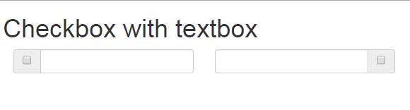
Attaching a checkbox to textbox example
You may attach a checkbox to a textbox by using built-in classes. This can be useful for different scenarios.
Code:
<div class="container">
<h1>Checkbox with textbox</h1>
<form class="form-horizontal" role="form">
  <div class="col-lg-3">
    <div class="input-group">
      <span class="input-group-addon">
        <input type="checkbox" aria-label="123">
      </span>
      <input type="text" class="form-control" aria-label="123">
    </div>
  </div>
  <div class="col-lg-3">
    <div class="input-group">
      <input type="text" class="form-control" aria-label="123">
      <span class="input-group-addon">
        <input type="checkbox" aria-label="123">
      </span>
   </div>
  </div>

</div>
You can see the figure or output of the above example that two textboxes are shown. A checkbox is attached to the left of checkbox while in the other textbox the checkbox is attached to the right side.
For that, the input-group-addon class is used in a span element that contains the checkbox.
If you add the textbox code before that span, the checkbox will be attached to the right side. While If the code is placed after the span element that contained checkbox code, the checkbox will be added to the left.
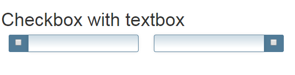
You may also add custom classes to style the textbox and span element that contains a checkbox. A demo is shown below:
Code with CSS:
<!DOCTYPE html>
<html>
<head>
    <link rel="stylesheet" href="https://maxcdn.bootstrapcdn.com/bootstrap/3.3.5/css/bootstrap.min.css" integrity="sha512-dTfge/zgoMYpP7QbHy4gWMEGsbsdZeCXz7irItjcC3sPUFtf0kuFbDz/ixG7ArTxmDjLXDmezHubeNikyKGVyQ==" crossorigin="anonymous">
    <meta name="viewport" content="width=device-width, initial-scale=1.0">
<style>
.inputstl {
    padding: 9px;
    border: solid 1px #517B97;
    outline: 0;
    background: -webkit-gradient(linear, left top, left 25, from(#FFFFFF), color-stop(4%, #CDDBE4), to(#FFFFFF));
    background: -moz-linear-gradient(top, #FFFFFF, #CDDBE4 1px, #FFFFFF 25px);
    box-shadow: rgba(0,0,0, 0.1) 0px 0px 8px;
    -moz-box-shadow: rgba(0,0,0, 0.1) 0px 0px 8px;
    -webkit-box-shadow: rgba(0,0,0, 0.1) 0px 0px 8px;

    }

.frspan {
    border: solid 1px #517B97;
    background: #517B97;
    }

</style>
</head>

<body>
<div class="container">
<h1>Checkbox with textbox</h1>
  <div class="col-lg-3">
    <div class="input-group">
      <span class="input-group-addon frspan">
        <input type="checkbox" aria-label="123">
      </span>
      <input type="text" class="form-control inputstl" aria-label="123">
    </div>
  </div>
  <div class="col-lg-3">
    <div class="input-group">
      <input type="text" class="form-control inputstl" aria-label="123">
      <span class="input-group-addon frspan">
        <input type="checkbox" aria-label="123">
      </span>
   </div>
  </div>

</div>

</body>
</html>
Following CSS classes are created, that you may change as per the need of the project.
For textbox:
.inputstl {

padding: 9px;

border: solid 1px #517B97;

outline: 0;

background: -webkit-gradient(linear, left top, left 25, from(#FFFFFF), color-stop(4%, #CDDBE4), to(#FFFFFF));

background: -moz-linear-gradient(top, #FFFFFF, #CDDBE4 1px, #FFFFFF 25px);

box-shadow: rgba(0,0,0, 0.1) 0px 0px 8px;

-moz-box-shadow: rgba(0,0,0, 0.1) 0px 0px 8px;

-webkit-box-shadow: rgba(0,0,0, 0.1) 0px 0px 8px;


}
For the span tag containing the checkbox:
.frspan {

border: solid 1px #517B97;

background: #517B97;

}
These classes are added in addition to the built-in classes in the input tag that creates a textbox and span tag.
Turn Bootstrap checkbox into switches
You may create beautiful switches based on the checkboxes that use Bootstrap classes along with jQuery. The good-looking switches can enhance the user experience and make your forms more interactive.
Have a look at a few demos of creating Bootstrap checkbox based switches. After that, you may also see the link for a detailed guide to set up on your website.
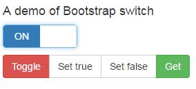
Demo 1: on/off switch
The on and off switch with options to get the current selected value of the checkbox. That is if checked or on, the true will return otherwise false:
Complete code:
Bootstrap Demo
Bootstrap Code		Output
<!DOCTYPE html>
<html>
<head>

<link rel="stylesheet" href="https://netdna.bootstrapcdn.com/bootstrap/3.3.4/css/bootstrap.min.css">
    <link href="css/bootstrap-switch/bootstrap-switch.css" rel="stylesheet">
</head>

<body>

    <main id="content" role="main">

      <div class="container">
        <div class="row">
          <div class="col-sm-6 col-lg-4">
            <h2 class="h4">A demo of Bootstrap switch</h2>
            <p>
              <input id="switch-state" type="checkbox" checked>
            </p>
            <div class="btn-group">
              <button type="button" data-switch-toggle="state" class="btn btn-danger">Toggle</button>
              <button type="button" data-switch-set="state" data-switch-value="true" class="btn btn-default">Set true</button>
              <button type="button" data-switch-set="state" data-switch-value="false" class="btn btn-default">Set false</button>
              <button type="button" data-switch-get="state" class="btn btn-success">Get</button>
            </div>
          </div>

        </div>
      </div>
    </main>


<script src="https://ajax.googleapis.com/ajax/libs/jquery/1.11.1/jquery.min.js"></script>
<script src="https://maxcdn.bootstrapcdn.com/bootstrap/3.3.6/js/bootstrap.min.js"></script>
    <script src="js/bootstrap-switch/highlight.js"></script>
    <script src="js/bootstrap-switch/bootstrap-switch.js"></script>
    <script src="js/bootstrap-switch/main.js"></script>
</body>
</html>


A demo of Bootstrap switch
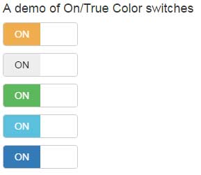
Demo 2: Various color switches using checkboxes
Create pre-defined themes switches as you generally use for other Bootstrap components like buttons. Have a look:
Complete code:
<!DOCTYPE html>
<html>
<head>

<link rel="stylesheet" href="https://netdna.bootstrapcdn.com/bootstrap/3.3.4/css/bootstrap.min.css">
<link href="css/bootstrap-switch/bootstrap-switch.css" rel="stylesheet">

</head>

<body>

    <main id="content" role="main">

      <div class="container">
        <div class="row">
          <div class="col-sm-6 col-lg-4">
            <h2 class="h4">A demo of On/True Color switches</h2>
            <p>
              <input id="switch-onColor" type="checkbox" checked data-on-color="warning">
            </p>
            <p>
              <input id="switch-onColor" type="checkbox" checked data-on-color="default">
            </p>
            <p>
              <input id="switch-onColor" type="checkbox" checked data-on-color="success">
            </p>
            <p>
              <input id="switch-onColor" type="checkbox" checked data-on-color="info">
            </p>
            <p>
              <input id="switch-onColor" type="checkbox" checked data-on-color="primary">
            </p>
          </div>

        </div>
      </div>
    </main>


<script src="https://ajax.googleapis.com/ajax/libs/jquery/1.11.1/jquery.min.js"></script>
<script src="https://maxcdn.bootstrapcdn.com/bootstrap/3.3.6/js/bootstrap.min.js"></script>
    <script src="js/bootstrap-switch/highlight.js"></script>
    <script src="js/bootstrap-switch/bootstrap-switch.js"></script>
    <script src="js/bootstrap-switch/main.js"></script>
</body>
</html>
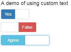
Using other text than On/Off
Of course, you may set the text as per the context of your form. For example, a checkbox Bootstrap switch for True/False or Agree/Do not agree, etc.:
Code:
<!DOCTYPE html>
<html>
<head>

<link rel="stylesheet" href="https://netdna.bootstrapcdn.com/bootstrap/3.3.4/css/bootstrap.min.css">
<link href="css/bootstrap-switch/bootstrap-switch.css" rel="stylesheet">

</head>

<body>

    <main id="content" role="main">

      <div class="container">
        <div class="row">
          <div class="col-sm-6 col-lg-4">
            <h2 class="h4">A demo of using custom text</h2>
            <p>
              <input id="bootswitch-text1" type="checkbox"  data-on-color="primary" data-off-color="warning" data-on-text="Yes" data-off-text="No">
            </p>
            <p>
              <input id="bootswitch-text2" type="checkbox"  data-on-color="success" data-off-color="danger" data-on-text="True" data-off-text="False">
            </p>
            <p>
              <input id="bootswitch-text3" type="checkbox"  data-on-color="info" data-off-color="success" data-on-text="Agree" data-off-text="Disagree">
            </p>
          </div>

        </div>
      </div>
    </main>


<script src="https://ajax.googleapis.com/ajax/libs/jquery/1.11.1/jquery.min.js"></script>
<script src="https://maxcdn.bootstrapcdn.com/bootstrap/3.3.6/js/bootstrap.min.js"></script>
    <script src="js/bootstrap-switch/highlight.js"></script>
    <script src="js/bootstrap-switch/bootstrap-switch.js"></script>
    <script src="js/bootstrap-switch/main.js"></script>
</body>
</html>
Similarly, you may create different-sized switches, setting different colors for On/Off states, and use other options. I have written a detailed guide about this awesome checkbox based switches.
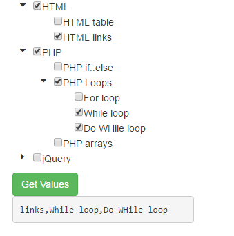
Using checkboxes in Bootstrap with treeview
The next demo is another nice plug-in that is based on jQuery and uses Bootstrap framework. It enables creating treeview with as many options/choices or values as you require. Against, each value or option, a checkbox is given.
You may see the demo by clicking the link below:
Compete code:
<!DOCTYPE html>
<html>
<head>

        <link type="text/css" rel="stylesheet" href="//cdnjs.cloudflare.com/ajax/libs/font-awesome/4.5.0/css/font-awesome.min.css" />
</head>
<body>
<div class="container">
<div class="row">
    <div class="col-md-6">
      <div id="treeview-checkbox-demo">
            <ul>
                <li>HTML
                <ul>
                        <li data-value="table">HTML table</li>
                        <li data-value="links">HTML links</li>
                 </ul>
                </li>
                <li>PHP
                    <ul>
                        <li data-value="PHP if..else">PHP if..else</li>
                        <li>PHP Loops
                            <ul>
                                <li data-value="For loop">For loop</li>
                                <li data-value="While loop">While loop</li>
                                <li data-value="Do WHile loop">Do WHile loop</li>
                            </ul>
                        </li>
                        <li>PHP arrays</li>
                    </ul>
                </li>
                <li>jQuery
                    <ul>
                        <li data-value="jQuery append">jQuery append</li>
                        <li data-value="jQuery prepend">jQuery prepend</li>
                    </ul>
                </li>
            </ul>
        </div>
        <button type="button" class="btn btn-success" id="show-values">Get Values</button>
        <pre id="values"></pre>
   </div>
  </div>
 </div>
        <script src="//cdnjs.cloudflare.com/ajax/libs/jquery/2.2.0/jquery.min.js"></script>
        <script src="//cdnjs.cloudflare.com/ajax/libs/twitter-bootstrap/3.3.6/js/bootstrap.min.js"></script>
        <script src="js/jquery-treeview/logger.js"></script>
        <script src="js/jquery-treeview/treeview.js"></script>

        <script>
            $('#treeview-checkbox-demo').treeview({
                debug : true,
                data : ['links', 'Do WHile loop']
            });
            $('#show-values').on('click', function(){
                $('#values').text(
                    $('#treeview-checkbox-demo').treeview('selectedValues')
                );
            });
        </script>
</body>
</html>
For details and how to set up this on your website, follow this link: treeview with checkboxes.
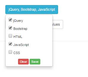
Create select dropdown with checkboxes in Bootstrap with jQuery
The following demo shows using the select dropdown with checkboxes so that with each option in the select, a checkbox is attached to it. All the selected options appear on top:
Code:
<!DOCTYPE html>
<html>
<head>
    <script src="//ajax.googleapis.com/ajax/libs/jquery/1.11.2/jquery.min.js"></script>
    <link rel="stylesheet" href="//maxcdn.bootstrapcdn.com/bootstrap/3.3.2/css/bootstrap.min.css">
    <link rel="stylesheet" href="css/dropdownCheckboxes/dropdownCheckboxes.min.css">
<style>
h2{
    color: #fff;
}
</style>
</head>
<body>
    <div class='container'>

      <h1>dropdown-checkboxes</h1><BR>

      <form class='myform'>

      <div class="dropdown cq-dropdown" data-name='statuses'>
        <button class="btn btn-info btn-sm dropdown-toggle" type="button" id="btndropdown" data-toggle="dropdown" aria-haspopup="true" aria-expanded="true">
          Your Expertise
          <span class="caret"></span>
        </button>
        <ul class="dropdown-menu" aria-labelledby="btndropdown">
          <li>
              <label class="radio-btn">
                  <input type="checkbox" value='jQuery' checked>
                  jQuery
              </label>
          </li>
          <li>
              <label class="radio-btn">
                  <input type="checkbox" value='Bootstrap'>
                  Bootstrap
              </label>
          </li>
          <li>
              <label class="radio-btn">
                  <input type="checkbox" value='HTML'>
                  HTML
              </label>
          </li>
          <li>
              <label class="radio-btn">
                  <input type="checkbox" value='JavaScript' checked>
                  JavaScript
              </label>
          </li>
          <li>
              <label class="radio-btn">
                  <input type="checkbox" value='CSS' checked>
                  CSS
              </label>
          </li>
          <li class='text-center'>
              <button type='button' class='btn btn-xs btn-danger clear close-dropdown' value='Clear'>Clear</button>
              <button type='button' class='btn btn-xs btn-success save' value='Save'>Save</button>
          </li>
        </ul>
      </div>

      <BR>


      </form>

      <button type='button' class='btn btn-default btn-sm' onClick=" console.log( $('.myform').serialize() ) ">
        Console log current form values
      </button>

    </div>

    <BR><HR>

    </div>
    <script>
    $(function(){
      $('.cq-dropdown').dropdownCheckboxes();
    });
    </script>
    <script src="js/dropdownCheckboxes/dropdownCheckboxes.min.js"></script>
    <script src="//maxcdn.bootstrapcdn.com/bootstrap/3.3.2/js/bootstrap.min.js"></script>


</body>
</html>
To learn more about this, visit this tutorial: dropdown with checkboxes.