
The Bootstrap 4 dropdown component may contain the list of links and more that can be used as contextual menus, in navbars, etc. The dropdown menu can be opened by clicking on a button or link (also split buttons) and these are toggleable.
An example of contextual menu usage can be using the dropdown menu in a textarea with different editing options. Similarly, using this in an editable table for adding/deleting or updating records.
In the navbars, the dropdowns can be used for containing a list of links for certain categories etc. See the following section for learning how to create the dropdown component independently and in other components in Bootstrap 4.
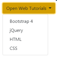
Let me start with a simple example of creating a dropdown by using a <button> tag with .btn and a contextual class.
The button is toggleable and as you click this, it will open the list of links. First, have a look at the demo and I will explain how it worked:
Complete markup for this example:
<!DOCTYPE html>
<html>
<head>
<link rel="stylesheet" href="https://maxcdn.bootstrapcdn.com/bootstrap/4.0.0-beta.3/css/bootstrap.min.css" integrity="sha384-Zug+QiDoJOrZ5t4lssLdxGhVrurbmBWopoEl+M6BdEfwnCJZtKxi1KgxUyJq13dy" crossorigin="anonymous">
<script src="https://ajax.googleapis.com/ajax/libs/jquery/3.2.1/jquery.min.js"></script>
<script src="https://cdnjs.cloudflare.com/ajax/libs/popper.js/1.12.6/umd/popper.min.js"></script>
<script src="https://maxcdn.bootstrapcdn.com/bootstrap/4.0.0-beta.3/js/bootstrap.min.js"></script>
</head>
<body>
<div class="container">
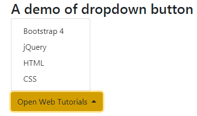
<h3>A demo of dropdown button</h3>
<div class="dropdown">
<button class="btn btn-warning dropdown-toggle" type="button" id="btnDropdownDemo" data-toggle="dropdown" aria-haspopup="true" aria-expanded="false">
Open Web Tutorials
</button>
<div class="dropdown-menu" aria-labelledby="btnDropdownDemo">
<a class="dropdown-item" href="https://www.jquery-az.com/bootstrap-4/">Bootstrap 4</a>
<a class="dropdown-item" href="https://www.jquery-az.com/jquery-tips/">jQuery</a>
<a class="dropdown-item" href="https://www.jquery-az.com/html-tutorials/">HTML</a>
<a class="dropdown-item" href="https://www.jquery-az.com/css-tutorials/">CSS</a>
</div>
</div>
</div>
</body>
</html>
So, how does this example work?
First of all, you need to include the Bootstrap CSS, jQuery, popper.js, and Bootstrap JS files. If you have worked with previous versions of Bootstrap (or specifically Bootstrap 3 dropdowns) then you are already familiar with three file inclusion except for the Popper.js (or Popper.min.js).
You may see all CDN links in the <head> section of the example page.
In the markup section, a <div> is given the .dropdown class that contains button and links markup.
The button is created by the standard .btn class along with the contextual class and .dropdown-toggle class. The last class adds an arrow in the button. If you omit this, the dropdown still works.
Besides, you can also see three data attributes in the <button> i.e. data-toggle=”dropdown”, aria-haspopup=”true” and aria-expanded=”false”.
Next <div> is given the .dropdown-menu class that contains links for the button dropdown menu. This <div> is linked by aria-labelledby which value is equal to the ID of the button.
The <a> tags are given the .dropdown-item item class.
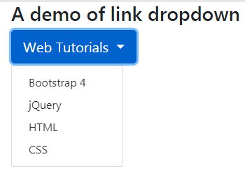
The example of link dropdown
As mentioned earlier, you may also create a link dropdown rather than a button. See the example below with the code:
The HTML code:
<div class="container">

<h3>A demo of link dropdown</h3>

<div class="dropdown ">

  <a class="btn btn-primary btn-lg dropdown-toggle" href="#" role="button" id="LinkDropdownDemo" data-toggle="dropdown" aria-haspopup="true" aria-expanded="false">

    Web Tutorials

  </a>

  <div class="dropdown-menu" aria-labelledby="LinkDropdownDemo">

    <a class="dropdown-item" href="https://www.jquery-az.com/bootstrap-4/">Bootstrap 4</a>

    <a class="dropdown-item" href="https://www.jquery-az.com/jquery-tips/">jQuery</a>

    <a class="dropdown-item" href="https://www.jquery-az.com/html-tutorials/">HTML</a>

    <a class="dropdown-item" href="https://www.jquery-az.com/css-tutorials/">CSS</a>

  </div>

</div>

</div>
By default, as you click the button or link dropdown, the menu opens in downward direction. You may also open this in other directions.
For that, simply add the .dropup class in the main div element that contains button.
Only this line of code is changed than the first dropdown menu example:
<div class=”dropdown dropup”>
Similarly, you may open the menu towards the left or right by using dropleft and dropright classes, respectively. The above markup will be:
For left drop:
<div class=”dropdown dropleft”>
For right drop:
<div class=”dropdown dropright”>
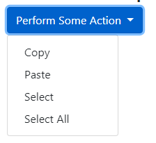
This is another difference between the Bootstrap 3 dropdowns that version 4 allows using the <button> tags for creating menu items rather than just the link <a> tags as used in above examples.
In the following examples, the <button> tags are used as link items markup:
The example markup:
<div class="dropdown">

  <button class="btn btn-primary dropdown-toggle" type="button" id="btnItemsDemo" data-toggle="dropdown" aria-haspopup="true" aria-expanded="false">

    Perform Some Action

  </button>

  <div class="dropdown-menu" aria-labelledby="btnItemsDemo">

    <button class="dropdown-item" type="button">Copy</button>

    <button class="dropdown-item" type="button">Paste</button>

    <button class="dropdown-item" type="button">Select</button>

    <button class="dropdown-item" type="button">Select All</button>

  </div>

</div>
You may also create a split button dropdown by using another <button> and specifying .dropdown-toggle-split class.
In this example, the dropdown opens as you click on the split button (the button towards the right with an arrow) while the first button is given the caption.
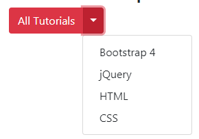
The code:
<div class="container">

<h3>A demo of split button dropdown</h3>

<div class="btn-group">

  <button type="button" class="btn btn-danger">All Tutorials</button>

  <button type="button" class="btn btn-danger dropdown-toggle dropdown-toggle-split" data-toggle="dropdown" aria-haspopup="true" aria-expanded="false">

    <span class="sr-only">Toggle</span>

  </button>

  <div class="dropdown-menu" aria-labelledby="btnDropdownDemo">

    <a class="dropdown-item" href="https://www.jquery-az.com/bootstrap-4/">Bootstrap 4</a>

    <a class="dropdown-item" href="https://www.jquery-az.com/jquery-tips/">jQuery</a>

    <a class="dropdown-item" href="https://www.jquery-az.com/html-tutorials/">HTML</a>

    <a class="dropdown-item" href="https://www.jquery-az.com/css-tutorials/">CSS</a>

  </div>

</div>

</div>
You may also display the dropdown menu by using both buttons in case you are using a split button. In the above example, the dropdown menu opened for the right split button while nothing happened as you press the button with text.
In this example, both buttons display the dropdown menu:
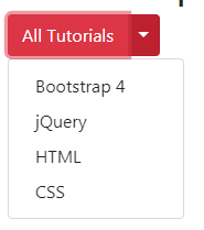
Online demo and code
Only this piece of code is added in the first button markup:
  <button type="button" class="btn btn-danger" data-toggle="dropdown" aria-haspopup="true" aria-expanded="false">All Tutorials</button>

  <button type="button" class="btn btn-danger dropdown-toggle dropdown-toggle-split" data-toggle="dropdown" aria-haspopup="true" aria-expanded="false">
See the complete code on the demo page.
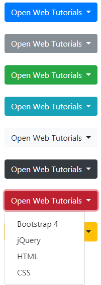
By using the contextual classes of the buttons in Bootstrap 4, you may create beautiful-looking dropdown buttons in various colors. The following built-in contextual classes can be used for styling the buttons:
- btn-primary
- btn-secondary
- btn-success
- btn-info
- btn-light
- btn-dark
- btn-danger
- btn-warning
See the following example where I used all these button contextual classes for creating the dropdowns:
Code
<body>
<div class="container">
<h3>A demo of dropdown button</h3>
<div class="dropdown">
  <button class="btn btn-primary dropdown-toggle" type="button" id="btnDropdownDemo" data-toggle="dropdown" aria-haspopup="true" aria-expanded="false">
    Open Web Tutorials
  </button>
  <div class="dropdown-menu" aria-labelledby="btnDropdownDemo">
    <a class="dropdown-item" href="https://www.jquery-az.com/bootstrap-4/">Bootstrap 4</a>
    <a class="dropdown-item" href="https://www.jquery-az.com/jquery-tips/">jQuery</a>
    <a class="dropdown-item" href="https://www.jquery-az.com/html-tutorials/">HTML</a>
    <a class="dropdown-item" href="https://www.jquery-az.com/css-tutorials/">CSS</a>
  </div>
</div>
<br />
<div class="dropdown">
  <button class="btn btn-secondary dropdown-toggle" type="button" id="btnDropdownDemo" data-toggle="dropdown" aria-haspopup="true" aria-expanded="false">
    Open Web Tutorials
  </button>
  <div class="dropdown-menu" aria-labelledby="btnDropdownDemo">
    <a class="dropdown-item" href="https://www.jquery-az.com/bootstrap-4/">Bootstrap 4</a>
    <a class="dropdown-item" href="https://www.jquery-az.com/jquery-tips/">jQuery</a>
    <a class="dropdown-item" href="https://www.jquery-az.com/html-tutorials/">HTML</a>
    <a class="dropdown-item" href="https://www.jquery-az.com/css-tutorials/">CSS</a>
  </div>
</div>

<br />
<div class="dropdown">
  <button class="btn btn-success dropdown-toggle" type="button" id="btnDropdownDemo" data-toggle="dropdown" aria-haspopup="true" aria-expanded="false">
    Open Web Tutorials
  </button>
  <div class="dropdown-menu" aria-labelledby="btnDropdownDemo">
    <a class="dropdown-item" href="https://www.jquery-az.com/bootstrap-4/">Bootstrap 4</a>
    <a class="dropdown-item" href="https://www.jquery-az.com/jquery-tips/">jQuery</a>
    <a class="dropdown-item" href="https://www.jquery-az.com/html-tutorials/">HTML</a>
    <a class="dropdown-item" href="https://www.jquery-az.com/css-tutorials/">CSS</a>
  </div>
</div>

<br />

<div class="dropdown">
  <button class="btn btn-info dropdown-toggle" type="button" id="btnDropdownDemo" data-toggle="dropdown" aria-haspopup="true" aria-expanded="false">
    Open Web Tutorials
  </button>
  <div class="dropdown-menu" aria-labelledby="btnDropdownDemo">
    <a class="dropdown-item" href="https://www.jquery-az.com/bootstrap-4/">Bootstrap 4</a>
    <a class="dropdown-item" href="https://www.jquery-az.com/jquery-tips/">jQuery</a>
    <a class="dropdown-item" href="https://www.jquery-az.com/html-tutorials/">HTML</a>
    <a class="dropdown-item" href="https://www.jquery-az.com/css-tutorials/">CSS</a>
  </div>
</div>
<br />

<div class="dropdown">
  <button class="btn btn-light dropdown-toggle" type="button" id="btnDropdownDemo" data-toggle="dropdown" aria-haspopup="true" aria-expanded="false">
    Open Web Tutorials
  </button>
  <div class="dropdown-menu" aria-labelledby="btnDropdownDemo">
    <a class="dropdown-item" href="https://www.jquery-az.com/bootstrap-4/">Bootstrap 4</a>
    <a class="dropdown-item" href="https://www.jquery-az.com/jquery-tips/">jQuery</a>
    <a class="dropdown-item" href="https://www.jquery-az.com/html-tutorials/">HTML</a>
    <a class="dropdown-item" href="https://www.jquery-az.com/css-tutorials/">CSS</a>
  </div>
</div>
<br />
<div class="dropdown">
  <button class="btn btn-dark dropdown-toggle" type="button" id="btnDropdownDemo" data-toggle="dropdown" aria-haspopup="true" aria-expanded="false">
    Open Web Tutorials
  </button>
  <div class="dropdown-menu" aria-labelledby="btnDropdownDemo">
    <a class="dropdown-item" href="https://www.jquery-az.com/bootstrap-4/">Bootstrap 4</a>
    <a class="dropdown-item" href="https://www.jquery-az.com/jquery-tips/">jQuery</a>
    <a class="dropdown-item" href="https://www.jquery-az.com/html-tutorials/">HTML</a>
    <a class="dropdown-item" href="https://www.jquery-az.com/css-tutorials/">CSS</a>
  </div>
</div>
<br />
<div class="dropdown">
  <button class="btn btn-danger dropdown-toggle" type="button" id="btnDropdownDemo" data-toggle="dropdown" aria-haspopup="true" aria-expanded="false">
    Open Web Tutorials
  </button>
  <div class="dropdown-menu" aria-labelledby="btnDropdownDemo">
    <a class="dropdown-item" href="https://www.jquery-az.com/bootstrap-4/">Bootstrap 4</a>
    <a class="dropdown-item" href="https://www.jquery-az.com/jquery-tips/">jQuery</a>
    <a class="dropdown-item" href="https://www.jquery-az.com/html-tutorials/">HTML</a>
    <a class="dropdown-item" href="https://www.jquery-az.com/css-tutorials/">CSS</a>
  </div>
</div>
<br />
<div class="dropdown">
  <button class="btn btn-warning dropdown-toggle" type="button" id="btnDropdownDemo" data-toggle="dropdown" aria-haspopup="true" aria-expanded="false">
    Open Web Tutorials
  </button>
  <div class="dropdown-menu" aria-labelledby="btnDropdownDemo">
    <a class="dropdown-item" href="https://www.jquery-az.com/bootstrap-4/">Bootstrap 4</a>
    <a class="dropdown-item" href="https://www.jquery-az.com/jquery-tips/">jQuery</a>
    <a class="dropdown-item" href="https://www.jquery-az.com/html-tutorials/">HTML</a>
    <a class="dropdown-item" href="https://www.jquery-az.com/css-tutorials/">CSS</a>
  </div>
</div>

</div>

</body>
Similarly, you may use the .outline classes of the buttons for creating dropdowns without background colors initially. These are buttons with bordered style and as you bring the mouse over, it displays the context background color.
The following outline classes can be used that are built-in in Bootstrap 4:
- btn-outline-warning
- btn-outline-danger
- btn-outline-dark
- btn-outline-light
- btn-outline-info
- btn-outline-success
- btn-outline-secondary
- btn-outline-primary
Have a look at this demo where I used all these classes:
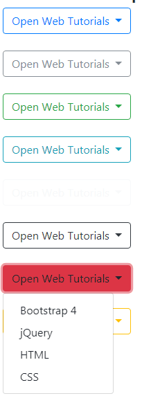
The example markup for .btn-outline-danger class:
<div class="dropdown">

  <button class="btn btn-outline-danger dropdown-toggle" type="button" id="btnDropdownDemo" data-toggle="dropdown" aria-haspopup="true" aria-expanded="false">

    Open Web Tutorials

  </button>

  <div class="dropdown-menu" aria-labelledby="btnDropdownDemo">

    <a class="dropdown-item" href="https://www.jquery-az.com/bootstrap-4/">Bootstrap 4</a>

    <a class="dropdown-item" href="https://www.jquery-az.com/jquery-tips/">jQuery</a>

    <a class="dropdown-item" href="https://www.jquery-az.com/html-tutorials/">HTML</a>

    <a class="dropdown-item" href="https://www.jquery-az.com/css-tutorials/">CSS</a>

  </div>

</div>
You may grab the complete code from the example page.
Now, see various combinations for the split button styles for dropdowns – all created by using built-in button classes.
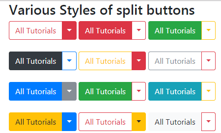
Online demo and code
Two of the button’s markup:
<div class="btn-group">

  <button type="button" class="btn btn-outline-danger">All Tutorials</button>

  <button type="button" class="btn btn-warning dropdown-toggle dropdown-toggle-split" data-toggle="dropdown" aria-haspopup="true" aria-expanded="false">

    <span class="sr-only">Toggle</span>

  </button>

</div>


<div class="btn-group">

  <button type="button" class="btn btn-light">All Tutorials</button>

  <button type="button" class="btn btn-outline-danger dropdown-toggle dropdown-toggle-split" data-toggle="dropdown" aria-haspopup="true" aria-expanded="false">

    <span class="sr-only">Toggle</span>

  </button>

</div>
See the code of all styles in the example page. Only first button’s code contains dropdown menu links.
Various size dropdown examples
Extending the above example, now see the various sizes of buttons – again by using the following built classes for buttons in BS4:
- btn-lg //for large size
- btn-sm //for small size
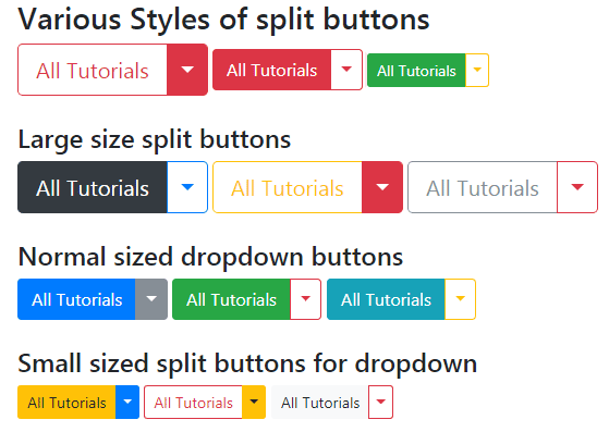
Online demo and code
The code of the first three buttons with all sizes:
<div class="btn-group">

  <button type="button" class="btn btn-outline-danger btn-lg" data-toggle="dropdown" aria-haspopup="true" aria-expanded="false">All Tutorials</button>

  <button type="button" class="btn btn-danger btn-lg dropdown-toggle dropdown-toggle-split" data-toggle="dropdown" aria-haspopup="true" aria-expanded="false">

    <span class="sr-only">Toggle</span>

  </button>

  <div class="dropdown-menu" aria-labelledby="btnDropdownDemo">

    <a class="dropdown-item" href="https://www.jquery-az.com/bootstrap-4/">Bootstrap 4</a>

    <a class="dropdown-item" href="https://www.jquery-az.com/jquery-tips/">jQuery</a>

    <a class="dropdown-item" href="https://www.jquery-az.com/html-tutorials/">HTML</a>

    <a class="dropdown-item" href="https://www.jquery-az.com/css-tutorials/">CSS</a>

  </div>

</div>

<div class="btn-group">

  <button type="button" class="btn btn-danger">All Tutorials</button>

  <button type="button" class="btn btn-outline-danger dropdown-toggle dropdown-toggle-split" data-toggle="dropdown" aria-haspopup="true" aria-expanded="false">

    <span class="sr-only">Toggle</span>

  </button>

</div>


<div class="btn-group">

  <button type="button" class="btn btn-success btn-sm">All Tutorials</button>

  <button type="button" class="btn btn-outline-warning btn-sm dropdown-toggle dropdown-toggle-split" data-toggle="dropdown" aria-haspopup="true" aria-expanded="false">

    <span class="sr-only">Toggle</span>

  </button>

</div>
See the code of all 12 buttons in the demo page’s code sections.
You may require differentiating certain menu items from the others. For that, you may use the .dropdown-divider class for adding a separator line:
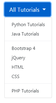
The markup for this demo:
<div class="dropdown">

  <button class="btn btn-primary btn-lg dropdown-toggle" type="button" id="btnDropdownDemo" data-toggle="dropdown" aria-haspopup="true" aria-expanded="false">

    All Tutorials

  </button>

  <div class="dropdown-menu" aria-labelledby="btnDropdownDemo">

    <a class="dropdown-item" href="https://www.jquery-az.com/python-tutorials/">Python Tutorials</a>

    <a class="dropdown-item" href="https://www.jquery-az.com/java-tutorials/">Java Tutorials</a>

    <div class="dropdown-divider"></div>

    <a class="dropdown-item" href="https://www.jquery-az.com/bootstrap-4/">Bootstrap 4</a>

    <a class="dropdown-item" href="https://www.jquery-az.com/jquery-tips/">jQuery</a>

    <a class="dropdown-item" href="https://www.jquery-az.com/html-tutorials/">HTML</a>

    <a class="dropdown-item" href="https://www.jquery-az.com/css-tutorials/">CSS</a>

    <div class="dropdown-divider"></div>

    <a class="dropdown-item" href="https://www.jquery-az.com/php-tutorials/">PHP Tutorials</a>

  </div>

</div>
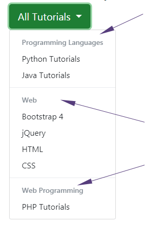
Use the .dropdown-header class for creating the headers in the menu:
See online demo and code
The markup for heading:
<h6 class=”dropdown-header”>Programming Languages</h6>
Complete code:
<div class="container">
<h3>A demo of dropdown button</h3>
<div class="dropdown">
  <button class="btn btn-success btn-lg dropdown-toggle" type="button" id="btnDropdownDemo" data-toggle="dropdown" aria-haspopup="true" aria-expanded="false">
    All Tutorials
  </button>
  <div class="dropdown-menu" aria-labelledby="btnDropdownDemo">
    <h6 class="dropdown-header">Programming Languages</h6>
    <a class="dropdown-item" href="https://www.jquery-az.com/python-tutorials/">Python Tutorials</a>
    <a class="dropdown-item" href="https://www.jquery-az.com/java-tutorials/">Java Tutorials</a>
    <div class="dropdown-divider"></div>
    <h6 class="dropdown-header">Web</h6>
    <a class="dropdown-item" href="https://www.jquery-az.com/bootstrap-4/">Bootstrap 4</a>
    <a class="dropdown-item" href="https://www.jquery-az.com/jquery-tips/">jQuery</a>
    <a class="dropdown-item" href="https://www.jquery-az.com/html-tutorials/">HTML</a>
    <a class="dropdown-item" href="https://www.jquery-az.com/css-tutorials/">CSS</a>
    <div class="dropdown-divider"></div>
    <h6 class="dropdown-header">Web Programming</h6>
    <a class="dropdown-item" href="https://www.jquery-az.com/php-tutorials/">PHP Tutorials</a>
  </div>
</div>
<br />

</div>

</body>
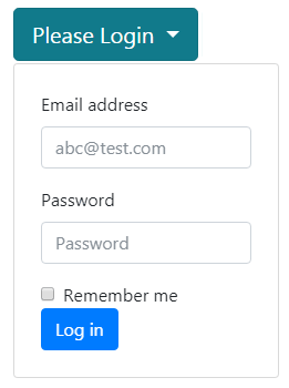
Display a form in dropdown
Well, you may virtually display any other content in the Bootstrap dropdown component. For example, display a form as the “Subscribe” button is pressed, otherwise, form is not visible.
In the following demo, a simple form is used that displays as the button is pressed:
See online demo and code
The code:
<div class="container">

<h3>A demo of form in dropdown</h3>

<div class="dropdown">

  <button class="btn btn-info btn-lg dropdown-toggle" type="button" id="btnDropdownDemo" data-toggle="dropdown" aria-haspopup="true" aria-expanded="false">

    Please Login

  </button>


<form class="dropdown-menu p-4">

  <div class="form-group">

    <label for="emailDropdown">Email address</label>

    <input type="email" class="form-control" id="emailDropdown" placeholder="abc@test.com">

  </div>

  <div class="form-group">

    <label for="passwordDropdown">Password</label>

    <input type="password" class="form-control" id="passwordDropdown" placeholder="Password">

  </div>

  <div class="form-check">

    <input type="checkbox" class="form-check-input" id="rememDemo">

    <label class="form-check-label" for="rememDemo">

      Remember me

    </label>

  </div>

  <button type="submit" class="btn btn-primary">Log in</button>

</form>

  </div>

</div>

</div>
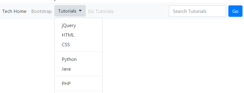
The following example uses button dropdown in the navigation bar. You may copy the code from the below and paste into your IDE and run it on your own system for full screen view.
The code:
<!DOCTYPE html>
<html>
<head>
<link rel="stylesheet" href="https://maxcdn.bootstrapcdn.com/bootstrap/4.0.0-beta.3/css/bootstrap.min.css" integrity="sha384-Zug+QiDoJOrZ5t4lssLdxGhVrurbmBWopoEl+M6BdEfwnCJZtKxi1KgxUyJq13dy" crossorigin="anonymous">

  <script src="https://ajax.googleapis.com/ajax/libs/jquery/3.2.1/jquery.min.js"></script>
  <script src="https://cdnjs.cloudflare.com/ajax/libs/popper.js/1.12.6/umd/popper.min.js"></script>
  <script src="https://maxcdn.bootstrapcdn.com/bootstrap/4.0.0-beta.3/js/bootstrap.min.js"></script>
</head>
<body>
<div class="container">
<h3>A demo of dropdown in navbar</h3>
<nav class="navbar navbar-expand-lg navbar-light bg-light">
  <a class="navbar-brand" href="#">Business</a>
  <button class="navbar-toggler" type="button" data-toggle="collapse" data-target="#navbarSupportedContent" aria-controls="navbarSupportedContent" aria-expanded="false" aria-label="Toggle navigation">
    <span class="navbar-toggler-icon"></span>
  </button>

  <div class="collapse navbar-collapse" id="navbarSupportedContent">
    <ul class="navbar-nav mr-auto">
      <li class="nav-item active">
        <a class="nav-link" href="#">Tech Home <span class="sr-only">(current)</span></a>
      </li>
      <li class="nav-item">
        <a class="nav-link" href="https://www.jquery-az.com/bootstrap-tips-tutorials/">Bootstrap</a>
      </li>
      <li class="nav-item dropdown">
  <button class="btn btn-light dropdown-toggle" type="button" id="btnDropdownDemo" data-toggle="dropdown" aria-haspopup="true" aria-expanded="false">
    Tutorials
  </button>
        <div class="dropdown-menu" aria-labelledby="navbarDropdown">
          <a class="dropdown-item" href="https://www.jquery-az.com/jquery-tips/">jQuery</a>
          <a class="dropdown-item" href="https://www.jquery-az.com/html-tutorials/">HTML</a>
          <a class="dropdown-item" href="#">CSS</a>
          <div class="dropdown-divider"></div>
          <a class="dropdown-item" href="https://www.jquery-az.com/python-tutorials/">Python</a>
          <a class="dropdown-item" href="https://www.jquery-az.com/java-tutorials/">Java</a>
          <div class="dropdown-divider"></div>
          <a class="dropdown-item" href="https://www.jquery-az.com/php-tutorials/">PHP</a>
          <div class="dropdown-divider"></div>
          <a class="dropdown-item" href="https://www.jquery-az.com/vba-excel-tutorials/">Excel</a>

        </div>
      </li>
      <li class="nav-item">
        <a class="nav-link disabled" href="#">Go Tutorials</a>
      </li>
    </ul>
    <form class="form-inline my-2 my-lg-0">
      <input class="form-control mr-sm-2" type="search" placeholder="Search Tutorials" aria-label="Search">
      <button class="btn btn-primary my-2 my-sm-0" type="submit">Go</button>
    </form>
  </div>
</nav>

</div>

</body>
</html>