
The alerts in Bootstrap
The alerts classes of Bootstrap allow you to create contextual error, warning, info, and dangerous action alerts. Unlike typical JavaScript alerts, these are not modal like alerts, instead, the users may keep on interacting with other parts of the website.
By using third party plug-ins, you may also create fancy and attractive Bootstrap alerts that may act as a replacement of simple JavaScript alerts.
I will show you creating contextual alerts by using built-in Bootstrap classes along with using different plug-ins to create alerts while using Bootstrap framework.
A demo of alerts by using Bootstrap classes
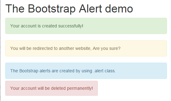
By using .alert built-in class in an element like <div>, <p>, <span> etc. you can create contextual alerts in Bootstrap. To give it specific look, for example, if notifying a user for deleting an account permanently, you can use .alert-danger class along with the .alert class.
Similarly, for showing a success message after performing some action, use alert alert-success classes in that element.
See the following demo’s output with available classes to create contextual alerts:
Complete code:
<!DOCTYPE html>
<html>
<head>
<link rel="stylesheet" href="https://maxcdn.bootstrapcdn.com/bootstrap/3.3.6/css/bootstrap.min.css" integrity="sha384-1q8mTJOASx8j1Au+a5WDVnPi2lkFfwwEAa8hDDdjZlpLegxhjVME1fgjWPGmkzs7" crossorigin="anonymous">
</head>

<body>
<div class="container">
<h1>The Bootstrap Alert demo</h1>

    <p class="alert alert-success">Your account is created successfully!</p>
    <div class="alert alert-warning">You will be redirected to another website, Are you sure?</div>
    <div class="alert alert-info">The Bootstrap alerts are created by using .alert class.</div>
    <span class="alert alert-danger">Your account will be deleted permanently!</span>
</div>
</body>
</html>
In the code above, you can see I created four Bootstrap alerts by using <p>, <div>, and <span> tags where I used the main .alert class along with a class related to the message’s nature:
Alerts in Bootstrap with close option
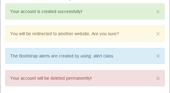
The alerts in the above demo are not dismissible or give an option to the user or close it. You may add a close button by using .alert-dismissible class along with adding a button, as shown in the example below:

BS 3 code:
<!DOCTYPE html>
<html>
<head>
    <link rel="stylesheet" href="https://maxcdn.bootstrapcdn.com/bootstrap/3.3.6/css/bootstrap.min.css" integrity="sha384-1q8mTJOASx8j1Au+a5WDVnPi2lkFfwwEAa8hDDdjZlpLegxhjVME1fgjWPGmkzs7" crossorigin="anonymous">
    <script src="https://ajax.googleapis.com/ajax/libs/jquery/1.11.3/jquery.min.js"></script>
    <script src="https://netdna.bootstrapcdn.com/bootstrap/3.0.3/js/bootstrap.min.js"></script>
</head>

<body>
<div class="container">
<h1>The Bootstrap Alert demo</h1>

    <p class="alert alert-success alert-dismissible" role="alert" >
    <button type="button" class="close" data-dismiss="alert" aria-label="Close"><span aria-hidden="true">×</span></button>
    Your account is created successfully!</p>

    <div class="alert alert-warning alert-dismissible" role="alert">You will be redirected to another website, Are you sure?
        <button type="button" class="close" data-dismiss="alert" aria-label="Close"><span aria-hidden="true">×</span></button>
    </div>

    <div class="alert alert-info alert-dismissible" role="alert">The Bootstrap alerts are created by using .alert class.
        <button type="button" class="close" data-dismiss="alert" aria-label="Close"><span aria-hidden="true">×</span></button>
    </div>
    <div class="alert alert-danger alert-dismissible" role="alert">Your account will be deleted permanently!
        <button type="button" class="close" data-dismiss="alert" aria-label="Close"><span aria-hidden="true">×</span></button>
    </div>


</div>
</div>
</body>
</html>
In the demo, I extended above example and just added a close button option in each alert. To add button, the following code is used:
<div class="alert alert-warning alert-dismissible" role="alert">You will be redirected to another website, Are you sure? <button type="button" class="close" data-dismiss="alert" aria-label="Close"><span aria-hidden="true">×</span></button> </div>
A demo to close alert automatically with fade-out effect
In this demo, three alerts are visible as the web page loads. The first alert will be “closed’ with a fade-out effect in four seconds automatically. The third one will be closed as you click the “close” button with fade-out effect. See the demo and code online:
Online demo and code
The first alert is hidden by using this code placed in the <script> section just above the </body> tag:
$("#warnalert").fadeOut(4000 );
So it will hide automatically.
The third alert is associated with the click event of the button. As you click it, the alert will disappear with fading effect in two seconds by using this code:
$("#closealert").click(function(){

$("#dangeralert").fadeOut(2000 );

});
Following is the markup used to create Bootstrap alerts:
 <p class="alert alert-success" id="warnalert">This alert will be closed in four seconds automatically!</p>

<div class="alert alert-info">The Bootstrap alerts are created by using .alert class.</div>

<span class="alert alert-danger" id="dangeralert">Click the button to close this alert!</span>

<p><button type="button" id="closealert" class="btn btn-danger btn-lg">Close alert</button></p>
Note: You may also use the hide method of jQuery to close alerts without fading effect immediately.
A Bootstrap alert by using bootboxjs plug-in
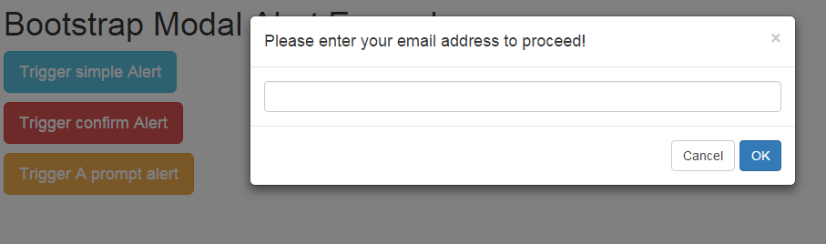
In this demo, I used bootbox.js plug-in to create three alerts. Basically, this plug-in uses the Bootstrap modal plug-in, so the alerts will not let you interact with other parts of the website unless some action is performed.
First, have a look at alerts by using this plug-in which is followed by its setting up guide.
See online demo and code
You can see that three Bootstrap buttons are created with three different alert types. The first one triggers a normal alert with a message. The following code is used for “Trigger simple alert” button:
$(document).on("click", "#bootalert", function(e) {

bootbox.alert("Your account has been created!", function() {

});

});
The second button, “Trigger confirm alert” fires the confirm alert that warns to look before proceeding. The user is given the option to press Ok or Cancel buttons. If you press Ok, another simple alert is shown that confirms the action is completed.
Pressing Cancel also triggers an alert for aborting the action. The following code is used to create a Bootstrap alert for confirmation:
$(document).on("click", "#confirmalert", function(e) {

bootbox.confirm("Your account will be deleted permanently, Are you sure?", function(result) {

if (result){

bootbox.alert("Your account is removed from our database!", function() {

});

}else{

bootbox.alert("Hurray, You saved your account!", function() {

});

}

});

});
The third button triggers a prompt Bootstrap alert. This alert type asks for the user input before proceeding to next step. For example, asking a user his/her name or email etc. This code is used for this alert:
$(document).on("click", "#promptalert", function(e) {

bootbox.prompt("Please enter your email address to proceed!", function(val) {

bootbox.alert("Following email is entered:" + val, function() {

});

});

});
In above example, the # bootalert, #confirmalert and #promptalert represent the button IDs. You can see the complete code in the demo page as well.
A demo to change the color of bootbox alert
As such, bootbox.js is using the bootstrap modal plug-in underneath: you may change the look and feel of these alerts by changing it CSS classes.
For example, the modal-header class to change the header of alerts, modal-body class to change the look and feel of the body, and so on.
The output and code is given below:
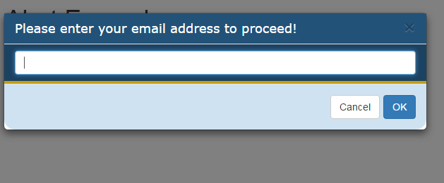
You can see the same set of alerts with different color schemes. Following CSS classes overridden the modal alert look and feel:
<style>

.modal-header {

background-color: #235278;

padding:9px 15px;

color:#FFF;

font-family:Verdana, sans-serif;

}

.modal-body {

background-color: #1C4262;

padding:9px 15px;

color:#fff;

font-family:Verdana, sans-serif;

border-bottom:4px solid #C49F0F;


}

.modal-footer {

background-color: #CFE2F1;

color:#FFF;

border-bottom-left-radius: 15px;

border-bottom-right-radius: 15px;

}

</style>
Note: You have to place this CSS after including the Bootstrap CSS.
Setting up Bootbox.js plugin
It is simple to use the bootbox.js plug-in. You simply need to down the bootbox.js file and place it at a directory of your choice. Refer it in the <head> section after the Bootstrap and jQuery libraries as shown below:
<link rel=”stylesheet” href=”https://maxcdn.bootstrapcdn.com/bootstrap/3.3.6/css/bootstrap.min.css” integrity=”sha384-1q8mTJOASx8j1Au+a5WDVnPi2lkFfwwEAa8hDDdjZlpLegxhjVME1fgjWPGmkzs7″ crossorigin=”anonymous”>
<script src=”https://ajax.googleapis.com/ajax/libs/jquery/1.11.3/jquery.min.js”></script>
<script src=”http://netdna.bootstrapcdn.com/bootstrap/3.0.3/js/bootstrap.min.js”></script>
<script src=”alert/bootbox.min.js”></script>
Start using bootbox to create alerts as shown in the demo.
Credits: You may download bootbox plug-in here.