
The dropdown component of Bootstrap Framework
The Bootstrap framework has built-in dropdown component and JS plug-in that can be used in navbars menus, pills, buttons, and even tabs quite easily.
You can use a dropdown to show contextual links in the menu bar or other parts of the website.
I will show you demos of using Bootstrap dropdown in different areas with default and custom color schemes. You can see/take the code and test it on your machine or experience demos online.
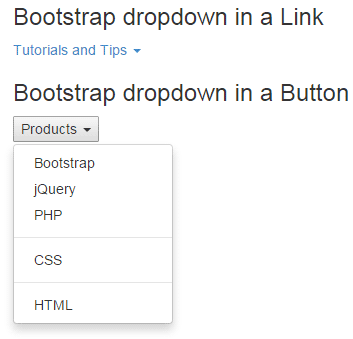
A simple example of using dropdown classes with HTML elements
Let me start with the basic HTML elements to show you how easy and flexible it is to create a Bootstrap dropdown. I will show you navbar, tabs, and other demos, however, this one is with a simple HTML button and link.
As you are already working on Bootstrap framework, so I am assuming you have included Bootstrap CSS and JS libraries in the <head> section. Otherwise, you simply need the dropdown.js component to be included (if you do not want complete JS library).
In the example, I simply used HTML button and anchor tag without any classes to create a dropdown menu. It is a series of <li> and <ul> tags to create menu items with divider classes.
The main <li> is given the required .dropdown class. The <ul> inside the <a> and <button> tags is given the dropdown-menu class, that are built-in classes in Framework.
Example code
<!DOCTYPE html>
<html>
<head>
    <link rel="stylesheet" href="//netdna.bootstrapcdn.com/bootstrap/3.1.1/css/bootstrap.min.css">
    <script src="https://ajax.googleapis.com/ajax/libs/jquery/1.10.2/jquery.min.js"></script>
    <script src="https://netdna.bootstrapcdn.com/bootstrap/3.0.3/js/bootstrap.min.js"></script>
    <meta name="viewport" content="width=device-width, initial-scale=1.0">
</head>

<body>
<div class="container">
<h3>Bootstrap dropdown in a Link</h3>
    <ul>
    <li class="dropdown" style="list-style: none;">
          <a href="#" class="dropdown-toggle" data-toggle="dropdown">Tutorials and Tips <b class="caret"></b></a>
          <ul class="dropdown-menu">
            <li><a href="https://www.jquery-az.com/bootstrap-tips-tutorials/">Bootstrap</a></li>
            <li><a href="https://www.jquery-az.com/jquery-tips/">jQuery</a></li>
            <li><a href="https://www.jquery-az.com/php-tutorials/">PHP</a></li>
            <li class="divider"></li>
            <li><a href="https://www.jquery-az.com/css-tutorials/">CSS</a></li>
            <li class="divider"></li>
            <li><a href="https://www.jquery-az.com/html-tutorials/">HTML</a></li>
          </ul>
    </li>
    </ul>
<h3>Bootstrap dropdown in a Button</h3>
    <ul>
    <li class="dropdown" style="list-style: none;">
          <button class="dropdown dropdown-toggle" data-toggle="dropdown">Products <b class="caret"></b></button>
          <ul class="dropdown-menu">
            <li><a href="https://www.jquery-az.com/bootstrap-tips-tutorials/">Bootstrap</a></li>
            <li><a href="https://www.jquery-az.com/jquery-tips/">jQuery</a></li>
            <li><a href="https://www.jquery-az.com/php-tutorials/">PHP</a></li>
            <li class="divider"></li>
            <li><a href="https://www.jquery-az.com/css-tutorials/">CSS</a></li>
            <li class="divider"></li>
            <li><a href="https://www.jquery-az.com/html-tutorials/">HTML</a></li>
          </ul>
    </li>
    </ul>
</div>
</body>
</html>
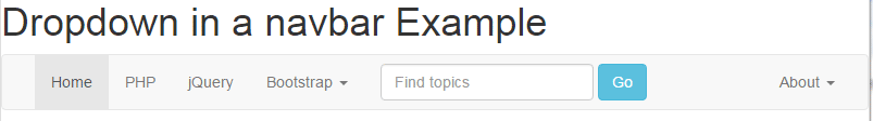
In the following example, the dropdown Bootstrap component is used in the navbar. I have used the default color scheme for both navbar and dropdown (see next example for a different color scheme).
Online demo and code
In the demo, you can see two dropdowns. One is at the center created with the following code:
       <!-- First dropdown menu here-->

<li class="dropdown">

<a href="https://www.jquery-az.com/bootstrap-tips-tutorials/" class="dropdown-toggle" data-toggle="dropdown" role="button" aria-haspopup="true" aria-expanded="false">Bootstrap <span class="caret"></span></a>

<ul class="dropdown-menu">

<li><a href="https://www.jquery-az.com/bootstrap-carousel-5-single-multiple-horizontal-and-vertical-sliding-demos/">Carousel</a></li>

<li><a href="https://www.jquery-az.com/bootstrap-form-customized-styles-6-online-examples/">Forms</a></li>

<li role="separator" class="divider"></li>

<li><a href="https://www.jquery-az.com/bootstrap-select-5-beautiful-styles/">Select</a></li>

</ul>

</li>

<!-- Dropdown ending here-->
While the second is at the right corner of the navbar. The complete code is given in the demo page.
In the following example, I will override the default CSS classes for navbar and dropdown inside the navbar to give it a custom look. Generally, this is required to match the design of your web page with the menu bars. Have a look at the demo online with description below:

Online demo and code
In the <head> section of code, you can see <style> with different classes. The .navbar-default is the default class name that specifies the color scheme of the navbar. This is a built-in class in Bootstrap CSS. By using navbar-default and its sub-classes for the navbar, you can change the color scheme or other properties of the navigation menu.
The <style> section contains many classes related to navbar, however, the classes dealing with dropdown menu are:
.navbar-default .navbar-nav > li > .dropdown-menu {

background-color: #69899f;

}

.navbar-default .navbar-nav > li > .dropdown-menu > li > a {

color: #d7e2e9;

}

.navbar-default .navbar-nav > li > .dropdown-menu > li > a:hover,

.navbar-default .navbar-nav > li > .dropdown-menu > li > a:focus {

color: #e5dbdb;

background-color: #425766;
You can change the text color, background properties, add radius etc. by using these classes.
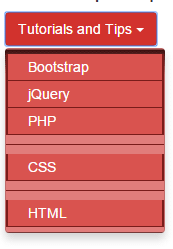
This time, the button is contained in a <div> tag rather <ul>. A Bootstrap button is created with btn btn-danger class along with dropdown related attributes. If you are initiating a dropdown by data attribute, then use data-toggle=”dropdown” in button tag.
Code:
<!DOCTYPE html>
<html>
<head>
    <link rel="stylesheet" href="//netdna.bootstrapcdn.com/bootstrap/3.1.1/css/bootstrap.min.css">
    <script src="https://ajax.googleapis.com/ajax/libs/jquery/1.10.2/jquery.min.js"></script>
    <script src="https://netdna.bootstrapcdn.com/bootstrap/3.0.3/js/bootstrap.min.js"></script>
    <meta name="viewport" content="width=device-width, initial-scale=1.0">

<style>
.dropdown-menu{

    background: -webkit-gradient(linear, left top, left 25, from(#E17D7B), color-stop(4%, #390E0D), to(#E17D7B));
    background: -moz-linear-gradient(top, #E17D7B, #390E0D 1px, #E17D7B 25px);
    color:white; }
.dropdown-menu li>a{
    color:#fff;
    }
.dropdown-menu>li{
    background:#D9534F;
    border-bottom:1px solid #791C1A;
    border-left:2px solid #791C1A;
    border-right:2px solid #791C1A;
    }
.dropdown-menu li>a:hover{
    background:#D9534F;
    }
.dropdown-menu > li > .divider {
    background-color: #D9534F;
    border:10px solid #791C1A;
}
</style>

</head>

<body>
<div class="container">
<h3>Bootstrap dropdown in a Button</h3>
<div class="dropdown">
  <button id="dLabel" type="button" class="btn btn-danger" data-toggle="dropdown" aria-haspopup="true" aria-expanded="false">
    Tutorials and Tips
    <span class="caret"></span>
  </button>
  <ul class="dropdown-menu" aria-labelledby="dLabel">
            <li><a href="https://www.jquery-az.com/bootstrap-tips-tutorials/">Bootstrap</a></li>
            <li><a href="https://www.jquery-az.com/jquery-tips/">jQuery</a></li>
            <li><a href="https://www.jquery-az.com/php-tutorials/">PHP</a></li>
            <li class="divider"></li>
            <li><a href="https://www.jquery-az.com/css-tutorials/">CSS</a></li>
            <li class="divider"></li>
            <li><a href="https://www.jquery-az.com/html-tutorials/">HTML</a></li>
  </ul>
</div>


</div>
</body>
</html>
Output:
Along with noticing a button tag that uses data attributes:
<button id=”dLabel” type=”button” class=”btn btn-danger” data-toggle=”dropdown” aria-haspopup=”true” aria-expanded=”false”>
You can see, dropdown-menu class is used in the <head> section to change the default color scheme of the dropdown menu. Feel free to change this with CSS or CSS 3 properties, as per the need of your web design.
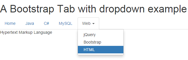
An example of dropdown with Bootstrap tabs
Similarly, you can use the dropdown with Bootstrap tabs. For that, I have simply used <li> and assigned it .dropdown class. Just like other tabs, use data attribute data-toggle=”tab” in list items of dropdown and in the tab’s content area use the tab-pane class with the same id as list items are created.
See a demo online:
Online demo and code
The following code is used to create a dropdown:
<li class="dropdown">

<a class="dropdown-toggle" data-toggle="dropdown" href="#">Web <b class="caret"></b></a>

<ul class="dropdown-menu">

<li><a href="#jquery" role="tab" data-toggle="tab">jQuery</a></li>

<li><a href="#boots" role="tab" data-toggle="tab">Bootstrap</a></li>

<li><a href="#html" role="tab" data-toggle="tab">HTML</a></li>

</ul>

</li>
For tab’s content:
<li class="dropdown">

<a class="dropdown-toggle" data-toggle="dropdown" href="#">Web <b class="caret"></b></a>

<ul class="dropdown-menu">

<li><a href="#jquery" role="tab" data-toggle="tab">jQuery</a></li>

<li><a href="#boots" role="tab" data-toggle="tab">Bootstrap</a></li>

<li><a href="#html" role="tab" data-toggle="tab">HTML</a></li>

</ul>

</li>
See the complete code on the demo page.
In the above example of button dropdown, only the single button was used to act as a dropdown contextual menu. By using two buttons and using data attributes, you can create a split dropdown button as well.
BS Code:
<!DOCTYPE html>
<html>
<head>
<title>Bootstrap Button demo</title>
   <link rel="stylesheet" href="//netdna.bootstrapcdn.com/bootstrap/3.1.1/css/bootstrap.min.css">
    <script src="https://ajax.googleapis.com/ajax/libs/jquery/1.10.2/jquery.min.js"></script>
    <script src="https://netdna.bootstrapcdn.com/bootstrap/3.0.3/js/bootstrap.min.js"></script>

    <meta name="viewport" content="width=device-width, initial-scale=1.0">
<style>
.dropdown-menu{
    background-color: #A8DEEE;
    border: 1px solid #428BCA;
}
.divider{
    border: 1px dashed #428BCA;
}
</style>
</head>

<body>
<div class="container">
<h1>A Split button dropdown demo</h1>
<!-- Single button -->
<div class="btn-group">
  <button type="button" class="btn btn-info">Split Dropdown Menu</button>
  <button type="button" class="btn btn-primary dropdown-toggle" data-toggle="dropdown" aria-haspopup="true" aria-expanded="false">
    <span class="caret"></span>
    <span class="sr-only"></span>
  </button>
  <ul class="dropdown-menu">
    <li><a href="https://www.jquery-az.com/">Home</a></li>
    <li><a href="https://www.jquery-az.com/bootstrap-tips-tutorials/">Bootstrap</a></li>
    <li><a href="https://www.jquery-az.com/jquery-tips/">jQuery</a></li>
    <li><a href="https://www.jquery-az.com/jquery-ui/">jQuery UI</a></li>
    <li role="separator" class="divider"></li>
    <li><a href="https://www.jquery-az.com/php-tutorials/">PHP</a></li>
  </ul>
</div>


   </div>
</body>
</html>
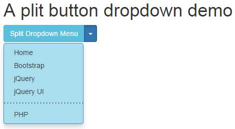
In the demo, the button is pulled down by clicking the right split button only. If you use the data attribute data-toggle=”dropdown” in the first button (towards the left) the menu will be pulled by the left button as well. For example:
<button type="button" class="btn btn-info" data-toggle="dropdown">Split Dropdown Menu</button>

<button type="button" class="btn btn-primary dropdown-toggle" data-toggle="dropdown" aria-haspopup="true" aria-expanded="false">

<span class="caret"></span>

<span class="sr-only"></span>

</button>
In that case, the dropdown will be pulled for both buttons. The <style> tag contains the CSS for dropdown and divider class:
The <style> tag contains the CSS for dropdown and divider class:
.dropdown-menu{

background-color: #A8DEEE;

border: 1px solid #428BCA;

}

.divider{

border: 1px dashed #428BCA;

}
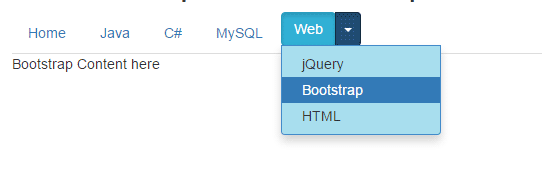
You can use single or split button dropdown in navbar or tabs as well. Following example shows a split dropdown in Tabs.
Tabs with split dropdown demo
The following example is just like the above tab example with dropdown, except I have used a button rather a link this time. The dropdown is a split button. See demo online
Complete code:
<!DOCTYPE html>
<html>
<head>
    <title>navbar example</title>
    <link rel="stylesheet" href="https://maxcdn.bootstrapcdn.com/bootstrap/3.3.6/css/bootstrap.min.css" integrity="sha384-1q8mTJOASx8j1Au+a5WDVnPi2lkFfwwEAa8hDDdjZlpLegxhjVME1fgjWPGmkzs7" crossorigin="anonymous">
    <script src="https://ajax.googleapis.com/ajax/libs/jquery/1.10.2/jquery.min.js"></script>
    <script src="https://maxcdn.bootstrapcdn.com/bootstrap/3.3.6/js/bootstrap.min.js" integrity="sha384-0mSbJDEHialfmuBBQP6A4Qrprq5OVfW37PRR3j5ELqxss1yVqOtnepnHVP9aJ7xS" crossorigin="anonymous"></script>
<style>
.dropdown-menu{
    background-color: #A8DEEE;
    border: 1px solid #428BCA;
}
.divider{
    border: 1px dashed #428BCA;
}
</style>
</head>

<body>
<div class="container">
<h1>A Bootstrap Tab with split button dropdown example</h1>

<!-- Nav tabs -->
<ul class="nav nav-tabs" role="tablist">
  <li class="active"><a href="#home" role="tab" data-toggle="tab">Home</a></li>
  <li><a href="#java" role="tab" data-toggle="tab">Java</a></li>
  <li><a href="#csharp" role="tab" data-toggle="tab">C#</a></li>
  <li><a href="#mysql" role="tab" data-toggle="tab">MySQL</a></li>

<li class="dropdown">
            <div class="btn-group">
            <button class="dropdown-toggle btn btn-info" data-toggle="dropdown" href="#">Web</button>
            <button type="button" class="btn btn-primary dropdown-toggle" data-toggle="dropdown" aria-haspopup="true" aria-expanded="false">
            <span class="caret"></span>
             <span class="sr-only"></span>
            </button>
            <ul class="dropdown-menu">
                <li><a href="#jquery" role="tab" data-toggle="tab">jQuery</a></li>
                <li><a href="#boots" role="tab" data-toggle="tab">Bootstrap</a></li>
                <li><a href="#html" role="tab" data-toggle="tab">HTML</a></li>
            </ul>
            </div>
</li>

</ul>
</li>

<!-- Tab panes -->
<div class="tab-content">
  <div class="tab-pane active" id="home">Content for home page here</div>
  <div class="tab-pane" id="java">Java is a programming language!</div>
  <div class="tab-pane" id="csharp">C# is also a programming language</div>
  <div class="tab-pane" id="mysql">MySQL is a databased mostly used for web applications.</div>
  <div class="tab-pane" id="jquery">jQuery content here </div>
  <div class="tab-pane" id="boots">Bootstrap Content here</div>
  <div class="tab-pane" id="html">Hypertext Markup Language</div>
</div>
</body>
</html>
Note: In all the above examples, I used data attribute to initiate the dropdown menu. You can use JavaScript as well.
For example:
$('.dropdown-toggle').dropdown()
This code will be placed in the <script> section.