
The progress bar component in web pages
You may need progress bars on web pages for different reasons, for example, showing the progress of uploading a file and letting the user know by way of progress bar that shows the percentage of the file being uploaded.
Update: Bootstrap 5 Progress bar tutorial is live.
Similarly, downloading a file, showing the progress of a long task that may involve saving the information in different databases on different servers, etc.
In this tutorial, the Bootstrap based progress bars are created that you may integrate into your web pages quite easily. Functionality-wise, it is up to you how to handle it.
A demo of progress bar Bootstrap with label
The bootstrap has a few built-in classes for creating the progress bars. You simply need to use the progress class in the main div containing progress bar. In the inner div, use the progress-bar class where you may specify different attributes including the label that shows the current progress value. Have a look:
The simple markup used for creating the progress bar using Bootstrap classes:
<!DOCTYPE html>
<html>
<head>
<link rel="stylesheet" href="https://maxcdn.bootstrapcdn.com/bootstrap/3.3.4/css/bootstrap.min.css">
</head>
<body>
<div class="container">
<h3>A demo of progress bar using Bootstrap</h3>
<div class="row">
<div class="col-md-4">
<div class="progress">
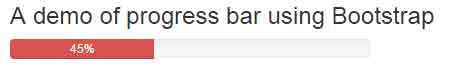
<div class="progress-bar progress-bar-danger" role="progressbar" aria-valuenow="40" aria-valuemin="0" aria-valuemax="100" style="width: 40%;">
45%
</div>
</div>
</div>
</div>
</div>
</body>
</html>
I used progress-bar-danger class to show the red color for the progress.
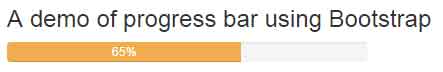
Using warning color in progress bar demo
In this demo, the progress-bar-warning class is used for creating the “yellowish” color bar. Basically, this is just like the button or alert classes used for different colors, have a look:
The markup:
<div class="container">

<h3>A demo of progress bar using Bootstrap</h3>

    <div class="row">

        <div class="col-md-4">

        <div class="progress">

          <div class="progress-bar progress-bar-warning" role="progressbar" aria-valuenow="65" aria-valuemin="0" aria-valuemax="100" style="width: 65%;">

            65%

          </div>

        </div>


       </div>

      </div>


</div>
Similarly, you may use the progress-bar-info for the light blue color, progress-bar-success for the green etc. The default is primary color i.e. blue.
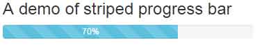
A demo of creating a stripped progress bar
In this demo, a striped progress bar is created by using the built-in progress-bar-striped class along with progress-bar and progress-bar-info classes.
The markup:
<div class="container">

<h3>A demo of striped progress bar</h3>

    <div class="row">

        <div class="col-md-4">

        <div class="progress">

          <div class="progress-bar progress-bar-info progress-bar-striped" role="progressbar" aria-valuenow="70" aria-valuemin="0" aria-valuemax="100" style="width: 70%">

            70% done

          </div>

        </div>

       </div>

      </div>


</div>
The striped bar style is accomplished by using the gradient.
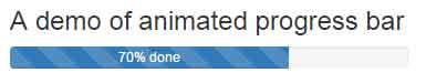
A demo of the animated and striped progress bar
By adding the .active class in the above demo of the striped progress bar, you may create an animated progress bar as shown below:
The code:
<div class="container">

<h3>A demo of animated progress bar</h3>

    <div class="row">

        <div class="col-md-4">

        <div class="progress">

          <div class="progress-bar progress-bar-primary progress-bar-striped active" role="progressbar" aria-valuenow="70" aria-valuemin="0" aria-valuemax="100" style="width: 70%">

            70% done

          </div>

        </div>

       </div>

      </div>


</div>
You can see, the animation from right to left in the progress bar.
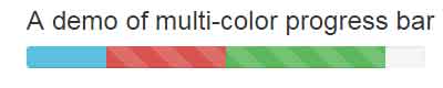
A demo of multi-colored progress bar
By using multiple progress bars within the main div containing the progress class, you may create multi-color progress bar by using Bootstrap. Have a look at the following demo where I used info, danger, and success colors for creating a progress bar with a simple and striped style by using the active class:
The code:
<div class="container">

<h3>A demo of multi-color progress bar</h3>

    <div class="row">

        <div class="col-md-4">

        <div class="progress">

 <div class="progress-bar progress-bar-info" style="width: 20%">

    20%

  </div>

  <div class="progress-bar progress-bar-danger progress-bar-striped" style="width: 30%">

    30% Complete

  </div>

  <div class="progress-bar progress-bar-success progress-bar-striped active" style="width: 40%">

    40%

  </div>

        </div>

       </div>

      </div>


</div>
A demo of progress bar with box-shadow
In this demo, the box-shadow property of CSS is used for the container of the progress bar. Apart from that, a few built-in properties of Bootstrap are overridden for the customization of the progress bar. For example, the properties of the progress class are changed along with the active class. The animation property of CSS is also used for showing the progress in three seconds duration.
Have a look and get the complete code from the demo page:

The CSS used in example:
.prog-container{

    background: #DDEEEE;

    border-radius: 40px;

    padding: 23px;

    margin: 10px 0;

    box-shadow: 0 0  5px #8CB4D7;

}

.progress{

    height: 30px;

    margin: 0;

    overflow: visible;

    border-radius: 50px;

    background: #eaedf3;

    box-shadow: inset 0 10px  10px rgba(220, 223, 239,0.6);

}

.progress .progress-bar{

    border-radius: 10px;

}

.progress .current-prog-val{

    position: relative;

    left: -65px;

    top: 4px;

    font-size: 16px;

    color: #FF8040;

    font-weight:800;

}

.progress-bar.active{

    animation: reverse progress-bar-stripes 0.40s ease-in, animate-positive 3s;

}

@-webkit-keyframes animate-positive{

    0% { width: 0%; }

}

@keyframes animate-positive {

    0% { width: 0%; }

}
The markup:
<div class="container">

    <div class="row">

        <div class="col-md-6">

            <div class="prog-container">

                <div class="progress">

                    <div class="progress-bar progress-bar-primary progress-bar-striped active" style="width:60%; box-shadow:-1px 10px 10px rgba(91, 192, 222, 0.7);"></div>

                    <div class="current-prog-val">60%</div>

                </div>

            </div>


        </div>

    </div>

</div>