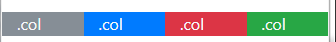
The spacing classes in Bootstrap 4
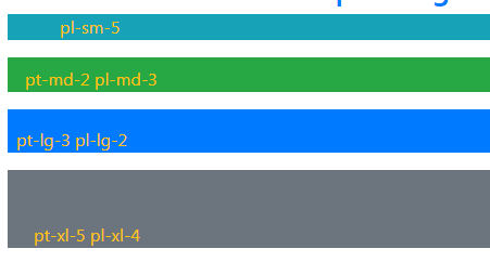
The Bootstrap 4 has built-in utility responsive classes for margin and padding that you may use easily in various elements to manage the spacing.

The Bootstrap 4 has built-in utility responsive classes for margin and padding that you may use easily in various elements to manage the spacing.
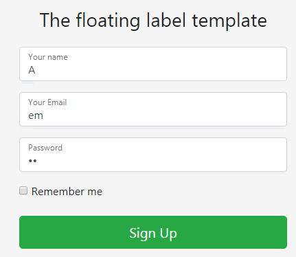
The labels in Bootstrap 4 can be referred differently for various elements. For example, labels in the form controls where the title for the text box is termed as label. Similarly, you may create floating labels that display inside the form controls
The Bootstrap CDN (Content Delivery Network) is the way of including required Bootstrap libraries from third party servers.
If you do not want hosting libraries at your own hosting due to bandwidth, speed or any other issues then you may use CDN links hosted by third parties.
In Bootstrap version 4, it does not include any icon library; Bootstrap has dropped the Glyph icons. However, Bootstrap has some recommendations for external icon libraries that you may use in Bootstrap 4 based projects.
Bootstrap 4 has a powerful grid system which is mobile-first and built with flexbox. Being mobile-first is a buzz these days and one of the reasons of Bootstrap’s huge popularity across.
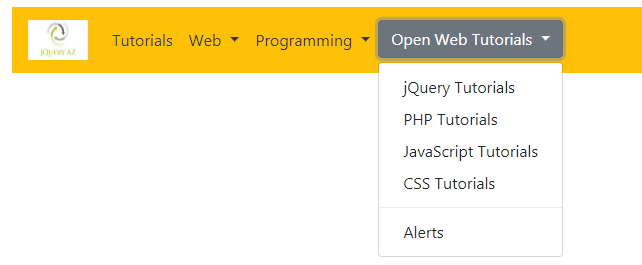
The navbar component of Bootstrap 4 is used to created header navigation on your website. The navbar header menu may contain a brand logo, navigation links to the main parts of the website, dropdown menus, inline forms etc.
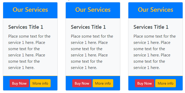
The Bootstrap card is a content container with the variety of options for presenting the information about your products or services or other information in the website.
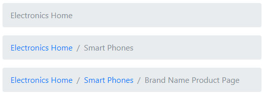
The breadcrumb is the type of navigation that shows user current location of web page within the navigational hierarchy. For example, you have main category Electronics and Sub category Smart-Phones.
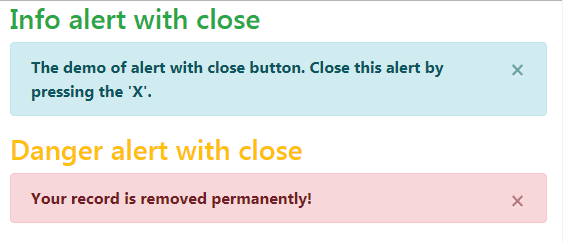
Just like the Bootstrap 3 alerts, the version 4 of Bootstrap also has classes specific to creating contextual alerts in your web project.
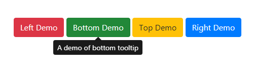
The Bootstrap 4 Tooltips are built by using CSS and JavaScript. The CSS3 animations are used. The Tooltips can be displayed in various directions explicitly (left, right, top and bottom).
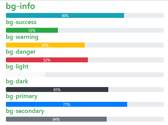
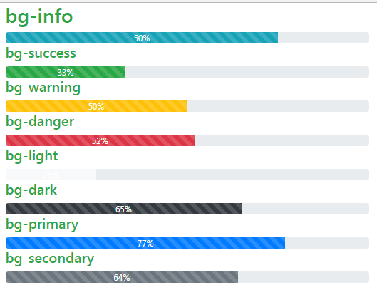
For creating a progress bar, use the .progress class in the container like

In this Bootstrap 4 carousel tutorial, I will show examples of how to create and customize the carousel In Bootstrap 4 for multiple images, vertical slider and more; so keep reading.
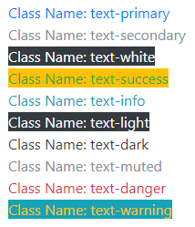
In this tutorial, I am going to show you examples of built-in Bootstrap colors classes for various elements. The Bootstrap has specific classes for coloring the text, links, buttons etc.
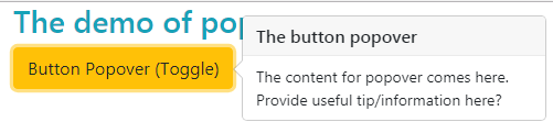
A pop-up box based on Bootstrap 4 framework can be created by using the built-in plug-in. You may attach the popover to any HTML element that open as that element is clicked.
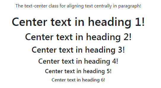
In this tutorial, I am going to show you live demos of aligning text center, right and left. I will also show you using the floating text center or right by using helper float classes.