
Using radio buttons allows selecting one option from many in HTML forms.
While using Bootstrap form, it is quite easy to create radio buttons with Bootstrap classes.
By using your own style or third party plug-ins, you may also create beautiful-looking radio buttons.
In this tutorial, I will show you simply using Bootstrap to create radio buttons along with plug-ins to style it beautifully.
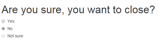
In this demo, a simple page is created with radio buttons. A group of three radio buttons is used that uses the radio class (by Bootstrap).
The class is used in the div while input type radio is used inside the label tags.
See the example/code online by clicking the link or image below:
 Make sure including the Bootstrap CSS file in the <head> section.
The markup:
<!DOCTYPE html>
<html>
<head>
    <link rel="stylesheet" href="https://maxcdn.bootstrapcdn.com/bootstrap/3.3.5/css/bootstrap.min.css">
    <meta name="viewport" content="width=device-width, initial-scale=1.0">

</head>


<body>
<div class="container">
<h1>Are you sure, you want to close?</h1>
<div class="radio">
  <label>
    <input type="radio" name="survey" id="Radios1" value="Yes">
    Yes
  </label>
</div>
<div class="radio">
  <label>
    <input type="radio" name="survey" id="Radios2" value="No">
    No
  </label>
</div>
<div class="radio disabled">
  <label>
    <input type="radio" name="survey" id="Radios3" value="Notsure" disabled>
    Not sure
  </label>
</div>
</div>


</body>
</html>
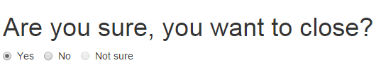
By using the radio-inline built-in class in the label tag, that contains the input radio, you may create the inline radio buttons. In this demo, the same set of radio buttons is used as in above example.
The Markup for this demo
<div class="container">

<h1>Are you sure, you want to close?</h1>


  <label class="radio-inline">

    <input type="radio" name="survey" id="Radios1" value="Yes">

    Yes

  </label>

  <label class="radio-inline">

    <input type="radio" name="survey" id="Radios2" value="No">

    No

  </label>

  <label class="radio-inline">

    <input type="radio" name="survey" id="Radios3" value="Notsure" disabled>

    Not sure

  </label>

</div>
You can see all radio buttons are inline. Instead of the label, you can also use a span tag there, however, the user won’t be able to select an option by clicking on the text.
Adding custom style in Bootstrap radio
Custom styles can be added to the Bootstrap radio buttons. I will show you a few demos by using the third-party small plug-in, awesome-bootstrap-checkbox, which is just a CSS file.
First, have a look at the style of radio buttons that you can create by using this:
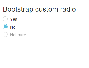
Online demo and code
You may see the difference between the first and this example. If you look at the code in this example, it is using an additional class in the radio’s div elements.
The class name is radio-info. Before that, in the head section a CSS file is included:
<link rel="stylesheet" href="build.css">
After that, you just need to refer to these classes in the radio div elements, e.g.
<div class="radio radio-info">

<input type="radio" name="survey" id="Radios2" value="No">

<label>

No

</label>

</div>
This style file is given by the maker and can be seen here.
By using this file, you can create nicely styled radio and checkboxes for your web pages.
See another example of a radio group in a form by using this CSS class.
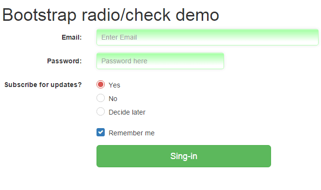
Using custom radio in a Bootstrap form example
Following is a sign-in form example, where a Bootstrap form with a custom style is created. First, have a look which is followed by step by step process to design this:
Complete code:
<!DOCTYPE html>
<html>
<head>
<link rel="stylesheet" href="https://maxcdn.bootstrapcdn.com/bootstrap/3.3.5/css/bootstrap.min.css" integrity="sha512-dTfge/zgoMYpP7QbHy4gWMEGsbsdZeCXz7irItjcC3sPUFtf0kuFbDz/ixG7ArTxmDjLXDmezHubeNikyKGVyQ==" crossorigin="anonymous">
<link rel="stylesheet" href="//netdna.bootstrapcdn.com/font-awesome/4.2.0/css/font-awesome.min.css">
<link rel="stylesheet" href="build.css">

<style>
.inputstl {
    padding: 9px;
    border: solid 1px #B3FFB3;
    outline: 0;
    background: -webkit-gradient(linear, left top, left 25, from(#FFFFFF), color-stop(4%, #A4FFA4), to(#FFFFFF));
    background: -moz-linear-gradient(top, #FFFFFF, #A4FFA4 1px, #FFFFFF 25px);
    box-shadow: rgba(0,0,0, 0.1) 0px 0px 8px;
    -moz-box-shadow: rgba(0,0,0, 0.1) 0px 0px 8px;
    -webkit-box-shadow: rgba(0,0,0, 0.1) 0px 0px 8px;

    }

</style>

</head>

<body>
<div class="container">
<h1>Bootstrap radio/check demo</h1>
    <form class="form-horizontal" role="form">
      <div class="form-group">
        <label for="email1" class="col-sm-2 control-label">Email:</label>
        <div class="col-sm-5">
          <input type="email" class="form-control inputstl" id="email1" placeholder="Enter Email">
        </div>
      </div>
      <div class="form-group">
        <label for="password1" class="col-sm-2 control-label">Password:</label>
        <div class="col-sm-3">
          <input type="password" class="form-control inputstl" id="password1" placeholder="Password here">
        </div>
      </div>
      <div class="form-group">
        <label for="email1" class="col-sm-2 control-label">Subscribe for updates?</label>
            <div class="col-sm-5">
            <div class="radio radio-danger">
              <input type="radio" name="survey" id="Radios1" value="Yes">
              <label>
                Yes
              </label>
            </div>
            <div class="radio radio-danger">
              <input type="radio" name="survey" id="Radios1" value="No">
              <label>
                No
              </label>
            </div>
            <div class="radio radio-danger disabled">
              <input type="radio" name="survey" id="Radios1" value="declater">
              <label>
                Decide later
              </label>
            </div>
      </div>
      </div>

      <div class="form-group">
        <div class="col-sm-offset-2 col-sm-10">
        <div class="checkbox checkbox-primary">
          <input id="checkbox2" class="styled" type="checkbox" checked>
           <label for="checkbox2">
           Remember me
           </label>
        </div>
      </div>
      </div>


      <div class="form-group">
        <div class="col-sm-offset-2 col-sm-4">
          <button type="submit" class="btn btn-lg btn-block btn-success">Sing-in</button>
        </div>
      </div>
    </form>
   </div>
</div>


</div>


</body>
</html>
Step by step to design this form:
First of all Bootstrap library is included in the head section:
<link rel=”stylesheet” href=”https://maxcdn.bootstrapcdn.com/bootstrap/3.3.5/css/bootstrap.min.css” crossorigin=”anonymous”>
This is followed by the plug-in file for the radio and checkbox:
<link rel=”stylesheet” href=”//netdna.bootstrapcdn.com/font-awesome/4.2.0/css/font-awesome.min.css”>
<link rel=”stylesheet” href=”build.css”>
Note: In above example, I only included build.css file. However, to use the checkbox as well, you have to include font file as well.
This is how Bootstrap radio buttons are created:
     <div class="form-group">

<label for="radiobtn" class="col-sm-2 control-label">Subscribe for updates?</label>

<div class="col-sm-5">

<div class="radio radio-danger">

<input type="radio" name="survey" id="Radios1" value="Yes" checked>

<label>

Yes

</label>

</div>

<div class="radio radio-danger">

<input type="radio" name="survey" id="Radios1" value="No">

<label>

No

</label>

</div>

<div class="radio radio-danger disabled">

<input type="radio" name="survey" id="Radios1" value="declater">

<label>

Decide later

</label>

</div>

</div>
And the code for checkbox:
     <div class="form-group">

<div class="col-sm-offset-2 col-sm-10">

<div class="checkbox checkbox-primary">

<input id="checkbox2" class="styled" type="checkbox" checked>

<label for="checkbox2">

Remember me

</label>

</div>

</div>

</div>
For text boxes, I used a custom CSS file which is placed in the head section as well.
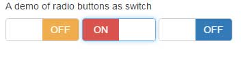
You may also create beautiful switches based on radio button using Bootstrap framework. The switches allow the users to select an option with a nice user interface. You can see a few in the figure below.
The following example shows the code for creating a radio-based switch where I used another jQuery plug-in:
Code:
<!DOCTYPE html>
<html>
<head>

<link rel="stylesheet" href="https://netdna.bootstrapcdn.com/bootstrap/3.3.4/css/bootstrap.min.css">
<link href="css/bootstrap-switch/bootstrap-switch.css" rel="stylesheet">

</head>

<body>

    <main id="content" role="main">

      <div class="container">
        <div class="row">
          <div class="col-sm-6">
              <h3 class="h5">A demo of radio buttons as switch</h3>
              <input type="radio" name="radio1" checked data-on-color="success" data-off-color="warning" class="switch-radio1">
              <input type="radio" name="radio1" data-on-color="danger" data-off-color="warning" class="switch-radio1">
              <input type="radio" name="radio1" data-on-color="info" data-off-color="primary"  class="switch-radio1">
            </div>


        </div>

    </main>


<script src="https://ajax.googleapis.com/ajax/libs/jquery/1.11.1/jquery.min.js"></script>
<script src="https://maxcdn.bootstrapcdn.com/bootstrap/3.3.6/js/bootstrap.min.js"></script>
    <script src="js/bootstrap-switch/highlight.js"></script>
    <script src="js/bootstrap-switch/bootstrap-switch.js"></script>
    <script src="js/bootstrap-switch/main.js"></script>
</body>
</html>
So if you have a form that uses radio buttons for options like:
- Yes/No
- Agree / Disagree
- Male / Female
- True / False
- On / Off
- Enable / Disable
- Or other
Then you may use this nice plug-in. For complete details of creating switches based on radio buttons and checkboxes, go to this tutorial: Bootstrap switches.