
Bootstrap buttons can be created by using the main class btn followed by its style and size optional classes.
For example, btn-info specifies a light blue button with normal size. Similarly, btn-primary is dark blue, btn-success is green and so on.
A button with Bootstrap classes:
<button type="button" class="btn btn-info btn-lg">A Bootstrap button with large size</button>
Quick demo of buttons in this tutorial
A few points to create Bootstrap styled buttons:
- You can create buttons by using the input tag, button tag, or link tag.
- The main button class to be used is btn which is Bootstrap class.
- The color of the buttons can be changed by using pre-defined classes like btn-info, btn-default, btn-primary, btn-danger.
- The size of the button can also be defined by using the pre-defined classes e.g. for large button use .btn-lg For the small button, use .btn-sm, and for extra small use btn-xs class.
See the following example for creating buttons by using Bootstrap classes. In the next section, I will show you how to override the default classes to change certain properties like using some other color with the same Bootstrap style OR changing the size as per the need of your website.
In this demo, I will only use the pre-defined classes to show how you can create buttons with bootstrap classes. See the online demo with code:
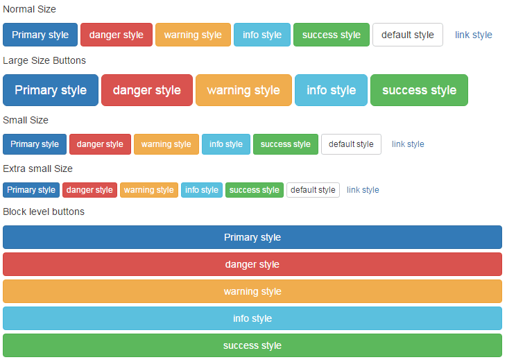 In the demo, you can see different sizes and styled buttons in different rows. Following are the codes for each style:
For normal size of Bootstrap buttons, do not specify any size as follows:
<button type="button" class="btn btn-primary">Primary style</button>

<button type="button" class="btn btn-danger">danger style</button>

<button type="button" class="btn btn-warning">warning style</button>

<button type="button" class="btn btn-info">info style</button>

<button type="button" class="btn btn-success">success style</button>

<button type="button" class="btn btn-default">default style</button>

<button type="button" class="btn btn-link">link style</button>
For Large size buttons use btn-lg class:
<button type="button" class="btn btn-primary btn-lg">Primary style</button>
For small sized buttons, use the btn-sm class, e.g.:
<button type="button" class="btn btn-success btn-sm">success style</button>
For extra small size buttons, use btn-xs class, e.g.:
<button type="button" class="btn btn-info btn-xs">info style</button>
And Block level buttons are using the btn-block class, for example:
<button type="button" class="btn btn-danger btn-block">danger style</button>
You can see code of all buttons with respective classes in the code section of demo page.
The following example uses the .active class in a button. While the other row uses the disabled attribute of the button to make button disabled.
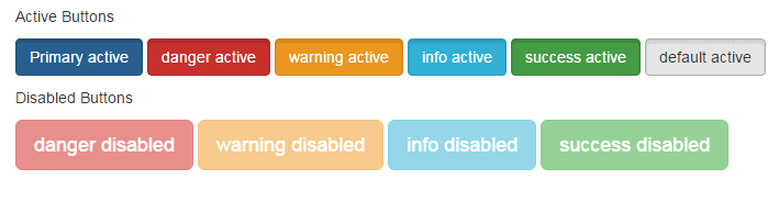
The active class is a little darker than the normal state that shows a button is “active” or clicked to stand it out from other buttons.
For example:
<button type="button" class="btn btn-warning active">warning active</button>
The disabled attribute is just a normal button attribute that is not clickable.
<button type="button" class="btn btn-danger btn-lg" disabled="disabled">danger disabled</button>
Complete code:
<!DOCTYPE html>
<html>
<head>
<title>Bootstrap Button demo</title>
    <link rel="stylesheet" href="https://maxcdn.bootstrapcdn.com/bootstrap/3.3.6/css/bootstrap.min.css" integrity="sha384-1q8mTJOASx8j1Au+a5WDVnPi2lkFfwwEAa8hDDdjZlpLegxhjVME1fgjWPGmkzs7" crossorigin="anonymous">
    <meta name="viewport" content="width=device-width, initial-scale=1.0">

</head>

<body>
<div class="container">
<h1>Bootstrap Button demo</h1>
<p>Active Buttons</p>
<p>
  <button type="button" class="btn btn-primary active">Primary active</button>
  <button type="button" class="btn btn-danger active">danger active</button>
  <button type="button" class="btn btn-warning active">warning active</button>
  <button type="button" class="btn btn-info active">info active</button>
  <button type="button" class="btn btn-success active">success active</button>
  <button type="button" class="btn btn-default active">default active</button>
</p>

<p>Disabled Buttons</p>
<p>
  <button type="button" class="btn btn-danger btn-lg" disabled="disabled">danger disabled</button>
  <button type="button" class="btn btn-warning btn-lg" disabled="disabled">warning disabled</button>
  <button type="button" class="btn btn-info btn-lg" disabled="disabled">info disabled</button>
  <button type="button" class="btn btn-success btn-lg" disabled="disabled">success disabled</button>
</p>


   </div>
</body>
</html>
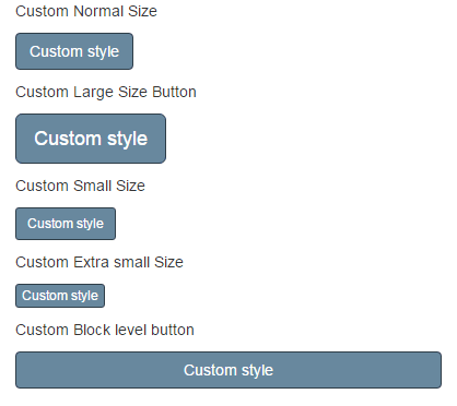
The buttons are nicely styled in the Bootstrap framework by using its classes. However, the colors are limited while using the available classes. In certain scenarios, you may want to use custom colors for buttons to match the theme of your website.
To accomplish that, one of the ways is to override the classes of Bootstrap related to the buttons. For example, you may take the btn-default class from the Bootstrap CSS file, copy it to style section, and use custom properties.
If you just want to change the color, the rest will be retained e.g. round edges, etc.
See a demo with different colors:
In the demo, you can see different color scheme is used for the buttons with the same styles as in the above examples. If you look at the code of buttons, it is also the same as used in the above example:
The markup:
<!DOCTYPE html>
<html>
<head>
<title>Bootstrap Button demo</title>
    <link rel="stylesheet" href="https://maxcdn.bootstrapcdn.com/bootstrap/3.3.6/css/bootstrap.min.css" integrity="sha384-1q8mTJOASx8j1Au+a5WDVnPi2lkFfwwEAa8hDDdjZlpLegxhjVME1fgjWPGmkzs7" crossorigin="anonymous">
    <meta name="viewport" content="width=device-width, initial-scale=1.0">
<style>
.btn-default
{
  background-color: #68889E;
  color:#FFF;
  border-color: #2F3E48;
}
.btn-default:hover, .btn-default:focus, .btn-default:active, .btn-default.active, .open .dropdown-toggle.btn-default {

  background-color: #2F3E48;
  color:#FFF;
  border-color: #31347B;
 }

</style>
</head>

<body>
<div class="container">
<h1>Bootstrap Button demo</h1>
<p>Custom Normal Size</p>
<p>
  <button type="button" class="btn btn-default">Primary style</button>
</p>

<p>Custom Large Size Button</p>
<p>
  <button type="button" class="btn btn-default btn-lg">Primary style</button>
</p>

<p>Custom Small Size</p>
<p>
  <button type="button" class="btn btn-default btn-sm">Primary style</button>
</p>

<p>Custom Extra small Size</p>
<p>
  <button type="button" class="btn btn-default btn-xs">Primary style</button>
</p>

<p>Custom Block level button</p>
<p>
  <button type="button" class="btn btn-default btn-block">Primary style</button>
</p>


   </div>
</body>
</html>
The only difference is the classes used in the head section:
.btn-default

{

background-color: #68889E;

color:#FFF;

border-color: #2F3E48;

}

.btn-default:hover, .btn-default:focus, .btn-default:active, .btn-default.active, .open .dropdown-toggle.btn-default {


background-color: #2F3E48;

color:#FFF;

border-color: #31347B;

}
What I have done is, take the classes from Bootstrap CSS for the btn-default style and in that demo just overridden the background-color, border and font color properties. As other properties are not changed, other properties will remain the same.
Similarly, you can change just btn class which will change the color of all buttons. Or change other classes like btn-danger, btn-info, etc.
One important thing is that you have to place this style after including the Bootstrap CSS file.
Although, you can change these styles in the source file, however, this is not recommended for consistency purposes.
The following demo uses more properties including CSS3 properties to style Bootstrap buttons. See the demo online followed by how you can do it:
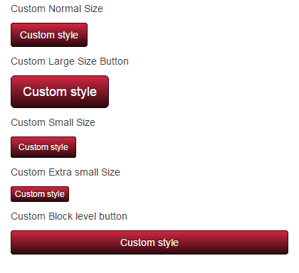
This is almost the same example as above except I used a few CSS 3 properties. While this time I used btn-danger class to override its properties.
Just play with different colors and properties to design your own.
.btn-danger

{

background-color: hsl(351, 68%, 11%) !important;

background-repeat: repeat-x;

background-image: -o-linear-gradient(top, #d12741, #2f080e);

background-image: linear-gradient(#d12741, #2f080e);

border-color: #2f080e #2f080e hsl(351, 68%, 1.5%);

color: #fff !important;

text-shadow: 0 -1px 0 rgba(0, 0, 0, 0.62);

}

.btn-danger:hover, .btn-danger:focus, .btn-danger:active, .btn-danger.active, .open .dropdown-toggle.btn-danger {

background-color: hsl(360, 68%, 60%) !important;

background-repeat: repeat-x;

background-image: linear-gradient(#fbeded, #de5353);

border-color: #de5353 #de5353 hsl(360, 68%, 51%);

color: #333 !important;

text-shadow: 0 1px 1px rgba(255, 255, 255, 0.59);

}
Also, note you may use custom names as well and just refer this after btn class, e.g.
btn btn-custom
You may turn a button into a dropdown (acting as a dropdown menu). By using a button tag with <ul> or <ol> tags and a few markup settings you may create it by using Bootstrap.
The buttons can be simple as shown in the above examples or you may use split buttons as well. Both demos are shown below:
See the demo and code online:
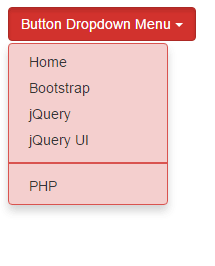
The button tag is given a few data attributes to turn it into a dropdown menu:
 <button type="button" class="btn btn-danger dropdown-toggle" data-toggle="dropdown" aria-haspopup="true" aria-expanded="false">

Button Dropdown Menu <span class="caret"></span>

</button>
After that, a list is created with menu items with dropdown-menu class of Bootstrap.
  <ul class="dropdown-menu">

<li><a href="https://www.jquery-az.com/">Home</a></li>

<li><a href="https://www.jquery-az.com/bootstrap-tips-tutorials/">Bootstrap</a></li>

<li><a href="https://www.jquery-az.com/jquery-tips/">jQuery</a></li>

<li><a href="https://www.jquery-az.com/jquery-ui/">jQuery UI</a></li>

<li role="separator" class="divider"></li>

<li><a href="https://www.jquery-az.com/php-tutorials/">PHP</a></li>

</ul>
The dropdown-menu and divider Bootstrap classes are overridden for background and border properties to match the button’s color for the demo.
Complete code for this example:
<!DOCTYPE html>
<html>
<head>
<title>Bootstrap Button demo</title>
   <link rel="stylesheet" href="//netdna.bootstrapcdn.com/bootstrap/3.1.1/css/bootstrap.min.css">
    <script src="https://ajax.googleapis.com/ajax/libs/jquery/1.10.2/jquery.min.js"></script>
    <script src="https://netdna.bootstrapcdn.com/bootstrap/3.0.3/js/bootstrap.min.js"></script>    <meta name="viewport" content="width=device-width, initial-scale=1.0">
<style>
.dropdown-menu{
    background-color: #F4CFCE;
    border: 1px solid #D9534F;
}
.divider{
    border: 1px solid #D9534F;
}
</style>
</head>

<body>
<div class="container">
<h1>Bootstrap Button demo</h1>
<!-- Single button -->
<div class="btn-group">
  <button type="button" class="btn btn-danger dropdown-toggle" data-toggle="dropdown" aria-haspopup="true" aria-expanded="false">
    Button Dropdown Menu <span class="caret"></span>
  </button>
  <ul class="dropdown-menu">
    <li><a href="https://www.jquery-az.com/">Home</a></li>
    <li><a href="https://www.jquery-az.com/bootstrap-tips-tutorials/">Bootstrap</a></li>
    <li><a href="https://www.jquery-az.com/jquery-tips/">jQuery</a></li>
    <li><a href="https://www.jquery-az.com/jquery-ui/">jQuery UI</a></li>
    <li role="separator" class="divider"></li>
    <li><a href="https://www.jquery-az.com/php-tutorials/">PHP</a></li>
  </ul>
</div>


   </div>
</body>
</html>
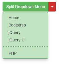
In this demo, a split button is created to act button as a dropdown. One button carries the text or heading of the menu while another acts as the toggling dropdown.
The code:
<!DOCTYPE html>
<html>
<head>
<title>Bootstrap Button demo</title>
   <link rel="stylesheet" href="//netdna.bootstrapcdn.com/bootstrap/3.1.1/css/bootstrap.min.css">
    <script src="https://ajax.googleapis.com/ajax/libs/jquery/1.10.2/jquery.min.js"></script>
    <script src="https://netdna.bootstrapcdn.com/bootstrap/3.0.3/js/bootstrap.min.js"></script>    <meta name="viewport" content="width=device-width, initial-scale=1.0">
<style>
.dropdown-menu{
    background-color: #C1E3C1;
    border: 1px solid #5CB85C;
}
.divider{
    border: 1px dashed #5CB85C;
}
</style>
</head>

<body>
<div class="container">
<h1>Bootstrap Button demo</h1>
<!-- Single button -->
<div class="btn-group">
  <button type="button" class="btn btn-success">Split Dropdown Menu</button>
  <button type="button" class="btn btn-danger dropdown-toggle" data-toggle="dropdown" aria-haspopup="true" aria-expanded="false">
    <span class="caret"></span>
    <span class="sr-only"></span>
  </button>
  <ul class="dropdown-menu">
    <li><a href="https://www.jquery-az.com/">Home</a></li>
    <li><a href="https://www.jquery-az.com/bootstrap-tips-tutorials/">Bootstrap</a></li>
    <li><a href="https://www.jquery-az.com/jquery-tips/">jQuery</a></li>
    <li><a href="https://www.jquery-az.com/jquery-ui/">jQuery UI</a></li>
    <li role="separator" class="divider"></li>
    <li><a href="https://www.jquery-az.com/php-tutorials/">PHP</a></li>
  </ul>
</div>


   </div>
</body>
</html>
You can see the difference between this and the above example.
Note: For buttons to act as dropdowns, you have to include Bootstrap JS library as well. In all the above examples (simple buttons), I only included CSS library.
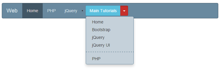
The use of this split (with toggle) or single dropdown button can be in different places including the navigation bar that uses Bootstrap’s navbar class.
The following example shows how to integrate a button dropdown that I created in the above example to a navbar.
Complete code:
<!DOCTYPE html>
<html>
<head>
    <title>navbar example</title>
    <link rel="stylesheet" href="https://maxcdn.bootstrapcdn.com/bootstrap/3.3.6/css/bootstrap.min.css" integrity="sha384-1q8mTJOASx8j1Au+a5WDVnPi2lkFfwwEAa8hDDdjZlpLegxhjVME1fgjWPGmkzs7" crossorigin="anonymous">
    <script src="https://ajax.googleapis.com/ajax/libs/jquery/1.10.2/jquery.min.js"></script>
    <script src="https://maxcdn.bootstrapcdn.com/bootstrap/3.3.6/js/bootstrap.min.js" integrity="sha384-0mSbJDEHialfmuBBQP6A4Qrprq5OVfW37PRR3j5ELqxss1yVqOtnepnHVP9aJ7xS" crossorigin="anonymous"></script>

<style>
.dropdown-menu{
    background-color: #C5D1DA;
    border: 1px solid #69899F;
}
.divider{
    border: 1px dashed #69899F;
}


.navbar-default {
  background-color: #69899f;
  border-color: #425766;
}
.navbar-default .navbar-brand {
  color: #d7e2e9;
}
.navbar-default .navbar-brand:hover, .navbar-default .navbar-brand:focus {
  color: #e5dbdb;
}
.navbar-default .navbar-text {
  color: #d7e2e9;
}
.navbar-default .navbar-nav > li > a {
  color: #d7e2e9;
}
.navbar-default .navbar-nav > li > a:hover, .navbar-default .navbar-nav > li > a:focus {
  color: #e5dbdb;
}
.navbar-default .navbar-nav > li > .dropdown-menu {
  background-color: #69899f;
}
.navbar-default .navbar-nav > li > .dropdown-menu > li > a {
  color: #d7e2e9;
}
.navbar-default .navbar-nav > li > .dropdown-menu > li > a:hover,
.navbar-default .navbar-nav > li > .dropdown-menu > li > a:focus {
  color: #e5dbdb;
  background-color: #425766;
}
.navbar-default .navbar-nav > li > .dropdown-menu > li > .divider {
  background-color: #69899f;
}
.navbar-default .navbar-nav > .active > a, .navbar-default .navbar-nav > .active > a:hover, .navbar-default .navbar-nav > .active > a:focus {
  color: #e5dbdb;
  background-color: #425766;
}
.navbar-default .navbar-nav > .open > a, .navbar-default .navbar-nav > .open > a:hover, .navbar-default .navbar-nav > .open > a:focus {
  color: #e5dbdb;
  background-color: #425766;
}
.navbar-default .navbar-toggle {
  border-color: #425766;
}
.navbar-default .navbar-toggle:hover, .navbar-default .navbar-toggle:focus {
  background-color: #425766;
}
.navbar-default .navbar-toggle .icon-bar {
  background-color: #d7e2e9;
}
.navbar-default .navbar-collapse,
.navbar-default .navbar-form {
  border-color: #d7e2e9;
}
.navbar-default .navbar-link {
  color: #d7e2e9;
}
.navbar-default .navbar-link:hover {
  color: #e5dbdb;
}

@media (max-width: 767px) {
  .navbar-default .navbar-nav .open .dropdown-menu > li > a {
    color: #d7e2e9;
  }
  .navbar-default .navbar-nav .open .dropdown-menu > li > a:hover, .navbar-default .navbar-nav .open .dropdown-menu > li > a:focus {
    color: #e5dbdb;
  }
  .navbar-default .navbar-nav .open .dropdown-menu > .active > a, .navbar-default .navbar-nav .open .dropdown-menu > .active > a:hover, .navbar-default .navbar-nav .open .dropdown-menu > .active > a:focus {
    color: #e5dbdb;
    background-color: #425766;
  }
}
</style>
</head>
<body>
<div class="container">
<h1>navbar Example</h1>
<nav class="navbar navbar-default">
  <div class="container-fluid">
    <!-- Brand and toggle get grouped for better mobile display -->
    <div class="navbar-header">
      <button type="button" class="navbar-toggle collapsed" data-toggle="collapse" data-target="#bs-example-navbar-collapse-1" aria-expanded="false">
        <span class="sr-only">Toggle navigation</span>
        <span class="icon-bar"></span>
        <span class="icon-bar"></span>
        <span class="icon-bar"></span>
      </button>
      <a class="navbar-brand" href="#">Web</a>
    </div>

    <!-- Collect the nav links, forms, and other content for toggling -->
    <div class="collapse navbar-collapse" id="bs-example-navbar-collapse-1">
      <ul class="nav navbar-nav">
        <li class="active"><a href="#">Home <span class="sr-only">(current)</span></a></li>
        <li><a href="https://www.jquery-az.com/php-tutorials/">PHP</a></li>
        <li><a href="https://www.jquery-az.com/jquery-tips/">jQuery</a></li>
      </ul>

<li>
<div class="btn-group navbar-btn">
  <button type="button" class="btn btn-info">Main Tutorials</button>
  <button type="button" class="btn btn-danger dropdown-toggle" data-toggle="dropdown" aria-haspopup="true" aria-expanded="false">
    <span class="caret"></span>
    <span class="sr-only"></span>
  </button>
  <ul class="dropdown-menu">
    <li><a href="https://www.jquery-az.com/">Home</a></li>
    <li><a href="https://www.jquery-az.com/bootstrap-tips-tutorials/">Bootstrap</a></li>
    <li><a href="https://www.jquery-az.com/jquery-tips/">jQuery</a></li>
    <li><a href="https://www.jquery-az.com/jquery-ui/">jQuery UI</a></li>
    <li role="separator" class="divider"></li>
    <li><a href="https://www.jquery-az.com/php-tutorials/">PHP</a></li>
  </ul>
</div>
</li>


    </div><!-- /.navbar-collapse -->
  </div><!-- /.container-fluid -->
</nav>
</div>
</body>
</html>
In the code, you can see a navbar is created with other menu items along with a button dropdown.
And CSS overridden to match the navbar color. Notice the .dropdown-menu class in the above code.
This is placed in the head section.
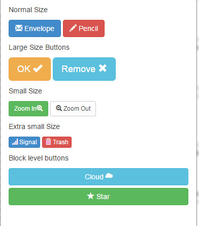
You can use Glyphicons, provided by Bootstrap in buttons as well. In this demo, I have created a few buttons with different icons. See the demo and then I will tell you how you can do it easily:
You can see, different sizes of buttons are created in the demo where icons are attached to each button. One of the ways is to use a span tag after the button tag and include icon class in the span tag. The placement of the text and icon can be changed as shown in the demo and code below:
<p>Normal Size</p>

<p>

<button type="button" class="btn btn-primary"><span class="glyphicon glyphicon-envelope"></span>  Envelope</button>

<button type="button" class="btn btn-danger"><span class="glyphicon glyphicon-pencil"></span> Pencil</button>

</p>


<p>Large Size Buttons</p>

<p>

<button type="button" class="btn btn-warning btn-lg">OK <span class="glyphicon glyphicon-ok"></span></button>

<button type="button" class="btn btn-info btn-lg">Remove <span class="glyphicon glyphicon-remove"></span></button>

</p>


<p>Small Size</p>

<p>

<button type="button" class="btn btn-success btn-sm">Zoom In<span class="glyphicon glyphicon-zoom-in"></span></button>

<button type="button" class="btn btn-default btn-sm"><span class="glyphicon glyphicon-zoom-out"></span> Zoom Out</button>


</p>


<p>Extra small Size</p>

<p>

<button type="button" class="btn btn-primary btn-xs"><span class="glyphicon glyphicon-signal"></span> Signal</button>

<button type="button" class="btn btn-danger btn-xs"><span class="glyphicon glyphicon-trash"></span> Trash</button>

</p>


<p>Block level buttons</p>

<p>

<button type="button" class="btn btn-info btn-block">Cloud <span class="glyphicon glyphicon-cloud"></span></button>

<button type="button" class="btn btn-success btn-block"><span class="glyphicon glyphicon-star"></span> Star</button>

</p>
You may create a button tool bar by using the btn-group class. In the following demo, media player toolbar, which is basically button group with glyphicons are created.
Three toolbars with extra small, small and normal sized buttons are created as shown below:
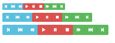
You can see the complete code on the demo page, however, the following is the code for extra small buttons acting as a toolbar:
<div class="btn-group" role="group" aria-label="...">

<button type="button" class="btn btn-info btn-xs">

<span class="glyphicon glyphicon-step-backward"></span>

</button>

<button type="button" class="btn btn-info btn-xs">

<span class="glyphicon glyphicon-fast-backward"></span>

</button>

<button type="button" class="btn btn-info btn-xs">

<span class="glyphicon glyphicon-backward"></span>

</button>

<button type="button" class="btn btn-danger btn-xs">

<span class="glyphicon glyphicon-play"></span>

</button>


<button type="button" class="btn btn-danger btn-xs">

<span class="glyphicon glyphicon-pause"></span>

</button>

<button type="button" class="btn btn-danger btn-xs">

<span class="glyphicon glyphicon-stop"></span>

</button>

<button type="button" class="btn btn-success btn-xs">

<span class="glyphicon glyphicon-forward"></span>

</button>

<button type="button" class="btn btn-success btn-xs">

<span class="glyphicon glyphicon-fast-forward"></span>

</button>

<button type="button" class="btn btn-success btn-xs">

<span class="glyphicon glyphicon-step-forward"></span>

</button>

</div>
Conclusion
By using Bootstrap’s framework, you may create nice-looking buttons with many uses quite easily including different sizes, color, customization and icons in the buttons.
You may use these buttons in forms, navigation bars, toolbars, and more.