
Alerts by using Tailwind CSS
In this tutorial, we are going to show you live demos and code for creating alerts by using the Tailwind CSS framework.
Alert is a way of notifying users of some minor to critical information. For example, display an alert for saving the record in the database successfully.
Similarly, display a message that tells the user that an order has been placed.
Showing a danger alert that your account will be removed permanently and so on.
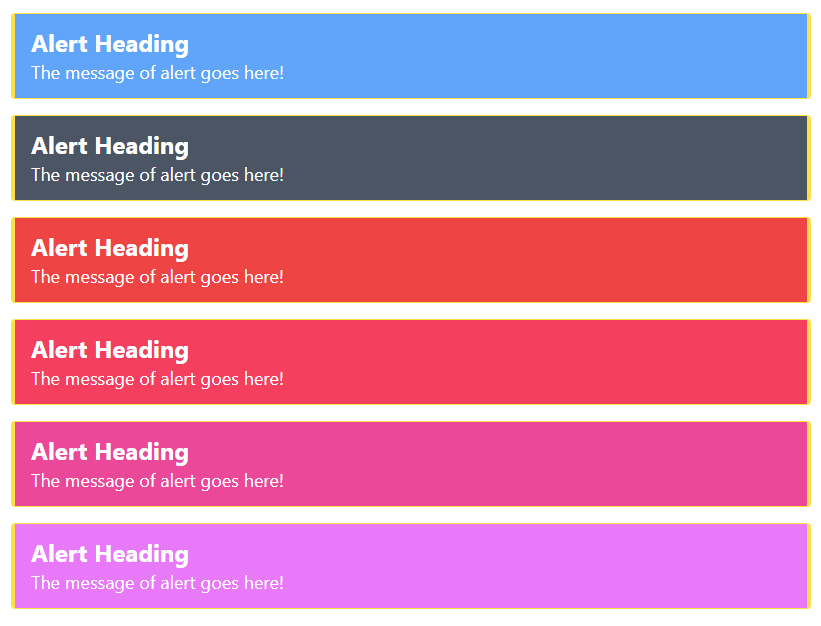
An example of simple Tailwind based alerts
In this demo of Tailwind alerts, we used various utility classes to style the alert’s heading, information etc.
The demo shows six different colored alerts, with thick left and right borders. This is done by using:
- border-l-4 (for left border)
- border-r-4 (for right border)
Besides, we specified padding, border colors, and background colors as well.
The width of the alert is given an arbitrary value. You may change the available classes as well:
<!DOCTYPE html>
<html>
<head>
<script src="https://cdn.tailwindcss.com"></script>

</head>

<body>
<h1 class="text-cyan-700 text-xl mx-10 mt-10 font-bold ">

 Tailwind Alerts Demo
</h1>
<div class="flex flex-5 mx-8 mt-10  justify-between">

<div class='m-4 space-y-4'>
    <div class="bg-blue-400 w-[50rem] border-yellow-300 border-l-4 border-r-4 border-y text-white px-4 py-3 rounded" role="alert">
        <p class="font-bold text-2xl">Alert Heading</p>
        <p class="text-lg">The message of alert goes here!</p>
    </div>
    <div class="bg-gray-600  w-[50rem] border-yellow-300 border-l-4 border-r-4 border-y text-white px-4 py-3 rounded" role="alert">
        <p class="font-bold text-2xl">Alert Heading</p>
        <p class="text-lg">The message of alert goes here!</p>
    </div>
    <div class="bg-red-500  w-[50rem] border-yellow-300 border-l-4 border-r-4 border-y text-white px-4 py-3 rounded" role="alert">
        <p class="font-bold text-2xl">Alert Heading</p>
        <p class="text-lg">The message of alert goes here!</p>
    </div>
    <div class="bg-rose-500 w-[50rem] border-yellow-300 border-l-4 border-r-4 border-y text-white px-4 py-3 rounded" role="alert">
        <p class="font-bold text-2xl">Alert Heading</p>
        <p class="text-lg">The message of alert goes here!</p>
    </div>
    <div class="bg-pink-500 w-[50rem] border-yellow-300 border-l-4 border-r-4 border-y text-white px-4 py-3 rounded" role="alert">
        <p class="font-bold text-2xl">Alert Heading</p>
        <p class="text-lg">The message of alert goes here!</p>
    </div>
    <div class="bg-fuchsia-400   w-[50rem] border-yellow-300 border-l-4 border-r-4 border-y text-white px-4 py-3 rounded" role="alert">
        <p class="font-bold text-2xl">Alert Heading</p>
        <p class="text-lg">The message of alert goes here!</p>
    </div>

</div>

</div>
</body>

</html>
Result:
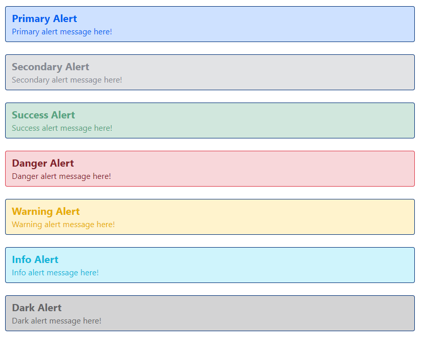
Creating Bootstrap style alerts by using Tailwind CSS
As Bootstrap is a popular and mostly used CSS framework, the demo below shows alerts like the contextual classes of Bootstrap.
So, we have Primary, Secondary, Info, Success, Warning etc. style in this example. Have a look:
<!DOCTYPE html>
<html>
<head>
<script src="https://cdn.tailwindcss.com"></script>

</head>

<body>
<h1 class="text-cyan-700 text-xl mx-10 mt-10 font-bold ">

 Tailwind font size: Alert
</h1>
<div class="flex flex-5 mx-8 mt-10  justify-between">

<div class='m-12 space-y-6'>
    <div class="bg-[#CEE1FF] w-[50rem] border-x border-y border-[#003077] text-[#0060F0] rounded px-3 py-2" role="alert">
        <p class="font-bold text-xl">Primary Alert</p>
        <p class="text-base">Primary alert message here!</p>
    </div>
    <div class="bg-[#E2E3E5] w-[50rem] border-x border-y border-[#003077] text-[#858992] rounded px-3 py-2" role="alert">
        <p class="font-bold text-xl">Secondary Alert</p>
        <p class="text-base">Secondary  alert message here!</p>
    </div>
    <div class="bg-[#D1E7DD] w-[50rem] border-x border-y border-[#003077] text-[#55A481] rounded px-3 py-2" role="alert">
        <p class="font-bold text-xl">Success Alert</p>
        <p class="text-base">Success alert message here!</p>
    </div>
    <div class="bg-[#F8D7DA] w-[50rem] border-x border-y border-[#DC3445] text-[#842029] rounded px-3 py-2" role="alert">
        <p class="font-bold text-xl">Danger Alert</p>
        <p class="text-base">Danger alert message here!</p>
    </div>
    <div class="bg-[#FFF3CD] w-[50rem] border-x border-y border-[#003077] text-[#E6AC00] rounded px-3 py-2" role="alert">
        <p class="font-bold text-xl">Warning Alert</p>
        <p class="text-base">Warning  alert message here!</p>
    </div>
    <div class="bg-[#CFF4FC] w-[50rem] border-x border-y border-[#003077] text-[#0EB6DA] rounded px-3 py-2" role="alert">
        <p class="font-bold text-xl">Info Alert</p>
        <p class="text-base">Info  alert message here!</p>
    </div>
    <div class="bg-[#D3D3D4] w-[50rem] border-x border-y border-[#003077] text-[#656567] rounded px-3 py-2" role="alert">
        <p class="font-bold text-xl">Dark Alert</p>
        <p class="text-base">Dark alert message here!</p>
    </div>
</div>

</div>
</body>
</html>
Output:
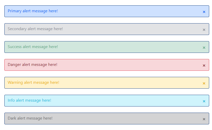
So, we want to enable users to close the alert after reading the notification.
The demo below adds a cross towards the right side of each alert.
This is followed by adding functionality for the cross button (next demo).
<!DOCTYPE html>
<html>
<head>
<script src="https://cdn.tailwindcss.com"></script>
</head>
<body>
<h1 class="text-cyan-700 text-xl mx-10 mt-10 font-bold ">
Tailwind Alert: Cross icon
</h1>
<div class="flex flex-5 mx-8 mt-10 justify-between">
<div class='m-12 space-y-6'>
<div class="flex justify-between bg-[#CEE1FF] w-[50rem] border-x border-y border-[#003077] text-[#0060F0] rounded px-3 py-2" role="alert">
<p class="w-base">Primary alert message here!
</p>
<strong class="text-xl align-right cursor-pointer close-alert">×</strong>
</div>
<div class="flex justify-between bg-[#E2E3E5] w-[50rem] border-x border-y border-[#003077] text-[#858992] rounded px-3 py-2" role="alert">
<p class="text-base">Secondary alert message here!</p>
<strong class="text-xl align-right cursor-pointer close-alert">×</strong>
</div>
<div class="flex justify-between bg-[#D1E7DD] w-[50rem] border-x border-y border-[#003077] text-[#55A481] rounded px-3 py-2" role="alert">
<p class="text-base">Success alert message here!</p>
<strong class="text-xl align-right cursor-pointer close-alert">×</strong>
</div>
<div class="flex justify-between bg-[#F8D7DA] w-[50rem] border-x border-y border-[#DC3445] text-[#842029] rounded px-3 py-2" role="alert">
<p class="text-base">Danger alert message here!</p>
<strong class="text-xl align-right cursor-pointer close-alert">×</strong>
</div>
<div class="flex justify-between bg-[#FFF3CD] w-[50rem] border-x border-y border-[#003077] text-[#E6AC00] rounded px-3 py-2" role="alert">
<p class="text-base">Warning alert message here!</p>
<strong class="text-xl align-right cursor-pointer close-alert">×</strong>
</div>
<div class="flex justify-between bg-[#CFF4FC] w-[50rem] border-x border-y border-[#003077] text-[#0EB6DA] rounded px-3 py-2" role="alert">
<p class="text-base">Info alert message here!</p>
<strong class="text-xl align-right cursor-pointer close-alert">×</strong>
</div>
<div class="flex justify-between bg-[#D3D3D4] w-[50rem] border-x border-y border-[#003077] text-[#656567] rounded px-3 py-2" role="alert">
<p class="text-base">Dark alert message here!</p>
<strong class="text-xl align-right cursor-pointer close-alert">×</strong>
</div>
</div>
</div>
</body>
</html>
Output:
Adding close functionality example
Using the same markup as in the above example, just add the following script before the </body> closing tag.
<script>
     // Script For Close alert
  var close_alert = document.querySelectorAll('.close-alert');

  close_alert.forEach((x) =>

    x.addEventListener('click', function () {

      x.parentElement.classList.add('hidden');

    })

  );

</script>
Copy/paste and run the code below and see by yourself – the closing icon is working:
<!DOCTYPE html>
<html>
<head>
<script src="https://cdn.tailwindcss.com"></script>
</head>
<body>
<h1 class="text-cyan-700 text-xl mx-10 mt-10 font-bold ">
Tailwind Alert: Cross icon
</h1>
<div class="flex flex-5 mx-8 mt-10 justify-between">
<div class='m-12 space-y-6'>
<div class="flex justify-between bg-[#CEE1FF] w-[50rem] border-x border-y border-[#003077] text-[#0060F0] rounded px-3 py-2" role="alert">
<p class="w-base">Primary alert message here!
</p>
<strong class="text-xl align-right cursor-pointer close-alert">×</strong>
</div>
<div class="flex justify-between bg-[#E2E3E5] w-[50rem] border-x border-y border-[#003077] text-[#858992] rounded px-3 py-2" role="alert">
<p class="text-base">Secondary alert message here!</p>
<strong class="text-xl align-right cursor-pointer close-alert">×</strong>
</div>
<div class="flex justify-between bg-[#D1E7DD] w-[50rem] border-x border-y border-[#003077] text-[#55A481] rounded px-3 py-2" role="alert">
<p class="text-base">Success alert message here!</p>
<strong class="text-xl align-right cursor-pointer close-alert">×</strong>
</div>
<div class="flex justify-between bg-[#F8D7DA] w-[50rem] border-x border-y border-[#DC3445] text-[#842029] rounded px-3 py-2" role="alert">
<p class="text-base">Danger alert message here!</p>
<strong class="text-xl align-right cursor-pointer close-alert">×</strong>
</div>
<div class="flex justify-between bg-[#FFF3CD] w-[50rem] border-x border-y border-[#003077] text-[#E6AC00] rounded px-3 py-2" role="alert">
<p class="text-base">Warning alert message here!</p>
<strong class="text-xl align-right cursor-pointer close-alert">×</strong>
</div>
<div class="flex justify-between bg-[#CFF4FC] w-[50rem] border-x border-y border-[#003077] text-[#0EB6DA] rounded px-3 py-2" role="alert">
<p class="text-base">Info alert message here!</p>
<strong class="text-xl align-right cursor-pointer close-alert">×</strong>
</div>
<div class="flex justify-between bg-[#D3D3D4] w-[50rem] border-x border-y border-[#003077] text-[#656567] rounded px-3 py-2" role="alert">
<p class="text-base">Dark alert message here!</p>
<strong class="text-xl align-right cursor-pointer close-alert">×</strong>
</div>
</div>
</div>
<script>
// Script For Close alert
var close_alert = document.querySelectorAll('.close-alert');
close_alert.forEach((x) =>
x.addEventListener('click', function () {
x.parentElement.classList.add('hidden');
})
);
</script>
</body>
</html>
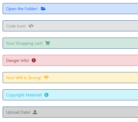
Tailwind alerts with font awesome icons
You may also use font-awesome icons in the alerts to make them more descriptive.
The demo below shows five different icons in different alerts that we used in the above examples.
Have a look:
<!DOCTYPE html>
<html>
<head>
<script src="https://cdn.tailwindcss.com"></script>
<link rel="stylesheet" href="https://cdnjs.cloudflare.com/ajax/libs/font-awesome/5.15.4/css/all.min.css" integrity="sha512-1ycn6IcaQQ40/MKBW2W4Rhis/DbILU74C1vSrLJxCq57o941Ym01SwNsOMqvEBFlcgUa6xLiPY/NS5R+E6ztJQ==" crossorigin="anonymous" />
</head>
<body>
<h1 class="text-cyan-700 text-xl mx-10 mt-10 font-bold ">
Tailwind Alert: Font Awesome Icons
</h1>
<div class="flex flex-5 mx-8 mt-10 justify-between">
<div class='m-12 space-y-6'>
<div class="flex justify-between bg-[#CEE1FF] w-[50rem] border-x border-y border-[#003077] text-[#0060F0] rounded px-3 py-2" role="alert">
<p class="self-center w-64">Open the Folder! <i class="fa fa-folder-open"></i>
</p>
</div>
<div class="flex justify-between bg-[#E2E3E5] w-[50rem] border-x border-y border-[#003077] text-[#858992] rounded px-3 py-2" role="alert">
<p class="text-base">Code icon! <i class="fa fa-code"></i></p>
</div>
<div class="flex justify-between bg-[#D1E7DD] w-[50rem] border-x border-y border-[#003077] text-[#55A481] rounded px-3 py-2" role="alert">
<p class="text-base">Your Shopping cart! <i class="fa fa-shopping-cart"></i></p>
</div>
<div class="flex justify-between bg-[#F8D7DA] w-[50rem] border-x border-y border-[#DC3445] text-[#842029] rounded px-3 py-2" role="alert">
<p class="text-base">Danger Info! <i class="fa fa-info-circle"></i></p>
</div>
<div class="flex justify-between bg-[#FFF3CD] w-[50rem] border-x border-y border-[#003077] text-[#E6AC00] rounded px-3 py-2" role="alert">
<p class="text-base">Your Wifi is Strong! <i class="fa fa-wifi"></i></p>
</div>
<div class="flex justify-between bg-[#CFF4FC] w-[50rem] border-x border-y border-[#003077] text-[#0EB6DA] rounded px-3 py-2" role="alert">
<p class="text-base">Copyright Material! <i class="fa fa-copyright"></i></p>
</div>
<div class="flex justify-between bg-[#D3D3D4] w-[50rem] border-x border-y border-[#003077] text-[#656567] rounded px-3 py-2" role="alert">
<p class="text-base">Upload Data! <i class="fa fa-upload"></i></p>
</div>
</div>
</div>
</body>
</html>
Result:
In this style, we have an icon towards the left, information in the center, and a close button towards the left of the alert.
<!DOCTYPE html>
<html>
<head>
<script src="https://cdn.tailwindcss.com"></script>
<link rel="stylesheet" href="https://cdnjs.cloudflare.com/ajax/libs/font-awesome/5.15.4/css/all.min.css" integrity="sha512-1ycn6IcaQQ40/MKBW2W4Rhis/DbILU74C1vSrLJxCq57o941Ym01SwNsOMqvEBFlcgUa6xLiPY/NS5R+E6ztJQ==" crossorigin="anonymous" />

</head>

<body>
<h1 class="text-cyan-700 text-xl mx-10 mt-10 font-bold ">

 Tailwind Alerts - FA 2
</h1>
<div class="mx-8 mt-10 ">

<div class="p-8 space-y-4">
  <div class="flex w-96 shadow-lg rounded-lg close-alert" role="alert">
    <div class="bg-sky-500 py-4 px-6 rounded-l-lg flex items-center">
    <i class="fa fa-download text-yellow-400 w-8 text-center"></i>
    </div>
    <div class="px-4 py-6 bg-sky-100 rounded-r-lg flex justify-between items-center w-full border border-l-transparent border-blue-200">
      <div>Your Download will start soon!</div>
      <i class="fa fa-times "></i>
    </div>
  </div>

</div>
<script>

  var close_alert = document.querySelectorAll('.close-alert');
  close_alert.forEach((x) =>
    x.addEventListener('click', function () {
      x.parentElement.classList.add('hidden');
    })
  );
</script>

</body>

</html>
Output:
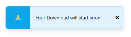
You can see the close button is also functioning in the demo page.
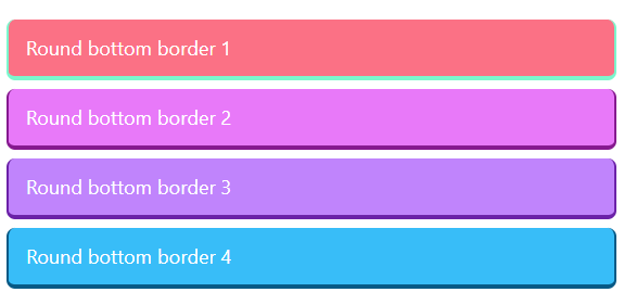
Alerts with thick rounded bottom
In this demo, we used rounded-t-lg class along with border-b-4 which makes the bottom border thicker.
- The edges are rounded.
- Besides, we also used a thin layer for the left and right borders while the top border was not used.
- Have a look at various colors:
The code
<!DOCTYPE html>
<html>
<head>
<script src="https://cdn.tailwindcss.com"></script>
<link rel="stylesheet" href="https://cdnjs.cloudflare.com/ajax/libs/font-awesome/5.15.4/css/all.min.css" integrity="sha512-1ycn6IcaQQ40/MKBW2W4Rhis/DbILU74C1vSrLJxCq57o941Ym01SwNsOMqvEBFlcgUa6xLiPY/NS5R+E6ztJQ==" crossorigin="anonymous" />

</head>

<body>
<h1 class="text-cyan-700 text-xl mx-10 mt-10 font-bold ">

 Tailwind Alerts - Round Bottom
</h1>
<div class="mx-8 mt-10 ">

<p>
<div class="bg-rose-400 w-full border-[#7BF7CD] mb-2 select-none rounded-t-lg  border-b-4 rounded-b-lg border-l-2 border-r-2 text-white px-4 py-3" role="alert">
        <p class="text-lg">Round bottom border 1</p>
</div>
</p>
<p>
<div class="bg-fuchsia-400 w-full border-fuchsia-800 mb-2 select-none rounded-t-lg  border-b-4 rounded-b-lg border-l-2 border-r-2 text-white px-4 py-3" role="alert">
        <p class="text-lg">Round bottom border 2</p>
</div>
</p>
<p>
<div class="bg-purple-400 w-full border-purple-800 mb-2 select-none rounded-t-lg  border-b-4 rounded-b-lg border-l-2 border-r-2 text-white px-4 py-3" role="alert">
        <p class="text-lg">Round bottom border 3</p>
</div>
</p>
<p>
<div class="bg-sky-400 w-full border-sky-800 mb-2 select-none rounded-t-lg  border-b-4 rounded-b-lg border-l-2 border-r-2 text-white px-4 py-3" role="alert">
        <p class="text-lg">Round bottom border 4</p>
</div>
</p>
</div>
</div>

</body>

</html>
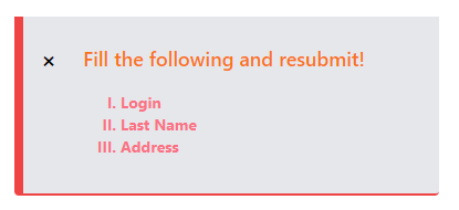
An error alert template
This alert uses <ul> and <li> tags with Tailwind classes. We also have a close button to dismiss the alert.
The example can be used to notify users of certain requirements in the form.
Markup
<!DOCTYPE html>
<html>
<head>
<script src="https://cdn.tailwindcss.com"></script>
<link rel="stylesheet" href="https://cdnjs.cloudflare.com/ajax/libs/font-awesome/5.15.4/css/all.min.css" integrity="sha512-1ycn6IcaQQ40/MKBW2W4Rhis/DbILU74C1vSrLJxCq57o941Ym01SwNsOMqvEBFlcgUa6xLiPY/NS5R+E6ztJQ==" crossorigin="anonymous" />
</head>
<body>
<h1 class="text-cyan-700 text-xl mx-10 mt-10 font-bold ">
Tailwind Alerts - FA 2
</h1>
<div class="mx-8 mt-10 ">
<div class="w-96 bg-gray-200 mb-2 border-l-8 border-b-2 rounded-b border-red-500 close-alert">
<div class="flex items-center">
<div class="p-2">
<div class="flex items-center">
<div class="ml-2">
<strong class="text-xl align-right cursor-pointer">×</strong>
</div>
<p class="px-6 py-4 text-orange-500 font-semibold text-lg">Fill the following and resubmit!</p>
</div>
<div class="px-20 mb-6">
<ul class="list-[upper-roman] ">
<li class="text-md font-bold text-rose-400 text-sm">Login </li>
<li class="text-md font-bold text-rose-400 text-sm">Last Name</li>
<li class="text-md font-bold text-rose-400 text-sm">Address</li>
</ul>
</div>
</div>
</div>
</div>
</div>
<script>
var close_alert = document.querySelectorAll('.close-alert');
close_alert.forEach((x) =>
x.addEventListener('click', function () {
x.parentElement.classList.add('hidden');
})
);
</script>
</body>
</html>