
Carousel component in Bootstrap 5
- In the previous version of Bootstrap (Bootstrap 3 Carousel), you had to use jQuery in order to use the carousel component.
- In Bootstrap 5, this is no more required. Instead, it uses a little JavaScript and CSS 3D transforms.
Quick Demos Online:
What is a carousel?
A carousel is a slideshow component that you may use for various purposes on your website. For example, sliding the important marketing information with images.
- A restaurant can use it for sliding different food deals.
- A software product component may use it for sliding the product features.
- E-commerce stores can use for special promotions with discounts, new arrivals.
- And so many uses of this sliding component – like a carousel.
In this tutorial, we will show you examples of a basic to the advanced carousel with various features.
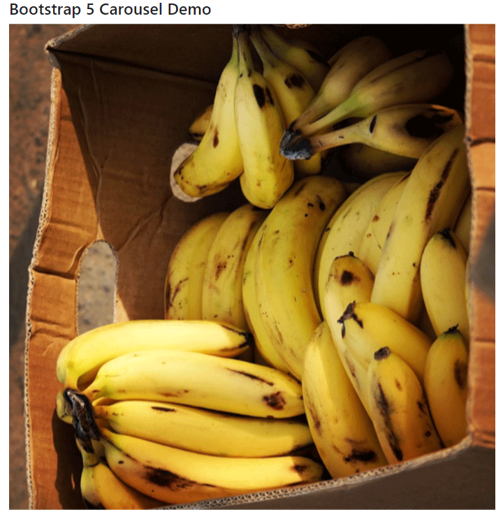
A simple example of Bootstrap 5 carousel
In the first example, we have a simple sliding images component like a carousel. The carousel is without any text, controls to move next/prev, etc. Have a look at the code and output below:
Online demo and code
<!DOCTYPE html>
<html lang="en">
<head>
  <meta name="viewport" content="width=device-width, initial-scale=1">
  <link href="https://cdn.jsdelivr.net/npm/bootstrap@5.0.1/dist/css/bootstrap.min.css" rel="stylesheet" integrity="sha384-+0n0xVW2eSR5OomGNYDnhzAbDsOXxcvSN1TPprVMTNDbiYZCxYbOOl7+AMvyTG2x" crossorigin="anonymous">
  <script src="https://cdn.jsdelivr.net/npm/bootstrap@5.2.3/dist/js/bootstrap.bundle.min.js"></script>
 <style>

  img{

    width:100%;

  }
</style>

</head>
<body>

<div class="container">

<h4>Bootstrap 5 Carousel Demo</h4>

<div id="jazdemo" class="carousel slide" data-bs-ride="carousel">

  <div class="carousel-inner">

    <div class="carousel-item active">

      <img src="images/banana.jpg" alt="Banana" class="d-block image-fluid" >

    </div>

    <div class="carousel-item">

      <img src="images/currant.jpg" alt="Currant" class="d-block" >

    </div>

    <div class="carousel-item">

      <img src="images/mango.jpg" alt="Mango" class="d-block" >

    </div>

   </div>

</div>
</div>

</body>

</html>
This is how the carousel is created:
- The main <div> is assigned the .carousel and .slide. This creates a carousel.
- In the next <div>, we assigned .carousel-inner class that adds slides to the carousel.
- For specifying the image (and other info), we used another <div> and assigned the .carousel-item
- Add as many div elements with this class as required.
- Add .active class to .carousel-item for the slide that you want to show first as the web page loads. In our example, we assigned this to the third div.
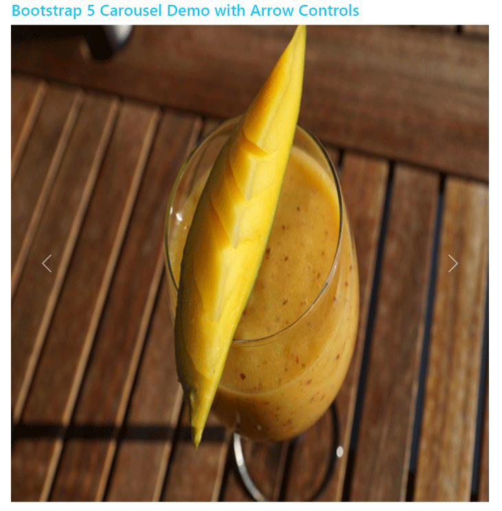
An example of carousel with left/right controls
Adding to the above example, we have a carousel with left and right arrows. So, instead of just moving sliding images automatically, you are giving an option to the user to move quickly by using arrows.
See an example below:
Online demo and code
<!DOCTYPE html>
<html lang="en">
<head>

  <meta name="viewport" content="width=device-width, initial-scale=1">

  <link href="https://cdn.jsdelivr.net/npm/bootstrap@5.0.1/dist/css/bootstrap.min.css" rel="stylesheet" integrity="sha384-+0n0xVW2eSR5OomGNYDnhzAbDsOXxcvSN1TPprVMTNDbiYZCxYbOOl7+AMvyTG2x" crossorigin="anonymous">

  <script src="https://cdn.jsdelivr.net/npm/bootstrap@5.2.3/dist/js/bootstrap.bundle.min.js"></script>
 <style>

  img{

    width:100%;
  }
</style>

</head>

<body>

<div class="container">

<h4 class="text-info">Bootstrap 5 Carousel Demo with Arrow Controls</h4>

<div id="jazdemo" class="carousel slide" data-bs-ride="carousel">

  <div class="carousel-inner">

    <div class="carousel-item">

      <img src="images/banana.jpg" alt="Banana" class="d-block image-fluid" >

    </div>

    <div class="carousel-item">

      <img src="images/currant.jpg" alt="Currant" class="d-block" >

    </div>

    <div class="carousel-item active">

      <img src="images/mango.jpg" alt="Mango" class="d-block" >

    </div>

   </div>

<!-- Adding controls for moving slides -->

<a class="carousel-control-prev" type="button" href="#jazdemo" data-bs-slide="prev">

    <span class="carousel-control-prev-icon"></span>

</a>

  <a class="carousel-control-next" type="button" href="#jazdemo" data-bs-slide="next">

    <span class="carousel-control-next-icon"></span>

</a>

</div>
</div>

</body>

</html>
This is how arrows are added to the carousel:
- Before the closing of the .carousel <div>, two <a> tags are used.
- The first <a> is assigned .carousel-control-prev class and the second .carousel-control-next
- Notice the href=”jazdemo”. This is mapped to the .carousel <div> id.
- In the <span> tag, inside each <a> tag, the icon classes are assigned. The .carousel-control-prev-icon to the first <a> and .carousel-control-next-icon to the second <a> tag.
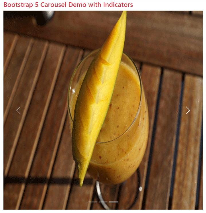
A carousel with indicators example
It’s another useful feature provided in the slideshow (like a carousel) to let users know which slide they are on. This might especially be useful for more sliding images.
The example below adds indicators to the above carousel – along with controls:
<!DOCTYPE html>
<html lang="en">
<head>

  <meta name="viewport" content="width=device-width, initial-scale=1">

  <link href="https://cdn.jsdelivr.net/npm/bootstrap@5.0.1/dist/css/bootstrap.min.css" rel="stylesheet" integrity="sha384-+0n0xVW2eSR5OomGNYDnhzAbDsOXxcvSN1TPprVMTNDbiYZCxYbOOl7+AMvyTG2x" crossorigin="anonymous">

  <script src="https://cdn.jsdelivr.net/npm/bootstrap@5.2.3/dist/js/bootstrap.bundle.min.js"></script>
 <style>

  img{

    width:100%;
  }
</style>

</head>
<body>

<div class="container">

<h4 class="text-danger">Bootstrap 5 Carousel Demo with Indicators</h4>

<div id="jazDemoIndicators" class="carousel slide" data-bs-ride="carousel">

  <!-- Adding Indicators -->

  <ol class="carousel-indicators">

    <li  data-bs-target="#jazDemoIndicators" data-bs-slide-to="0" class="active"></li>

    <li data-bs-target="#jazDemoIndicators" data-bs-slide-to="1"></li>

    <li data-bs-target="#jazDemoIndicators" data-bs-slide-to="2"></li>

</ol>

  <div class="carousel-inner">

    <div class="carousel-item active">

      <img src="images/banana.jpg" alt="Banana" class="d-block image-fluid" >

    </div>

    <div class="carousel-item">

      <img src="images/currant.jpg" alt="Currant" class="d-block" >

    </div>

    <div class="carousel-item">

      <img src="images/mango.jpg" alt="Mango" class="d-block" >

    </div>

   </div>

<!-- Adding controls for moving slides -->

<a class="carousel-control-prev" role="button" href="#jazDemoIndicators" data-bs-slide="prev">

    <span class="carousel-control-prev-icon"></span>

</a>

  <a class="carousel-control-next" role="button" href="#jazDemoIndicators" data-bs-slide="next">

    <span class="carousel-control-next-icon"></span>

</a>
</div>
</div>

</body>

</html>
So, how indicators are added in our demo?
- After the main <div> containing .carousel class, an ordered list <ol> is added and .carousel-indicators class is assigned.
- Then three <li> items, as per the number of slides in the carousel, are added.
- Ensure that .active class is assigned to an <li>, otherwise, the carousel will not be visible.
- See the other code for relating the slide to the indicator.
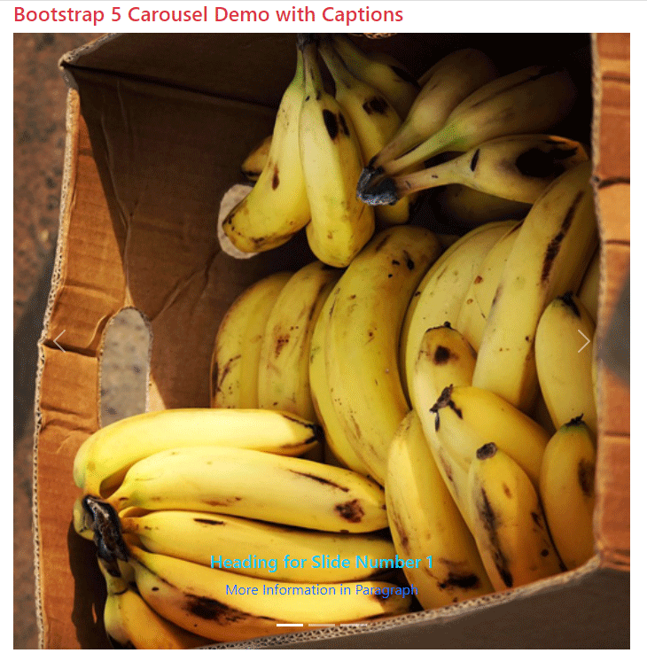
Adding information to sliding images
To make slide images with information, you may add captions easily. You may also manage to show information on the big screens and hide it on smartphones by using utility classes. First, see an example below:
<!DOCTYPE html>
<html lang="en">
<head>

  <meta name="viewport" content="width=device-width, initial-scale=1">

  <link href="https://cdn.jsdelivr.net/npm/bootstrap@5.0.1/dist/css/bootstrap.min.css" rel="stylesheet" integrity="sha384-+0n0xVW2eSR5OomGNYDnhzAbDsOXxcvSN1TPprVMTNDbiYZCxYbOOl7+AMvyTG2x" crossorigin="anonymous">

  <script src="https://cdn.jsdelivr.net/npm/bootstrap@5.2.3/dist/js/bootstrap.bundle.min.js"></script>
 <style>

  img{

    width:100%;

  }

</style>

</head>
<body>

<div class="container">

<h4 class="text-danger">Bootstrap 5 Carousel Demo with Captions</h4>

<div id="jazDemoIndicators" class="carousel slide" data-bs-ride="carousel">

  <!-- Adding Indicators -->

  <ol class="carousel-indicators">

    <li  data-bs-target="#jazDemoIndicators" data-bs-slide-to="0" class="active"></li>

    <li data-bs-target="#jazDemoIndicators" data-bs-slide-to="1"></li>

    <li data-bs-target="#jazDemoIndicators" data-bs-slide-to="2"></li>

</ol>

  <div class="carousel-inner">

    <div class="carousel-item active">

      <img src="images/banana.jpg" alt="Banana" class="d-block" >

<!--Adding Captions/information-->

    <div class="carousel-caption d-none d-md-block">

      <h5 class="text-info">Heading for Slide Number 1</h5>

      <p class="text-primary">More Information in Paragraph</p>

    </div>

    </div>

    <div class="carousel-item">

      <img src="images/currant.jpg" alt="Currant" class="d-block" >

    <!--Adding Captions/information-->

    <div class="carousel-caption d-none d-md-block">

      <h5>Heading for Slide Number 3</h5>

      <p>More Information in Paragraph</p>

    </div>

    </div>

    <div class="carousel-item">

      <img src="images/mango.jpg" alt="Mango" class="d-block" >

      <!--Adding Captions/information-->

      <div class="carousel-caption d-none d-md-block">

      <h5>Heading for Slide Number 13</h5>

      <p>More Information in Paragraph</p>

    </div>

    </div>

   </div>
<!-- Adding controls for moving slides -->

<a class="carousel-control-prev" role="button" href="#jazDemoIndicators" data-bs-slide="prev">

    <span class="carousel-control-prev-icon"></span>

</a>

  <a class="carousel-control-next" role="button" href="#jazDemoIndicators" data-bs-slide="next">

    <span class="carousel-control-next-icon"></span>

</a>
</div>
</div>

</body>

</html>
How to add captions?
Just after the <img> tag for each slide, a <div> with .carousel-caption class is assigned.
There you can add headings like <h1> to <h6>, paragraphs, etc. for displaying the information as shown in the image.
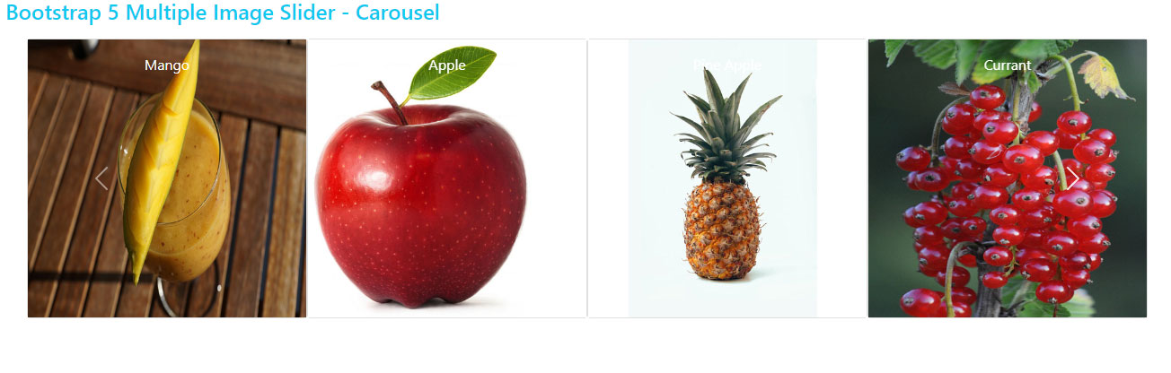
Multiple image slider demo using Bootstrap 5
In the following demo, we have a carousel that displays multiple slides at one time. In the demo, four slides are displayed that adjust the image size per available width (display screen).
Online demo and code
<!DOCTYPE html>
<html lang="en">
<head>

  <meta name="viewport" content="width=device-width, initial-scale=1">

  <link href="https://cdn.jsdelivr.net/npm/bootstrap@5.0.1/dist/css/bootstrap.min.css" rel="stylesheet" integrity="sha384-+0n0xVW2eSR5OomGNYDnhzAbDsOXxcvSN1TPprVMTNDbiYZCxYbOOl7+AMvyTG2x" crossorigin="anonymous">

  <script src="https://cdn.jsdelivr.net/npm/bootstrap@5.2.3/dist/js/bootstrap.bundle.min.js"></script>

 <style>

@media (max-width: 767px) {

        .carousel-inner .carousel-item > div {

            display: none;

        }

        .carousel-inner .carousel-item > div:first-child {

            display: block;

        }

    }
    .carousel-inner .carousel-item.active,

    .carousel-inner .carousel-item-next,

    .carousel-inner .carousel-item-prev {

        display: flex;

    }
    /* medium and up screens */

    @media (min-width: 768px) {
        .carousel-inner .carousel-item-end.active,

        .carousel-inner .carousel-item-next {

            transform: translateX(25%);

        }

        .carousel-inner .carousel-item-start.active,

        .carousel-inner .carousel-item-prev {

            transform: translateX(-25%);

        }

    }

    .carousel-inner .carousel-item-end,

    .carousel-inner .carousel-item-start {

        transform: translateX(0);

    }

</style>

</head>
<body>

<div class="container">

<h4 class="text-info">Bootstrap 5 Multiple Image Slider - Carousel</h4>

<div class="container text-center my-3">

        <div class="row mx-auto my-auto justify-content-center">

            <div id="recipeCarousel" class="carousel slide" data-bs-ride="carousel">

                <div class="carousel-inner" role="listbox">

                    <div class="carousel-item active">

                        <div class="col-md-3">

                            <div class="card">

                                <div class="card-img">

                                    <img src="images/banana.jpg" class="img-fluid">

                                </div>

                                <div class="card-img-overlay text-white">Banana</div>

                            </div>

                        </div>

                    </div>

                    <div class="carousel-item">

                        <div class="col-md-3">

                            <div class="card">

                                <div class="card-img">

                                    <img src="images/mango.jpg" class="img-fluid">

                                </div>

                                <div class="card-img-overlay text-white">Mango</div>

                            </div>

                        </div>

                    </div>

                    <div class="carousel-item">

                        <div class="col-md-3">

                            <div class="card">

                                <div class="card-img">

                                    <img src="images/apple-2.jpg" class="img-fluid">

                                </div>

                                <div class="card-img-overlay text-white">Apple</div>

                            </div>

                        </div>

                    </div>

                    <div class="carousel-item">

                        <div class="col-md-3">

                            <div class="card">

                                <div class="card-img">

                                    <img src="images/pineapple-2.jpg" class="img-fluid">

                                </div>

                                <div class="card-img-overlay text-white">Pine Apple</div>

                            </div>

                        </div>

                    </div>

                    <div class="carousel-item">

                        <div class="col-md-3">

                            <div class="card">

                                <div class="card-img">

                                    <img src="images/currant.jpg" class="img-fluid">

                                </div>

                                <div class="card-img-overlay text-white">Currant</div>

                            </div>

                        </div>

                    </div>


                </div>

                <a class="carousel-control-prev bg-transparent w-aut" href="#recipeCarousel" role="button" data-bs-slide="prev">

                    <span class="carousel-control-prev-icon" aria-hidden="true"></span>

                </a>

                <a class="carousel-control-next bg-transparent w-aut" href="#recipeCarousel" role="button" data-bs-slide="next">

                    <span class="carousel-control-next-icon" aria-hidden="true"></span>

                </a>

            </div>

        </div>

    </div>
</div>

<script>

let items = document.querySelectorAll('.carousel .carousel-item')

items.forEach((el) => {

  const minPerSlide = 4

  let next = el.nextElementSibling

  for (var i=1; i<minPerSlide; i++) {

    if (!next) {

        // wrap carousel by using first child

        next = items[0]

    }

    let cloneChild = next.cloneNode(true)

    el.appendChild(cloneChild.children[0])

    next = next.nextElementSibling

}

})

</script>

</body>

</html>
In the above code, note the CSS in the style section, markup, and JavaScript code before the </body> tag.
Credit:
https://codepen.io/hellomev/pen/LYORMQW
Changing the interval for slideshow
The default value for slides for automatically moving to the next slide is 5000 ms i.e. 5 seconds. You may change the interval by using the data attribute:
data-bs-interval = “3000” etc.
This applies to each carousel item separately.
In the example below we set the interval value as 1000 ms i.e. one second. Have a look:
Online demo and code
<!DOCTYPE html>
<html lang="en">

<head>

  <meta name="viewport" content="width=device-width, initial-scale=1">

  <link href="https://cdn.jsdelivr.net/npm/bootstrap@5.0.1/dist/css/bootstrap.min.css" rel="stylesheet" integrity="sha384-+0n0xVW2eSR5OomGNYDnhzAbDsOXxcvSN1TPprVMTNDbiYZCxYbOOl7+AMvyTG2x" crossorigin="anonymous">

  <script src="https://cdn.jsdelivr.net/npm/bootstrap@5.2.3/dist/js/bootstrap.bundle.min.js"></script>
 <style>

  img{

    width:100%;

  }

</style>

</head>
<body>

<div class="container">

<h4 class="text-success">Bootstrap 5 Carousel Demo with Less Interval</h4>

<div id="jazDemoIndicators" class="carousel slide" data-bs-ride="carousel">

  <!-- Adding Indicators -->

  <ol class="carousel-indicators">

    <li  data-bs-target="#jazDemoIndicators" data-bs-slide-to="0" class="active"></li>

    <li data-bs-target="#jazDemoIndicators" data-bs-slide-to="1"></li>

    <li data-bs-target="#jazDemoIndicators" data-bs-slide-to="2"></li>

</ol>

  <div class="carousel-inner">

    <div class="carousel-item active" data-bs-interval="1000">

      <img src="images/banana.jpg" alt="Banana" class="d-block" >

<!--Adding Captions/information-->

    <div class="carousel-caption d-none d-md-block">

      <h5 class="text-info">Heading for Slide Number 1</h5>

      <p class="text-primary">More Information in Paragraph</p>

    </div>

    </div>

    <div class="carousel-item" data-bs-interval="1000">

      <img src="images/currant.jpg" alt="Currant" class="d-block" >

    <!--Adding Captions/information-->

    <div class="carousel-caption d-none d-md-block">

      <h5>Heading for Slide Number 3</h5>

      <p>More Information in Paragraph</p>

    </div>

    </div>

    <div class="carousel-item" data-bs-interval="1000">

      <img src="images/mango.jpg" alt="Mango" class="d-block" >

      <!--Adding Captions/information-->

      <div class="carousel-caption d-none d-md-block">

      <h5>Heading for Slide Number 13</h5>

      <p>More Information in Paragraph</p>

    </div>

    </div>

   </div>
<!-- Adding controls for moving slides -->

<a class="carousel-control-prev" role="button" href="#jazDemoIndicators" data-bs-slide="prev">

    <span class="carousel-control-prev-icon"></span>

</a>

  <a class="carousel-control-next" role="button" href="#jazDemoIndicators" data-bs-slide="next">

    <span class="carousel-control-next-icon"></span>

</a>
</div>

</div>

</body>

</html>
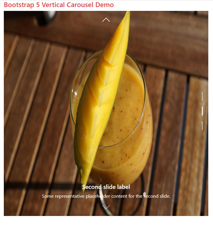
An example of creating vertical carousel in Bootstrap 5
The following example shows creating a carousel where slides move vertically.
In all our above examples, slides move horizontally whether it’s a single image slider or multiple.
In this example, you can see the indicators are visible on the right side and arrows for moving the slides towards the top and bottom of the slide.
You can test the example on your own by copying the complete code in your editor and just replacing the image paths:
Online demo and code
<!DOCTYPE html>
<html lang="en">

<head>

  <meta name="viewport" content="width=device-width, initial-scale=1">

  <link href="https://cdn.jsdelivr.net/npm/bootstrap@5.0.1/dist/css/bootstrap.min.css" rel="stylesheet" integrity="sha384-+0n0xVW2eSR5OomGNYDnhzAbDsOXxcvSN1TPprVMTNDbiYZCxYbOOl7+AMvyTG2x" crossorigin="anonymous">

  <script src="https://cdn.jsdelivr.net/npm/bootstrap@5.2.3/dist/js/bootstrap.bundle.min.js"></script>

 <style>

/**

 * User: Alessandro Battaglia

 * Date: 17/05/2022

 * Time: 15:24

 */


 .vertical.carousel .carousel-item {

    overflow: hidden;

}


.vertical.carousel .carousel-item-next:not(.carousel-item-start),

.vertical.carousel .active.carousel-item-end {

    transform: translateY(100%);

}


.vertical.carousel .carousel-item-prev:not(.carousel-item-end),

.vertical.carousel .active.carousel-item-start {

    transform: translateY(-100%);

}


.vertical.carousel .carousel-indicators {

    top: 0;

    left: unset;


    margin-left: unset !important;

    margin-right: 1rem;


    flex-direction: column;

}


.vertical.carousel .carousel-indicators [data-bs-target] {

    height: 30px;

    width: 3px;

}


.vertical.carousel .carousel-control-prev,

.vertical.carousel .carousel-control-next {

    width: 100%;

    height: 60px;

}


.vertical.carousel .carousel-control-prev-icon,

.vertical.carousel .carousel-control-next-icon {

    transform: rotateZ(90deg);

}


.vertical.carousel .carousel-control-next {

    top: unset;

    bottom: 0;

}

</style>

</head>


<body>

<div class="container">

<h4 class="text-danger">Bootstrap 5 Vertical Carousel Demo</h4>

<div id="carouselExampleCaptions" class="carousel slide vertical" data-bs-ride="false">

  <div class="carousel-indicators">

    <button type="button" data-bs-target="#carouselExampleCaptions" data-bs-slide-to="0" class="active" aria-current="true" aria-label="Slide 1"></button>

    <button type="button" data-bs-target="#carouselExampleCaptions" data-bs-slide-to="1" aria-label="Slide 2"></button>

    <button type="button" data-bs-target="#carouselExampleCaptions" data-bs-slide-to="2" aria-label="Slide 3"></button>

  </div>

  <div class="carousel-inner">

    <div class="carousel-item active">

      <img src="images/banana.jpg" class="d-block w-100" alt="...">

      <div class="carousel-caption d-none d-md-block">

        <h5>First slide label</h5>

        <p>Some representative placeholder content for the first slide.</p>

      </div>

    </div>

    <div class="carousel-item">

      <img src="images/mango.jpg" class="d-block w-100" alt="...">

      <div class="carousel-caption d-none d-md-block">

        <h5>Second slide label</h5>

        <p>Some representative placeholder content for the second slide.</p>

      </div>

    </div>

    <div class="carousel-item">

      <img src="images/apple.jpg" class="d-block w-100" alt="...">

      <div class="carousel-caption d-none d-md-block">

        <h5>Third slide label</h5>

        <p>Some representative placeholder content for the third slide.</p>

      </div>

    </div>

  </div>

  <button class="carousel-control-prev" type="button" data-bs-target="#carouselExampleCaptions" data-bs-slide="prev">

    <span class="carousel-control-prev-icon" aria-hidden="true"></span>

    <span class="visually-hidden">Previous</span>

  </button>

  <button class="carousel-control-next" type="button" data-bs-target="#carouselExampleCaptions" data-bs-slide="next">

    <span class="carousel-control-next-icon" aria-hidden="true"></span>

    <span class="visually-hidden">Next</span>

  </button>

</div>


</div>


</div>

</body>

</html>
Credit for CSS:
Making slideshow crossfade example
In all the above demos, (horizontal or vertical), the image moves in a sliding way. You can also create a carousel where next slide appears in a fading transition – easily.
For that, simply add the .carousel-fade class to the main <div> that contains .carousel. That’s it!
Online demo and code
<!DOCTYPE html>

<html lang="en">

<head>

  <meta name="viewport" content="width=device-width, initial-scale=1">

  <link href="https://cdn.jsdelivr.net/npm/bootstrap@5.0.1/dist/css/bootstrap.min.css" rel="stylesheet" integrity="sha384-+0n0xVW2eSR5OomGNYDnhzAbDsOXxcvSN1TPprVMTNDbiYZCxYbOOl7+AMvyTG2x" crossorigin="anonymous">

  <script src="https://cdn.jsdelivr.net/npm/bootstrap@5.2.3/dist/js/bootstrap.bundle.min.js"></script>
 <style>

  img{

    width:100%;

  }

</style>

</head>

<body>

<div class="container">

<h4 class="text-danger">Bootstrap 5 Carousel Demo with Fade Transition </h4>

<div id="jazDemoFadeTrans" class="carousel slide carousel-fade" data-bs-ride="carousel">

  <!-- Adding Indicators -->

  <ol class="carousel-indicators">

    <li  data-bs-target="#jazDemoFadeTrans" data-bs-slide-to="0" class="active"></li>

    <li data-bs-target="#jazDemoFadeTrans" data-bs-slide-to="1"></li>

    <li data-bs-target="#jazDemoFadeTrans" data-bs-slide-to="2"></li>

</ol>

  <div class="carousel-inner">

    <div class="carousel-item active" data-bs-interval = "2000">

      <img src="images/banana.jpg" alt="Banana" class="d-block" >

<!--Adding Captions/information-->

    <div class="carousel-caption d-none d-md-block">

      <h5 class="text-info">Heading for Slide Number 1</h5>

      <p class="text-primary">More Information in Paragraph</p>

    </div>

    </div>

    <div class="carousel-item" data-bs-interval = "2000">

      <img src="images/currant.jpg" alt="Currant" class="d-block" >

    <!--Adding Captions/information-->

    <div class="carousel-caption d-none d-md-block">

      <h5>Heading for Slide Number 3</h5>

      <p>More Information in Paragraph</p>

    </div>

    </div>

    <div class="carousel-item" data-bs-interval = "2000">

      <img src="images/mango.jpg" alt="Mango" class="d-block" >

      <!--Adding Captions/information-->

      <div class="carousel-caption d-none d-md-block">

      <h5>Heading for Slide Number 13</h5>

      <p>More Information in Paragraph</p>

    </div>

    </div>

   </div>

<!-- Adding controls for moving slides -->

<a class="carousel-control-prev" role="button" href="#jazDemoFadeTrans" data-bs-slide="prev">

    <span class="carousel-control-prev-icon"></span>

</a>

  <a class="carousel-control-next" role="button" href="#jazDemoFadeTrans" data-bs-slide="next">

    <span class="carousel-control-next-icon"></span>

</a>

</div>
</div>

</body>

</html>
Reference:
https://getbootstrap.com/docs/5.0/components/carousel/