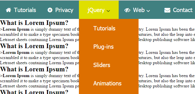
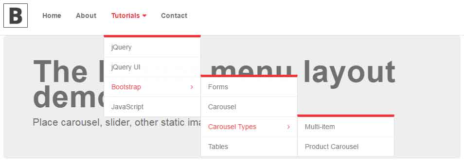
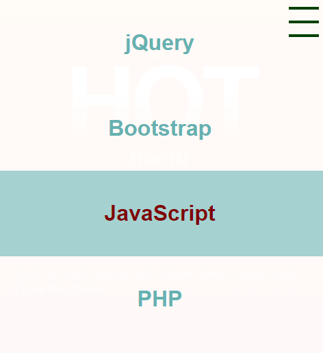
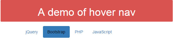
The Mega Menu based on CSS and HTML
The mega menu shared in this article can be used for showing the portfolio or for other purposes. As the mouse hovers over any item, the theme or placeholder for mega menu changes with its own content.
Browse the range of menu scripts and plug-ins based on jQuery and Bootstrap. The menus include top bar, off-canvas, full screen, vertical, horizontal, responsive and many more..
The mega menu shared in this article can be used for showing the portfolio or for other purposes. As the mouse hovers over any item, the theme or placeholder for mega menu changes with its own content.
Creating the sidebar with Angular and Bootstrap navbar The ng-bs-navbar is an Angular directive that can be used for creating the navbar based on Bootstrap, as well as it includes a handy sidebar. You may also place the icons from the materialIcon with the menu items. Developer page Download plug-in How to setup this Angular … Read more
What is sideToggle plug-in? The sideToggle is a jQuery plug-in that you may use for creating the side toggle menu on your website. Basically, this plug-in toggles the elements sideways, however, the usage can be menus or toggling other elements. The jQuery default toggle behavior is towards up and down as explained in this tutorial … Read more
Creating responsive menus by a jQuery plug-in The simple and light-weight (1K) responsive-navigation jQuery plug-in enables creating responsive menus for your website. It uses font-awesome icons with the menu item and also creates sub menu that is adaptive to the user’s screen. Developer’s page Download plug-in Setting up responsive-navigation plug-in You need to include the … Read more
What is the contextMenu? The contextMenu is a lightweight solution for creating contextual menus on your web pages. The contextMenu will display as a user right clicks on a DOM element. You may associate this context menu plug-in with different elements in DOM like a div, form, table, etc. You may easily customize the look … Read more
How to create a fixed menu on the scroll? In this tutorial, a jQuery and CSS based menu is shared that will be fixed on top as you scroll down the page. That way, your main content may appear on the top with the menu bar afterward. As the user scrolls down the page and passes … Read more
Creating responsive sidebar sliding menu bar in Bootstrap In this post, I am going to share a nice and simple sliding menu bar that slides from left to right. As you click the typical three horizontal lines of “mobile icon”, the menu will open in a sliding manner. As it opens, a cross icon will … Read more
The Bootstrap navbar classes The navigation bar in Bootstrap-based projects can be created by using navbar and its related classes quite easily. Bootstrap provides two styles that you may specify in the <nav> tag. These classes are: navbar-default navbar-inverse The navbar-default gives a grayish look to the navigation bar while inverse gives it black. In … Read more
The header layouts using Bootstrap framework In this post, I am going to share an excellent plug-in that works with Bootstrap for creating the header menu for your website. It includes 23 free templates that you may choose as per the need of your web project. The free code is included by the developer that … Read more
The off-canvas menu using pure CSS The off-canvas menu is the one that slides and overlaps the main content with the navigation links. Generally, you may need to use JavaScript to create this type of menu. In this post, an off-canvas menu is shared with pure CSS. This menu type can particularly be useful for … Read more
The CSS tabs menu In this tutorial, a CSS menu is created which is tabbed style and slides as you click a menu item. The content of different tabs is contained in the same web page, so it can be used for the single-page web site. The navigation can be done by using mouse click … Read more
The CSS menu with JavaScript With the fact that mobile searches have crossed the desktop searches, this becomes necessary that your website is mobile friendly. The Google search engine also adds mobile factor as the ranking factor along with the tag in organic search results as: “This website is mobile friendly” (Update: This is showing … Read more
The full-screen responsive menu In certain website designs, you may need to have a full-screen menu that overlaps the entire content that is visible to the user. In this tutorial, a jQuery plug-in is used for creating the responsive full screen menus. The menu, as clicked from the top right, will overlap the visible content … Read more
The hover effect in Bootstrap navs This is highly likely that you will use navigation menu whether it is a top, left or right menu as using the Bootstrap framework or any other website that contain links to the main pages, categories etc. Adding cool hovering effects as a user brings the mouse over any … Read more
The right/left sliding menu in Bootstrap In this tutorial, the BootSideMenu plug-in is used for creating the sliding menus. The menu panel can be left or right that will close and open as you click the respective arrow. This may be useful if you have large content that overlaps when the menu is opened, otherwise, whole … Read more