
The carousel component in Bootstrap framework
To have carousel-like images sliding in your website home page or other pages, Bootstrap has a JavaScript component that enables you to do that quite easily.
It is just a matter of including a complete Bootstrap JS library (if using other components of the framework) or just including the caorusel.js component, a few methods, and events.
I will show you using different options in Bootstrap carousel along with adding more features by using third party add-ons, first, see a demo online of a simple carousel with 4 images sliding:
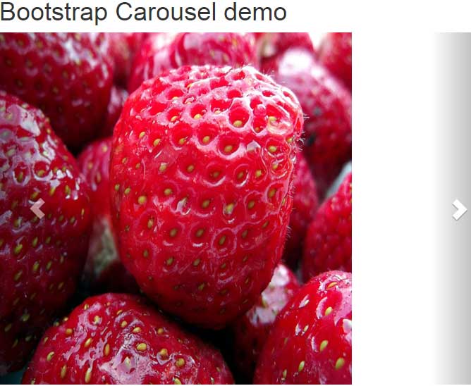
See the online demo and code
Following are the steps to create this carousel:
Step 1:
Include Bootstrap: CSS and JavaScript in the head section.
Also, include the jQuery library in the head section.
Step 2:
In the body section, create a main div and assign it the carousel class of Bootstrap. For image sliding, add slider class as well, so it looks as follows:
<div id=”carousel-demo” class=”carousel slide” data-ride=”carousel”>
Step 3:
In this step, sliding images are specified. Create a div element and assign it the item class. Inside that div, create an image tag (<img>) with the source of the image files. e.g.
<div class=”carousel-inner”>
<div class=”item”>
<img src=”images/banana.jpg” alt=”banana”>
</div>
Add as many images as you need (for the demos, I have placed four images in the “images” folder. You may copy these or use your own to test).
Use the .active class ahead of item class where you want sliding to start, as the page loads.
Step 4:
Add controls to allow visitors to move slides next / previous etc. by using anchor tags that contain the carousel-control class, e.g.
  <a class="left carousel-control" href="#carousel-demo" data-slide="prev">

<span class="glyphicon glyphicon-chevron-left"></span>

</a>
A carousel example with captions
In this carousel Bootstrap example, I will extend the above example and add captions or information in each slide. This information can be marketing or small description related to sliding image of your website.
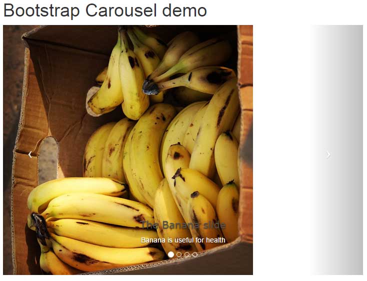
By default, the captions are added at the bottom side by using the following class after the image:
carousel-caption
Inside that div, you can use any tags like paragraphs, simple or Bootstrap buttons, headings etc. The example uses this:
<div class="carousel-caption">

<h3>The Mango slide</h3>

<p>Text here</p>

</div>
This demo also used carousel-indicators class after the main div to show an “indication” of the number of sliders in the circles.
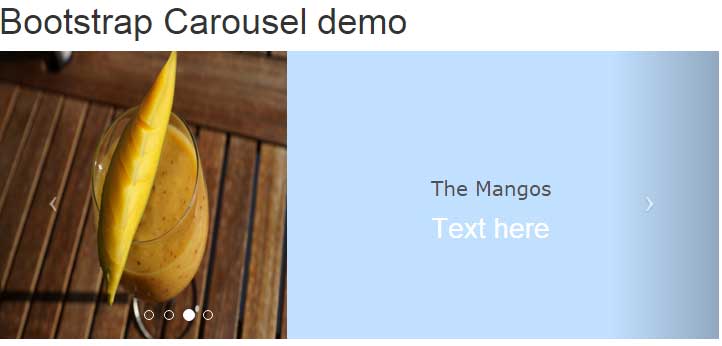
You may customize both classes i.e. carousel-caption and carousel-indicators in the <style> section or an external CSS file after including the Bootstrap CSS file. See the following demo where a few changes are made in these classes to change the positioning of captions:
See the online demo and code
In the head section, you can see the style tag is used to modify the following classes in order to change the caption positioning in Bootstrap carousel:
.carousel-inner {

background-color: #C1E0FF;

}


.carousel-caption {

font-size: 1.5em;

right: 10%;

left: 60%;

top: 30%;

bottom: 30%;

text-align: left;

}
By using the .carousel-inner class, you can override the default properties like I added the background color. Similarly, .carousel-caption properties are also modified, so you can see captions are appearing towards the right side of the sliding image.
In the demo, the speed of the slide show is increased by using the data-interval attribute in the main div:
<div id=”carousel-demo” class=”carousel slide” data-ride=”carousel” data-interval=”2000″>
Multiple sliding images in Bootstrap carousel
In the above examples, only one image is sliding at a time. You may add links/captions or marketing text there as well.
In this example, multiple images are sliding at a time. For the bigger screen, it is kept four. If the screen is smaller, the sliding images will be reduced. First, have a look at live demo followed by a little description to set it up.
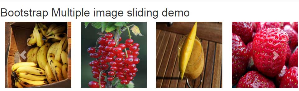
You may add links to each sliding image separately. See the following steps to set multiple images sliding in Bootstrap carousel:
Step 1:
Just like the above examples, refer to the libraries of Bootstrap and jQuery.
Step 2:
In the head section, following jQuery code is placed:
<script>

jQuery(document).ready(function() {


jQuery('.carousel[data-type="multi"] .item').each(function(){

var next = jQuery(this).next();

if (!next.length) {

next = jQuery(this).siblings(':first');

}

next.children(':first-child').clone().appendTo(jQuery(this));


for (var i=0;i<2;i++) {

next=next.next();

if (!next.length) {

next = jQuery(this).siblings(':first');

}

next.children(':first-child').clone().appendTo($(this));

}

});


});

</script>
Step 3:
Also, look at the CSS in the head section in the <style> tag on the demo page. You may change the code and test different things there.
Step 4:
Setting up the carousel code like in the above example. You may get the code from the demo page. You simply need to change the image sources to be replaced to your image source.
In the main div, set the interval of sliding as per the requirement, I have used 2000 Milliseconds:
<div class=”carousel slide row” data-ride=”carousel” data-type=”multi” data-interval=”2000″ id=”fruitscarousel”>
Credit: The link goes to github site
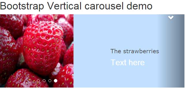
A vertical image sliding example
In above examples, the slideshow in the carousel is horizontal. By using a small piece of CSS code, you may slide images in a vertical direction.
Have a look at the live demo:
See online demo and code
The code is the same as I used in the third example i.e. carousel with captions and its positioning. The only difference is in the head section where the CSS style is used.
Just look at the carousel.vertical CSS class. You need to place this class and just refer to the main div that refers to the carousel class.
<div id=”carousel-demo” class=”carousel vertical slide” data-ride=”carousel” data-interval=”2000″>
The vertical class is referred to after the carousel class. That’s it!
Carousel with fade-in and fade-out effects
Rather than sliding the images horizontally or vertically, you can move to the next images or create a carousel with fading effects. For that, you do not need to include any other library. A simple piece of CSS is provided which is available that you can use to create that carousel.
Find the link at the bottom; first, have a look at what I am talking about:
See online demo and code
The images are occupying the full available width which is set in the CSS section (see the style tag in the head section). You may change this as per the need and space you want to utilize for this carousel.
The speed of slideshow may be changed in the <script> section at the bottom of the page, before the closing tag of the body:
<script type="text/javascript">

$('.carousel').carousel({

interval: 2000,

pause: false

})

</script>
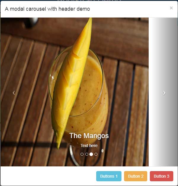
Creating Bootstrap carousel with modal component
By mixing up the modal and Bootstrap carousel components, you may create a carousel in Bootstrap that acts under the modal window. So, just like in carousel, the image/content is sliding while it appears in a modal window – making background content dimmed.
This may help in focusing fully on the content of carousel that you want to present to the user. The carousel with modal can be launched by clicking a button, link or as the web page loads, etc.
Click on the following link or image below for loading the demo where you can see a button to launch a modal carousel that uses Bootstrap classes:
See online demo and code
You can see, the images are sliding like a carousel and it also uses Bootstrap modal features like header and buttons in the footer.
Note: I used images of normal quality for demo only. As you use high-quality images for your project, this should look much better.
A detailed guide is written with demos and code in this tutorial: The modal carousel using Bootstrap
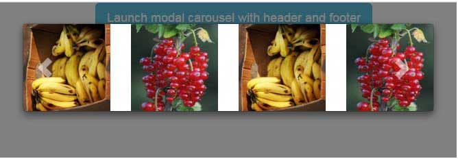
Create Bootstrap multi-image slider with modal example
Similarly, you may create multiple images sliding like a carousel while using the modal features. See the example where multiple images are sliding in the modal window:
Complete code:
<!DOCTYPE html>
<html>
<head>
    <link rel="stylesheet" href="//netdna.bootstrapcdn.com/bootstrap/3.1.1/css/bootstrap.min.css">
        <script src="//code.jquery.com/jquery.js"></script>
        <script src="//maxcdn.bootstrapcdn.com/bootstrap/3.3.4/js/bootstrap.min.js"></script>

<script>
jQuery(document).ready(function() {

    jQuery('.carousel[data-type="multi"] .item').each(function(){
        var next = jQuery(this).next();
        if (!next.length) {
            next = jQuery(this).siblings(':first');
        }
        next.children(':first-child').clone().appendTo(jQuery(this));

        for (var i=0;i<2;i++) {
            next=next.next();
            if (!next.length) {
                next = jQuery(this).siblings(':first');
            }
            next.children(':first-child').clone().appendTo($(this));
        }
    });

});
</script>
<style>
.carousel-control.left, .carousel-control.right {
    background-image:none;
}

.img-responsive{
    width:100%;
    height:auto;
}

@media (min-width: 992px ) {
    .carousel-inner .active.left {
        left: -25%;
    }
    .carousel-inner .next {
        left:  25%;
    }
    .carousel-inner .prev {
        left: -25%;
    }
}

@media (min-width: 768px) and (max-width: 991px ) {
    .carousel-inner .active.left {
        left: -33.3%;
    }
    .carousel-inner .next {
        left:  33.3%;
    }
    .carousel-inner .prev {
        left: -33.3%;
    }
    .active > div:first-child {
        display:block;
    }
    .active > div:first-child + div {
        display:block;
    }
    .active > div:last-child {
        display:none;
    }
}

@media (max-width: 767px) {
    .carousel-inner .active.left {
        left: -100%;
    }
    .carousel-inner .next {
        left:  100%;
    }
    .carousel-inner .prev {
        left: -100%;
    }
    .active > div {
        display:none;
    }
    .active > div:first-child {
        display:block;
    }
}
</style>

</head>
<body>
<div class="container text-center">

<!-- Button trigger modal -->
<button type="button" class="btn btn-info btn-lg" data-toggle="modal" data-target="#ModalCarousel">
  Launch multi-item modal carousel
</button>

<!-- Modal -->
<div class="modal fade" id="ModalCarousel" tabindex="-1" role="dialog" aria-labelledby="ModalCarouselLabel">
  <div class="modal-dialog" role="document">
    <div class="modal-content">

<!--The main div for carousel-->
<!--The main div for carousel-->
<div class="carousel slide row" data-ride="carousel" data-type="multi" data-interval="2000" id="fruitscarousel">

    <div class="carousel-inner">
        <div class="item active">
            <div class="col-md-3 col-sm-4 col-xs-12"><a href="#"><img src="images/banana.jpg" class="img-responsive"></a></div>
        </div>
        <div class="item">
            <div class="col-md-3 col-sm-4 col-xs-12"><a href="#"><img src="images/currant.jpg" class="img-responsive"></a></div>
        </div>
        <div class="item">
            <div class="col-md-3 col-sm-4 col-xs-12"><a href="#"><img src="images/mango.jpg" class="img-responsive"></a></div>
        </div>
        <div class="item">
            <div class="col-md-3 col-sm-4 col-xs-12"><a href="#"><img src="images/strawberries.jpg" class="img-responsive"></a></div>
        </div>
        <div class="item">
            <div class="col-md-3 col-sm-4 col-xs-12"><a href="#"><img src="images/banana.jpg" class="img-responsive"></a></div>
        </div>
        <div class="item">
            <div class="col-md-3 col-sm-4 col-xs-12"><a href="#"><img src="images/currant.jpg" class="img-responsive"></a></div>
        </div>
    </div>

    <a class="left carousel-control" href="#fruitscarousel" data-slide="prev"><i class="glyphicon glyphicon-chevron-left"></i></a>
    <a class="right carousel-control" href="#fruitscarousel" data-slide="next"><i class="glyphicon glyphicon-chevron-right"></i></a>

</div>

    </div>
  </div>
</div>
</div>

</body>
</html>
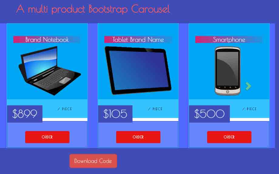
A Bootstrap multi-product carousel component
The following demo shows a multi-product carousel component that can be used for e-commerce sites. At a time, it shows four products in boxes with a prominent price tag. It also displays an elegant title of the product along with a button to place the order. The carousel is displayed with wow-animation that you may change as per your liking.
See online demo and code
You may customize it by adding more buttons like “product info” etc. For more info and downloading the code of this Bootstrap product carousel, follow this link: multi-product carousel.
Further reading: jQuery Nivo Slider and jQuery Full width Slider/Carousel