
The Bootstrap 4 Form component has more styles and customization options than the Forms in Bootstrap 3.
For example, you may style the checkbox and radio buttons, the textarea can be expanded vertically while horizontal is disabled, better form validation is implemented, select dropdowns with different styles, sizing is enhanced, and others.
In this forms tutorial of Bootstrap 4 Framework, you can see the online form examples utilizing available classes along with customized form demos.
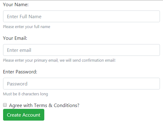
An example of full-width form
By default, any element like textbox, select, textarea, etc. with .form-control class has 100% width as per the parent element containing them.
You may create forms with two types of layouts using Bootstrap 4:
- Full-width forms
- Inline forms
The following example shows a full-width form with different form controls:
See online demo and code
The markup for the form:
<div class="container">

<form>


  <div class="form-group">

    <label for="NameDemo">Your Name:</label>

    <input type="text" class="form-control" id="NameDemo" aria-describedby="nameHelp" placeholder="Enter Full Name">

    <small id="nameHelp" class="form-text text-muted">Please enter your full name</small>

  </div>

  <div class="form-group">

    <label for="EmailDemo">Your Email:</label>

    <input type="email" class="form-control" id="EmailDemo" aria-describedby="emailHelp" placeholder="Enter email">

    <small id="emailHelp" class="form-text text-muted">Please enter your primary email, we will send confirmation email!</small>

  </div>

  <div class="form-group">

    <label for="passDemo">Enter Password:</label>

    <input type="password" class="form-control" id="passDemo" aria-describedby="passHelp" placeholder="Password">

    <small id="passHelp" class="form-text text-muted">Must be 8 characters long</small>

  </div>

  <div class="form-check">

    <input type="checkbox" class="form-check-input" id="CheckDemo">

    <label class="form-check-label" for="CheckDemo">Agree with Terms & Conditions?</label>

  </div>

  <button type="submit" class="btn btn-success">Create Account</button>

</form>

</div>
You may notice a few things in the above code:
- Textual fields like Name, Email, and Password are given the .form-control
- The form-control class implements the style like width, padding, line-height, background-color, border, border-radius, etc. Besides, the focus state and sizing is also dealt by this class.
- It is always recommended to use the type attribute for the form fields. For example, the above demo used text, password, and email as types. This helps in achieving the form validation implementation based on Bootstrap easily.
- I used the container class in the <div> that contains the form, so its form fields took the width of the parent div with the container class.
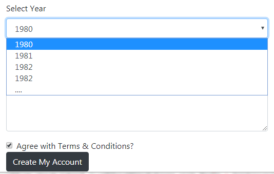
Using the select and textarea in the form
The following demo shows using the <select> and a textarea in the above form. As mentioned earlier, the textarea can be changed vertically only while horizontal is disabled as it may disturb overall page layout.
Have a look:
Online demo and code
The markup:
<div class="container">

<form>


  <div class="form-group">

    <label for="NameDemo">Your Name:</label>

    <input type="text" class="form-control" id="NameDemo" aria-describedby="nameHelp" placeholder="Enter Full Name">

    <small id="nameHelp" class="form-text text-muted">Please enter your full name</small>

  </div>

  <div class="form-group">

    <label for="EmailDemo">Your Email:</label>

    <input type="email" class="form-control" id="EmailDemo" aria-describedby="emailHelp" placeholder="Enter email">

    <small id="emailHelp" class="form-text text-muted">Please enter your primary email, we will send confirmation email!</small>

  </div>

  <div class="form-group">

    <label for="passDemo">Enter Password:</label>

    <input type="password" class="form-control" id="passDemo" aria-describedby="passHelp" placeholder="Password">

    <small id="passHelp" class="form-text text-muted">Must be 8 characters long</small>

  </div>


  <div class="form-group">

    <label for="selectDemo">Select Year</label>

    <select class="form-control" id="selectDemo">

      <option>1980</option>

      <option>1981</option>

      <option>1982</option>

      <option>1982</option>

      <option>....</option>

    </select>

  </div>


  <div class="form-group">

    <label for="textareaDemo">Any Feedback/Requirement</label>

    <textarea class="form-control" id="textareaDemo" rows="5"></textarea>

  </div>


  <div class="form-check">

    <input type="checkbox" class="form-check-input" id="CheckDemo">

    <label class="form-check-label" for="CheckDemo">Agree with Terms & Conditions?</label>

  </div>

  <button type="submit" class="btn btn-dark">Create My Account</button>

</form>

</div>
The select box is given the form-control class. You may also use multiple attribute for allowing more than one selection.
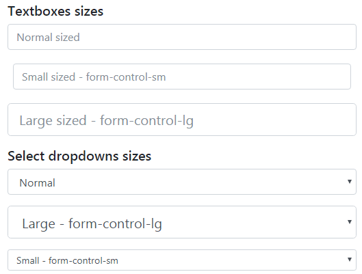
The example of setting the height of form controls
The Bootstrap 4 has classes for setting the height of the form controls. The following built-in classes can be used with form-control class:
- .form-control-lg
- .form-control-sm
Have a look at this example to see the difference between three sizes for textboxes and <select>:
The HTML
<form>

<h5>Textboxes sizes</h5>

  <div class="form-group">

    <input type="text" class="form-control" id="NameDemoSize" aria-describedby="nameHelp" placeholder="Normal sized">

  </div>

  <div class="form-group form-control-sm">

    <input type="text" class="form-control" id="NameDemoSize2" aria-describedby="nameHelp" placeholder="Small sized - form-control-sm">

  </div>

  <div class="form-group">

    <input type="text" class="form-control form-control-lg" id="NameDemoSize3" aria-describedby="nameHelp" placeholder="Large sized - form-control-lg">

  </div>

<h5>Select dropdowns sizes</h5>

  <div class="form-group">

    <select class="form-control" id="selectDemoSize">

      <option>Normal</option>

      <option>....</option>

    </select>

  </div>


  <div class="form-group">

    <select class="form-control form-control-lg" id="selectDemoSize">

      <option>Large - form-control-lg</option>

      <option>....</option>

    </select>

  </div>


  <div class="form-group">

    <select class="form-control form-control-sm" id="selectDemoSize">

      <option>Small - form-control-sm</option>

      <option>....</option>

    </select>

  </div>


</form>
How to deal with form control widths?
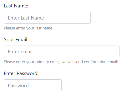
You may use grid classes for managing the width of form controls. For example, you may not want to display all text boxes equally i.e. 100% width of the main container. The Name text box may require bigger width than the password.
For dealing with the widths of form controls, use the Bootstrap 4 grid classes e.g. col-md-6, col-md-4, col-md-8 etc. You may place these classes in the control individual’s <div> tag where the form-control class is used.
Have a look at this code/output where I used various grid classes for dealing with the width of form controls:
The code:
<form>


  <div class="form-group">

    <label for="NameDemo1">First Name:</label>

    <input type="text" class="form-control col-md-3" id="NameDemo1" aria-describedby="nameHelp" placeholder="Enter First Name">

    <small id="nameHelp" class="form-text text-muted">Please enter your first name</small>

  </div>

  <div class="form-group">

    <label for="NameDemo2">Last Name:</label>

    <input type="text" class="form-control col-md-3" id="NameDemo2" aria-describedby="nameHelp" placeholder="Enter Last Name">

    <small id="nameHelp" class="form-text text-muted">Please enter your last name</small>

  </div>

  <div class="form-group">

    <label for="EmailDemo">Your Email:</label>

    <input type="email" class="form-control col-md-4" id="EmailDemo" aria-describedby="emailHelp" placeholder="Enter email">

    <small id="emailHelp" class="form-text text-muted">Please enter your primary email, we will send confirmation email!</small>

  </div>

  <div class="form-group">

    <label for="passDemo">Enter Password:</label>

    <input type="password" class="form-control col-md-2" id="passDemo" aria-describedby="passHelp" placeholder="Password">

    <small id="passHelp" class="form-text text-muted">Must be 8 characters long</small>

  </div>


  <div class="form-group col-md-2">

    <label for="selectDemo">Select Year</label>

    <select class="form-control" id="selectDemo">

      <option>1980</option>

      <option>1981</option>

      <option>1982</option>

      <option>1982</option>

      <option>....</option>

    </select>

  </div>


  <button type="submit" class="btn btn-dark">Create My Account</button>

</form>
Note: You may also use classes e.g. col-2, col-3, etc., or even col-auto class for taking as much space as needed.
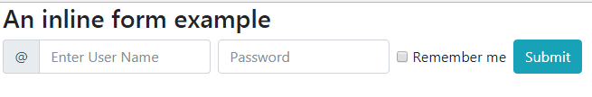
A demo of inline form in Bootstrap 4
For devices that are greater than or equal to 576px, you may display the inline-forms in a single horizontal row. If the screen becomes smaller then it displays horizontally.
For that, use the .form-inline class in the <form> tag. In that case, the form controls may display slightly different than their default states.
Have a look at this code/output where two textboxes, a checkbox, and a button are displayed inline:
The HTML code
<div class="container">

<h3>An inline form example</h3>

<form class="form-inline">


  <label class="sr-only" for="UsernameInlineFormInput">Username</label>

  <div class="input-group mb-2 mr-sm-2">

    <div class="input-group-prepend">

      <div class="input-group-text">@</div>

    </div>

    <input type="text" class="form-control" id="UsernameInlineFormInput" placeholder="Enter User Name">

  </div>

  <label class="sr-only" for="passwordInlineFormInputGroup">Name</label>

  <input type="password" class="form-control mb-2 mr-sm-2" id="passwordInlineFormInputGroup" placeholder="Password">


  <div class="form-check mb-2 mr-sm-2">

    <input class="form-check-input" type="checkbox" id="inlineFormCheck">

    <label class="form-check-label" for="inlineFormCheck">

      Remember me

    </label>

  </div>


  <button type="submit" class="btn btn-info mb-2">Submit</button>

</form>

</div>
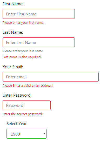
A demo of the form with validation
The form validation is made easy with Bootstrap 4. It was not built-in Version 3, so you had to use third-party solutions or write your own. I also wrote a few articles about implementing validation in Bootstrap by using jQuery plug-ins:
jQuery validate plug-in for Bootstrap and
Validation with the custom error message in Bootstrap 3
In Bootstrap 4, by using the form fields with required attribute and adding a little JavaScript, you may create a form with good looking validation style. It also requires adding a few Bootstrap 4 classes.
First, have a look at the following demo by clicking the link or image below. Submit the button without entering any information and see how it displays the validation messages according to the field required. After that, I will explain how it worked:
See online demo and code
The HTML for the validation demo:
<div class="container">

<h3>Bootstrap 4 Form validation</h3>

<form id="bs-validate-demo" novalidate>


  <div class="form-group">

    <label for="NameDemo1">First Name:</label>

    <input type="text" class="form-control col-md-3" id="NameDemo1" aria-describedby="nameHelp" placeholder="Enter First Name" required>

        <div class="invalid-feedback">

          Please enter your first name.

        </div>

  </div>

  <div class="form-group">

    <label for="NameDemo2">Last Name:</label>

    <input type="text" class="form-control col-md-3" id="NameDemo2" aria-describedby="nameHelp" placeholder="Enter Last Name" required>

    <small id="nameHelp" class="form-text text-muted">Please enter your last name</small>

      <div class="invalid-feedback">

        Last name is also required!

      </div>

  </div>

  <div class="form-group">

    <label for="EmailDemo">Your Email:</label>

    <input type="email" class="form-control col-md-4" id="EmailDemo" placeholder="Enter email" required>

      <div class="invalid-feedback">

        Please Enter a valid email address!

      </div>

  </div>

  <div class="form-group">

    <label for="passDemo">Enter Password:</label>

    <input type="password" class="form-control col-md-2" id="passDemo" aria-describedby="passHelp" placeholder="Password" required>

      <div class="invalid-feedback">

        Enter the correct password!

      </div>

  </div>


  <div class="form-group col-md-2">

    <label for="selectDemo">Select Year</label>

    <select class="form-control" id="selectDemo">

      <option>1980</option>

      <option>1981</option>

      <option>1982</option>

      <option>1982</option>

      <option>....</option>

    </select>

  </div>


  <button type="submit" class="btn btn-dark">Create My Account</button>

</form>

</div>
A little script is also required:
<script>

(function() {

  'use strict';


  window.addEventListener('load', function() {

    var form = document.getElementById('bs-validate-demo');

    form.addEventListener('submit', function(event) {

      if (form.checkValidity() === false) {

        event.preventDefault();

        event.stopPropagation();

      }

      form.classList.add('was-validated');

    }, false);

  }, false);

})();

</script>
You may get the complete code from the demo page.
This is how validation in this demo worked:
- First of all, novalidate attribute is used in the <form> tag and the form is given an ID. The novalidate Boolean attribute disables the default tooltips of the browser, however, form validation APIs in JavaScript are still accessible.
- Just like the above example, the form fields are created with the required attribute. This is HTML5 attribute.
- With each required field, a div is also added with .invalid-feedback class.
- As the form is submitted, the :invalid and :valid pseudo CSS classes are applied to the form fields. The form fields include textboxes, textarea and <select>.
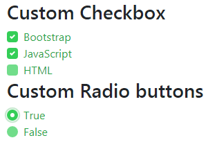
The Bootstrap 4 has .custom-control-input class that you can use for styling the checkboxes and radio buttons.
See the example output:
The HTML:
<form class="was-validated">

    <h3>Custom Checkbox</h3>

    <div class="custom-control custom-checkbox">

      <input type="checkbox" class="custom-control-input" id="checkCustom1">

      <label class="custom-control-label" for="checkCustom1">Bootstrap</label>

    </div>

    <div class="custom-control custom-checkbox">

      <input type="checkbox" class="custom-control-input" id="checkCustom2">

      <label class="custom-control-label" for="checkCustom2">JavaScript</label>

    </div>

    <div class="custom-control custom-checkbox">

      <input type="checkbox" class="custom-control-input" id="checkCustom3">

      <label class="custom-control-label" for="checkCustom3">HTML</label>

    </div>

    <h3>Custom Radio buttons</h3>

    <div class="custom-control custom-radio">

      <input type="radio" id="RadioCustom1" name="RadioDemo" class="custom-control-input">

      <label class="custom-control-label" for="RadioCustom1">True</label>

    </div>

    <div class="custom-control custom-radio">

      <input type="radio" id="RadioCustom2" name="RadioDemo" class="custom-control-input">

      <label class="custom-control-label" for="RadioCustom2">False</label>

    </div>

</form>
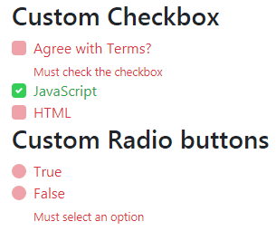
Checkboxes and radios with form validation state example
Just like the textboxes, textarea, and <select>, you may style the custom checkboxes with validation states. For that, use the .was-validated class in the <form> element. Also, mark the input type checkbox and radio as required that you want to validate.
Optionally, you may display the message for “invalid” state by using .invalid-feedback class as shown in the example below:
The code:
<form class="was-validated">

    <h3>Custom Checkbox</h3>

    <div class="custom-control custom-checkbox">

      <input type="checkbox" class="custom-control-input" id="checkCustom1" required>

      <label class="custom-control-label" for="checkCustom1">Agree with Terms?</label>

       <div class="invalid-feedback">Must check the checkbox</div>

    </div>

    <div class="custom-control custom-checkbox">

      <input type="checkbox" class="custom-control-input" id="checkCustom2" required>

      <label class="custom-control-label" for="checkCustom2">JavaScript</label>

    </div>

    <div class="custom-control custom-checkbox">

      <input type="checkbox" class="custom-control-input" id="checkCustom3" required>

      <label class="custom-control-label" for="checkCustom3">HTML</label>

    </div>

    <h3>Custom Radio buttons</h3>

    <div class="custom-control custom-radio">

      <input type="radio" id="RadioCustom1" name="RadioDemo" class="custom-control-input" required>

      <label class="custom-control-label" for="RadioCustom1">True</label>

    </div>

    <div class="custom-control custom-radio">

      <input type="radio" id="RadioCustom2" name="RadioDemo" class="custom-control-input" required>

      <label class="custom-control-label" for="RadioCustom2">False</label>

      <div class="invalid-feedback">Must select an option</div>

    </div>

</form>
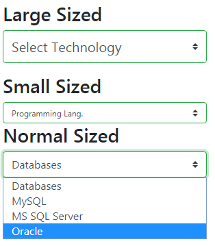
Bootstrap 4 has built-in classes for creating the select menu for different sizes. The following classes are available:
- custom-select //For creating a normal sized select menu
- custom-select-sm //use with custom-select for small size
- -custom-select-lg // for large size
Have a look at the demo online for all three sizes:
The code:
<div class="container">

<h3>Custom select Menu</h3>

<form class="was-validated">

<h3>Large Sized</h3>

<select class="custom-select custom-select-lg mb-3">

  <option selected>Select Technology</option>

  <option value="1">HTML</option>

  <option value="2">Bootstrap</option>

  <option value="3">JavaScript</option>

</select>

<h3>Small Sized</h3>

<select class="custom-select custom-select-sm">

  <option selected>Programming Lang.</option>

  <option value="1">Java</option>

  <option value="2">Python</option>

  <option value="3">C#</option>

</select>


<h3>Normal Sized</h3>

<select class="custom-select">

  <option selected>Databases</option>

  <option value="1">MySQL</option>

  <option value="2">MS SQL Server</option>

  <option value="3">Oracle</option>

</select>

</form>


</div>
The following demo shows using the BS 4 .form-control-file class, specific to the input type=file. The example page also shows another file upload button with validation and custom name after the file is selected.
This is done by using the .custom-file-label class, have a look:
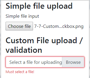
The file upload HTML code:
<form class="was-validated">

<h3>Simple file upload</h3>

  <div class="form-group">

    <label for="exampleFormControlFile1">Simple file input</label>

    <input type="file" class="form-control-file" id="exampleFormControlFile1">

  </div>

<h3>Custom File upload / validation</h3>

  <div class="custom-file">

    <input type="file" class="custom-file-input" id="FileValidationDemo" required>

    <label class="custom-file-label" for="FileValidationDemo">Select a file for uploading...</label>

    <div class="invalid-feedback">Must select a file!</div>

  </div>

</form>
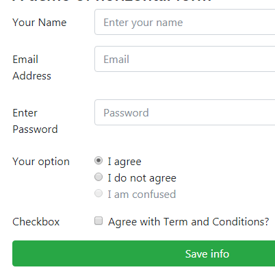
The demo of horizontal form in BS 4
In the above form example, you might have noticed the labels appear above the form controls. For displaying labels towards the left of controls you may create horizontal forms by using the .row class with .form-group for creating a horizontal form.
The example code:
<form>

  <div class="form-group row">

    <label for="NameHori" class="col-sm-2 col-form-label">Your Name</label>

    <div class="col-sm-10">

      <input type="text" class="form-control" id="emailHori" placeholder="Enter your name">

    </div>

  </div>

  <div class="form-group row">

    <label for="emailHori" class="col-sm-2 col-form-label">Email Address</label>

    <div class="col-sm-10">

      <input type="email" class="form-control" id="emailHori" placeholder="Email">

    </div>

  </div>

  <div class="form-group row">

    <label for="PasswordHori" class="col-sm-2 col-form-label">Enter Password</label>

    <div class="col-sm-10">

      <input type="password" class="form-control" id="PasswordHori" placeholder="Password">

    </div>

  </div>

  <fieldset class="form-group">

    <div class="row">

      <legend class="col-form-label col-sm-2 pt-0">Your option</legend>

      <div class="col-sm-10">

        <div class="form-check">

          <input class="form-check-input" type="radio" name="gridRadios" id="gridRadios1" value="option1" checked>

          <label class="form-check-label" for="gridRadios1">

            I agree

          </label>

        </div>

        <div class="form-check">

          <input class="form-check-input" type="radio" name="gridRadios" id="gridRadios2" value="option2">

          <label class="form-check-label" for="gridRadios2">

            I do not agree

          </label>

        </div>

        <div class="form-check disabled">

          <input class="form-check-input" type="radio" name="gridRadios" id="gridRadios3" value="option3" disabled>

          <label class="form-check-label" for="gridRadios3">

            I am confused

          </label>

        </div>

      </div>

    </div>

  </fieldset>

  <div class="form-group row">

    <div class="col-sm-2">Checkbox</div>

    <div class="col-sm-10">

      <div class="form-check">

        <input class="form-check-input" type="checkbox" id="gridCheck1">

        <label class="form-check-label" for="gridCheck1">

          Agree with Term and Conditions?

        </label>

      </div>

    </div>

  </div>

  <div class="form-group row">

    <div class="col-sm-10">

      <button type="submit" class="btn btn-success btn-block">Save info</button>

    </div>

  </div>

</form>
Get the complete code and see the output on the demo page.
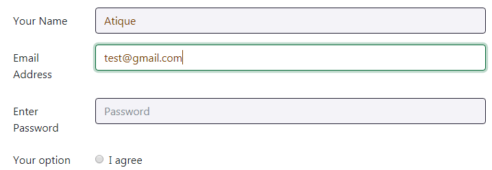
Customizing the form controls as per your desire
Want to use Bootstrap framework-based form classes yet need to make little tweaks to match the design of your website or for any other reason?
You can do this by extracting the form classes and overriding those in your own external CSS file or at the page level in the <style> section.
In this demo, I have overridden the .form-control and .form-control:focus classes to change the background color, border and text color in the normal state as well as in the control’s focus state.
The same markup is used as in the above horizontal form example; only the style is added in the <head> section as follows:
The CSS
<style>

.form-control {

  color: #804000;

  background-color: #F4F3F8;

  background-clip: padding-box;

  border: 1px solid #242134;

  border-radius: 0.25rem;

  transition: border-color 0.15s ease-in-out, box-shadow 0.15s ease-in-out;

}

.form-control:focus {

  color: #804000;

  background-color: #fff;

  border-color: #006633;

  box-shadow: 0 0 0 0.2rem rgba(0, 102, 51, 0.25);

}

</style>
In the same way, you may use the .form-control::placeholder, .form-control-plaintext, form-control-lg, form-control-sm and any other form related classes and modify/add the properties while utilizing the power of Bootstrap 4.