
The datepicker in Bootstrap
Unlike many other add-ons, the datetime picker is not provided in the Bootstrap framework. In order to use date picker, you may use jQuery UI-based datepicker widget, as such in your web projects based on Bootstrap 3, you generally have the jQuery library included.
In that case, you only need to include the jQuery UI library that has date picker component. This can be customized as per the needs of your website. A guide to set this up is written here.
The other way is to use third-party plug-ins that are based on Bootstrap framework. This tutorial is a step-by-step guide to setting up Bootstrap date picker.
The datepicker plug-in name is bootstrap-datepicker, which is a fork of Stefan Petre and is enhanced and maintained by semvar (source links are given at the bottom).
Before setting up this plug-in, have a look at a few demos online to see how it looks, stand-alone and in Bootstrap forms with other form controls.
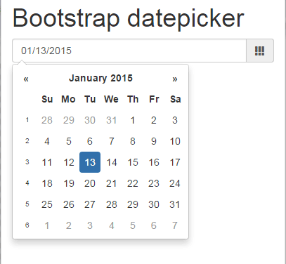
A simple datepicker demo
In this demo, a date picker Bootstrap is created with a textbox. As you click in the textbox or icon ahead of it, it will display the calendar to select the date. See the demo online by clicking the link or image below:
See online demo and code
Complete code for this example
<!DOCTYPE html>
<html>
<head>
    <title>Bootstrap datepicket demo</title>
    <link href="//netdna.bootstrapcdn.com/bootstrap/3.0.3/css/bootstrap.min.css" rel="stylesheet">
    <script src="https://netdna.bootstrapcdn.com/bootstrap/3.0.3/js/bootstrap.min.js"></script>
    <script type='text/javascript' src='//code.jquery.com/jquery-1.8.3.js'></script>

    <link rel="stylesheet" href="https://cdnjs.cloudflare.com/ajax/libs/bootstrap-datepicker/1.5.0/css/bootstrap-datepicker3.min.css">
    <script type='text/javascript' src="https://cdnjs.cloudflare.com/ajax/libs/bootstrap-datepicker/1.5.0/js/bootstrap-datepicker.min.js"></script>
<script type='text/javascript'>
$(function(){
$('.input-group.date').datepicker({
    calendarWeeks: true,
    todayHighlight: true,
    autoclose: true
});
});

</script>
</head>
<body>
<div class="container">
<h1>Bootstrap datepicker</h1>
<div class="input-group date">
  <input type="text" class="form-control"><span class="input-group-addon"><i class="glyphicon glyphicon-calendar"></i></span>
</div>
</div>
</body>
</html>
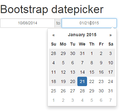
A date range datepicker demo
This demo shows how to give a user an option to select the date range. In that case, two text boxes are shown where a user can select the date from the calendar.
Markup:
<body>
<div class="container">
<h1>Bootstrap datepicker</h1>

<div class="input-daterange input-group" id="datepicker">
    <input type="text" class="input-sm form-control" name="from" placeholder="From date"/>
    <span class="input-group-addon">to</span>
    <input type="text" class="input-sm form-control" name="to" placeholder="To date"/>
</div>

</div>
</body>
jQuery in the <head> section
<script type='text/javascript'>
$(function(){
$('.input-daterange').datepicker({
    autoclose: true
});
});

</script>
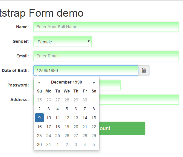
A datepicker demo in a sign-up form
In this demo, a form is created in Bootstrap. It has different controls like textboxes, Bootstrap select dropdown, a button, checkbox, and a datepicker, which is a textbox with date picker. I will explain how this is integrated into form, in the step by step guide after this example. See the live demo of this calendar:
See online demo and code
Steps to set up this Bootstrap-datepicker plug-in
In all the above datepicker examples, I have used bootstrap-datepicker plug-in. As mentioned earlier, this is a third-party plug-in that needs to be installed or set up in order to get it working.
Follow these steps to have it working on your website:
Step 1: Libraries
Include the Bootstrap libraries of CSS and JavaScript.
The plug-in site says its requirement is Bootstrap 2.0.4+. I have tested it with the latest version as well, Bootstrap 3.3.5, and it is working there as well.
You also need to include the jQuery library: 1.7.1 +
Step 2: Include bootstrap-datepicker files
If you looked at the code section of above online demos, it has two additional files:
<link rel=”stylesheet” href=”https://cdnjs.cloudflare.com/ajax/libs/bootstrap-datepicker/1.5.0/css/bootstrap-datepicker3.min.css”>
<script type=’text/javascript’ src=”https://cdnjs.cloudflare.com/ajax/libs/bootstrap-datepicker/1.5.0/js/bootstrap-datepicker.min.js”></script>
These are the required files that contain plug-in and style. Include these after the Bootstrap and jQuery libraries.
You may get these libraries here: CDN link or find it in GitHub site.
That’s it as far as including libraries are concerned to make it work.
Step 3: jQuery section to call datepicker
See the <script> part in example codes to call the date picker as you click in the textbox or icon.
For example, this is what I used in the second and third examples:
<script type='text/javascript'>

$(function(){

$('.input-daterange').datepicker({

});

});


</script>
And
<script type='text/javascript'>

$(function(){

$('.col-sm-4.date').datepicker({

});

});

</script>
You have to call datepicker by textbox ID, class, or name. Just replace it with the ID of your textbox that is associated with the calendar.
Step 4 – Markup
The markup or HTML to be used varies as per the need and functionality you want in the calendar. For example, in the first example, I simply used a textbox with icon and the markup is:
<div class="input-group date">

<input type="text" class="form-control"><span class="input-group-addon"><i class="glyphicon glyphicon-calendar"></i></span>

</div>
In the second example of date range datepicker:
<div class="input-daterange input-group" id="datepicker">

<input type="text" class="input-sm form-control" name="from" placeholder="From date"/>

<span class="input-group-addon">to</span>

<input type="text" class="input-sm form-control" name="to" placeholder="To date"/>

</div>
In the form example, which also uses a custom class to style the form controls including calendar textbox, the markup used for datepicker:
<div class="form-group">

<label for="dateofbirth" class="col-sm-2 control-label">Date of Birth:</label>

<div class="col-sm-4 input-group date">

<input type="text" class="form-control inputstl" id="dateofbirth" placeholder="Select Date"><span class="input-group-addon"><i class="glyphicon glyphicon-calendar"></i></span>


</div>

</div>
In all above example, you might have noticed the datepicker or calendar is using the same style, which is the default. In professional websites, you may also need to change the look and feel of the date picker to match the theme of your website. The following section describes it, how!
A demo to change the default style of Bootstrap-datepicker
The style of date picker is set in the CSS file of the bootstrap-datepicker plug-in. This file is included in the head section:
<link rel=”stylesheet” href=”https://cdnjs.cloudflare.com/ajax/libs/bootstrap-datepicker/1.5.0/css/bootstrap-datepicker3.min.css”>
In order to change the look of the calendar, you have to change the colors or other CSS in that file. You may either download this file, amend it as per need and host it at your own OR select the required CSS classes that need to be changed and override the default.
Following are a few datepicker styles by changing a few CSS properties mentioned below:
In that demo, a few classes from the bootstrap-datepicker3 are taken that affect the color of the whole datepicker, the hover state of the month/year bar, the hover class for days as you bring the mouse over it and current day class.
For the demo, I have placed these classes in the head section after the bootstrap-datepicker3.min.css file.
The following classes are changed in that demo:
To change the background color and adding a radius in the datepicker dropdown:
.datepicker-dropdown {

top: 0;

left: 0;

padding: 4px;

background-color: #2C6E8E;

border-radius: 10px;

}
To change the color of days:
.datepicker table tr td,

.datepicker table tr th {

text-align: center;

width: 30px;

height: 30px;

border-radius: 4px;

border: none;

color: #FFFFFF;

}
Hover state of days as you bring mouse over:
datepicker table tr td.day:hover,

.datepicker table tr td.focused {

background: #555555;

cursor: pointer;

}
Changing old days of previous month or days of next month (in orange)
.datepicker table tr td.old,

.datepicker table tr td.new {

color: #FF8000;

}
To change the current day
.datepicker table tr td.today {

color: #000000;

background-color: #FFA953;

border-color: #FFB76F;

}
Hover state of current day
.datepicker table tr td.today:hover {

color: #FFFFFF;

background-color: #884400;

border-color: #f59e00;

}
The header, where year and month are displayed
.datepicker .datepicker-switch {

width: 145px;


}

.datepicker .datepicker-switch:hover,

.datepicker .prev:hover,

.datepicker .next:hover,

.datepicker tfoot tr th:hover {

background: #50A2C9;

}
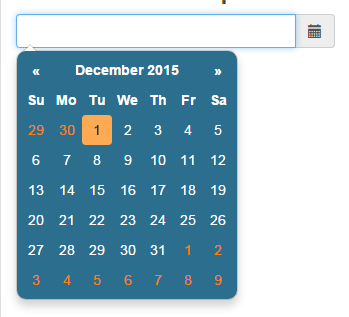
Another custom datepicker with CSS 3 properties
The following demo is another datepicker that is using the Bootstrap-datepicker plug-in with a few CSS3 properties. The classes are placed in the head section that overrides the default classes.
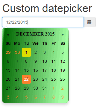
In this demo, I simply used a linear gradient background in the main datepicker-dropdown class.
.datepicker-dropdown {

top: 0;

left: 0;

padding: 4px;

background: -webkit-gradient(linear, left top, left 25, from(#A4FFA4), color-stop(4%, #006600), to(#A4FFA4));

background: -webkit-gradient(linear, left top, right 25, from(#A4FFA4), color-stop(4%, #006600), to(#A4FFA4));

background: -moz-linear-gradient(top, #A4FFA4, #006600 1px, #FFFFFF 25px);

border-radius: 10px;

}
Besides, to match the colors of days, active day, current day, and hover states, a few changes are made in above mentioned classes.
A datepicker Bootstrap with bordered days
In this example, bordered days are presented with linear-gradient along with changing the color scheme of the datepicker.
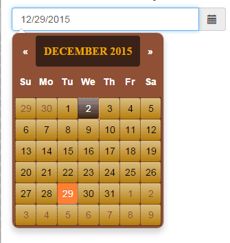
The following class is amended to get the bordered days which is also using gradient:
.datepicker table tr td {

border:dotted 1px #3A2218;

background-color:#B77F0E;

background-image: linear-gradient(rgba(255,255,255,.5), rgba(255,255,255,0));

}
Rounded days demo
By using the border-radius property, you can change the look of days to round style as shown below:
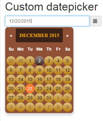
The class for table –> –> tr –> td is changed as shown below:
.datepicker table tr td {

background-color:#B77F0E;

background-image: linear-gradient(rgba(255,255,255,.5), rgba(255,255,255,0));

border-radius: 50%;

}
The only difference in the above example is border-radius: 50%.
Using custom datepicker in a form
The following demo shows using the custom datepicker in a Bootstrap form. The form contains same controls as in the third example i.e. a sign-up form. See the demo online:
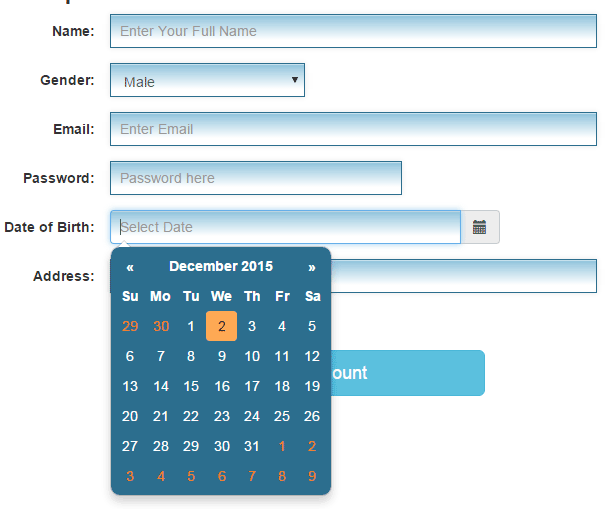
See online demo and code
The style section contains the custom CSS class for the controls as well as selected classes of the datepicker’s CSS classes that override the default styles.
What about customizing range datepicker?
Similarly, if you need to modify the date range datepicker styles, it has a different set of classes in the same CSS file. Just go through it and you will find it easily with the range prefix. Copy those classes from that CSS file and bring it in the styles section of the head tag OR use an external CSS file.
In any case, you must refer to that style after including the bootstrap-datepicker3.min.css file. (or if you are using less or another format).
datepicker Setting wizard
By using this link, you can set up the datepicker functionality by using an online wizard. It will automatically generate the code for the jQuery section (in the head) and markup that you can use in your website.
For example, the datepicker should be auto-close or not, as a user clicks on a day. Including keyboard navigation, setting date format, Calendar Weeks, and many other options can be set up by selecting or unselecting options.