The Bootstrap color picker
The color picker is a component that you may require for the front-end interface for the end users. The purpose can be selecting a color of theme, backgrounds, or other sections of the website. However, color pickers can generally be used in the admin interface to allow visitors to set the customized theme as per liking.
There may be many other uses of color pickers depending on the scenarios and nature of visitors of the website.
In this tutorial, I am going to show you a jQuery and Bootstrap based color picker plug-in that you may easily integrate into your website. The plug-in is available on the GitHub website and is developed by mjoinic. You may download the color picker plug-in from the given link.
A demo of Bootstrap colorpicker
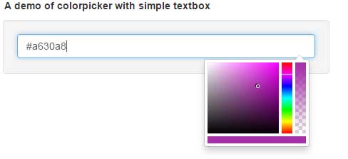
In this demo, a simple color picker becomes visible as the input field is clicked. The input field also shows the color HEX value. As textbox is clicked, a small palette becomes visible where you may choose the color. Wherever you click inside that color palette, the value of that color is displayed in the textbox.
Test yourself by going to the demo page:
See online demo and code
For setting up this Bootstrap / jQuery based color picker, you need to include the following files:
In the <head> section, include the Bootstrap and bootstrap-colorpicker CSS files.
<link href=”//maxcdn.bootstrapcdn.com/bootstrap/3.3.6/css/bootstrap.min.css” rel=”stylesheet”>
<link href=”css/bootstrap-colorpicker/bootstrap-colorpicker.css” rel=”stylesheet”>
You also need to include the latest jQuery and Bootstrap’s JS files along with color picker plug-in file:
<script src=”//code.jquery.com/jquery-2.2.2.min.js”></script>
<script src=”//maxcdn.bootstrapcdn.com/bootstrap/3.3.6/js/bootstrap.min.js”></script>
<script src=”js/bootstrap-colorpicker/bootstrap-colorpicker.js”></script>
In the <body> section, write the markup of the input field and initiate the plug-in by using the jQuery code.
The markup for creating the color picker:
<div class="example-content well">

<div class="example-content-widget">

<input id="simple-color-picker" type="text" class="form-control" value="#8f3596"/>


<script>

$(function () {

$('#simple-color-picker').colorpicker();

});

</script>

</div>

</div>
See the complete code in the demo page.
Also note, if you place the plug-in CSS file (bootstrap-colorpicker.css ) at your desired location other than default or what I used in the demo, take care of the image paths inside the CSS file. The plug-in package also includes an “img” folder that contains a few small images. Its path is set in the CSS file, for example:
background-image: url(“../../img/bootstrap-colorpicker/saturation.png”);
Its occurrence is six times in the CSS file, so set the path of images according to the location where you have placed images or img folder, otherwise, color palette would not display correctly.
A demo of color picker as a component
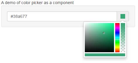
You may display color picker as a component as well. An icon is displayed ahead of the textbox. Upon clicking the icon, it will display color picker. See the demo online:
Code:
<!DOCTYPE html>
<html>
<head>

    <link href="//maxcdn.bootstrapcdn.com/bootstrap/3.3.6/css/bootstrap.min.css" rel="stylesheet">
    <link href="css/bootstrap-colorpicker/bootstrap-colorpicker.css" rel="stylesheet">


    <script src="//code.jquery.com/jquery-2.2.2.min.js"></script>
    <script src="//maxcdn.bootstrapcdn.com/bootstrap/3.3.6/js/bootstrap.min.js"></script>
    <script src="js/bootstrap-colorpicker/bootstrap-colorpicker.js"></script>


</head>

<body>
<div class="container">

<div class="row">
    <div class="col-md-5">
<div class="example">
    <div class="example-title">A demo of color picker as a component</div>

    <div class="example-content well">
        <div class="example-content-widget">
      <div id="color-picker-component" class="input-group colorpicker-component">
          <input type="text" value="#38a677" class="form-control"/>
          <span class="input-group-addon"><i></i></span>
      </div>
      <script>
          $(function () {
              $('#color-picker-component').colorpicker();
          });
      </script>
        </div>

   </div>
</div>

  </div>
</div>
</div>

</body>
</html>
A demo of showing RGB code
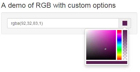
In above two example, the HEX codes are displayed while using the color picker plug-in. In this example, RGB (Red, Green, and Blue) codes are shown in the textbox as you select a color from the palette.
The markup and <script>:
<div class="example-content-widget">

<div id="color-picker-rgb" class="input-group colorpicker-component">

<input type="text" value="#05FF44" class="form-control"/>

<span class="input-group-addon"><i></i></span>

</div>

<script>

$(function () {

$('#color-picker-rgb').colorpicker({

color: '#05FF44',

format: 'rgba'

});

});

</script>

</div>
In the script section, notice the options used i.e. it takes the value of color and the format is rgba. So, the text field is showing the RGB value of the selected color.
A demo of working with events of date picker
You may perform certain actions as an event occurs in the date picker. For example, as the color is changed, you can apply the selected color to a specified element.
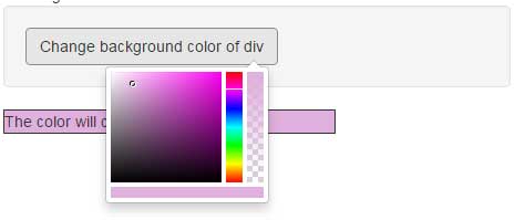
See the following example where the background color of a div just below the button is changed as you pick a color from the palette.
The markup used for this example:
<div class="example-content well">

<div class="example-content-widget">

<a href="#" class="btn btn-default" id="color-picker-background">Change background color of div</a>

</div>

</div>


<div id="chgcolor" style="background-color: #eee;heihgt:50px;width:300px;border:solid 1px">

The color will change here

</div>
In the script section:
<script>

$(function () {

$('#color-picker-background').colorpicker().on('changeColor', function (e) {

$('#chgcolor')[0].style.backgroundColor = e.color.toHex();

});

});

</script>
So, at the changeColor event, the selected color is applied to the specified div element.
Similarly, you may apply colors to body’s background, table cell or other section of the web page. The plug-in also supports other events like create, showPicker, hidePicker, disable, enable and destroy. As these events occur, you may perform useful actions there.
A demo of displaying palette horizontally
By using the horizontal option as true, you may show the palette horizontally. If you noticed in above example, the palette is vertical.
This is done by using the horizontal option in the <script> part:
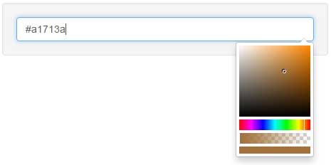
The script:
$('#color-picker-horizontal').colorpicker({

color: "#a1713a",

horizontal: true

});
Using alias or color names demo
You may also use the alias of the colors to allow users to select a color. For example, using the Bootstrap standard colors like info for light blue, primary for dark blue, success for green etc. That way, the small color boxes will be visible to the users as they open the palette. with the alias shown in the text field.
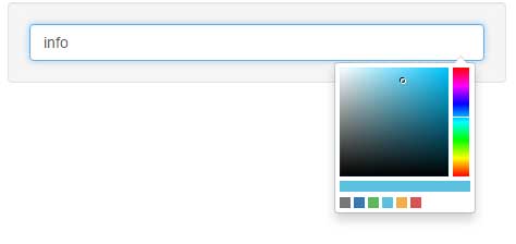
Markup and JS:
<body>
<div class="container">

<div class="row">
    <div class="col-md-5">
<div class="example">
    <div class="example-title">Aliased color palette</div>

    <div class="example-content well">
        <div class="example-content-widget">
      <input type="text" data-format="hex" class="form-control" id="color-picker-alias" value="blue"/>
      <script>
          $(function () {
              $('#color-picker-alias').colorpicker({
                  colorSelectors: {
                      'grey': '#777777',
                      'blue': '#337ab7',
                      'success': '#5cb85c',
                      'info': '#5bc0de',
                      'warning': '#f0ad4e',
                      'red': '#d9534f'
                  }
              });
          });
      </script>
        </div>

   </div>
</div>
</body>
A demo of specifying the size of palette
In all above examples, the default size of the palette is used. You may also specify the size by using the customClass option. In that option, you may set the custom class that is placed in the <style> section or an external CSS file. Just specify the file name that contains the width and height properties for the palette.
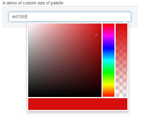
The following CSS class is created which is assigned in the jQuery code section:
<style>

.custom-size .colorpicker-saturation {

width: 250px;

height: 250px;

}


.custom-size .colorpicker-hue,

.custom-size .colorpicker-alpha {

width: 40px;

height: 250px;

}


.custom-size .colorpicker-color,

.custom-size .colorpicker-color div {

height: 40px;

}

</style>
The script part:
$('#color-picker-size').colorpicker({

customClass: 'custom-size',

sliders: {

saturation: {

maxLeft: 250,

maxTop: 250

},

hue: {

maxTop: 250

},

alpha: {

maxTop: 250

}

}

});
Get the complete code on the demo page.
