Width utility classes in Tailwind
- To set the width of various elements in a web page like buttons, textboxes, select, etc. – you may use the width utility classes in Tailwind CSS.
- The width classes start with the letter ‘w‘ and are followed by numbers (fixed widths) or Percentage widths etc.
For example, to set the width of 1 rem (16px), you may use:
Similarly,
w-1 width: 0.25rem; /* 4px */
w-1.5 width: 0.375rem; /* 6px */
w-2 width: 0.5rem; /* 8px */
….
w-96 width: 24rem; /* 384px */
In the same way, for setting the width Percentage wise, you may use utility classes like:
w-1/2 width: 50%;
w-1/3 width: 33.333333%;
w-2/3 width: 66.666667%;
w-1/5 width: 20%;
w-1/6 width: 16.666667%;
w-4/12 width: 33.333333%;
Besides, following width classes (Viewport width) are also available:
w-full width: 100%;w-screen width: 100vw;
w-min width: min-content;
w-max width: max-content;
w-fit width: fit-content;
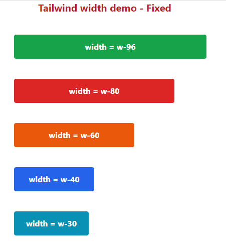
In the following example, we created five buttons and used various utility classes for their styling.
There, we also used width classes (fixed size):
Code:
<!DOCTYPE html>

<html>

<head>

<script src="https://cdn.tailwindcss.com"></script>
</head>

<body>

<h1 class="text-red-700 text-xl mx-20 font-bold ">
Tailwind width demo - Fixed
</h1>

<div class="flex flex-5 mx-8 mt-10  justify-between gap-2">
<div class="max-w-xs">

<p class="mb-10">

<button class="bg-green-600 hover:bg-green-800 text-white font-bold py-3 px-6 w-96 rounded focus:outline-none focus:shadow-outline" type="button">

width = w-96

</button>

</p>

<p class="mb-10">

<button class="bg-red-600 hover:bg-red-800 text-white font-bold py-3 px-6 w-80 rounded focus:outline-none focus:shadow-outline" type="button">

width = w-80

</button>

</p>

<p class="mb-10">

<button class="bg-orange-600 hover:bg-orange-800 text-white font-bold py-3 px-6 w-60 rounded focus:outline-none focus:shadow-outline" type="button">

width = w-60

</button>

</p>

<p class="mb-10">

<button class="bg-blue-600 hover:bg-blue-800 text-white font-bold py-3 px-6 w-40 rounded focus:outline-none focus:shadow-outline" type="button">

width = w-40

</button>

</p>

<p class="mb-10">

<button class="bg-cyan-600 hover:bg-cyan-800 text-white font-bold py-3 px-6 w-30 rounded focus:outline-none focus:shadow-outline" type="button">

width = w-30

</button>

</p>
</div>
</body>
</html>
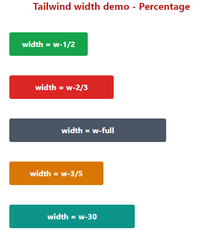
An example of using percentage sizing
In this example, we set the button width by percentage utility classes.
Markup:
<!DOCTYPE html>
<html>

<head>

<script src="https://cdn.tailwindcss.com"></script>
</head>

<body>
<h1 class="text-red-700 text-xl mx-20 font-bold ">
Tailwind width demo - Percentage
</h1>
<div class="flex flex-5 mx-8 mt-10  justify-between gap-2">

<div class="max-w-xs w-96">

<p class="mb-10">

<button class="bg-green-600 hover:bg-green-800 text-white font-bold py-3 px-6 w-1/2 rounded focus:outline-none focus:shadow-outline" type="button">

width = w-1/2

</button>

</p>

<p class="mb-10">

<button class="bg-red-600 hover:bg-red-800 text-white font-bold py-3 px-6 w-2/3 rounded focus:outline-none focus:shadow-outline" type="button">

width = w-2/3

</button>

</p>

<p class="mb-10">

<button class="bg-gray-600 hover:bg-gray-800 text-white font-bold py-3 px-6 w-full rounded focus:outline-none focus:shadow-outline" type="button">

width = w-full

</button>

</p>

<p class="mb-10">

<button class="bg-amber-600 hover:bg-amber-800 text-white font-bold py-3 px-6 w-3/5 rounded focus:outline-none focus:shadow-outline" type="button">

width = w-3/5

</button>

</p>

<p class="mb-10">

<button class="bg-teal-600 hover:bg-teal-800 text-white font-bold py-3 px-6 w-4/5 rounded focus:outline-none focus:shadow-outline" type="button">

width = w-30

</button>

</p>
</div>

</body>
</html>
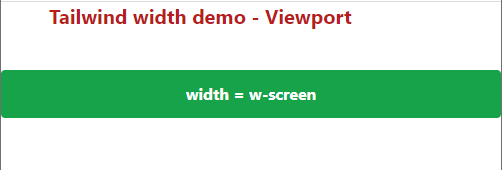
Using viewport class example
If you want buttons to display according to the viewport – the size of the user’s screen then you may use the w-screen class for the button.
See an example below:
Code:
<!DOCTYPE html>
<html>

<head>
<script src="https://cdn.tailwindcss.com"></script>
</head>

<body>
<h1 class="text-red-700 text-xl mx-20 font-bold ">

Tailwind width demo - Viewport
</h1>
<div class="flex flex-5 mx-8 mt-10  justify-between gap-2">
<div class="max-w-xs w-96">

<p class="mb-10">

<button class="bg-green-600 hover:bg-green-800 text-white font-bold py-3 px-6 w-screen rounded focus:outline-none focus:shadow-outline" type="button">

width = w-screen

</button>

</p>
</div>

</body>
</html>
Output:
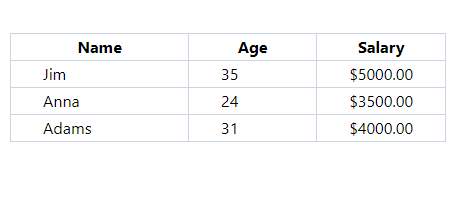
Using width utilities in a table example
In the example below, we have an HTML table where we used a few classes like Tailwind padding, and border and we also used fixed width classes.
- The first column is given w-60
- Second column w-40
- and third column w-90
See an example below:
Code:
<!DOCTYPE html>

<html>

<head>

<script src="https://cdn.tailwindcss.com"></script>
</head>

<body>
<div class="flex flex-5 mx-8 mt-10  justify-between gap-2">

<table class="border-collapse border border-slate-400 ">

<thead>

<tr>

<th class="border border-slate-300 px-8 w-60">Name</th>

<th class="border border-slate-300 px-8 w-40">Age</th>

<th class="border border-slate-300 px-8 w-90">Salary</th>

</tr>

</thead>

<tbody>

<tr>

<td class="border border-slate-300 px-8 px-8 w-60">Jim</td>

<td class="border border-slate-300 px-8 w-40">35</td>

<td class="border border-slate-300 px-8 w-90">$5000.00</td>

</tr>

<tr>

<td class="border border-slate-300 px-8 px-8 w-60">Anna</td>

<td class="border border-slate-300 px-8 w-40">24</td>

<td class="border border-slate-300 px-8 w-90">$3500.00</td>

</tr>

<tr>

<td class="border border-slate-300 px-8 px-8 w-60">Adams</td>

<td class="border border-slate-300 px-8 w-40">31</td>

<td class="border border-slate-300 px-8 w-90">$4000.00</td>

</tr>

</tbody>

</table>

</div>
</div>

</body>
</html>
Output:
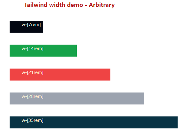
Using arbitrary values for width
This is useful if you need to use it for once or so. For using an arbitrary value, use the following syntax:
An example below shows using this in a five paragraphs. There we used:
- w-[7rem]
- w-[14rem]
- w-[21rem]
- w-[28rem]
- w-[35rem]
Code:
<!DOCTYPE html>

<html>

<head>

<script src="https://cdn.tailwindcss.com"></script>
</head>

<body>
<h1 class="text-red-700 text-xl mx-20 font-bold ">

Tailwind width demo - Arbitrary
</h1>

<div class="flex flex-5 mx-8 mt-10  justify-between gap-2">

<div class="max-w-xs w-96">

<p class="mb-10 h-10 w-[7rem] bg-gray-950 text-orange-100   pl-10">w-[7rem]</p>
<p class="mb-10 h-10 w-[14rem] bg-green-600 text-orange-100 pl-10">w-[14rem]</p>
<p class="mb-10 h-10 w-[21rem] bg-red-500 text-orange-100   pl-10">w-[21rem]</p>
<p class="mb-10 h-10 w-[28rem] bg-gray-400 text-orange-100  pl-10">w-[28rem]</p>
<p class="mb-10 h-10 w-[35rem] bg-cyan-950 text-orange-100  pl-10">w-[35rem]</p>

</div>

</body>
</html>
Output: