
The alerts in jQuery
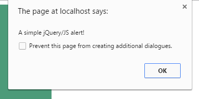
The jQuery is a JavaScript library so you can use simple JavaScript alerts while using jQuery in your web projects. The alerts take the browser’s default style which looks simple.
Have a look at this an alert which is created inside the jQuery code:
Code with jQuery
<!DOCTYPE html>
<head>
<script src="//code.jquery.com/jquery-1.10.2.js"></script>
<script>
$(document).ready(function(){
    $("#div_alert").click(function(){
    alert("A simple jQuery/JS alert!");
    });
});
</script>

<style>
#div_alert {
  background: #4C9B79;
  height: 220px;
  width:40%;
  border-radius: 15px;
  padding:20px;
  font-size:18px;
  color:#fff;
}
</style>
</head>
<body>

<div id="div_alert">Click anywhere in this div!</div>

</body>
</html>
Creating an alert in jQuery is easy, e.g.:
alert("A simple jQuery/JS alert!");
However, you can see it is simple and old-fashioned. You may use it for debugging purpose as a web developer, however, my focus is user end in this tutorial.
Although jQuery does not have a built-in alert component to create modal alerts, you can use plug-ins quite easily to create beautiful jQuery alert box in your web pages.
I will show you using two different plug-ins for creating different alerts, for example, a basic alert with the simple message and Ok button. The confirmation and prompt alerts. You can also see an example of alert with HTML elements like a link inside it, so keep reading!
By using jAlert plug-in
The jAlert enables you to create alerts with a variety of options for different types of alerts. For example, a simple or confirmation alert with the animation using different colors of buttons to close the alert.
This plug-in is compatible with the latest versions of jQuery as well.
See the demos with different options.
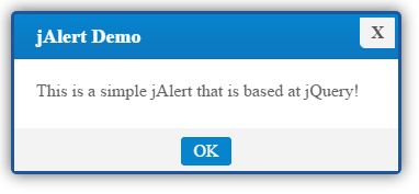
A simple alert demo by using jAlert
In this demo, A jQuery alert is created with an Ok button to close the alert box.
Online demo and code
The following code is used in the jQuery section:
<script>

$('.alertdemo').on('click', function(e){

e.preventDefault();

theme = "blue";


$.jAlert({

'title': 'jAlert Demo',

'content': 'This is a simple jAlert that is based at jQuery!',

'theme': theme,

'backgroundColor': 'white',

'btns': [

{'text':'OK', 'theme':theme}

]

});

});

</script>
The color of the alert is set by using the theme variable. You may use different colors for various contexts. For example, the bluish theme may represent an informative message like I used in the above demo.
You may use red for dangerous action or green for success. You may also use yellow or black colors in theme parameter.
Similarly, you can set the title of an alert box in the title parameter. The content parameter is where you can write the message to display. I used the “white’ background for this demo. You may use black as well.
A demo to close alert by clicking anywhere
If you want to let a user close this jQuery alert by clicking anywhere on the screen rather than clicking the “Ok” button, as shown in the above demo, then use this option:
'closeOnClick': true
Remove the button code from the above demo. See this demo with different theme:
See online demo and code
The following code is used this time:
  $.jAlert({

'title': 'jAlert Demo',

'content': 'Close this alert by clicking anywhere on the screen!',

'theme': theme,

'closeOnClick': true,

'backgroundColor': 'black',

});
You can see the options used in the above code.
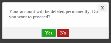
A confirm alert demo
The following example demonstrates how you can create a confirm jQuery alert by using the jAlert plug-in. As you click the button, the confirm alert will be shown with a custom text message along with “Yes” and “No” buttons.
Upon clicking the Yes or No button, another alert will be displayed which is a simple alert to confirm the action.
Markup and jQuery:
<!DOCTYPE html>
<html>
<head>
<script src="//code.jquery.com/jquery-1.11.3.min.js"></script>
<script src="alert/jAlert-v3.min.js"></script>
<script src="alert/jAlert-functions.min.js"></script>
<link rel="stylesheet" href="alert/jAlert-v3.css" />

<style>
.divalert{
  background: #6A0432;
  width:220px;
  border-radius: 15px;
  padding:20px;
  font-size:18px;
  color:#fff;
}
</style>
</head>

<body>

<h1>The jQuery Alert demo</h1>

<div class="divalert">
   <button class='alertdemo'>Trigger confirm jAlert</button>
</div>
<script>
$('.alertdemo').click(confirm);

function confirm()
{
  $.jAlert({'type': 'confirm','confirmQuestion':'Your account will be deleted permanently, Do you want to proceed?', 'onConfirm': function(){
    alert('Your account is removed!');
  }, 'onDeny': function(){
    alert('Your account is safe!');
  } });
}

</script>
</body>
</html>
Changing the theme of confirm dialog box
You can also customize the look of the confirm alerts as using the jAlert plug-in. In this demo, I will create a jQuery confirm dialog with the red theme.
As you click the Yes or No buttons, rather displaying the simple alert like in the above example, I will show jAlerts with different themes and styles.
See the demo online:
The code:
<!DOCTYPE html>
<html>
<head>
<script src="//code.jquery.com/jquery-1.11.3.min.js"></script>
<script src="alert/jAlert-v3.min.js"></script>
<script src="alert/jAlert-functions.min.js"></script>
<link rel="stylesheet" href="alert/jAlert-v3.css" />
<style>
.divalert{
background: #6A0432;
width:220px;
border-radius: 15px;
padding:20px;
font-size:18px;
color:#fff;
}
</style>
</head>
<body>
<h1>The jQuery Alert demo</h1>
<div class="divalert">
<button class='alertdemo'>Trigger confirm jAlert</button>
</div>
<script>
$('.alertdemo').click(confirm);
function confirm()
{
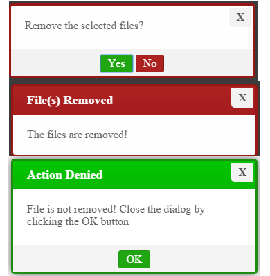
$.jAlert({'type': 'confirm',
'confirmQuestion':'Remove the selected files?',
'theme': 'red',
'onConfirm': function(){
theme = "red";
$.jAlert({
'title': 'File(s) Removed',
'content': 'The files are removed!',
'theme': theme,
'closeOnClick': true,
'backgroundColor': 'black'
});
}, 'onDeny': function(){
theme = "green";
$.jAlert({
'title': 'Action Denied',
'content': 'File is not removed! Close the dialog by clicking the OK button',
'theme': theme,
'backgroundColor': 'white',
'btns': [
{'text':'OK', 'theme':theme}
]
});
} });
}
</script>
</body>
</html>
If you copy/paste the above code, you can see that if Yes button was clicked, another dialog displayed with different settings like the red theme, black background, and you can close that dialog by clicking anywhere on the screen.
On the other hand, if you clicked No, the alert with the green theme, white background, and an Ok button to close that dialog appeared.
This code was used to create confirm jQuery dialog:
<script>

$('.alertdemo').click(confirm);


function confirm()

{

$.jAlert({'type': 'confirm',

'confirmQuestion':'Remove the selected files?',

'theme': 'red',

'onConfirm': function(){

theme = "red";

$.jAlert({

'title': 'File(s) Removed',

'content': 'The files are removed!',

'theme': theme,

'closeOnClick': true,

'backgroundColor': 'black'

});

}, 'onDeny': function(){

theme = "green";

$.jAlert({

'title': 'Action Denied',

'content': 'File is not removed! Close the dialog by clicking the OK button',

'theme': theme,

'backgroundColor': 'white',

'btns': [

{'text':'OK', 'theme':theme}

]


});

} });

}


</script>
In the demo, the alert is called at the click event of the button. You may use a link or some other element to display that.
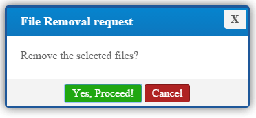
In the above examples, I only used the default button: Yes and No in the confirm alert. In pro sites, you may also need to change the text to, for example, Yes and Cancel or any other.
See the following demo with different button’s text:
Online demo and code
This is how the button text is changed in the <script> section for the confirm box:
 'confirmBtnText': "Yes, Proceed!",

'denyBtnText': 'Cancel',
Also, I used the title for this confirmation demo:
'title': 'File Removal request',
The rest is the same, as used in the above demo.
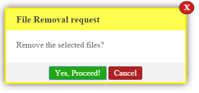
You can also specify the close button in different alerts of jQuery alert. See the following alert with the red circle.
HTML, CSS and jQuery
<!DOCTYPE html>
<html>
<head>
<script src="//code.jquery.com/jquery-1.11.3.min.js"></script>
<script src="alert/jAlert-v3.min.js"></script>
<script src="alert/jAlert-functions.min.js"></script>
<link rel="stylesheet" href="alert/jAlert-v3.css" />

<style>
.divalert{
  background: #6A0432;
  width:220px;
  border-radius: 15px;
  padding:20px;
  font-size:18px;
  color:#fff;
}
</style>
</head>

<body>

<h1>The jQuery Alert demo</h1>

<div class="divalert">
   <button class='alertdemo'>Trigger confirm jAlert</button>
</div>
<script>
$('.alertdemo').click(confirm);

function confirm()
{
  $.jAlert({'type': 'confirm',
            'title': 'File Removal request',
            'closeBtnAlt': true,
            'confirmQuestion':'Remove the selected files?',
            'theme': 'yellow',
            'confirmBtnText': "Yes, Proceed!",
            'denyBtnText': 'Cancel',
            'backgroundColor': 'white',
            'onConfirm': function(){
      theme = "red";
      $.jAlert({
          'title': 'File(s) Removed',
          'content': 'The files are removed!',
          'theme': theme,
          'closeOnClick': true,
          'backgroundColor': 'black'
         });
  }, 'onDeny': function(){
      theme = "green";
      $.jAlert({
          'title': 'Action Denied',
          'content': 'File is not removed! Close the dialog by clicking the OK button',
          'theme': theme,
          'backgroundColor': 'white',
          'btns': [
        	{'text':'OK', 'theme':theme}
                ]

         });
  } });
}

</script>
</body>
</html>
The following line of code is used, in addition to the above example’s code:
'closeBtnAlt': true,
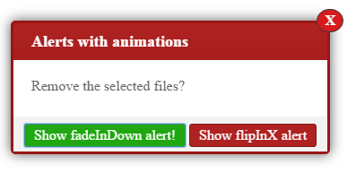
jQuery animated alerts demo
The animation can also be added to different alerts by using the jAlert plug-in. See the following demo, where an alert will be triggered as you click the button with ‘bounceIn’ effect.
Online demo and code
You can see three different animations for three alerts. The animation is added by using this code:
For example, the confirm alert is given:
'showAnimation': 'bounceIn',
Setting up jAlert plugin
Enough of online demos, this is how you may set up this cool plug-in for your web project. Simply include the plug-in libraries in the <head> section:
<script src=”//code.jquery.com/jquery-1.11.3.min.js”></script>
<script src=”alert/jAlert-v3.min.js”></script>
<link rel=”stylesheet” href=”alert/jAlert-v3.css” />
The first one is the jQuery library while the second is the JS file of jAlert version 3. You may download and host it at your own by going to plug-in’s site (see the credit link below) or right click on any demo page, view source and find this line: <script src=”alert/jAlert-v3.min.js”></script>.
Click on the link to open the JS file. After that, right-click and save it to your computer.
The same is applied to the third file, which is a CSS file.
For creating confirm alert, also, include this file in the head section:
<script src=”alert/jAlert-functions.min.js”></script>
Credits: The plug-in site @ GitHub
jQuery alerts by using another plug-in
If you are using 1.8.3 or lower version of jQuery, then you may use this plug-in to create different types of alerts including alerts with HTML and prompt alerts.
First, have a look at a demo online which is followed by how you can set up this plug-in to work in your projects.
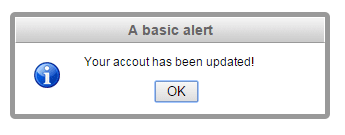
A simple alert demo
Following is a simple alert with a message and an Ok button to close the alert. This is a modal alert, so you cannot interact with other parts of the website until you close the alert.
Online demo and code
This code is used to create a simple alert that also uses jAlert keyword:
<script>

$(document).ready( function() {

$(".alertdemo").click( function() {

jAlert('Your accout has been updated!', 'A basic alert');

});

});

</script>
However, this is a different plug-in. To set up this plug-in, you have to include following in the <head> section:
<script src=”https://ajax.googleapis.com/ajax/libs/jquery/1.8.3/jquery.min.js”></script>
<script src=”//code.jquery.com/ui/1.11.2/jquery-ui.js”></script>
<script src=”alert/jquery.alerts.js” type=”text/javascript”></script>
<link href=”alert/jquery.alerts.css” rel=”stylesheet” type=”text/css” media=”screen” />
The first two libraries are jQuery libraries that are referred from the CDN.
You also have to include the jquery.alerts.js file that you may get by right clicking the demo page, view source and downloading the library, or visiting the plug-in page.
The last file is the CSS, which defines the look of alerts. You may find it the same way and download at your system or visit above link and download the zipped file that contains all dependency files.
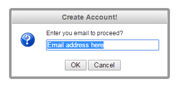
A prompt alert demo
A jQuery prompt alert that takes input from the user can be created by using the jPrompt keyword.
Complete Code
<!DOCTYPE html>
<head>
<script src="https://ajax.googleapis.com/ajax/libs/jquery/1.8.3/jquery.min.js"></script>
<script src="//code.jquery.com/ui/1.11.2/jquery-ui.js"></script>

<script src="alert/jquery.alerts.js" type="text/javascript"></script>
<link href="alert/jquery.alerts.css" rel="stylesheet" type="text/css" media="screen" />

<style>
.divalert{
  background: #1A3C57;
  width:220px;
  border-radius: 15px;
  padding:20px;
  font-size:18px;
  color:#fff;
}
</style>

</head>
<body>
<div class="divalert">
<input class="alertdemo" type="button" value="Trigger a prompt alert" />
</div>

<script>
$(document).ready( function() {

$(".alertdemo").click( function() {
jPrompt('Enter you email to proceed?', 'Email address here', 'Create Account!', function(retvalue) {
if( retvalue )
    jAlert('Your entered email is: ' + retvalue, 'Confirm email!');
});
});

});
</script>
</body>
</html>
So, you may specify the title, message, and default text in the input field in that alert. The input text is retrieved by using the retvalue parameter (you may use any other). If some text is entered, it is shown by using a simple alert.
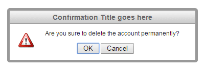
A confirm alert demo
Similarly, you may create a confirm alert by using the jConfirm word as shown in the following demo:
Following jQuery, HTML and CSS code:
<!DOCTYPE html>
<head>
<script src="https://ajax.googleapis.com/ajax/libs/jquery/1.8.3/jquery.min.js"></script>
<script src="//code.jquery.com/ui/1.11.2/jquery-ui.js"></script>

<script src="alert/jquery.alerts.js" type="text/javascript"></script>
<link href="alert/jquery.alerts.css" rel="stylesheet" type="text/css" media="screen" />

<style>
.divalert{
  background: #1A3C57;
  width:220px;
  border-radius: 15px;
  padding:20px;
  font-size:18px;
  color:#fff;
}
</style>

</head>
<body>
<div class="divalert">
<input class="alertdemo" type="button" value="Trigger a confirm alert" />
</div>

<script>
$(document).ready( function() {

$(".alertdemo").click( function() {
    jConfirm('Are you sure to delete the account permanently?', 'Confirmation Title goes here', function(result) {
        if (result){
        jAlert('Your account is removed','You clicked OK');
        }
        else{
        jAlert('Your account is safe', 'You clicked cancel');
        }
});
});

});
</script>
</body>
</html>
For each response, you may perform the desired action, e.g. connecting with a database to remove the account or placing the redirection code if asking the user to redirect to another website.
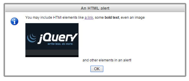
An alert with HTML
You may also use this plug-in to create an alert with HTML tags like hyperlinks, bold text, headings etc. See the following demo online with code:
See online demo and code
You can see, an alert with a link, bold text, and even an image is created by using this plug-in. The following code is used to create that HTML alert:
jAlert('You may include HTML elements like <a href="https://www.jquery-az.com/">a link</a>, some <strong>bold text</strong>, even an image<img src="jquery.jpg"> and other elements in an alert!','An HTML alert');
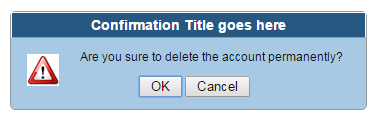
Changing the colors or theme of alerts
By modifying the CSS file included with this plug-in, you can change the theme of different alerts quite easily. The other way can be overriding these classes by your own CSS.
In this demo, I will show you overriding the default CSS with custom CSS for creating an alert.
The code
<!DOCTYPE html>
<head>
<script src="https://ajax.googleapis.com/ajax/libs/jquery/1.8.3/jquery.min.js"></script>
<script src="//code.jquery.com/ui/1.11.2/jquery-ui.js"></script>

<script src="alert/jquery.alerts.js" type="text/javascript"></script>
<link href="alert/jquery.alerts.css" rel="stylesheet" type="text/css" media="screen" />

<style>
#popup_container {
	font-family: Arial, sans-serif;
	font-size: 12px;
	min-width: 300px; /* Dialog will be no smaller than this */
	max-width: 600px; /* Dialog will wrap after this width */
	background: #A7C9E4;
	border: solid 1px #999;
	color: #000;
	-moz-border-radius: 5px;
	-webkit-border-radius: 5px;
	border-radius: 5px;
}

#popup_title {
	font-size: 14px;
	font-weight: bold;
	text-align: center;
	line-height: 1.75em;
	color: #fff;
	background: #275881;
	border: solid 1px #FFF;
	border-bottom: solid 1px #999;
	cursor: default;
	padding: 0em;
	margin: 0em;
}
.divalert{
  background: #1A3C57;
  width:220px;
  border-radius: 15px;
  padding:20px;
  font-size:18px;
  color:#fff;
}
</style>

</head>
<body>
<div class="divalert">
<input class="alertdemo" type="button" value="Trigger a confirm alert" />
</div>

<script>
$(document).ready( function() {

$(".alertdemo").click( function() {
    jConfirm('Are you sure to delete the account permanently?', 'Confirmation Title goes here', function(result) {
        if (result){
        jAlert('Your account is removed','You clicked OK');
        }
        else{
        jAlert('Your account is safe', 'You clicked cancel');
        }
});
});

});
</script>
</body>
</html>
In the example, I just picked two CSS classes and changed the properties for the title and content area.
Similarly, you can change the other properties for different alerts including icons used in the alerts.