
The Bootstrap 4 Modals are built by using HTML, CSS, and JavaScript (jQuery). As a modal is displayed, the underneath content in the web page becomes “inactive” that a user cannot interact with until it is closed. The scroll bars are removed for underlying content so that modal content can be scrolled.
You may use Modal Bootstrap 4 for adding user notifications, and lightboxes, marketing some important service or product, making announcements, etc.
In this tutorial, I will show you how to create modals by using Bootstrap 4 framework with live demos and complete code.
- 1. A simple modal example
- 2. Display modal vertically centered example
- 3. Displaying tooltips in Modal dialog example
- 4. A demo of displaying popovers
- 5. Create large and small-sized modal windows
- 6. How to customize the height and width of Modal in Bootstrap 4?
- 7. Overriding the default colors demo
- 8. Removing the animation as modal closes
- 9. Display the modal as the web page loads
- 10. Disable the keyboard Escape key example
- 11. Disabling the backdrop in modal Bootstrap
A simple modal example
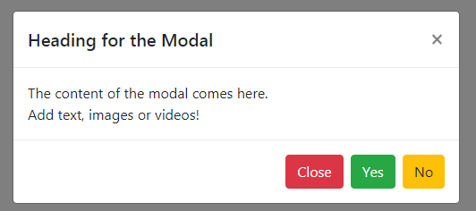
Let me begin by creating a simple modal by using the built-in classes and data attributes. A modal generally has three sections:
- The Modal header – Display a title/heading with controls like close option.
- Modal body – Convey the message to the user, place a form, images, videos etc.
- Modal footer – The optional component where you may place actionable stuff like “Subscription”, “Create Account” buttons etc.
See the example below with all three components in the Bootstrap 4 Modal:
See online demo and code
The markup for the example:
<div class="container"> <!-- Button trigger modal --> <button type="button" class="btn btn-info" data-toggle="modal" data-target="#Modal-simple-demo"> Launch demo modal </button> <!-- Modal --> <div class="modal fade" id="Modal-simple-demo" tabindex="-1" role="dialog" aria-labelledby="Modal-simple-demo-label" aria-hidden="true"> <div class="modal-dialog" role="document"> <div class="modal-content"> <div class="modal-header"> <h5 class="modal-title" id="Modal-simple-demo-label">Heading for the Modal</h5> <button type="button" class="close" data-dismiss="modal" aria-label="Close"> <span aria-hidden="true">×</span> </button> </div> <div class="modal-body"> The content of the modal comes here. <br /> Add text, images or videos! </div> <div class="modal-footer"> <button type="button" class="btn btn-danger" data-dismiss="modal">Close</button> <button type="button" class="btn btn-success">Yes</button> <button type="button" class="btn btn-warning">No</button> </div> </div> </div> </div> </div>
The requirements:
You are required to include the Bootstrap CSS file, jQuery, and popper JS files and finally Bootstrap JS file in order to make the modal component work. I have included all these by CDN:
<link rel=”stylesheet” href=”https://maxcdn.bootstrapcdn.com/bootstrap/4.0.0-beta.3/css/bootstrap.min.css” integrity=”sha384-Zug+QiDoJOrZ5t4lssLdxGhVrurbmBWopoEl+M6BdEfwnCJZtKxi1KgxUyJq13dy” crossorigin=”anonymous”>
<script src=”https://ajax.googleapis.com/ajax/libs/jquery/3.2.1/jquery.min.js”></script>
<script src=”https://cdnjs.cloudflare.com/ajax/libs/popper.js/1.12.6/umd/popper.min.js”></script>
<script src=”https://maxcdn.bootstrapcdn.com/bootstrap/4.0.0-beta.3/js/bootstrap.min.js”></script>
How modal code works?
Step 1:
First of all, you can see a modal launch button that used the data-target attribute. Its value is matched to the ID of the main div containing modal i.e.
<div class=”modal fade” id=”Modal-simple-demo” tabindex=”-1″ role=”dialog” aria-labelledby=”Modal-simple-demo-label” aria-hidden=”true”>
Besides, the data-toggle=”modal” attribute is also used in the launch button.
Step 2:
The modal header is defined by using the .modal-header class in a div. In our example header, the modal contains the title and close button.
Step 3:
The body of the modal where you will write the content or display images/videos is defined by using a <div> that is given the .modal-body class.
Step 4:
The footer is set by using another div with .modal-footer class. There, I used a few Bootstrap 4 buttons classes.
Display modal vertically centered example
As you launched the above modal by pressing the button, you might notice the modal displayed upwards as per your screen. It was not vertically centered by default.
If you require displaying the modal aligned vertically centered then just add the .modal-dialog-centered class with .modal-dialog. Have a look at this demo:
Online demo and code
The markup:
<div class="container"> <h3>Bootstrap 4 Modal</h3> <!-- Button trigger modal --> <button type="button" class="btn btn-info" data-toggle="modal" data-target="#Modal-vert-center-demo"> Open Vertically Centered Modal </button> <!-- Modal --> <div class="modal fade" id="Modal-vert-center-demo" tabindex="-1" role="dialog" aria-labelledby="Modal-vert-center-demo-label" aria-hidden="true"> <div class="modal-dialog modal-dialog-centered" role="document"> <div class="modal-content"> <div class="modal-header"> <h5 class="modal-title" id="Modal-vert-center-demo-label">Vertically centered modal</h5> <button type="button" class="close" data-dismiss="modal" aria-label="Close"> <span aria-hidden="true">×</span> </button> </div> <div class="modal-body"> This modal is aligned <br /> Vertically centered! </div> <div class="modal-footer"> <button type="button" class="btn btn-danger" data-dismiss="modal">Close</button> <button type="button" class="btn btn-success">Yes</button> <button type="button" class="btn btn-warning">No</button> </div> </div> </div> </div> </div>
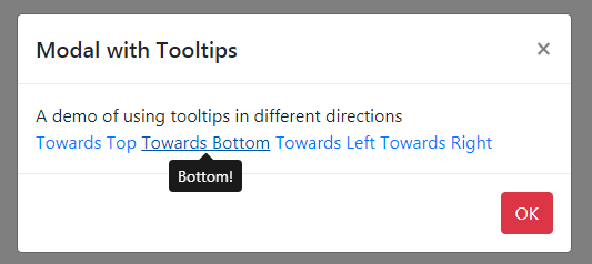
Displaying tooltips in Modal dialog example
As mentioned earlier, you may display content as per the requirement in the modal body. The following example displays the tooltips by using Bootstrap 4 tooltip component classes in the modal body:
The markup for the demo:
<div class="container"> <h3>Bootstrap 4 Modal</h3> <!-- Button trigger modal --> <button type="button" class="btn btn-info" data-toggle="modal" data-target="#Modal-vert-center-demo"> Open Modal with Tooltips </button> <!-- Modal --> <div class="modal fade" id="Modal-vert-center-demo" tabindex="-1" role="dialog" aria-labelledby="Modal-vert-center-demo-label" aria-hidden="true"> <div class="modal-dialog modal-dialog-centered" role="document"> <div class="modal-content"> <div class="modal-header"> <h5 class="modal-title" id="Modal-vert-center-demo-label">Modal with Tooltips</h5> <button type="button" class="close" data-dismiss="modal" aria-label="Close"> <span aria-hidden="true">×</span> </button> </div> <div class="modal-body"> A demo of using tooltips in different directions <br /> <a href="#" data-toggle="tooltip-demo" data-placement="top" title="Top direction">Towards Top</a> <a href="#" data-toggle="tooltip-demo" data-placement="bottom" title="Bottom!">Towards Bottom</a> <a href="#" data-toggle="tooltip-demo" data-placement="left" title="Left!">Towards Left</a> <a href="#" data-toggle="tooltip-demo" data-placement="right" title="Right!">Towards Right</a> </div> <div class="modal-footer"> <button type="button" class="btn btn-danger" data-dismiss="modal">OK</button> </div> </div> </div> </div> </div>
You also need to initiate the tooltip component via jQuery:
<script>

$(document).ready(function(){

    $('[data-toggle="tooltip-demo"]').tooltip();

});

</script>
You can see that the tooltips are displayed in left, right, top, and bottom directions.
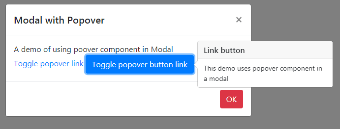
A demo of displaying popovers
Similarly, you may use the popover component in the Modal dialog. Have a look at the demo:
The markup:
<div class="container"> <h3>Bootstrap 4 Modal</h3> <!-- Button trigger modal --> <button type="button" class="btn btn-info" data-toggle="modal" data-target="#Modal-pop-demo"> Open Modal with popovers </button> <!-- Modal --> <div class="modal fade" id="Modal-pop-demo" tabindex="-1" role="dialog" aria-labelledby="Modal-pop-demo-label" aria-hidden="true"> <div class="modal-dialog modal-dialog-centered" role="document"> <div class="modal-content"> <div class="modal-header"> <h5 class="modal-title" id="Modal-pop-demo-label">Modal with Popover</h5> <button type="button" class="close" data-dismiss="modal" aria-label="Close"> <span aria-hidden="true">×</span> </button> </div> <div class="modal-body"> A demo of using poover component in Modal<br /> <a href="#" data-toggle="modal-popover-demo" title="Using Popover in Modal" data-content="This demo uses popover component in a modal">Toggle popover link</a> <a href="#" data-toggle="modal-popover-demo" role="button" class="btn btn-primary" title="Link button" data-content="This demo uses popover component in a modal">Toggle popover button link</a> </div> <div class="modal-footer"> <button type="button" class="btn btn-danger" data-dismiss="modal">OK</button> </div> </div> </div> </div> </div>
The script for initializing the popover:
$(document).ready(function(){

    $('[data-toggle="modal-popover-demo"]').popover();

});
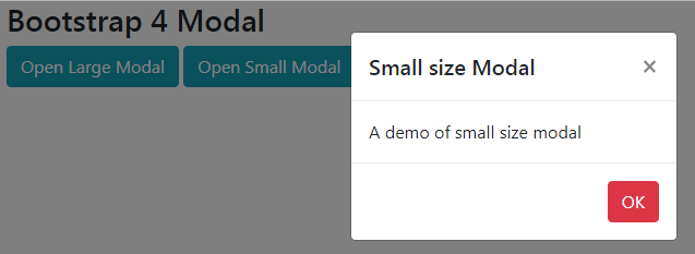
Create large and small-sized modal windows
Bootstrap 4 has classes to create small and large modal dialogs. In Bootstrap 3 modals, you had to customize the sizes by grabbing the modal classes and changing the height or width of modal as per the requirement. You can also do this in Bootstrap 4, however, it also has built-in classes for creating the standard small and large-sized modal windows.
The size of the modals will adjust as per the user’s device. The following classes can be used with .modal-dialog class:
- modal-lg //For creating large sized modal
- modal-sm //For small size modals
Have a look at this demo where you can see two buttons to launch large and small size modal dialogs:
See online demo and code
The markup for small and large size modals:
<div class="container"> <h3>Bootstrap 4 Modal</h3> <!-- Button trigger modal --> <button type="button" class="btn btn-info" data-toggle="modal" data-target="#Modal-large-demo"> Open Large Modal </button> <button type="button" class="btn btn-info" data-toggle="modal" data-target="#Modal-small-demo"> Open Small Modal </button> <!-- large size Modal --> <div class="modal fade" id="Modal-large-demo" tabindex="-1" role="dialog" aria-labelledby="Modal-large-demo-label" aria-hidden="true"> <div class="modal-dialog modal-lg" role="document"> <div class="modal-content"> <div class="modal-header"> <h5 class="modal-title" id="Modal-large-demo-label">Large sized Modal</h5> <button type="button" class="close" data-dismiss="modal" aria-label="Close"> <span aria-hidden="true">×</span> </button> </div> <div class="modal-body"> A demo of large size modal<br /> </div> <div class="modal-footer"> <button type="button" class="btn btn-danger" data-dismiss="modal">OK</button> </div> </div> </div> </div> <!-- large small Modal --> <div class="modal fade" id="Modal-small-demo" tabindex="-1" role="dialog" aria-labelledby="Modal-small-demo-label" aria-hidden="true"> <div class="modal-dialog modal-sm" role="document"> <div class="modal-content"> <div class="modal-header"> <h5 class="modal-title" id="Modal-small-demo-label">Small size Modal</h5> <button type="button" class="close" data-dismiss="modal" aria-label="Close"> <span aria-hidden="true">×</span> </button> </div> <div class="modal-body"> A demo of small size modal<br /> </div> <div class="modal-footer"> <button type="button" class="btn btn-danger" data-dismiss="modal">OK</button> </div> </div> </div> </div> </div>
How to customize the height and width of Modal in Bootstrap 4?
Rather than using the default settings for height and width for Bootstrap modals (for normal, small, or large sizes), you may specify your own as per requirement.
For that, you need to use the custom CSS after the reference of Bootstrap CSS file. The following example shows using the CSS in <style> section.
There, I used the .modal-dialog class and set the width as follows:
The CSS
<style>

.modal-dialog {

  width: 430px;

  }

</style>
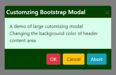
Overriding the default colors demo
Similarly, by using the .modal-content property after the reference of Bootstrap 4 CSS, you may customize the color scheme of the content area and .modal-header for the header of the modal.
See a demonstration below where I changed the header and content default colors by overriding these classes:
First complete code:
<!DOCTYPE html>
<html>
<head>
<link rel="stylesheet" href="https://maxcdn.bootstrapcdn.com/bootstrap/4.0.0-beta.3/css/bootstrap.min.css" integrity="sha384-Zug+QiDoJOrZ5t4lssLdxGhVrurbmBWopoEl+M6BdEfwnCJZtKxi1KgxUyJq13dy" crossorigin="anonymous">

<script src="https://ajax.googleapis.com/ajax/libs/jquery/3.2.1/jquery.min.js"></script>
<script src="https://cdnjs.cloudflare.com/ajax/libs/popper.js/1.12.6/umd/popper.min.js"></script>
<script src="https://maxcdn.bootstrapcdn.com/bootstrap/4.0.0-beta.3/js/bootstrap.min.js"></script>

<style>
.modal-dialog {
          width: 360px;
        }
.modal-header {
    background-color: #004000;
    padding:5px 5px;
    color:#FFF;
    border-bottom:1px dashed #BBBB00;
 }
.modal-content {
    /* 80% of window height */
    height: 90%;
    background-color:#D7FFEB;
}

.modal-footer {
  background-color:#004000;
  padding: 1rem;
  border-top: 1px solid #e9ecef;
}
</style>

</head>
<body>

<div class="container">
<h3>Bootstrap 4 Modal</h3>
<!-- Button trigger modal -->
<button type="button" class="btn btn-dark" data-toggle="modal" data-target="#Modal-custom-demo">
  Open Custom Modal
</button>

<!-- Custom Modal -->
<div class="modal fade" id="Modal-custom-demo" tabindex="-1" role="dialog" aria-labelledby="Modal-custom-demo-label" aria-hidden="true">
  <div class="modal-dialog" role="document">
    <div class="modal-content">
      <div class="modal-header">
        <h5 class="modal-title" id="Modal-custom-demo-label">Customzing Bootstrap Modal</h5>
        <button type="button" class="close" data-dismiss="modal" aria-label="Close">
          <span aria-hidden="true">×</span>
        </button>
      </div>
      <div class="modal-body">
        A demo of large cutomizing modal<br />
        Changing the background color of header<br />
        content area<br />
        and fotter
      </div>
      <div class="modal-footer">
        <button type="button" class="btn btn-danger" data-dismiss="modal">OK</button>
        <button type="button" class="btn btn-warning" data-dismiss="modal">Cancel</button>
        <button type="button" class="btn btn-info" data-dismiss="modal">Abort</button>
      </div>
    </div>
  </div>
</div>


</div>

</body>
</html>
The CSS for this demo:
<style>

.modal-dialog {

          width: 360px;

        }

.modal-header {

    background-color: #004000;

    padding:5px 5px;

    color:#FFF;

    border-bottom:1px dashed #BBBB00;

 }

.modal-content {

    /* 80% of window height */

    height: 90%;

    background-color:#D7FFEB;

}


.modal-footer {

  background-color:#004000;

  padding: 1rem;

  border-top: 1px solid #e9ecef;

}

</style>
In the same way, you may get the other classes and override the default styles.
Related Tutorial: Customize Bootstrap 3 modals
Removing the animation as modal closes
In all the above examples, you might have seen the usage of .fade class in the <div> with .modal class (the first div). That gives modals a fading effect as you open or close the modal window by pressing the cross sign or click somewhere in “backdrop”.
If you want to remove this effect, simply delete the fade class. See this example where modal dialog displays without any effect:
See online demo and code
Only this bit is changed to the main div:
<div class=”modal” id=”Modal-nofade-demo” tabindex=”-1″ role=”dialog” aria-labelledby=”Modal-nofade-demo-label” aria-hidden=”true”>
That is, the fade class is removed.
Display the modal as the web page loads
In all the above examples, the modal is launched as you press the button. In certain situations, you may require loading the modal dialog as the web page loads.
For that, you may use the modal’s show method in jQuery code as shown in the example below. Click the image or link below to load the example page and you will see the modal is loaded:
Online demo
Just add the following script before the </body> tag:
$(document).ready(function(){

    $('#Modal-onload-demo').modal('show');

});
Make sure using the correct modal ID in the jQuery code.
Disable the keyboard Escape key example
Again, in all the above examples, the modal window is closed as you press the “Esc” key in the keyboard along with options of closing by clicking the cross button or clicking on “backdrop”.
You may disable the keyboard Esc key by using the keyboard: false in the jQuery code or by using data-attribute.
The script:
$('#Modal-keyboard-demo').modal({

  keyboard: false

})
Note: You may also use the data attribute for disabling the keyboard if you do not want to use the jQuery code. For example:
data-keyboard=”false”
This markup will also work for the above example without jQuery code:
<div class=”modal fade” id=”Modal-keyboard-demo” tabindex=”-1″ data-keyboard=”false” role=”dialog” aria-labelledby=”Modal-keyboard-demo-label” aria-hidden=”true”>
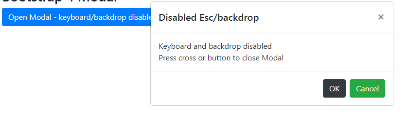
Disabling the backdrop in modal Bootstrap
Similarly, you may set the backdrop false via JavaScript or data attribute. In that case, the modal will not be closed by clicking anywhere outside of the modal. You may also disable keyboard and backdrop together, so a user may close the modal only by pressing the cross button or buttons in the modal.
Have a look at the demo below where I disabled keyboard Esc as well as the backdrop by using the data attributes.
See online demo and code
The markup:
<div class="container"> <h3>Bootstrap 4 Modal</h3> <!-- Button trigger modal --> <button type="button" class="btn btn-primary" data-toggle="modal" data-target="#Modal-key-back-demo"> Open Modal - keyboard/backdrop disabled </button> <!-- Custom Modal --> <div class="modal fade" id="Modal-key-back-demo" tabindex="-1" data-keyboard="false" data-backdrop="false" role="dialog" aria-labelledby="Modal-key-back-demo-label" aria-hidden="true"> <div class="modal-dialog" role="document"> <div class="modal-content"> <div class="modal-header"> <h5 class="modal-title" id="Modal-key-back-demo-label">Disabled Esc/backdrop</h5> <button type="button" class="close" data-dismiss="modal" aria-label="Close"> <span aria-hidden="true">×</span> </button> </div> <div class="modal-body"> Keyboard and backdrop disabled <br /> Press cross or button to close Modal </div> <div class="modal-footer"> <button type="button" class="btn btn-dark" data-dismiss="modal">OK</button> <button type="button" class="btn btn-success" data-dismiss="modal">Cancel</button> </div> </div> </div> </div> </div>
These two attributes are used:
data-keyboard=”false” data-backdrop=”false”
No JavaScript.