
Purpose of CSS background image property
The background-image property of CSS is used to set the background image of the HTML elements like div, paragraphs, headings, table headings, body, etc.
You can set images with different extensions like PNG, JPG, GIF, SVG, etc.
You may use one or more images to set the background of elements by CSS3, as well. For example:
Setting single image background:
background-image: url (“images/demo.jpg”);
Or use shorthand background property:
background: url (“images/demo.jpg”);
You may use the absolute path as well:
background-image: url (“http://www.example.com/images/demo.jpg”);
Setting multiple background images:
background-image: url (“images/image1.jpg”), url (“images/image2.jpg”), url (“images/image3.jpg”) ;
Following are demos to use CSS background-image property in different ways. I will use single and multiple, images with the transition, position, and other values. You can see live demos as well with each example.
A simple example of setting the background image of a div
A CSS class is created where the background image is used. The class is assigned to a <div> tag. See code and demo online:
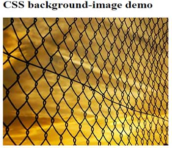
The following class sets the background image:
.divbk{

background-image: url("images/sunset.jpg");

height: 400px;

width:450px;

}
Setting the fallback color example
If somehow, the background image is unable to download in the user’s browsers: due to internet speed, slow server, or browser issues, you can set the fallback color in the background property as follows:
background: url(“images/sunset1.jpg”) #eee;

In the URL, a wrong image name is given for demonstration purposes. As the image is not available, the background color is used instead:
.divbk{

background: url("images/sunset1.jpg") #A3B8C0;

height: 400px;

width:450px;

}
A multiple background image demo
In this example, I used two images in the background-image CSS3 property. Along with setting background images, background position and background-repeat properties are used as follows:
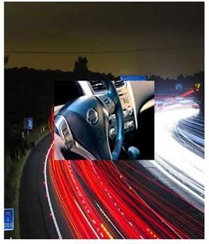
This is how the multiple images are set with other CSS properties:
background-image: url("images/car.jpg") , url("images/motoway.jpg");

height: 500px;

width:400px;

background-position: center, left;

background-repeat: no-repeat;
The background-repeat is used to ensure that image is not repeated by using no-repeat value. While, you may set the position of both images by using different directions.
If you do not specify a position, the default will be top-left for both images.
Displaying background image with transparency or opacity
While there is no property to set transparent images in the background by CSS, you may either use Photoshop or some other tool to make images transparent.
In CSS, one of the ways can be using the background with linear-gradient and using RGB that allows setting the opacity.
The following example demonstrates how you can do that:
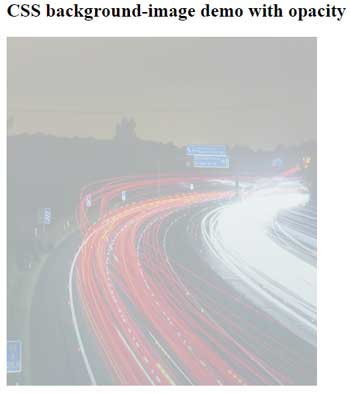
This is CSS used to achieve background opacity in the image:
.divbk{

height: 450px;

width:400px;

background: -webkit-linear-gradient(top, rgba(202,215,219,0.8) 0%,rgba(255,255,255,0.7) 100%), url("images/motoway.jpg");

background: -o-linear-gradient(top, rgba(202,215,219,0.8) 0%,rgba(255,255,255,0.7) 100%), url("images/motoway.jpg");

background: -ms-linear-gradient(top, rgba(202,215,219,0.8) 0%,rgba(255,255,255,0.7) 100%), url("images/motoway.jpg");

background: -moz-linear-gradient(top, rgba(202,215,219,0.8) 0%, rgba(255,255,255,0.7) 100%), url("images/motoway.jpg");

background: -webkit-gradient(linear, left top, left bottom, color-stop(0%,rgba(255,255,255,0.7)), color-stop(100%,rgba(255,255,255,0.7))), url("images/motoway.jpg");

background: linear-gradient(to top, rgba(202,215,219,0.8) 0%,rgba(255,255,255,0.7) 100%), url("images/motoway.jpg");

}
The CSS3 property is compatible with all major browsers; however, you have to handle each separately. For instance, in Mozilla Firefox you have to use this line:
background: -moz-linear-gradient(top, rgba(202,215,219,0.8) 0%, rgba(255,255,255,0.7) 100%), url("images/motoway.jpg");
In the example, I used the same height and width for the div, as the image. If you have a smaller image or larger div then use the repeat property as below:
background: linear-gradient(to top, rgba(202,215,219,0.8) 0%,rgba(255,255,255,0.7) 100%), url("images/motoway.jpg" repeat 0 0);
In the case of the above example, the image will not be repeated and the empty space will be filled by the given RGB color.
Note that, I used the same image as used in the above example with multiple background images.
Using background images in HTML tables
You may set background images of the table elements as well by using the CSS background-image property. The table heading and table data images can be set separately. If you set the background image in main the <table> tag, then the background image can be applied to the whole table as well.
In the following demo, I will set the background image of table headings only:

The following CSS is used to create the table, particularly focusing on the table header CSS:
.demotbl {

border-collapse: collapse;

}

.demotbl th{

color: #EAE635;

font-size: 20px;

background: url("images/CSS-background-image-table.jpg");

height:50px;

width:150px;

border-radius: 6px;

}

.demotbl td{

border: 1px dotted black;

border-top: none;

color: #002F5E;

padding:15px;

width:100px;

background-color:#D2E6FB;

}
The markup:
<body>
<p>A table with CSS properties</p>
<table class="demotbl">
  <tr>
      <th>Product ID</th>
      <th>Product Name</th>
      <th>Product Quality</th>
      <th>Product Quantity</th>
  </tr>
  <tr>
      <td>1</td>
      <td>Wheat</td>
      <td>Good</td>
      <td>200 Bags</td>
  </tr>
  <tr>
      <td>2</td>
      <td>Rice</td>
      <td>Good</td>
      <td>250 Bags</td>
  <tr>
      <td>3</td>
      <td>Sugar</td>
      <td>Good</td>
      <td>200 Bags</td>
  </tr>
</table>
</body>
Alternatively, you can use CSS3 properties like the gradient to create an image-like look by using colors. A guide is written here.
Setting full page background image CSS example
In the following example, I will show you how you can set an image as a full-screen background for the page.
You can see the complete code and demo by clicking the link below.
See online demo and code
Setting full background image of div example
Similarly, you can use background-image with other background properties to make a tiny image to cover a full container or given elements. For example, you want to use the background image for the header, footer, left navigation or other elements in a web page rather full page.
For that demo, I am using a tiny image that repeats to cover the full space of the div elements.
The CSS:
background: url("images/background.jpg") center center fixed;

background-repeat:repeat;

height:300px;

width:200px;
However, before using this, consider speed issues with browser cache.
Setting the background image size
By using the background-size property with the background-image, you can set the height and width of the background image.
The syntax to use CSS background-size property is:
background-size: 200px 300px;
Where the first value represents the width and the second specifies the height of the image.
See an example below:
You may also specify the height and width in percentage. For example:
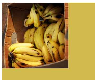
background-image: url("images/banana.jpg");

background-size: 70%;
You should use background-repeat:no-repeat; in that case, otherwise, the remaining space of the container (div in that case) will be filled by that image.
Applying transformation to background images
By using the transform property with background shorthand or background-image properties, you can rotate, scale images as well.
Following are a few examples of using the transform property with background images:
A demo to rotate image by 20 degrees
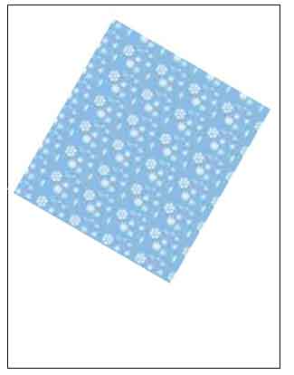
See online demo and code
The CSS:
background: url("images/bk.jpg");

transform:rotate(20deg);
Similarly, you can skew, scale, and translate the background images by using the transform property.
The following is an example that uses skew with x and y values:
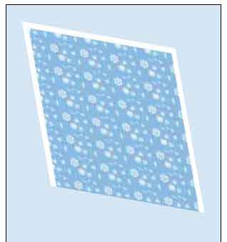
Following CSS is used to skew the image by transform property:
.divbk{

background: url("images/bk.jpg");


-webkit-transform:skew(10deg,10deg);

-moz-transform:skew(10deg,10deg);

-ms-transform:skew(10deg,10deg);

-o-transform:skew(10deg,10deg);

transform:skew(10deg,10deg);

height:230px;

width:215px;

margin:42px;


}

.container{

border:1px solid black;

height:400px;

width:300px;

background-color:#D5E6F4;

}
The final word
The background-image property of CSS should be used if this is part of the design and not the content. The images are small and or supposed to repeat. You can mix small images with CSS3 properties.
If your images are part of the design then you should use background-image property like in header background, as full web page background, table heads, etc.
If images are for the content and it has some semantic meanings then you should use the <img> tag to include images in your web page. You can use alt and title tags in <img> tag that are important for SEO purposes to convey the meanings to search engines as well.
If you want to include images if web pages are printed, by default, then you should use <img> tag.