
Button Group in Bootstrap 5
In order to create a series of buttons in a single horizontal line or stack in a vertical column, you may create button groups in Bootstrap 5.
For example, creating button groups for next/previous, and first/last navigation. Similarly, cut/copy/paste button group and so on.
All you need to do is wrap a series of buttons with .btn class in .btn-group class.
See the examples below.
As mentioned in the above section, you need to use:
- .btn series of buttons in button group class i.e. btn-group.
- Ensure that the correct value is assigned to the role attribute. For example, the value for button group should be role = “group”.
See an example below where we created a button group consisting of three buttons.
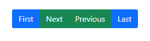
<!DOCTYPE html>

<html>

<head>

<link href="https://cdn.jsdelivr.net/npm/bootstrap@5.0.1/dist/css/bootstrap.min.css" rel="stylesheet" integrity="sha384-+0n0xVW2eSR5OomGNYDnhzAbDsOXxcvSN1TPprVMTNDbiYZCxYbOOl7+AMvyTG2x" crossorigin="anonymous">

</head>

<body>

 <div class="container">

<h3>Bootstrap 5 Button Group</h3> <br>

 <div class="btn-group" role="group" aria-label="Basic example">

  <button type="button" class="btn btn-primary">First</button>

  <button type="button" class="btn btn-success">Next</button>

  <button type="button" class="btn btn-success">Previous</button>

  <button type="button" class="btn btn-primary">Last</button>


</div>

</body>

</html>
You may also assign .btn classes to the <a> tag in order to create a button group. See an example below:
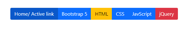
<!DOCTYPE html>

<html>

<head>

<link href="https://cdn.jsdelivr.net/npm/bootstrap@5.0.1/dist/css/bootstrap.min.css" rel="stylesheet" integrity="sha384-+0n0xVW2eSR5OomGNYDnhzAbDsOXxcvSN1TPprVMTNDbiYZCxYbOOl7+AMvyTG2x" crossorigin="anonymous">

</head>

<body>

<div class="container">

<h3>Bootstrap 5 Button Group</h3> <br>

<div class="btn-group">

  <a href="https://www.jquery-az.com/" class="btn btn-primary active" aria-current="page">Home/ Active link</a>

  <a href="https://www.jquery-az.com/bootstrap-5/" class="btn btn-primary">Bootstrap 5</a>

  <a href="https://www.jquery-az.com/html-tutorials/" class="btn btn-warning">HTML</a>

  <a href="https://www.jquery-az.com/css-tutorials/" class="btn btn-primary">CSS</a>

  <a href="https://www.jquery-az.com/javascript-tutorials/" class="btn btn-primary">JavScript</a>

  <a href="https://www.jquery-az.com/jquery-tips/" class="btn btn-danger">jQuery</a>

</div>

</body>

</html>
You may also create button groups with an outline style. For that, you need to use outline-style classes for buttons. See an example below:
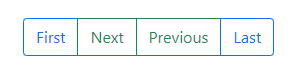
<!DOCTYPE html>

<html>

<head>

<link href="https://cdn.jsdelivr.net/npm/bootstrap@5.0.1/dist/css/bootstrap.min.css" rel="stylesheet" integrity="sha384-+0n0xVW2eSR5OomGNYDnhzAbDsOXxcvSN1TPprVMTNDbiYZCxYbOOl7+AMvyTG2x" crossorigin="anonymous">

</head>

<body>

 <div class="container">

<h3>Bootstrap 5 Button Group</h3> <br>

 <div class="btn-group" role="group" aria-label="Basic example">

  <button type="button" class="btn btn-outline-primary">First</button>

  <button type="button" class="btn btn-outline-success">Next</button>

  <button type="button" class="btn btn-outline-success">Previous</button>

  <button type="button" class="btn btn-outline-primary">Last</button>


</div>

</body>

</html>
The following outline classes for buttons are available:
- btn-outline-primary
- btn-outline-secondary
- btn-outline-success
- btn-outline-danger
- btn-outline-warning
- btn-outline-info
- btn-outline-light
- btn-outline-dark
Learn more about Bootstrap 5 buttons
Bootstrap 5 also enables you to create checkbox and radio button groups. These are basically toggle button groups.
See an example below:
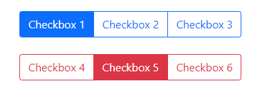
<!DOCTYPE html>

<html>

<head>

<link href="https://cdn.jsdelivr.net/npm/bootstrap@5.0.1/dist/css/bootstrap.min.css" rel="stylesheet" integrity="sha384-+0n0xVW2eSR5OomGNYDnhzAbDsOXxcvSN1TPprVMTNDbiYZCxYbOOl7+AMvyTG2x" crossorigin="anonymous">

</head>

<body>

<div class="container">

<h3>Checkbox Button Group</h3> <br>

<div class="btn-group" role="group" aria-label="Basic checkbox toggle button group">

  <input type="checkbox" class="btn-check" id="btncheck1" autocomplete="off">

  <label class="btn btn-outline-primary" for="btncheck1">Checkbox 1</label>

  <input type="checkbox" class="btn-check" id="btncheck2" autocomplete="off">

  <label class="btn btn-outline-primary" for="btncheck2">Checkbox 2</label>

  <input type="checkbox" class="btn-check" id="btncheck3" autocomplete="off">

  <label class="btn btn-outline-primary" for="btncheck3">Checkbox 3</label>

</div>

<br><br>

<div class="btn-group" role="group" aria-label="Basic checkbox toggle button group">

  <input type="checkbox" class="btn-check" id="btncheck4" autocomplete="off">

  <label class="btn btn-outline-danger" for="btncheck4">Checkbox 4</label>

  <input type="checkbox" class="btn-check" id="btncheck5" autocomplete="off">

  <label class="btn btn-outline-danger" for="btncheck5">Checkbox 5</label>

  <input type="checkbox" class="btn-check" id="btncheck6" autocomplete="off">

  <label class="btn btn-outline-danger" for="btncheck6">Checkbox 6</label>

</div>

</div>

</body>

</html>
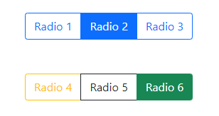
Similarly, create radio button groups by using .btn-group. Remember to map the id of <input> and “for” of the <label>.
Also, you need to change the name of the radio group to make multiple radio button groups on a single web page.
See this example where we created two radio button groups.
<!DOCTYPE html>

<html>

<head>

<link href="https://cdn.jsdelivr.net/npm/bootstrap@5.0.1/dist/css/bootstrap.min.css" rel="stylesheet" integrity="sha384-+0n0xVW2eSR5OomGNYDnhzAbDsOXxcvSN1TPprVMTNDbiYZCxYbOOl7+AMvyTG2x" crossorigin="anonymous">

</head>

<body>

<div class="container">

<h3>Radio Button Group</h3> <br>

<div class="btn-group" role="group" aria-label="Basic radio toggle button group" >

  <input type="radio" class="btn-check" name="btnradio" id="btnradio1" autocomplete="off" checked>

  <label class="btn btn-outline-primary" for="btnradio1">Radio 1</label>

  <input type="radio" class="btn-check" name="btnradio" id="btnradio2" autocomplete="off">

  <label class="btn btn-outline-primary" for="btnradio2">Radio 2</label>

  <input type="radio" class="btn-check" name="btnradio" id="btnradio3" autocomplete="off">

  <label class="btn btn-outline-primary" for="btnradio3">Radio 3</label>

</div>

<br><br><br>

<div class="btn-group" role="group" aria-label="Basic radio toggle button group">

  <input type="radio" class="btn-check" name="btnradio2" id="btnradio4" autocomplete="off" checked>

  <label class="btn btn-outline-warning" for="btnradio4">Radio 4</label>

  <input type="radio" class="btn-check" name="btnradio2" id="btnradio5" autocomplete="off">

  <label class="btn btn-outline-dark" for="btnradio5">Radio 5</label>

  <input type="radio" class="btn-check" name="btnradio2" id="btnradio6" autocomplete="off">

  <label class="btn btn-outline-success" for="btnradio6">Radio 6</label>

</div>

</div>

</body>

</html>
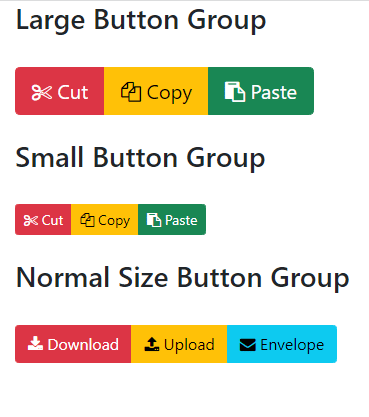
Normally, you have to specify the button size classes (.btn-lg for large and .btn-sm for small) for each button separately as using the Bootstrap framework.
However, as using button groups, you just need to assign the size class to .btn-group. Following sizing classes are available:
- btn-group-lg (large buttons)
- btn-group-small (small button)
- btn-group (normal size)
The example below shows using all three size buttons. There we used font awesome icons in buttons:
<!DOCTYPE html>
<html>

<head>

<link href="https://cdn.jsdelivr.net/npm/bootstrap@5.0.1/dist/css/bootstrap.min.css" rel="stylesheet" integrity="sha384-+0n0xVW2eSR5OomGNYDnhzAbDsOXxcvSN1TPprVMTNDbiYZCxYbOOl7+AMvyTG2x" crossorigin="anonymous">

<!-- Font Awesome CSS -->

<link rel="stylesheet" href="https://stackpath.bootstrapcdn.com/font-awesome/4.7.0/css/font-awesome.min.css" integrity="sha384-wvfXpqpZZVQGK6TAh5PVlGOfQNHSoD2xbE+QkPxCAFlNEevoEH3Sl0sibVcOQVnN" crossorigin="anonymous">

</head>

<body>

 <div class="container">

<h3>Large Button Group</h3> <br>

<div class="btn-group btn-group-lg" role="group" aria-label="Basic example">

<button type="button" class="btn btn-labeled btn-danger">

         <span class="btn-label"><i class="fa fa-cut"></i></span> Cut</button>

<button type="button" class="btn btn-labeled btn-warning">

  <span class="btn-label"><i class="fa fa-copy"></i></span> Copy</button>

 <button type="button" class="btn btn-labeled btn-success">

  <span class="btn-label"><i class="fa fa-paste"></i></span> Paste</button>

</div>

<br><br>

<h3>Small Button Group</h3> <br>

<div class="btn-group btn-group-sm" role="group" aria-label="Basic example">

<button type="button" class="btn btn-labeled btn-danger">

         <span class="btn-label"><i class="fa fa-cut"></i></span> Cut</button>

<button type="button" class="btn btn-labeled btn-warning">

  <span class="btn-label"><i class="fa fa-copy"></i></span> Copy</button>

 <button type="button" class="btn btn-labeled btn-success">

  <span class="btn-label"><i class="fa fa-paste"></i></span> Paste</button>

</div>

<br><br>

<h3>Normal Size Button Group</h3> <br>

<div class="btn-group" role="group" aria-label="Basic example">

<button type="button" class="btn btn-labeled btn-danger">

         <span class="btn-label"><i class="fa fa-download"></i></span> Download</button>

<button type="button" class="btn btn-labeled btn-warning">

  <span class="btn-label"><i class="fa fa-upload"></i></span> Upload</button>

 <button type="button" class="btn btn-labeled btn-info">

  <span class="btn-label"><i class="fa fa-envelope"></i></span> Envelope</button>

</div>

</div>

</body>

</html>
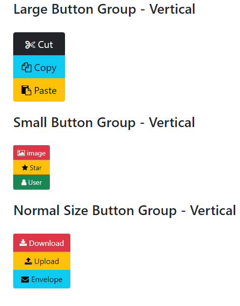
By using .btn-group-vertical class, you may create vertically aligned buttons.
<!DOCTYPE html>

<html>

<head>

<link href="https://cdn.jsdelivr.net/npm/bootstrap@5.0.1/dist/css/bootstrap.min.css" rel="stylesheet" integrity="sha384-+0n0xVW2eSR5OomGNYDnhzAbDsOXxcvSN1TPprVMTNDbiYZCxYbOOl7+AMvyTG2x" crossorigin="anonymous">

<!-- Font Awesome CSS -->

<link rel="stylesheet" href="https://stackpath.bootstrapcdn.com/font-awesome/4.7.0/css/font-awesome.min.css" integrity="sha384-wvfXpqpZZVQGK6TAh5PVlGOfQNHSoD2xbE+QkPxCAFlNEevoEH3Sl0sibVcOQVnN" crossorigin="anonymous">

</head>

<body>

 <div class="container">

<h3>Large Button Group - Vertical</h3> <br>

<div class="btn-group-vertical btn-group-lg" role="group" aria-label="Basic example">

<button type="button" class="btn btn-labeled btn-dark">

         <span class="btn-label"><i class="fa fa-cut"></i></span> Cut</button>

<button type="button" class="btn btn-labeled btn-info">

  <span class="btn-label"><i class="fa fa-copy"></i></span> Copy</button>

 <button type="button" class="btn btn-labeled btn-warning">

  <span class="btn-label"><i class="fa fa-paste"></i></span> Paste</button>

</div>

<br><br>

<h3>Small Button Group - Vertical</h3> <br>

<div class="btn-group-vertical btn-group-sm" role="group" aria-label="Basic example">

<button type="button" class="btn btn-labeled btn-danger">

         <span class="btn-label"><i class="fa fa-image"></i></span> image</button>

<button type="button" class="btn btn-labeled btn-warning">

  <span class="btn-label"><i class="fa fa-star"></i></span> Star</button>

 <button type="button" class="btn btn-labeled btn-success">

  <span class="btn-label"><i class="fa fa-user"></i></span> User</button>

</div>

<br><br>

<h3>Normal Size Button Group - Vertical</h3> <br>

<div class="btn-group-vertical" role="group" aria-label="Basic example">

<button type="button" class="btn btn-labeled btn-danger">

         <span class="btn-label"><i class="fa fa-download"></i></span> Download</button>

<button type="button" class="btn btn-labeled btn-warning">

  <span class="btn-label"><i class="fa fa-upload"></i></span> Upload</button>

 <button type="button" class="btn btn-labeled btn-info">

  <span class="btn-label"><i class="fa fa-envelope"></i></span> Envelope</button>

</div>

</div>

</body>

</html>
In this way, you may also create checkbox and radio button groups as well.
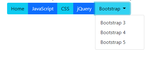
You may use a button group within another group. That is called a nested button group. This can be useful in scenarios where you need to place a dropdown within a series of buttons.
The following example shows its usage:
By using .btn-group-vertical class, you may create vertical aligned buttons.
<!DOCTYPE html>

<html>

<head>

<link href="https://cdn.jsdelivr.net/npm/bootstrap@5.0.1/dist/css/bootstrap.min.css" rel="stylesheet" integrity="sha384-+0n0xVW2eSR5OomGNYDnhzAbDsOXxcvSN1TPprVMTNDbiYZCxYbOOl7+AMvyTG2x" crossorigin="anonymous">

<script src="https://cdn.jsdelivr.net/npm/bootstrap@5.0.2/dist/js/bootstrap.bundle.min.js"></script>


<!-- Font Awesome CSS -->

<link rel="stylesheet" href="https://stackpath.bootstrapcdn.com/font-awesome/4.7.0/css/font-awesome.min.css" integrity="sha384-wvfXpqpZZVQGK6TAh5PVlGOfQNHSoD2xbE+QkPxCAFlNEevoEH3Sl0sibVcOQVnN" crossorigin="anonymous">

</head>

<body>

 <div class="container">

<h3>Nested Dropdown Button Group</h3>

 <div class="btn-group" role="group" aria-label="Button group with nested dropdown">

  <button type="button" class="btn btn-info">Home</button>

  <button type="button" class="btn btn-primary">JavaScript</button>

  <button type="button" class="btn btn-info">CSS</button>

  <button type="button" class="btn btn-primary">jQuery</button>


  <div class="btn-group" role="group">

    <button id="btnGroupDrop1" type="button" class="btn btn-info dropdown-toggle" data-bs-toggle="dropdown" aria-expanded="false">

      Bootstrap

    </button>

    <ul class="dropdown-menu" aria-labelledby="btnGroupDrop1">

      <li><a class="dropdown-item" href="#">Bootstrap 3</a></li>

      <li><a class="dropdown-item" href="#">Bootstrap 4</a></li>

      <li><a class="dropdown-item" href="#">Bootstrap 5</a></li>

    </ul>

  </div>

</div>

</div>

</body>

</html>