
In this post, I am going to share a nice and simple sliding menu bar that slides from left to right. As you click the typical three horizontal lines of “mobile icon”, the menu will open in a sliding manner.
As it opens, a cross icon will also display to let the users closing the menu. As you hover over any menu item, the hover effect is used to make it prominent while you may also add sub-menus or dropdown menu.
See the following section for the live demonstration and complete code.
This sliding menu which is based on Bootstrap requires you adding the references of Bootstrap CSS and jQuery. It also uses a little jQuery code.
The CSS is placed inside the <style> section that you may place in your own external CSS file or a separate file if not intended to use inside the web page.
Now, have a look at the live demo by clicking the link or image below:
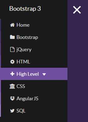
See online demo and code
Following is the markup for the sidebar:
        <!-- Sidebar -->

        <nav class="navbar navbar-inverse navbar-fixed-top" id="sidebar-wrapper" role="navigation">

            <ul class="nav sidebar-nav">

                <li class="sidebar-brand">

                    <a href="#">

                       Bootstrap 3

                    </a>

                </li>

                <li>

                    <a href="#"><i class="fa fa-fw fa-home"></i> Home</a>

                </li>

                <li>

                    <a href="#"><i class="fa fa-fw fa-folder"></i> Bootstrap</a>

                </li>

                <li>

                    <a href="#"><i class="fa fa-fw fa-file-o"></i> jQuery</a>

                </li>

                <li>

                    <a href="#"><i class="fa fa-fw fa-cog"></i> HTML</a>

                </li>

                <li class="dropdown">

                  <a href="#" class="dropdown-toggle" data-toggle="dropdown"><i class="fa fa-fw fa-plus"></i> High Level <span class="caret"></span></a>

                  <ul class="dropdown-menu" role="menu">

                    <li><a href="#">Java</a></li>

                    <li><a href="#">Python</a></li>

                    <li><a href="#">Separated link</a></li>

                    <li><a href="#">C Sharp</a></li>

                  </ul>

                </li>

                <li>

                    <a href="#"><i class="fa fa-fw fa-bank"></i> CSS</a>

                </li>

                <li>

                    <a href="#"><i class="fa fa-fw fa-dropbox"></i> AngularJS</a>

                </li>

                <li>

                    <a href="#"><i class="fa fa-fw fa-twitter"></i> SQL</a>

                </li>

            </ul>

        </nav>

        <!-- /#sidebar-wrapper -->
The CSS used in demo:
<style>

@import "http://designmodo.github.io/Flat-UI/dist/css/flat-ui.min.css";

@import "https://maxcdn.bootstrapcdn.com/font-awesome/4.4.0/css/font-awesome.min.css";

@import "https://daneden.github.io/animate.css/animate.min.css";

/*-------------------------------*/

/*           VARIABLES           */

/*-------------------------------*/

body {

  position: relative;

  overflow-x: hidden;

}

body,

html {

  height: 100%;

  background-color: #583e7e;

}

.nav .open > a {

  background-color: transparent;

}

.nav .open > a:hover {

  background-color: transparent;

}

.nav .open > a:focus {

  background-color: transparent;

}

/*-------------------------------*/

/*           Wrappers            */

/*-------------------------------*/

#wrapper {

  -moz-transition: all 0.5s ease;

  -o-transition: all 0.5s ease;

  -webkit-transition: all 0.5s ease;

  padding-left: 0;

  transition: all 0.5s ease;

}

#wrapper.toggled {

  padding-left: 220px;

}

#wrapper.toggled #sidebar-wrapper {

  width: 220px;

}

#wrapper.toggled #page-content-wrapper {

  margin-right: -220px;

  position: absolute;

}

#sidebar-wrapper {

  -moz-transition: all 0.5s ease;

  -o-transition: all 0.5s ease;

  -webkit-transition: all 0.5s ease;

  background: #1a1a1a;

  height: 100%;

  left: 220px;

  margin-left: -220px;

  overflow-x: hidden;

  overflow-y: auto;

  transition: all 0.5s ease;

  width: 0;

  z-index: 1000;

}

#sidebar-wrapper::-webkit-scrollbar {

  display: none;

}

#page-content-wrapper {

  padding-top: 70px;

  width: 100%;

}

/*-------------------------------*/

/*     Sidebar nav styles        */

/*-------------------------------*/

.sidebar-nav {

  list-style: none;

  margin: 0;

  padding: 0;

  position: absolute;

  top: 0;

  width: 220px;

}

.sidebar-nav li {

  display: inline-block;

  line-height: 20px;

  position: relative;

  width: 100%;

}

.sidebar-nav li:before {

  background-color: #1c1c1c;

  content: '';

  height: 100%;

  left: 0;

  position: absolute;

  top: 0;

  -webkit-transition: width 0.2s ease-in;

  transition: width 0.2s ease-in;

  width: 3px;

  z-index: -1;

}

.sidebar-nav li:first-child a {

  background-color: #1a1a1a;

  color: #ffffff;

}

.sidebar-nav li:nth-child(2):before {

  background-color: #402d5c;

}

.sidebar-nav li:nth-child(3):before {

  background-color: #4c366d;

}

.sidebar-nav li:nth-child(4):before {

  background-color: #583e7e;

}

.sidebar-nav li:nth-child(5):before {

  background-color: #64468f;

}

.sidebar-nav li:nth-child(6):before {

  background-color: #704fa0;

}

.sidebar-nav li:nth-child(7):before {

  background-color: #7c5aae;

}

.sidebar-nav li:nth-child(8):before {

  background-color: #8a6cb6;

}

.sidebar-nav li:nth-child(9):before {

  background-color: #987dbf;

}

.sidebar-nav li:hover:before {

  -webkit-transition: width 0.2s ease-in;

  transition: width 0.2s ease-in;

  width: 100%;

}

.sidebar-nav li a {

  color: #dddddd;

  display: block;

  padding: 10px 15px 10px 30px;

  text-decoration: none;

}

.sidebar-nav li.open:hover before {

  -webkit-transition: width 0.2s ease-in;

  transition: width 0.2s ease-in;

  width: 100%;

}

.sidebar-nav .dropdown-menu {

  background-color: #222222;

  border-radius: 0;

  border: none;

  box-shadow: none;

  margin: 0;

  padding: 0;

  position: relative;

  width: 100%;

}

.sidebar-nav li a:hover,

.sidebar-nav li a:active,

.sidebar-nav li a:focus,

.sidebar-nav li.open a:hover,

.sidebar-nav li.open a:active,

.sidebar-nav li.open a:focus {

  background-color: transparent;

  color: #ffffff;

  text-decoration: none;

}

.sidebar-nav > .sidebar-brand {

  font-size: 20px;

  height: 65px;

  line-height: 44px;

}

/*-------------------------------*/

/*       Hamburger-Cross         */

/*-------------------------------*/

.hamburger {

  background: transparent;

  border: none;

  display: block;

  height: 32px;

  margin-left: 15px;

  position: fixed;

  top: 20px;

  width: 32px;

  z-index: 999;

}

.hamburger:hover {

  outline: none;

}

.hamburger:focus {

  outline: none;

}

.hamburger:active {

  outline: none;

}

.hamburger.is-closed:before {

  -webkit-transform: translate3d(0, 0, 0);

  -webkit-transition: all 0.35s ease-in-out;

  color: #ffffff;

  content: '';

  display: block;

  font-size: 14px;

  line-height: 32px;

  opacity: 0;

  text-align: center;

  width: 100px;

}

.hamburger.is-closed:hover before {

  -webkit-transform: translate3d(-100px, 0, 0);

  -webkit-transition: all 0.35s ease-in-out;

  display: block;

  opacity: 1;

}

.hamburger.is-closed:hover .hamb-top {

  -webkit-transition: all 0.35s ease-in-out;

  top: 0;

}

.hamburger.is-closed:hover .hamb-bottom {

  -webkit-transition: all 0.35s ease-in-out;

  bottom: 0;

}

.hamburger.is-closed .hamb-top {

  -webkit-transition: all 0.35s ease-in-out;

  background-color: rgba(255, 255, 255, 0.7);

  top: 5px;

}

.hamburger.is-closed .hamb-middle {

  background-color: rgba(255, 255, 255, 0.7);

  margin-top: -2px;

  top: 50%;

}

.hamburger.is-closed .hamb-bottom {

  -webkit-transition: all 0.35s ease-in-out;

  background-color: rgba(255, 255, 255, 0.7);

  bottom: 5px;

}

.hamburger.is-closed .hamb-top,

.hamburger.is-closed .hamb-middle,

.hamburger.is-closed .hamb-bottom,

.hamburger.is-open .hamb-top,

.hamburger.is-open .hamb-middle,

.hamburger.is-open .hamb-bottom {

  height: 4px;

  left: 0;

  position: absolute;

  width: 100%;

}

.hamburger.is-open .hamb-top {

  -webkit-transform: rotate(45deg);

  -webkit-transition: -webkit-transform 0.2s cubic-bezier(0.73, 1, 0.28, 0.08);

  background-color: #fff;

  margin-top: -2px;

  top: 50%;

}

.hamburger.is-open .hamb-middle {

  background-color: #fff;

  display: none;

}

.hamburger.is-open .hamb-bottom {

  -webkit-transform: rotate(-45deg);

  -webkit-transition: -webkit-transform 0.2s cubic-bezier(0.73, 1, 0.28, 0.08);

  background-color: #fff;

  margin-top: -2px;

  top: 50%;

}

.hamburger.is-open:before {

  -webkit-transform: translate3d(0, 0, 0);

  -webkit-transition: all 0.35s ease-in-out;

  color: #ffffff;

  content: '';

  display: block;

  font-size: 14px;

  line-height: 32px;

  opacity: 0;

  text-align: center;

  width: 100px;

}

.hamburger.is-open:hover before {

  -webkit-transform: translate3d(-100px, 0, 0);

  -webkit-transition: all 0.35s ease-in-out;

  display: block;

  opacity: 1;

}

/*-------------------------------*/

/*          Dark Overlay         */

/*-------------------------------*/

.overlay {

  position: fixed;

  display: none;

  width: 100%;

  height: 100%;

  top: 0;

  left: 0;

  right: 0;

  bottom: 0;

  background-color: rgba(0, 0, 0, 0.4);

  z-index: 1;

}

/* SOME DEMO STYLES - NOT REQUIRED */

body,

html {

  background-color: #583e7e;

}

body h1,

body h2,

body h3,

body h4 {

  color: rgba(255, 255, 255, 0.9);

}

body p,

body blockquote {

  color: rgba(255, 255, 255, 0.7);

}

body a {

  color: rgba(255, 255, 255, 0.8);

  text-decoration: underline;

}

body a:hover {

  color: #fff;

}


</style>
A little jQuery code:
        <script>

            $(document).ready(function () {

              var trigger = $('.hamburger'),

                  overlay = $('.overlay'),

                 isClosed = false;


                trigger.click(function () {

                  hamburger_cross();

                });


                function hamburger_cross() {


                  if (isClosed == true) {

                    overlay.hide();

                    trigger.removeClass('is-open');

                    trigger.addClass('is-closed');

                    isClosed = false;

                  } else {

                    overlay.show();

                    trigger.removeClass('is-closed');

                    trigger.addClass('is-open');

                    isClosed = true;

                  }

              }


              $('[data-toggle="offcanvas"]').click(function () {

                    $('#wrapper').toggleClass('toggled');

              });

            });

        </script>
Get the complete code from the demo page.
The credit for this awesome sidebar sliding menu goes to j_holtslander.