
The navigation bar (navbar) which generally acts as the header in a website, is an important part to deal with. Creating navbars with various options is as easy as using the Materialize framework.
The navbar normally has two parts:
- The placement of brand name or logo
- Navigational links e.g. products, services, about, contact pages
The Materialize navbar is created by HTML 5 <nav> tag with container (recommended div) with nav-wrapper class.
For creating responsive navbar with hamburger icon, you may use the built-in class button-collapse for that. The navbar may contain buttons, search box, and links/logo can be aligned left or right easily.
The next section shows all the above-mentioned examples with live demos and code, so keep reading.
- 1. A navbar with logo and navigational links example
- 2. Links left aligned and logo right aligned example
- 3. The navbar example with hamburger icon for mobile
- 4. How to change the default color of materialize navbar?
- 5. An extended navbar with tabs example
- 6. The navbar with active item example
- 7. A navbar with dropdown menu demo
- 8. Using search in navbar example
- 9. Using the search box with logo and navigation links
- 10. The navbar with icons for links demo
In this example, a navbar is created with logo/slogan towards the left side and navigational links to the right side. The navigational links disappear on medium and small devices while only the logo keeps on displaying. This is done by using the hide-on-med-and-down class. Have a look at the code and demo online:

The Code:
<!DOCTYPE html>
<html>
 <head>
  <link rel="stylesheet" href="https://cdnjs.cloudflare.com/ajax/libs/materialize/0.100.2/css/materialize.min.css">

 </head>

<body>
<div class="container">
 <nav>
    <div class="nav-wrapper">
      <a href="#" class="brand-logo">Slogan</a>
      <ul id="nav-mobile" class="right hide-on-med-and-down">
        <li><a href="https://www.jquery-az.com/jquery-tips/">jQuery</a></li>
        <li><a href="https://www.jquery-az.com/javascript-tutorials/">JavaScript</a></li>
        <li><a href="https://www.jquery-az.com/html-tutorials/">HTML</a></li>
        <li><a href="https://www.jquery-az.com/css-tutorials/">CSS</a></li>
      </ul>
    </div>
  </nav>

</div>

</body>
</html>
Links left aligned and logo right aligned example
If you want to align logo to the right and nav links towards the left side then use the right class in the <a> tag containing log/slogan and left class in the <ul> containing navigation links. See the example:

The markup:
<nav>

    <div class="nav-wrapper">

      <a href="#" class="brand-logo right">Slogan</a>

      <ul id="nav-mobile" class="left hide-on-med-and-down">

        <li><a href="https://www.jquery-az.com/jquery-tips/">jQuery</a></li>

        <li><a href="https://www.jquery-az.com/javascript-tutorials/">JavaScript</a></li>

        <li><a href="https://www.jquery-az.com/html-tutorials/">HTML</a></li>

        <li><a href="https://www.jquery-az.com/css-tutorials/">CSS</a></li>

      </ul>

    </div>

  </nav>
Similarly, for aligning the logo centrally, replace the right class in above example by center class.
<a href=”#” class=”brand-logo center”>Slogan</a>
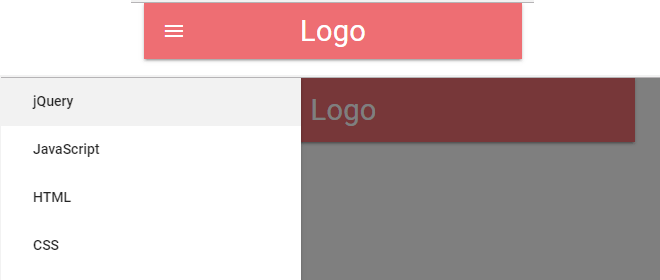
In today’s mobile world where more and more people are visiting websites from the smartphones, your website overall and navbar should adapt according to the user’s screen. Generally, this is desired to display hamburger icon for the navbar. As this is tapped, the navigational links open as offset menu.
To add this capability in navbar based on Materialize, you need to follow certain steps. If you are on the desktop then resize the browser to a smaller size until hamburger icon appears:
The markup:
<div class="container">

  <nav>

    <div class="nav-wrapper">

      <a href="#!" class="brand-logo">Logo</a>

      <a href="#" data-activates="mobile-demo" class="button-collapse"><i class="material-icons">menu</i></a>

      <ul class="right hide-on-med-and-down">

        <li class="active"><a href="https://www.jquery-az.com/jquery-tips/">jQuery</a></li>

        <li><a href="https://www.jquery-az.com/javascript-tutorials/">JavaScript</a></li>

        <li><a href="https://www.jquery-az.com/html-tutorials/">HTML</a></li>

        <li><a href="https://www.jquery-az.com/css-tutorials/">CSS</a></li>

      </ul>

      <ul class="side-nav" id="mobile-demo">

        <li class="active"><a href="https://www.jquery-az.com/jquery-tips/">jQuery</a></li>

        <li><a href="https://www.jquery-az.com/javascript-tutorials/">JavaScript</a></li>

        <li><a href="https://www.jquery-az.com/html-tutorials/">HTML</a></li>

        <li><a href="https://www.jquery-az.com/css-tutorials/">CSS</a></li>

      </ul>

    </div>

  </nav>


</div>
For initializing the collapsible button for mobile, you need to use the following JavaScript code:
<script>

 $(".button-collapse").sideNav();

</script>
In the markup section, you can see the navigational links are used twice; one as in above example that hides in medium and small devices by using the hide-on-med-and-down class in <ul> containing links.
The same set of links (or links that you want to display on mobile) are also placed in another <ul> with side-nav class.
After the logo markup, the following line is used for the hamburger icon:
<a href=”#” data-activates=”mobile-demo” class=”button-collapse”><i class=”material-icons”>menu</i></a>
Finally, a little jQuery code to make it work. In the example page, you can also see that the materialize CSS and jQuery library are also included in the <head> section.
In your Materialize framework-based projects, you most probably require using the navbar with a different color than default – to match it to the rest of design.
For modifying the default navbar color, you may override the nav-wrapper class. Add this class in your external CSS file or in the <style> section. There, you may provide the background color as you want. See the example below with custom colored navbar:

The CSS:
<style>

.nav-wrapper {

    background-color: #BF0000 !important;

    font-size: 14px;

    font-weight: bold;

  }

</style>
Get the complete code including the markup from the demo page.
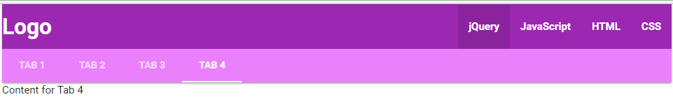
If you require navbar with more components than logo and navigation links then extend the navbar with more height by using nav-extended class in the main <nav> tag.
After that, you may use tab component markup for including tabs in the navbar. Have a look at the demo and code online. I used another custom color for this demo for the navbar:
The CSS:
<style>

.nav-wrapper  {

    background-color: #9c27b0 !important;

    font-size: 14px;

    font-weight: bold;

  }


.nav-content  {

    background-color: #ea80fc !important;

    font-size: 13px;


  }

</style>
The markup:
<div class="container">

 <nav class="nav-extended">

    <div class="nav-wrapper">

      <a href="#" class="brand-logo">Logo</a>

      <a href="#" data-activates="mobile-demo" class="button-collapse"><i class="material-icons">menu</i></a>

      <ul id="nav-mobile" class="right hide-on-med-and-down">

        <li class="active"><a href="https://www.jquery-az.com/jquery-tips/">jQuery</a></li>

        <li><a href="https://www.jquery-az.com/javascript-tutorials/">JavaScript</a></li>

        <li><a href="https://www.jquery-az.com/html-tutorials/">HTML</a></li>

        <li><a href="https://www.jquery-az.com/css-tutorials/">CSS</a></li>

      </ul>

      <ul class="side-nav" id="mobile-demo">

        <li class="active"><a href="https://www.jquery-az.com/jquery-tips/">jQuery</a></li>

        <li><a href="https://www.jquery-az.com/javascript-tutorials/">JavaScript</a></li>

        <li><a href="https://www.jquery-az.com/html-tutorials/">HTML</a></li>

        <li><a href="https://www.jquery-az.com/css-tutorials/">CSS</a></li>

      </ul>

    </div>

    <div class="nav-content">

      <ul class="tabs tabs-transparent">

        <li class="tab"><a href="#tab1">Tab 1</a></li>

        <li class="tab"><a class="active" href="#tab2">Tab 2</a></li>

        <li class="tab disabled"><a href="#tab3">Tab 3</a></li>

        <li class="tab"><a href="#tab4">Tab 4</a></li>

      </ul>

    </div>

  </nav>

  <div id="tab1" class="col s12">Content for Tab 1</div>

  <div id="tab2" class="col s12">Content for Tab 2</div>

  <div id="tab3" class="col s12">Content for Tab 3</div>

  <div id="tab4" class="col s12">Content for Tab 4</div>


</div>
For making the current menu item/navigation link active to let the users know which page they are on, use the active class in the <li> tag as shown in the example below:

For example:
<li class=”active”><a href=”https://www.jquery-az.com/jquery-tips/”>jQuery</a></li>
If you require adding a dropdown menu, use the markup for the dropdown menu and inside the <nav> tag, use an element e.g. a button to trigger the dropdown.

The markup:
<div class="container">

<!-- Dropdown Structure -->

<ul id="dropdown1" class="dropdown-content">

  <li><a href="https://www.jquery-az.com/6-examples-materialize-modals-live-demos-code/">Modal</a></li>

  <li><a href="https://www.jquery-az.com/9-styles-of-materialize-buttons-to-use-in-your-web-projects/">Buttons</a></li>

  <li class="divider"></li>

  <li><a href="https://www.jquery-az.com/7-examples-materialize-tables-along-custom-styles/">Table</a></li>

</ul>

<nav>

  <div class="nav-wrapper">

    <a href="#!" class="brand-logo">Logo</a>

    <ul class="right hide-on-med-and-down">

        <li class="active"><a href="https://www.jquery-az.com/jquery-tips/">jQuery</a></li>

        <li><a href="https://www.jquery-az.com/javascript-tutorials/">JavaScript</a></li>

        <li><a href="https://www.jquery-az.com/html-tutorials/">HTML</a></li>

        <li><a href="https://www.jquery-az.com/css-tutorials/">CSS</a></li>

      <!-- Dropdown Trigger -->

      <li><a class="dropdown-button" href="#!" data-activates="dropdown1">Materialize<i class="material-icons right">arrow_drop_down</i></a></li>

    </ul>

  </div>

</nav>


</div>
A little CSS for customizing the color of navbar:
<style>

.nav-wrapper  {

    background-color: #a5d6a7  !important;

    font-size: 14px;

  }


.dropdown-button  {

    background-color: #388e3c  !important;

    font-size: 13px;


  }

</style>
The following example shows using the search bar in the navbar component. The search icon appears and as a user clicks it, the search textbox displays that spans across the navbar. Have a look at the code and output:

Complete code:
<!DOCTYPE html>
<html>
 <head>
 <link rel="stylesheet" href="https://cdnjs.cloudflare.com/ajax/libs/materialize/0.100.2/css/materialize.min.css">

  <link href="https://fonts.googleapis.com/icon?family=Material+Icons" rel="stylesheet">
  <script type = "text/javascript" src = "https://code.jquery.com/jquery-2.1.1.min.js"></script>
  <script src="https://cdnjs.cloudflare.com/ajax/libs/materialize/0.100.2/js/materialize.min.js"></script>
 </head>

<body>
<div class="container">
  <nav>
    <div class="nav-wrapper">
      <form>
        <div class="input-field">
          <input id="search" type="search" required>
          <label class="label-icon" for="search"><i class="material-icons">search</i></label>
          <i class="material-icons">close</i>
        </div>
      </form>
    </div>
  </nav>

</div>

</body>
</html>
Rather than taking the full width for the search box, you may also create a small search element that displays with logo/slogan and navigation links in the navbar.
For that, use the markup for search box inside another <li> element that is used for creating navigation links. Have a look:

The markup:
<div class="container">

<nav class="white">

<div class="nav-wrapper">

  <a href="#" class="brand-logo black-text">Logo</a>

<ul class="hide-on-med-and-down  right">

<li ><a href="https://www.jquery-az.com/jquery-tips/" class="black-text">jQuery</a></li>

<li><a href="https://www.jquery-az.com/javascript-tutorials/" class="black-text">JavaScript</a></li>

<li><a href="https://www.jquery-az.com/html-tutorials/" class="black-text">HTML</a></li>

<li class="active "><a href="https://www.jquery-az.com/css-tutorials/" class="black-text">CSS</a></li>

<li>

<div class="center row">

<div class="col s12" >

<div class="row">

  <div class="input-field col s6 s12 black-text">

    <i class="green-text material-icons prefix">search</i>

    <input type="text" class="blue-text" >

    </div>

  </div>

</div>

</div>

  </li>


</ul>

</div>

</nav>


</div>
The following example shows using icons rather than text for navigation links in the navbar. The material icons are included in the <head> section that is used in the markup for navbar:
The markup:
<div class="container">

  <nav>

    <div class="nav-wrapper">

      <a href="https://www.jquery-az.com/" class="brand-logo"><i class="material-icons">home</i></a>

      <ul class="right hide-on-med-and-down">

        <li><a href="https://www.jquery-az.com/bootstrap-4/"><i class="material-icons">alarm</i></a></li>

        <li><a href="https://www.jquery-az.com/javascript-tutorials/"><i class="material-icons">explore</i></a></li>

        <li><a href="https://www.jquery-az.com/materialize-tutorials/"><i class="material-icons">favorite</i></a></li>

        <li><a href="https://www.jquery-az.com/vba-excel-tutorials/"><i class="material-icons">report_problem</i></a></li>

        <li><a href="https://www.jquery-az.com/whats-whys-hows/"><i class="material-icons">redeem</i></a></li>

        <li><a href="https://www.jquery-az.com/bootstrap-tips-tutorials/"><i class="material-icons">search</i></a></li>

      </ul>

    </div>

  </nav>

</div>
You can see the output by visiting the example page.