
The metisMenu plug-in
The metisMenu is a jQuery plug-in that you may use with Bootstrap framework (version 3+) for creating different types of menus like a vertical menu, and a menu with folder view.
You may also create menu items that open at mouse hover and with different animations like bounceIn, fade, flip, and others.
Keep reading this tutorial for setting up and seeing the live demos of different menus created by using this plug-in.
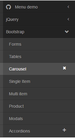
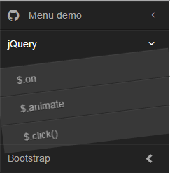
In this example, a vertical menu with auto collapse is created. You may click the arrows, plus, and cross icons for opening and closing the main or sub menus. See the demonstration and code online by clicking the links below:
See online demo and code
This is how the menu is created.
First of all, include the Bootstrap, font-awesome, metisMenu, and CSS for this demo files in the <head> section (you can see the CDN and local links in the demo page’s code section).
The markup section involves creating div, nav, ul, etc tags where Bootstrap and plug-in’s CSS classes are referenced. For example, this is the complete menu markup of the demo:
  <div class="clearfix">

<aside class="sidebar">

<nav class="sidebar-nav">

<ul class="metismenu" id="auto-collapse-menu-demo">

<li class="active">

<a href="#" aria-expanded="true">

<span class="sidebar-nav-item-icon fa fa-github fa-lg"></span>

<span class="sidebar-nav-item">Menu demo</span>

<span class="fa arrow"></span>

</a>

<ul aria-expanded="true">

<li>

<a href="https://www.jquery-az.com/">

<span class="sidebar-nav-item-icon fa fa-code-fork"></span>

jQuery

</a>

</li>

<li>

<a href="https://www.jquery-az.com/">

<span class="sidebar-nav-item-icon fa fa-star"></span>

Bootstrap

</a>

</li>

<li>

<a href="https://www.jquery-az.com/">

<span class="sidebar-nav-item-icon fa fa-exclamation-triangle"></span>

PHP

</a>

</li>

</ul>

</li>

<li>

<a href="#" aria-expanded="false">jQuery <span class="fa arrow"></span></a>

<ul aria-expanded="false">

<li><a href="https://www.jquery-az.com/">$.on</a></li>

<li><a href="https://www.jquery-az.com/">$.animate</a></li>

<li><a href="https://www.jquery-az.com/">$.click()</a></li>

</ul>

</li>

<li>

<a href="https://www.jquery-az.com/" aria-expanded="false">Bootstrap <span class="glyphicon arrow"></span></a>

<ul aria-expanded="false">

<li><a href="#">Forms</a></li>

<li><a href="#">Tables</a></li>

<li>

<a href="#" aria-expanded="false">Carousel <span class="fa plus-times"></span></a>

<ul aria-expanded="false">

<li><a href="#">Single Item</a></li>

<li><a href="#">Multi item</a></li>

<li><a href="#">Product</a></li>

</ul>

</li>

<li><a href="#">Modals</a></li>

<li>

<a href="#" aria-expanded="false">Accordions<span class="fa plus-minus"></span></a>

<ul aria-expanded="false">

<li><a href="#">Accordion 1</a></li>

<li><a href="#">Accordion 2</a></li>

<li><a href="#">Accordion 3</a></li>

<li><a href="#">Accordion 4</a></li>

</ul>

</li>

</ul>

</li>

</ul>

</nav>

</aside>


</div>
Just above the </body> tag, place the JS files of jQuery, Bootstrap, and plug-in. Finally, the jQuery code for initiating the menu:
<script>

$(function() {


$('#auto-collapse-menu-demo').metisMenu();


});

</script>
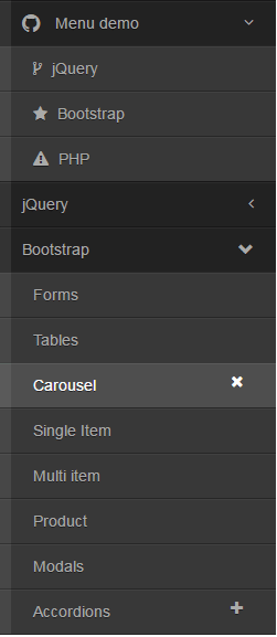
By using the toggle option as false, you may create a non-collapsible menu. That means, if you open the first menu and click on the second header, the first menu will not close. You may compare this to above example where only single menu items are opened and other (if opened) get closed.
The only difference between this and the first example is the jQuery code where the toggle option is used:
$('#auto-collapse-menu-demo').metisMenu({

toggle: false

});
By using dir=”rtl” attribute in the main div containing the menu, you may create a right-to-left menu. See the same menu with rtl directive:
The only difference is in the main <div>:
<div class=”clearfix” dir=”rtl”>
You should set the position of the menu with other content on the web page where you intend to use this plug-in.
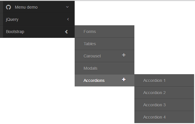
For the desktop users of your website, you may present the menu with hover option. As the mouse hovers over the menu items with sub-menu, it will open up. For the smaller screens, (for mobile or smart phones) the menu will work as shown in above examples, so it is responsive. See the demo with hover state:
For that, you need to add jQuery code and deal with CSS for small and large screens.
Complete code with CSS, Markup and jQuery code:
<!DOCTYPE html>
<html lang="en">
<head>
<link rel="stylesheet" href="//cdnjs.cloudflare.com/ajax/libs/twitter-bootstrap/3.3.6/css/bootstrap.min.css">
  <link rel="stylesheet" href="https://cdnjs.cloudflare.com/ajax/libs/font-awesome/4.6.2/css/font-awesome.min.css">

  <link rel="stylesheet" href="css/metisMenu/metisMenu.min.css">
  <link rel="stylesheet" href="css/metisMenu/demo.css">
    <style>
      @media (min-width: 768px) {
        #hover-menu-demo li {
          position: relative;
        }
        #hover-menu-demo > li ul {
          position: absolute;
          left: 100%;
          top: 0;
          min-width: 200px;
          display: none;
        }
        #hover-menu-demo li:hover > ul,
        #hover-menu-demo li:hover > ul.collapse {
          display: block !important;
          height: auto !important;
          z-index: 1000;
          background: #444;
          visibility: visible;
        }
      }

    </style>
    <style>
      @media (max-width: 767px) {
        section.content {
          float: left;
          width: 100%;
        }
      }

    </style>

</head>
<body>

  <div class="clearfix">
    <aside class="sidebar">
      <nav class="sidebar-nav">
        <ul class=metismenu id="hover-menu-demo">
          <li class="active">
            <a href="#">
              <span class="sidebar-nav-item-icon fa fa-github fa-lg"></span>
              <span class="sidebar-nav-item">Menu demo</span>
              <span class="fa arrow"></span>
            </a>
            <ul>
              <li>
                <a href="https://www.jquery-az.com/">
                  <span class="sidebar-nav-item-icon fa fa-code-fork"></span>
                  jQuery
                </a>
              </li>
              <li>
                <a href="https://www.jquery-az.com/">
                  <span class="sidebar-nav-item-icon fa fa-star"></span>
                  Bootstrap
                </a>
              </li>
              <li>
                <a href="https://www.jquery-az.com/">
                  <span class="sidebar-nav-item-icon fa fa-exclamation-triangle"></span>
                  PHP
                </a>
              </li>
            </ul>
          </li>
          <li>
            <a href="#" aria-expanded="false">jQuery <span class="fa arrow"></span></a>
            <ul aria-expanded="false">
              <li><a href="https://www.jquery-az.com/">$.on</a></li>
              <li><a href="https://www.jquery-az.com/">$.animate</a></li>
              <li><a href="https://www.jquery-az.com/">$.click()</a></li>
            </ul>
          </li>
          <li>
            <a href="https://www.jquery-az.com/" aria-expanded="false">Bootstrap <span class="glyphicon arrow"></span></a>
            <ul aria-expanded="false">
              <li><a href="#">Forms</a></li>
              <li><a href="#">Tables</a></li>
              <li>
                <a href="#" aria-expanded="false">Carousel <span class="fa plus-times"></span></a>
                <ul aria-expanded="false">
                  <li><a href="#">Single Item</a></li>
                  <li><a href="#">Multi item</a></li>
                  <li><a href="#">Product</a></li>
                </ul>
              </li>
              <li><a href="#">Modals</a></li>
              <li>
                <a href="#" aria-expanded="false">Accordions<span class="fa plus-minus"></span></a>
                <ul aria-expanded="false">
                  <li><a href="#">Accordion 1</a></li>
                  <li><a href="#">Accordion 2</a></li>
                  <li><a href="#">Accordion 3</a></li>
                  <li><a href="#">Accordion 4</a></li>
                </ul>
              </li>
            </ul>
          </li>
        </ul>
      </nav>
    </aside>

  </div>


<script src="js/metisMenu/jquery.min.js"></script>
  <script src="//cdnjs.cloudflare.com/ajax/libs/twitter-bootstrap/3.3.6/js/bootstrap.min.js"></script>
  <script src="js/metisMenu/metisMenu.min.js"></script>

  <script>
    $(function() {
    $('#hover-menu-demo').metisMenu();
    });
  </script>

    <script>
      (function($) {
        $(document).ready(function() {

          var $this = $('#hover-menu-demo'),
            resizeTimer,
            self = this;

          var initCollapse = function(el) {
            if ($(window).width() >= 768) {
              this.find('li').has('ul').children('a').off('click');
            }
          };

          $(window).resize(function() {
            clearTimeout(resizeTimer);
            resizeTimer = setTimeout(self.initCollapse($this), 250);
          });

        });
      })(jQuery);
    </script>
</body>
</html>
To add interactivity in menus, you may use animate.css animations to open menus or sub-menus with different styles. For that, you may simply add the animate.css from the CDN in the <head> section:
<link rel=”stylesheet” href=”https://cdnjs.cloudflare.com/ajax/libs/animate.css/3.5.1/animate.min.css” charset=”utf-8″>
And just add the classes (animated and desired style) in the menu head or sub-head where you want to use it. For example,
<ul aria-expanded=”false” class=”animated swing”>
See the following demo where I added “animated pulse” classes in the “menu demo” main menu, swing to the jQuery menu item, fade to Bootstrap and jello to the sub-menu “Accordions”.
See online demo and code
A menu code looks like this with animate classes:
 <li>

<a href="#" aria-expanded="false">jQuery <span class="fa arrow"></span></a>

<ul aria-expanded="false" class="animated swing">

<li><a href="https://www.jquery-az.com/">$.on</a></li>

<li><a href="https://www.jquery-az.com/">$.animate</a></li>

<li><a href="https://www.jquery-az.com/">$.click()</a></li>

</ul>

</li>
The CSS file that deals with the color scheme of the menu is demo.css. You may change the style there to match the menu with the rest of the design of your website or take a few classes and override in the <style> section or in your own external CSS file. For example, sidebar-nav ul ul a class deals with the links contained in <ul>.
Get this file by going to Github website or view source any demo page and download any required CSS or JS file.