
Bootstrap 5 Modal
Bootstrap modal or a simple modal has generally the following characteristics:
- The modal element is positioned over everything else on the web page. So, if you have paragraphs, images, videos, etc. on your page.. the modal will be active while all other content becomes passive.
- Modal also removes the scroll from the body.
- If the modal has large content then its scrollbar is displayed.
Also, See:
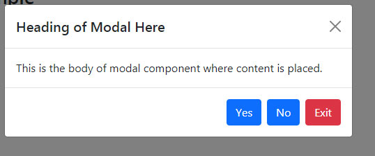
A basic modal example
In the first example of Bootstrap version 5 Modal component, we have a simple modal with the following three components:
- Modal header
- Body
- Modal footer
As the name suggests, the header part contains the title/heading of the modal. The body part contains the content/message etc. while the footer contains buttons for closing the modal. Have a look at the live demo by clicking the button below or copy/paste the code below into your editor and run in your browser from localhost:
Online demo and code
<!DOCTYPE html>

<html>

<head>

<link href="https://cdn.jsdelivr.net/npm/bootstrap@5.0.1/dist/css/bootstrap.min.css" rel="stylesheet" integrity="sha384-+0n0xVW2eSR5OomGNYDnhzAbDsOXxcvSN1TPprVMTNDbiYZCxYbOOl7+AMvyTG2x" crossorigin="anonymous">

<script src="https://cdn.jsdelivr.net/npm/bootstrap@5.0.1/dist/js/bootstrap.min.js" integrity="sha384-Atwg2Pkwv9vp0ygtn1JAojH0nYbwNJLPhwyoVbhoPwBhjQPR5VtM2+xf0Uwh9KtT" crossorigin="anonymous"></script>

<script>

var myModal = new bootstrap.Modal(document.getElementById('basiceModal'), options)

</script>

</head>

<body>

<div class="container">

  <h3>Bootstrap 5 Modal Example</h2>

<!-- Trigger Modal Component -->

<button type="button" class="btn btn-danger" data-bs-toggle="modal" data-bs-target="#basiceModal">

  Launch demo modal

</button>

<!-- Modal -->

<div class="modal fade" id="basiceModal" tabindex="-1" aria-labelledby="basicModalLabel" aria-hidden="true">

  <div class="modal-dialog">

    <div class="modal-content">

      <div class="modal-header">

        <h5 class="modal-title" id="basicModalLabel">Heading of Modal Here</h5>

        <button type="button" class="btn-close" data-bs-dismiss="modal" aria-label="Close"></button>

      </div>

      <div class="modal-body">

        This is the body of modal component where content is placed.

      </div>

      <div class="modal-footer">

        <button type="button" class="btn btn-primary">Yes</button>

        <button type="button" class="btn btn-primary">No</button>

        <button type="button" class="btn btn-danger" data-bs-dismiss="modal">Exit</button>

      </div>

    </div>

  </div>

</div>

</div>

</body>

</html>
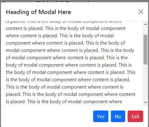
The example of scrolling Modal
As mentioned in the intro section, if a modal contains larger content then its scrollbar should be displayed. Whereas the scrollbar of the containing page disappears/becomes inactive as the modal component is active.
In the demo, you can see the modal with the scrollbar. We have longer content in the body section:
Online demo and code
<!DOCTYPE html>

<html>

<head>

<link href="https://cdn.jsdelivr.net/npm/bootstrap@5.0.1/dist/css/bootstrap.min.css" rel="stylesheet" integrity="sha384-+0n0xVW2eSR5OomGNYDnhzAbDsOXxcvSN1TPprVMTNDbiYZCxYbOOl7+AMvyTG2x" crossorigin="anonymous">

<script src="https://cdn.jsdelivr.net/npm/bootstrap@5.0.1/dist/js/bootstrap.min.js" integrity="sha384-Atwg2Pkwv9vp0ygtn1JAojH0nYbwNJLPhwyoVbhoPwBhjQPR5VtM2+xf0Uwh9KtT" crossorigin="anonymous"></script>

<script>

var myModal = new bootstrap.Modal(document.getElementById('scrollingModal'), options)

</script>

</head>

<body>

<div class="container">

  <h3>Bootstrap 5 Modal Example</h2>

<!-- Trigger Modal Component -->

<button type="button" class="btn btn-danger" data-bs-toggle="modal" data-bs-target="#scrollingModal">

  Launch demo modal

</button>


<!-- Modal -->

<div class="modal fade" id="scrollingModal" tabindex="-1" aria-labelledby="basicModalLabel" aria-hidden="true">

  <div class="modal-dialog modal-dialog-scrollable">

    <div class="modal-content">

      <div class="modal-header">

        <h5 class="modal-title" id="basicModalLabel">Heading of Scrollable Modal Here</h5>

        <button type="button" class="btn-close" data-bs-dismiss="modal" aria-label="Close"></button>

      </div>

      <div class="modal-body">

        This is the body of modal component where content is placed.

        This is the body of modal component where content is placed.
        .......................


      </div>

      <div class="modal-footer">

        <button type="button" class="btn btn-primary">Yes</button>

        <button type="button" class="btn btn-primary">No</button>

        <button type="button" class="btn btn-danger" data-bs-dismiss="modal">Exit</button>

      </div>

    </div>

  </div>

</div>

</div>

</body>

</html>
Just notice this line of code:
<div class=”modal-dialog modal-dialog-scrollable”>
So, you have to add the .modal-dialog-scrollable class in order to make the modal scrollable.
An example of full screen modal
You may also display the modal that covers the full viewport of the user. Place one of the following modifier classes with the .modal-dialog class:
<!DOCTYPE html>

<html>

<head>

<link href="https://cdn.jsdelivr.net/npm/bootstrap@5.0.1/dist/css/bootstrap.min.css" rel="stylesheet" integrity="sha384-+0n0xVW2eSR5OomGNYDnhzAbDsOXxcvSN1TPprVMTNDbiYZCxYbOOl7+AMvyTG2x" crossorigin="anonymous">

<script src="https://cdn.jsdelivr.net/npm/bootstrap@5.0.1/dist/js/bootstrap.min.js" integrity="sha384-Atwg2Pkwv9vp0ygtn1JAojH0nYbwNJLPhwyoVbhoPwBhjQPR5VtM2+xf0Uwh9KtT" crossorigin="anonymous"></script>

<script>

var myModal = new bootstrap.Modal(document.getElementById('fullScreenModal'), options)

</script>

</head>

<body>

<div class="container">

  <h3>Bootstrap 5 Modal Example</h2>

<!-- Trigger Modal Component -->

<button type="button" class="btn btn-danger" data-bs-toggle="modal" data-bs-target="#fullScreenModal">

  Launch Full Screen Modal

</button>

<!-- Modal -->

<div class="modal fade" id="fullScreenModal" tabindex="-1" aria-labelledby="basicModalLabel" aria-hidden="true">

  <div class="modal-dialog modal-fullscreen">

    <div class="modal-content">

      <div class="modal-header">

        <h5 class="modal-title" id="basicModalLabel">Heading of Scrollable Modal Here</h5>

        <button type="button" class="btn-close" data-bs-dismiss="modal" aria-label="Close"></button>

      </div>

      <div class="modal-body">

        Content for the full screen modal comes here

      </div>

      <div class="modal-footer">

        <button type="button" class="btn btn-primary">Yes</button>

        <button type="button" class="btn btn-primary">No</button>

        <button type="button" class="btn btn-danger" data-bs-dismiss="modal">Cancel</button>

      </div>

    </div>

  </div>

</div>

</div>

</body>

</html>
If you want to display the full screen modal for a specific screen width then you may use the modifier classes as follows:
- .modal-fullscreen – modal will always be a full screen for all screens.
- .modal-fullscreen-sm-down – full modal for screens below 576px
- .modal-fullscreen-md-down – for screens below 768px
- .modal-fullscreen-lg-down – below 992px
- .modal-fullscreen-xl-down – below 1200px
- .modal-fullscreen-xxl-down – below 1400px
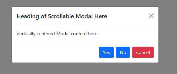
A vertically centered Modal example
In the above examples (except full screen), you might notice the modal displayed upwards. For displaying the modal vertically centered position, you may add the .modal-dialog-centered class to the .modal-dialog class. See the demo below:
BS 5 code
<!DOCTYPE html>

<html>

<head>

<link href="https://cdn.jsdelivr.net/npm/bootstrap@5.0.1/dist/css/bootstrap.min.css" rel="stylesheet" integrity="sha384-+0n0xVW2eSR5OomGNYDnhzAbDsOXxcvSN1TPprVMTNDbiYZCxYbOOl7+AMvyTG2x" crossorigin="anonymous">

<script src="https://cdn.jsdelivr.net/npm/bootstrap@5.0.1/dist/js/bootstrap.min.js" integrity="sha384-Atwg2Pkwv9vp0ygtn1JAojH0nYbwNJLPhwyoVbhoPwBhjQPR5VtM2+xf0Uwh9KtT" crossorigin="anonymous"></script>

<script>

var myModal = new bootstrap.Modal(document.getElementById('vertCentModal'), options)

</script>

</head>

<body>

<div class="container">

  <h3>Bootstrap 5 Modal Example</h2>

<!-- Trigger Modal Component -->

<button type="button" class="btn btn-danger" data-bs-toggle="modal" data-bs-target="#vertCentModal">

  Launch Vertically centered Modal

</button>


<!-- Modal -->

<div class="modal fade" id="vertCentModal" tabindex="-1" aria-labelledby="basicModalLabel" aria-hidden="true">

  <div class="modal-dialog modal-dialog-centered">

    <div class="modal-content">

      <div class="modal-header">

        <h5 class="modal-title" id="basicModalLabel">Heading of Scrollable Modal Here</h5>

        <button type="button" class="btn-close" data-bs-dismiss="modal" aria-label="Close"></button>

      </div>

      <div class="modal-body">

        Vertically centered Modal content here

      </div>

      <div class="modal-footer">

        <button type="button" class="btn btn-primary">Yes</button>

        <button type="button" class="btn btn-primary">No</button>

        <button type="button" class="btn btn-danger" data-bs-dismiss="modal">Cancel</button>

      </div>

    </div>

  </div>

</div>

</div>

</body>

</html>
Modals with different animations
Bootstrap 5 modal component has $modal-fade-transform class that allows you to set the scale of transform state. You may set different animations, e.g. a zoom-in animation can be done by using the:
$modal-fade-transform: scale(.8)
Same modal with different content example
You may also display the same modal with a little different content. For example, if you have a few buttons that trigger the same modal, however, a little content – e.g., the name or email/id is different (depending on the button) then you may do this by using HTML and JS as shown in the example below:
This is how it worked. You need to use the:
- relatedTarget
- HTML data-bs-* attributes
The example of static backdrop modal
In the following example, we have a modal with a static backdrop. That means, unlike the above examples, the modal will not close if you click outside it. For closing the modal, the “Close” button can be used:
Online demo and code
<!DOCTYPE html>

<html>

<head>

<link href="https://cdn.jsdelivr.net/npm/bootstrap@5.0.1/dist/css/bootstrap.min.css" rel="stylesheet" integrity="sha384-+0n0xVW2eSR5OomGNYDnhzAbDsOXxcvSN1TPprVMTNDbiYZCxYbOOl7+AMvyTG2x" crossorigin="anonymous">

<script src="https://cdn.jsdelivr.net/npm/bootstrap@5.0.1/dist/js/bootstrap.min.js" integrity="sha384-Atwg2Pkwv9vp0ygtn1JAojH0nYbwNJLPhwyoVbhoPwBhjQPR5VtM2+xf0Uwh9KtT" crossorigin="anonymous"></script>

<script>

var myModal = new bootstrap.Modal(document.getElementById('StaticModal'), options)

</script>

</head>

<body>

<div class="container">

  <h3>Bootstrap 5 Modal Example</h2>

<!-- Trigger Modal Component -->

<button type="button" class="btn btn-danger" data-bs-toggle="modal" data-bs-target="#StaticModal">

  Load Static Modal

</button>

<!-- Modal -->

<div class="modal fade" data-bs-backdrop="static" id="StaticModal" tabindex="-1" aria-labelledby="basicModalLabel" aria-hidden="true">

  <div class="modal-dialog modal-dialog-centered">

    <div class="modal-content">

      <div class="modal-header">

        <h5 class="modal-title" id="basicModalLabel">Heading of Static backdrop modal</h5>

        <button type="button" class="btn-close" data-bs-dismiss="modal" aria-label="Close"></button>

      </div>

      <div class="modal-body">

        Clicking outside will not close this modal!

      </div>

      <div class="modal-footer">

        <button type="button" class="btn btn-primary">Yes</button>

        <button type="button" class="btn btn-primary">No</button>

        <button type="button" class="btn btn-danger" data-bs-dismiss="modal">Cancel</button>

      </div>

    </div>

  </div>

</div>

</div>

</body>

</html>
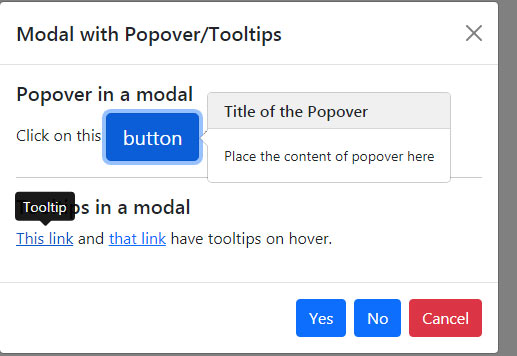
Adding Tooltips and popovers in a modal demo
You may also add tooltips and popovers in the modal window. The popovers or tooltips inside the modal are also dismissed as you close the modal. See an example below:
<!DOCTYPE html>

<html>

<head>

<link href="https://cdn.jsdelivr.net/npm/bootstrap@5.0.1/dist/css/bootstrap.min.css" rel="stylesheet" integrity="sha384-+0n0xVW2eSR5OomGNYDnhzAbDsOXxcvSN1TPprVMTNDbiYZCxYbOOl7+AMvyTG2x" crossorigin="anonymous">

<script src="https://cdn.jsdelivr.net/npm/@popperjs/core@2.9.2/dist/umd/popper.min.js" integrity="sha384-IQsoLXl5PILFhosVNubq5LC7Qb9DXgDA9i+tQ8Zj3iwWAwPtgFTxbJ8NT4GN1R8p" crossorigin="anonymous"></script>

<script src="https://cdn.jsdelivr.net/npm/bootstrap@5.0.1/dist/js/bootstrap.min.js" integrity="sha384-Atwg2Pkwv9vp0ygtn1JAojH0nYbwNJLPhwyoVbhoPwBhjQPR5VtM2+xf0Uwh9KtT" crossorigin="anonymous"></script>


<script>

var myModal = new bootstrap.Modal(document.getElementById('StaticModal'), options)

</script>

</head>

<body>

<div class="container">

  <h3>Bootstrap 5 Modal Example</h2>

<!-- Trigger Modal Component -->

<button type="button" class="btn btn-danger" data-bs-toggle="modal" data-bs-target="#StaticModal">

  Modal with Popover and Tooltips.

</button>

<!-- Modal -->

<div class="modal fade"  id="StaticModal" tabindex="-1" aria-labelledby="basicModalLabel" aria-hidden="true">

  <div class="modal-dialog modal-dialog-centered">

    <div class="modal-content">

      <div class="modal-header">

        <h5 class="modal-title" id="basicModalLabel">Modal with Popover/Tooltips</h5>

        <button type="button" class="btn-close" data-bs-dismiss="modal" aria-label="Close"></button>

      </div>

<div class="modal-body">

  <h5>Popover in a modal</h5>


  <p>Click on this <a href="#" role="button" class="btn btn-primary btn-lg popover-example" title="Title of the Popover" data-bs-content="Place the content of popover here">button</a> to open the popover</p>

  <hr>

  <h5>Tooltips in a modal</h5>

  <p><a href="#" class="tooltip-example" data-bs-toggle="tooltip" title="Tooltip">This link</a> and <a href="#" class="tooltip-example" data-bs-toggle="tooltip" title="Tooltip">that link</a> have tooltips on hover.</p>

</div>

      <div class="modal-footer">

        <button type="button" class="btn btn-primary">Yes</button>

        <button type="button" class="btn btn-primary">No</button>

        <button type="button" class="btn btn-danger" data-bs-dismiss="modal">Cancel</button>

      </div>

    </div>

  </div>

</div>

</div>

<script>

var popover = new bootstrap.Popover(document.querySelector('.popover-example'), {

  container: 'body'

})

var tooltipTriggerList = [].slice.call(document.querySelectorAll('[data-bs-toggle="tooltip"]'))

var tooltipList = tooltipTriggerList.map(function (tooltipTriggerEl) {

  return new bootstrap.Tooltip(tooltipTriggerEl)

})

</script>

</body>

</html>