
Bootstrap 5 Select Form Control
- The select is an HTML element to get the user input in the form of a dropdown list.
- Most often, the select is used in HTML forms.
- Bootstrap 5 provides built-in classes to design/style the HTML select form control
- This tutorial provides how to use those classes along with various styles
An example of Bootstrap 5 Select
You only need to refer the Bootstrap 5 .form-select class to the HTML select element and BS will style the initial appearance of the select dropdown.
Note, it does not change how list items (options) are displayed. This behavior is due to browser limitations.
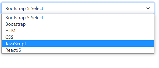
Have a look at a simple select control with five options:
BS 5 Code:
<!DOCTYPE html>
<html>

<head>
<link href="https://cdn.jsdelivr.net/npm/bootstrap@5.0.1/dist/css/bootstrap.min.css" rel="stylesheet" integrity="sha384-+0n0xVW2eSR5OomGNYDnhzAbDsOXxcvSN1TPprVMTNDbiYZCxYbOOl7+AMvyTG2x" crossorigin="anonymous">

</head>
<body>

<div class="container m-4">

<select class="form-select" aria-label="Default select example">

  <option selected>Bootstrap 5 Select</option>

  <option value="1">Bootstrap</option>

  <option value="2">HTML</option>

  <option value="3">CSS</option>

  <option value="3">JavaScript</option>

  <option value="3">ReactJS</option>

</select>
</div>

</body>
</html>
Output:
An example of a disabled select dropdown
You just need to add the disabled HTML attribute to the form control to disable it. It does two things:
- It gives select a grayed-out look.
- It also removes pointer events.
See the example below of a disabled select control:
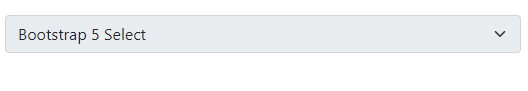
Code:
<!DOCTYPE html>
<html>
<head>
<link href="https://cdn.jsdelivr.net/npm/bootstrap@5.0.1/dist/css/bootstrap.min.css" rel="stylesheet" integrity="sha384-+0n0xVW2eSR5OomGNYDnhzAbDsOXxcvSN1TPprVMTNDbiYZCxYbOOl7+AMvyTG2x" crossorigin="anonymous">

</head>

<body>

<div class="container m-4">

<select class="form-select" aria-label="Default select example" disabled>

  <option selected>Bootstrap 5 Select</option>

  <option value="1">Bootstrap</option>

  <option value="2">HTML</option>

  <option value="3">CSS</option>

  <option value="3">JavaScript</option>

  <option value="3">ReactJS</option>

</select>
</div>
</body>

</html>
As you run the above code, a user won’t be able to click on the select to see its list/options.
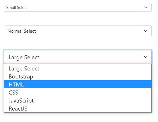
Sizing of the select control example
You may also manage the size of select control by using size-specific classes provided by BS 5.
Following classes can be used for small and large select controls.
- form-select-sm (For small size)
- form-select-lg (For large size)
The following example shows all three types i.e. Normal (as we have seen in the above examples), small, and large:
BS 5 code:
<!DOCTYPE html>
<html>
<head>
<link href="https://cdn.jsdelivr.net/npm/bootstrap@5.0.1/dist/css/bootstrap.min.css" rel="stylesheet" integrity="sha384-+0n0xVW2eSR5OomGNYDnhzAbDsOXxcvSN1TPprVMTNDbiYZCxYbOOl7+AMvyTG2x" crossorigin="anonymous">
</head>

<body>

<div class="container m-4">

<select class="form-select form-select-sm" aria-label="Default select example">

  <option selected>Small Select</option>

  <option value="1">Bootstrap</option>

  <option value="2">HTML</option>

  <option value="3">CSS</option>

  <option value="3">JavaScript</option>

  <option value="3">ReactJS</option>

</select>

<br><br>

<select class="form-select" aria-label="Default select example">

  <option selected>Normal Select</option>

  <option value="1">Bootstrap</option>

  <option value="2">HTML</option>

  <option value="3">CSS</option>

  <option value="3">JavaScript</option>

  <option value="3">ReactJS</option>

</select>
<br><br>

<select class="form-select form-select-lg" aria-label="Default select example">

  <option selected>Large Select</option>

  <option value="1">Bootstrap</option>

  <option value="2">HTML</option>

  <option value="3">CSS</option>

  <option value="3">JavaScript</option>

  <option value="3">ReactJS</option>

</select>
</div>
</body>
</html>
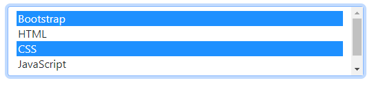
Using multiple attribute of the HTML select example
Need to allow users to select multiple options? BS 5 also supports multiple attribute. Just add multiple to the select tag and you are done. Have a look:
Code:
<!DOCTYPE html>
<html>
<head>

<link href="https://cdn.jsdelivr.net/npm/bootstrap@5.0.1/dist/css/bootstrap.min.css" rel="stylesheet" integrity="sha384-+0n0xVW2eSR5OomGNYDnhzAbDsOXxcvSN1TPprVMTNDbiYZCxYbOOl7+AMvyTG2x" crossorigin="anonymous">
</head>
<body>

<div class="container m-4">
<select class="form-select" aria-label="Default select example" multiple >

   <option value="1">Bootstrap</option>

  <option value="2">HTML</option>

  <option value="3">CSS</option>

  <option value="3">JavaScript</option>

  <option value="3">ReactJS</option>

</select>
</body>

</html>
Output:
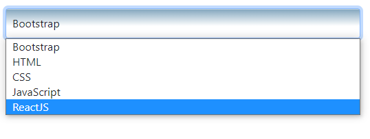
Styling the select control
You may apply custom CSS to style the select control. In the following example, we have created a CSS class and referred it to the select control.
Markup:
<!DOCTYPE html>
<html>
<head>

<link href="https://cdn.jsdelivr.net/npm/bootstrap@5.0.1/dist/css/bootstrap.min.css" rel="stylesheet" integrity="sha384-+0n0xVW2eSR5OomGNYDnhzAbDsOXxcvSN1TPprVMTNDbiYZCxYbOOl7+AMvyTG2x" crossorigin="anonymous">
<style>

.selcls {

    padding: 9px;

    border: solid 1px #375366;

    outline: 0;

    background: -webkit-gradient(linear, left top, left 25, from(#FFFFFF), color-stop(4%, #86A8BF), to(#FFFFFF));

    background: -moz-linear-gradient(top, #FFFFFF, #CAD9E3 1px, #FFFFFF 25px);

    box-shadow: rgba(0,0,0, 0.1) 0px 0px 8px;

    -moz-box-shadow: rgba(0,0,0, 0.1) 0px 0px 8px;

    -webkit-box-shadow: rgba(0,0,0, 0.1) 0px 0px 8px;
    }
</style>
</head>
<body>

<div class="container m-4">

<select class="form-select selcls" aria-label="Default select example" >

   <option value="1">Bootstrap</option>

  <option value="2">HTML</option>

  <option value="3">CSS</option>

  <option value="3">JavaScript</option>

  <option value="3">ReactJS</option>

</select>
</body>

</html>
Result:
You may style your own CSS and apply it to form along with select control.