
What are Bootstrap 5 Border utilities?
To quickly style the border and border-radius of different elements, you may use the Bootstrap 5 border utilities.
Border utilities are great for:
- Buttons
- Images
- And any other element
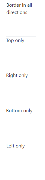
An example of Bootstrap borders for a paragraph – Addictive borders
You may apply all borders to any elements or one/two border(s) at a time. The example below applies border to five paragraphs:
- Borders in all directions
- Border on top
- Border on right
- On bottom
- And on left only
Example code:
<!DOCTYPE html>

<html>

<head>

<link href="https://cdn.jsdelivr.net/npm/bootstrap@5.0.1/dist/css/bootstrap.min.css" rel="stylesheet" integrity="sha384-+0n0xVW2eSR5OomGNYDnhzAbDsOXxcvSN1TPprVMTNDbiYZCxYbOOl7+AMvyTG2x" crossorigin="anonymous">

<style>

p{

    height: 100px;

    width: 100px;

}

</style>

</head>

<body>

<div class="container">

<h3>Bootstrap 5 Borders</h3>

<p class="border">Border in all directions</p>

<p class="border-top">Top only</p>

<p class="border-end">Right only</p>

<p class="border-bottom">Bottom only</p>

<p class="border-start">Left only</p>

</div>

</body>

</html>
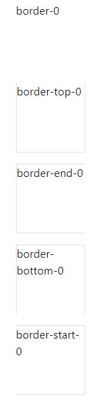
An example of subtractive borders
Substantive border means the one you specify is subtracted while all others are applied. For example, if you use border-top-0 class, it will omit the top border and apply the border in all other three directions.
BS 5 Code:
<!DOCTYPE html>
<html>
<head>
<link href="https://cdn.jsdelivr.net/npm/bootstrap@5.0.1/dist/css/bootstrap.min.css" rel="stylesheet" integrity="sha384-+0n0xVW2eSR5OomGNYDnhzAbDsOXxcvSN1TPprVMTNDbiYZCxYbOOl7+AMvyTG2x" crossorigin="anonymous">
<style>
p{
    height: 100px;
    width: 100px;
}
</style>
</head>


<body>
<div class="container">
<h3>Bootstrap 5 Borders</h3>
<p class="border border-0">border-0</p>
<p class="border border-top-0">border-top-0</p>
<p class="border border-end-0">border-end-0</p>
<p class="border border-bottom-0">border-bottom-0</p>
<p class="border border-start-0">border-start-0</p>
</div>
</body>


</html>
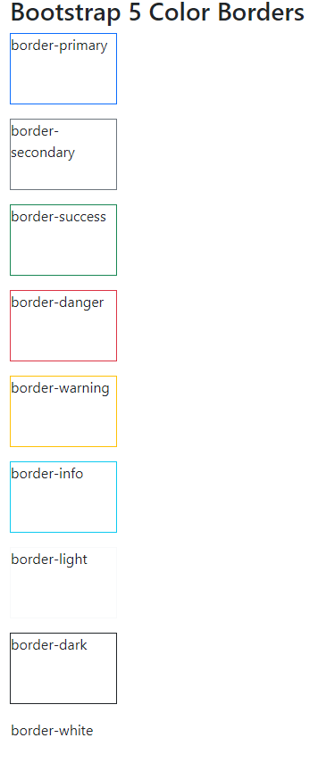
Applying colors to border example
By using contextual color classes, you may apply borders with colors easily. An example below shows various available classes for colors and their usage with borders. Have a look:
<!DOCTYPE html>

<html>

<head>

<link href="https://cdn.jsdelivr.net/npm/bootstrap@5.0.1/dist/css/bootstrap.min.css" rel="stylesheet" integrity="sha384-+0n0xVW2eSR5OomGNYDnhzAbDsOXxcvSN1TPprVMTNDbiYZCxYbOOl7+AMvyTG2x" crossorigin="anonymous">

<style>

p{

    height: 80px;

    width: 120px;

}

</style>

</head>


<body>

<div class="container">

<h3>Bootstrap 5 Color Borders</h3>

<p class="border border-primary">border-primary</p>

<p class="border border-info">border-info</p>

<p class="border border-light">border-light</p>

<p class="border border-danger">border-danger</p>

<p class="border border-warning">border-warning</p>

<p class="border border-dark">border-dark</p>

<p class="border border-white">border-white</p>

<p class="border border-secondary">border-secondary</p>

<p class="border border-success">border-success</p>

</div>

</body>

</html>
Following color border classes are available in BS 5 that you may use along with the main .border class:
- border-primary
- border-secondary
- border-success
- border-danger
- border-warning
- border-info
- border-light
- border-dark
- border-white
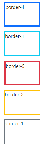
Setting the border width example
Bootstrap 5 also has classes for setting the border width easily. Simply add the border-1, border-2 to border-5. classes to the main .border class and it will set the border width.
See an example where we set the border of paragraph element from 1 to 5 (available classes):
<!DOCTYPE html>

<html>

<head>

<link href="https://cdn.jsdelivr.net/npm/bootstrap@5.0.1/dist/css/bootstrap.min.css" rel="stylesheet" integrity="sha384-+0n0xVW2eSR5OomGNYDnhzAbDsOXxcvSN1TPprVMTNDbiYZCxYbOOl7+AMvyTG2x" crossorigin="anonymous">

<style>

p{

    height: 80px;

    width: 120px;

}

</style>

</head>

<body>

<div class="container">

<h3>Bootstrap 5 Color Borders</h3>

<p class="border border-primary border-4">border-4</p>

<p class="border border-info border-3">border-3</p>

<p class="border border-danger border-5">border-5</p>

<p class="border border-warning border-2">border-2</p>

<p class="border border-secondary border-1">border-1</p>

</div>

</body>

</html>
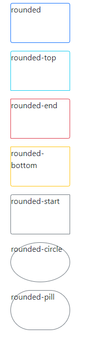
Setting the border-radius example
For rounding the corners, creating circles for elements like span, paragraph, images, etc. you may use the classes related to border-radius.
- rounded
- rounded-top
- rounded-end
- rounded-bottom
- rounded-start
- rounded-circle
- rounded-pill
<!DOCTYPE html>

<html>

<head>

<link href="https://cdn.jsdelivr.net/npm/bootstrap@5.0.1/dist/css/bootstrap.min.css" rel="stylesheet" integrity="sha384-+0n0xVW2eSR5OomGNYDnhzAbDsOXxcvSN1TPprVMTNDbiYZCxYbOOl7+AMvyTG2x" crossorigin="anonymous">

<style>

p{

    height: 80px;

    width: 120px;

}

</style>

</head>


<body>

<div class="container">

<h3>Bootstrap 5 Border Radius</h3>

<p class="border border-primary rounded">rounded</p>

<p class="border border-info rounded-top">rounded-top</p>

<p class="border border-danger rounded-end">rounded-end</p>

<p class="border border-warning rounded-bottom">rounded-bottom</p>

<p class="border border-secondary rounded-start">rounded-start</p>

<p class="border border-secondary rounded-circle">rounded-circle</p>

<p class="border border-secondary rounded-pill">rounded-pill</p>

</div>

</body>

</html>
An example of border-radius with images
See an example below of border-radius classes with images.

<!DOCTYPE html>

<html>

<head>

<link href="https://cdn.jsdelivr.net/npm/bootstrap@5.0.1/dist/css/bootstrap.min.css" rel="stylesheet" integrity="sha384-+0n0xVW2eSR5OomGNYDnhzAbDsOXxcvSN1TPprVMTNDbiYZCxYbOOl7+AMvyTG2x" crossorigin="anonymous">


</head>

<body>

<div class="container">

<h3>Bootstrap 5 Border Radius</h3>

<img src="images/Bootstrap-logo.png" class="rounded" alt="...">

<img src="images/Bootstrap-logo.png" class="rounded-top" alt="...">

<img src="images/Bootstrap-logo.png" class="rounded-end" alt="...">

<img src="images/Bootstrap-logo.png" class="rounded-bottom" alt="...">

<img src="images/Bootstrap-logo.png" class="rounded-start" alt="...">

<img src="images/Bootstrap-logo.png" class="rounded-circle" alt="...">

<img src="images/Bootstrap-logo.png" class="rounded-pill" alt="...">

</div>

</body>

</html>
Using size classes for large/small corners example

<!DOCTYPE html>

<html>

<head>

<link href="https://cdn.jsdelivr.net/npm/bootstrap@5.0.1/dist/css/bootstrap.min.css" rel="stylesheet" integrity="sha384-+0n0xVW2eSR5OomGNYDnhzAbDsOXxcvSN1TPprVMTNDbiYZCxYbOOl7+AMvyTG2x" crossorigin="anonymous">

</head>

<body>

<div class="container">

<h3>Bootstrap 5 Border Radius</h3>

<img src="images/Bootstrap-logo.png" class="rounded-top rounded-0" alt="...">

<img src="images/Bootstrap-logo.png" class="rounded-start rounded-1" alt="...">

<img src="images/Bootstrap-logo.png" class="rounded-pill rounded-2" alt="...">

<img src="images/Bootstrap-logo.png" class="rounded-circle rounded-3" alt="...">

</div>

</body>


</html>
Following scaling classes are available for smaller and larger round corners:
- rounded-0
- rounded-1
- rounded-2
- rounded-3