Colorizing text and links using Bootstrap 5
Bootstrap 5 has utility classes for coloring text and links. In this tutorial, we will show you how to use those utility classes for text and link color.
Color utility classes available for text
The following utility classes are available for text color:
- .text-primary
- .text-secondary
- .text-success
- .text-danger
- .text-warning
- .text-info
- .text-light
- .text-dark
- .text-body
- .text-muted
- .text-white
- .text-black-50
- .text-white-50
An example of using text classes in paragraphs
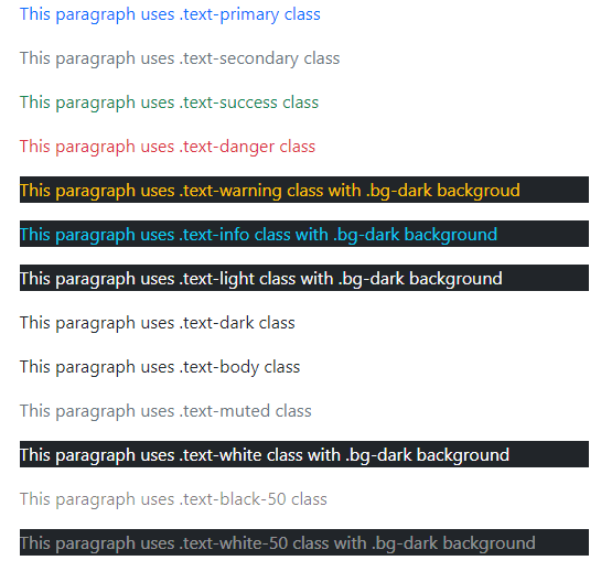
In this example, each available text class is used in the paragraph. The sequence in the code and image below is different. Have a look:

Code:
<!DOCTYPE html>
<html>
<head>

<link href="https://cdn.jsdelivr.net/npm/bootstrap@5.0.1/dist/css/bootstrap.min.css" rel="stylesheet" integrity="sha384-+0n0xVW2eSR5OomGNYDnhzAbDsOXxcvSN1TPprVMTNDbiYZCxYbOOl7+AMvyTG2x" crossorigin="anonymous">

</head>

<body>

<div class="container">

<h3>Bootstrap 5 text color</h3>

<p class="text-primary">This paragraph uses .text-primary class</p>

<p class="text-secondary">This paragraph uses .text-secondary class</p>

<p class="text-dark">This paragraph uses .text-dark class</p>

<p class="text-body">This paragraph uses .text-body class</p>

<p class="text-warning bg-dark">This paragraph uses .text-warning class with .bg-dark backgroud</p>

<p class="text-muted">This paragraph uses .text-muted class</p>

<p class="text-success">This paragraph uses .text-success class</p>

<p class="text-danger">This paragraph uses .text-danger class</p>

<p class="text-white bg-dark">This paragraph uses .text-white class with .bg-dark background</p>

<p class="text-black-50">This paragraph uses .text-black-50 class</p>

<p class="text-white-50 bg-dark">This paragraph uses .text-white-50 class with .bg-dark background</p>

<p class="text-info bg-dark">This paragraph uses .text-info class with .bg-dark background</p>

<p class="text-light bg-dark">This paragraph uses .text-light class with .bg-dark background</p>

</div>

</body>

</html>
Classes available for link coloring
The following utility classes are available for link colors:
- link-primary
- link-secondary
- link-success
- link-danger
- link-warning
- link-info
- link-light
- link-dark
Note: The link classes have :hover and :focus states.
An example of using link color utility classes in Bootstrap 5
In this example, we have all color classes for links that change on hover and focus state.
BS 5 Code:
<!DOCTYPE html>
<html>
<head>

<link href="https://cdn.jsdelivr.net/npm/bootstrap@5.0.1/dist/css/bootstrap.min.css" rel="stylesheet" integrity="sha384-+0n0xVW2eSR5OomGNYDnhzAbDsOXxcvSN1TPprVMTNDbiYZCxYbOOl7+AMvyTG2x" crossorigin="anonymous">

</head>

<body>

<div class="container">

<h3>Bootstrap 5 link color</h3>

<a href="https://www.jquery-az.com/bootstrap-5/" class="link-primary">Bootstrap 5</a>

<a href="https://www.jquery-az.com/bootstrap-5/" class="link-secondary">Bootstrap 5</a><br>

<a href="https://www.jquery-az.com/bootstrap-5/" class="link-success">Bootstrap 5</a>

<a href="https://www.jquery-az.com/bootstrap-5/" class="link-danger">Bootstrap 5</a><br>

<a href="https://www.jquery-az.com/bootstrap-5/" class="link-warning">Bootstrap 5</a>

<a href="https://www.jquery-az.com/bootstrap-5/" class="link-info">Bootstrap 5</a><br>

<a href="https://www.jquery-az.com/bootstrap-5/" class="link-light bg-dark">Bootstrap 5</a>

<a href="https://www.jquery-az.com/bootstrap-5/" class="link-dark">Bootstrap 5</a>

</div>

</body>

</html>
Result:

References:
https://getbootstrap.com/docs/5.0/utilities/colors/
https://getbootstrap.com/docs/5.0/helpers/colored-links/
