
A little about Bootstrap 5 Alerts
The alert is a way of communicating with the users of your website. A contextual feedback message can be displayed to the user by using the Bootstrap 5 built-in component, easily.
For example, you may display an alert as a warning that is orange in color. Similarly, a critical message can be given .danger- class that is red in color, and a success message (the record is saved, for example) can be displayed in green.
See the examples below for creating alerts with various options.
The example of alerts with contextual classes
In this example, we utilized available contextual classes (for colors) to create alerts in Bootstrap 5. For each alert, the main .alert class is used as follows:
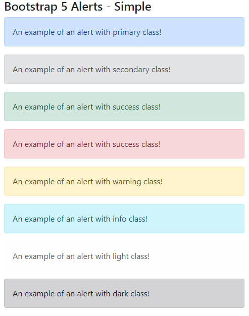
<!DOCTYPE html>

<html>

<head>

<link href="https://cdn.jsdelivr.net/npm/bootstrap@5.0.1/dist/css/bootstrap.min.css" rel="stylesheet" integrity="sha384-+0n0xVW2eSR5OomGNYDnhzAbDsOXxcvSN1TPprVMTNDbiYZCxYbOOl7+AMvyTG2x" crossorigin="anonymous">


</head>

<body>

<div class="container">

  <h3>Bootstrap 5 Block Button Example</h2>


<div class="alert alert-primary" role="alert">

  An example of an alert with primary class!

</div>

<div class="alert alert-secondary" role="alert">

    An example of an alert with secondary class!

</div>

<div class="alert alert-success" role="alert">

  An example of an alert with primary class!

</div>

<div class="alert alert-danger" role="alert">

  An example of an alert with success class!

</div>

<div class="alert alert-warning" role="alert">

  An example of an alert with warning class!

</div>

<div class="alert alert-info" role="alert">

  An example of an alert with info class!

</div>

<div class="alert alert-light" role="alert">

  An example of an alert with light class!

</div>

<div class="alert alert-dark" role="alert">

  An example of an alert with dark class!

</div>


</div>

</body>

</html>
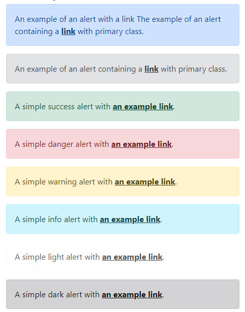
The example with a link color in alerts
You may add links in the message of alerts and to match the color, utilize the available class for links i.e. alert-link. This will match the color according to the contextual class given for the main alert. See the code and output below:
<!DOCTYPE html>
<html>
<head>
<link href="https://cdn.jsdelivr.net/npm/bootstrap@5.0.1/dist/css/bootstrap.min.css" rel="stylesheet" integrity="sha384-+0n0xVW2eSR5OomGNYDnhzAbDsOXxcvSN1TPprVMTNDbiYZCxYbOOl7+AMvyTG2x" crossorigin="anonymous">

</head>
<body>
<div class="container">
  <h3>Bootstrap 5 alerts Example</h2>

<div class="alert alert-primary" role="alert">
  An example of an alert with a link
  The example of an alert containing a <a href="https://www.jquery-az.com/" class="alert-link">link</a> with primary class.
</div>
<div class="alert alert-secondary" role="alert">
  An example of an alert containing a <a href="https://www.jquery-az.com/" class="alert-link">link</a> with secondary class.
</div>
<div class="alert alert-success" role="alert">
  A simple success alert with <a href="https://www.jquery-az.com/" class="alert-link">an example link</a>.
</div>
<div class="alert alert-danger" role="alert">
  A simple danger alert with <a href="https://www.jquery-az.com/" class="alert-link">an example link</a>.
</div>
<div class="alert alert-warning" role="alert">
  A simple warning alert with <a href="https://www.jquery-az.com/" class="alert-link">an example link</a>.
</div>
<div class="alert alert-info" role="alert">
  A simple info alert with <a href="https://www.jquery-az.com/" class="alert-link">an example link</a>.
</div>
<div class="alert alert-light" role="alert">
  A simple light alert with <a href="https://www.jquery-az.com/" class="alert-link">an example link</a>.
</div>
<div class="alert alert-dark" role="alert">
  A simple dark alert with <a href="https://www.jquery-az.com/" class="alert-link">an example link</a>.
</div>

</div>
</body>
</html>
Output:
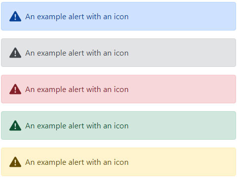
The example of alerts with Icons
In this example, the alerts are created with an icon using various contextual classes.
Code:
<!DOCTYPE html>

<html>

<head>

<link href="https://cdn.jsdelivr.net/npm/bootstrap@5.0.1/dist/css/bootstrap.min.css" rel="stylesheet" integrity="sha384-+0n0xVW2eSR5OomGNYDnhzAbDsOXxcvSN1TPprVMTNDbiYZCxYbOOl7+AMvyTG2x" crossorigin="anonymous">


</head>

<body>

<div class="container">

  <h3>Bootstrap 5 Alerts Example</h2>


<div class="alert alert-primary d-flex align-items-center" role="alert">

  <svg xmlns="http://www.w3.org/2000/svg" width="24" height="24" fill="currentColor" class="bi bi-exclamation-triangle-fill flex-shrink-0 me-2" viewBox="0 0 16 16" role="img" aria-label="Warning:">

    <path d="M8.982 1.566a1.13 1.13 0 0 0-1.96 0L.165 13.233c-.457.778.091 1.767.98 1.767h13.713c.889 0 1.438-.99.98-1.767L8.982 1.566zM8 5c.535 0 .954.462.9.995l-.35 3.507a.552.552 0 0 1-1.1 0L7.1 5.995A.905.905 0 0 1 8 5zm.002 6a1 1 0 1 1 0 2 1 1 0 0 1 0-2z"/>

  </svg>

  <div>

    An example alert with an icon

  </div>

</div>


<div class="alert alert-secondary d-flex align-items-center" role="alert">

  <svg xmlns="http://www.w3.org/2000/svg" width="24" height="24" fill="currentColor" class="bi bi-exclamation-triangle-fill flex-shrink-0 me-2" viewBox="0 0 16 16" role="img" aria-label="Warning:">

    <path d="M8.982 1.566a1.13 1.13 0 0 0-1.96 0L.165 13.233c-.457.778.091 1.767.98 1.767h13.713c.889 0 1.438-.99.98-1.767L8.982 1.566zM8 5c.535 0 .954.462.9.995l-.35 3.507a.552.552 0 0 1-1.1 0L7.1 5.995A.905.905 0 0 1 8 5zm.002 6a1 1 0 1 1 0 2 1 1 0 0 1 0-2z"/>

  </svg>

  <div>

    An example alert with an icon

  </div>

</div>


<div class="alert alert-danger d-flex align-items-center" role="alert">

  <svg xmlns="http://www.w3.org/2000/svg" width="24" height="24" fill="currentColor" class="bi bi-exclamation-triangle-fill flex-shrink-0 me-2" viewBox="0 0 16 16" role="img" aria-label="Warning:">

    <path d="M8.982 1.566a1.13 1.13 0 0 0-1.96 0L.165 13.233c-.457.778.091 1.767.98 1.767h13.713c.889 0 1.438-.99.98-1.767L8.982 1.566zM8 5c.535 0 .954.462.9.995l-.35 3.507a.552.552 0 0 1-1.1 0L7.1 5.995A.905.905 0 0 1 8 5zm.002 6a1 1 0 1 1 0 2 1 1 0 0 1 0-2z"/>

  </svg>

  <div>

    An example alert with an icon

  </div>

</div>


<div class="alert alert-success d-flex align-items-center" role="alert">

  <svg xmlns="http://www.w3.org/2000/svg" width="24" height="24" fill="currentColor" class="bi bi-exclamation-triangle-fill flex-shrink-0 me-2" viewBox="0 0 16 16" role="img" aria-label="Warning:">

    <path d="M8.982 1.566a1.13 1.13 0 0 0-1.96 0L.165 13.233c-.457.778.091 1.767.98 1.767h13.713c.889 0 1.438-.99.98-1.767L8.982 1.566zM8 5c.535 0 .954.462.9.995l-.35 3.507a.552.552 0 0 1-1.1 0L7.1 5.995A.905.905 0 0 1 8 5zm.002 6a1 1 0 1 1 0 2 1 1 0 0 1 0-2z"/>

  </svg>

  <div>

    An example alert with an icon

  </div>

</div>


<div class="alert alert-warning d-flex align-items-center" role="alert">

  <svg xmlns="http://www.w3.org/2000/svg" width="24" height="24" fill="currentColor" class="bi bi-exclamation-triangle-fill flex-shrink-0 me-2" viewBox="0 0 16 16" role="img" aria-label="Warning:">

    <path d="M8.982 1.566a1.13 1.13 0 0 0-1.96 0L.165 13.233c-.457.778.091 1.767.98 1.767h13.713c.889 0 1.438-.99.98-1.767L8.982 1.566zM8 5c.535 0 .954.462.9.995l-.35 3.507a.552.552 0 0 1-1.1 0L7.1 5.995A.905.905 0 0 1 8 5zm.002 6a1 1 0 1 1 0 2 1 1 0 0 1 0-2z"/>

  </svg>

  <div>

    An example alert with an icon

  </div>

</div>


</div>

</body>

</html>
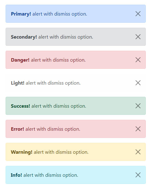
An example of alert with the cross-to-close alert
In this example, various colored alerts are created with the cross button towards the right side. By clicking on that, the alert will be dismissed. For that, just add the .alert-dismissible class in the container:
Code:
<!DOCTYPE html>

<html lang="en">

<head>

<meta charset="utf-8">

<meta name="viewport" content="width=device-width, initial-scale=1">

<link href="https://cdn.jsdelivr.net/npm/bootstrap@5.0.2/dist/css/bootstrap.min.css" rel="stylesheet">

<script src="https://cdn.jsdelivr.net/npm/bootstrap@5.0.2/dist/js/bootstrap.bundle.min.js"></script>

</head>

<body>

<div class="m-4">

    <!-- Primary Dismiss Alert -->

    <div class="alert alert-primary alert-dismissible fade show">

        <strong>Primary!</strong> alert with dismiss option.

        <button type="button" class="btn-close" data-bs-dismiss="alert"></button>

    </div>

    <!-- Success Alert -->

    <div class="alert alert-secondary alert-dismissible fade show">

        <strong>Secondary!</strong> alert with dismiss option.

        <button type="button" class="btn-close" data-bs-dismiss="alert"></button>

    </div>

    <!-- Success Alert -->

    <div class="alert alert-danger alert-dismissible fade show">

        <strong>Danger!</strong> alert with dismiss option.

        <button type="button" class="btn-close" data-bs-dismiss="alert"></button>

    </div>

    <!-- Success Alert -->

    <div class="alert alert-light alert-dismissible fade show">

        <strong>Light!</strong> alert with dismiss option.

        <button type="button" class="btn-close" data-bs-dismiss="alert"></button>

    </div>


    <!-- Success Alert -->

    <div class="alert alert-success alert-dismissible fade show">

        <strong>Success!</strong> alert with dismiss option.

        <button type="button" class="btn-close" data-bs-dismiss="alert"></button>

    </div>


    <!-- Error Alert -->

    <div class="alert alert-danger alert-dismissible fade show">

        <strong>Error!</strong> alert with dismiss option.

        <button type="button" class="btn-close" data-bs-dismiss="alert"></button>

    </div>


    <!-- Warning Alert -->

    <div class="alert alert-warning alert-dismissible fade show">

        <strong>Warning!</strong> alert with dismiss option.

        <button type="button" class="btn-close" data-bs-dismiss="alert"></button>

    </div>


    <!-- Info Alert -->

    <div class="alert alert-info alert-dismissible fade show">

        <strong>Info!</strong> alert with dismiss option.

        <button type="button" class="btn-close" data-bs-dismiss="alert"></button>

    </div>

</div>

</body>

</html>
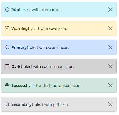
Another example of Bootstrap 5 alerts with icons
In this example, the alerts are created with icons inside. For that, bootstrap-icons.css is added in the head section.
Code
<!DOCTYPE html>

<html lang="en">

<head>

<meta charset="utf-8">

<meta name="viewport" content="width=device-width, initial-scale=1">

<link href="https://cdn.jsdelivr.net/npm/bootstrap@5.0.2/dist/css/bootstrap.min.css" rel="stylesheet">

<link href="https://cdn.jsdelivr.net/npm/bootstrap-icons@1.5.0/font/bootstrap-icons.css" rel="stylesheet">

<script src="https://cdn.jsdelivr.net/npm/bootstrap@5.0.2/dist/js/bootstrap.bundle.min.js"></script>

<style>

/* Custom style to set icon size */

.alert i[class^="bi-"]{

  font-size: 1.5em;

  line-height: 1;

}

</style>

</head>

<body>

<div class="m-4">

    <div class="alert alert-info alert-dismissible d-flex align-items-center fade show">

                <i class="bi bi-alarm"></i>

        <strong class="mx-2">Info!</strong> alert with alarm icon.

        <button type="button" class="btn-close" data-bs-dismiss="alert"></button>

    </div>


    <div class="alert alert-warning alert-dismissible d-flex align-items-center fade show">

                <i class="bi bi-save"></i>

        <strong class="mx-2">Warning!</strong> alert with save icon.

        <button type="button" class="btn-close" data-bs-dismiss="alert"></button>

    </div>


    <div class="alert alert-primary alert-dismissible d-flex align-items-center fade show">

                <i class="bi bi-search"></i>

        <strong class="mx-2">Primary!</strong> alert with search icon.

        <button type="button" class="btn-close" data-bs-dismiss="alert"></button>

    </div>


    <div class="alert alert-dark alert-dismissible d-flex align-items-center fade show">

                <i class="bi bi-code-square"></i>

        <strong class="mx-2">Dark!</strong> alert with code-square icon.

        <button type="button" class="btn-close" data-bs-dismiss="alert"></button>

    </div>


    <div class="alert alert-success alert-dismissible d-flex align-items-center fade show">

                <i class="bi bi-cloud-upload-fill"></i>

        <strong class="mx-2">Success!</strong> alert with cloud-upload icon.

        <button type="button" class="btn-close" data-bs-dismiss="alert"></button>

    </div>


    <div class="alert alert-secondary alert-dismissible d-flex align-items-center fade show">

                <i class="bi bi-file-earmark-pdf"></i>

        <strong class="mx-2">Secondary!</strong> alert with pdf icon.

        <button type="button" class="btn-close" data-bs-dismiss="alert"></button>

    </div>

</div>

</body>

</html>
For a complete available icons list, go to this link: https://icons.getbootstrap.com/