
Bootstrap 5 Buttons
You may use Bootstrap 5 buttons in:
- Forms
- Tables for data navigation
- Dialogues
- Modals
- Accordions
- & More
Bootstrap 5 Buttons are available with:
- Different sizes (small, large, etc.)
- States
- & More
The examples below show how to create buttons with Bootstrap 5 built-in classes. You can see style output as well as live examples with code.
Starting with the pre-defined semantic classes example
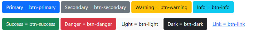
Bootstrap 5 (just like version 3, and BS 4 buttons) has predefined built-in classes for creating buttons. These styles have semantic meanings. For example, danger classes display the button as red that you may use for some critical action like deleting a record.
See the example below with available button classes:
<!DOCTYPE html>

<html>

<head>

<link href="https://cdn.jsdelivr.net/npm/bootstrap@5.0.1/dist/css/bootstrap.min.css" rel="stylesheet" integrity="sha384-+0n0xVW2eSR5OomGNYDnhzAbDsOXxcvSN1TPprVMTNDbiYZCxYbOOl7+AMvyTG2x" crossorigin="anonymous">

</head>

<body>

<div class="container">

  <h3>Bootstrap 5 Button Example</h2>


<p><button type="button" class="btn btn-primary">Primary = btn-primary</button>

<button type="button" class="btn btn-secondary">Secondary = btn-secondary</button>

<button type="button" class="btn btn-warning">Warning = btn-warning</button>

<button type="button" class="btn btn-info">Info = btn-info</button></p>

<p>

<button type="button" class="btn btn-success">Success = btn-success</button>

<button type="button" class="btn btn-danger">Danger = btn-danger</button>

<button type="button" class="btn btn-light">Light = btn-light</button>

<button type="button" class="btn btn-dark">Dark = btn-dark</button>

<button type="button" class="btn btn-link">Link = btn-link</button>

</p>

</div>

</body>

</html>
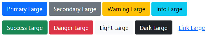
By default, the button size in Bootstrap is normal/medium-sized. For creating large or small-sized buttons, you may add the following classes along with the main .btn class:
- .btn-lg (for large button)
- .btn-sm (for small button)
The example below shows large buttons which is followed by small button example:
<!DOCTYPE html>

<html>

<head>

<link href="https://cdn.jsdelivr.net/npm/bootstrap@5.0.1/dist/css/bootstrap.min.css" rel="stylesheet" integrity="sha384-+0n0xVW2eSR5OomGNYDnhzAbDsOXxcvSN1TPprVMTNDbiYZCxYbOOl7+AMvyTG2x" crossorigin="anonymous">

</head>

<body>

<div class="container">

  <h3>Bootstrap 5 Large Button Example</h2>


<p><button type="button" class="btn btn-primary btn-lg">Primary Large</button>

<button type="button" class="btn btn-secondary btn-lg">Secondary Large</button>

<button type="button" class="btn btn-warning btn-lg">Warning Large</button>

<button type="button" class="btn btn-info btn-lg">Info Large</button></p>

<button type="button" class="btn btn-success btn-lg">Success Large</button>

<button type="button" class="btn btn-danger btn-lg">Danger Large</button>

<button type="button" class="btn btn-light btn-lg">Light Large</button>

<button type="button" class="btn btn-dark btn-lg">Dark Large</button>

<button type="button" class="btn btn-link btn-lg">Link Large</button>

</p>

</div>

</body>

</html>
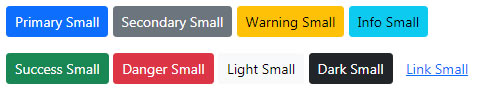
The example code below shows the small button by using the btn-sm class:
<!DOCTYPE html>

<html>

<head>

<link href="https://cdn.jsdelivr.net/npm/bootstrap@5.0.1/dist/css/bootstrap.min.css" rel="stylesheet" integrity="sha384-+0n0xVW2eSR5OomGNYDnhzAbDsOXxcvSN1TPprVMTNDbiYZCxYbOOl7+AMvyTG2x" crossorigin="anonymous">


</head>

<body>

<div class="container">

  <h3>Bootstrap 5 Small Button Example</h2>


<p><button type="button" class="btn btn-primary btn-sm">Primary Small</button>

<button type="button" class="btn btn-secondary btn-sm">Secondary Small</button>

<button type="button" class="btn btn-warning btn-sm">Warning Small</button>

<button type="button" class="btn btn-info btn-sm">Info Small</button></p>

<button type="button" class="btn btn-success btn-sm">Success Small</button>

<button type="button" class="btn btn-danger btn-sm">Danger Small</button>

<button type="button" class="btn btn-light btn-sm">Light Small</button>

<button type="button" class="btn btn-dark btn-sm">Dark Small</button>

<button type="button" class="btn btn-link btn-sm">Link Small</button>

</p>

</div>

</body>

</html>
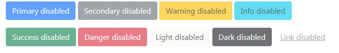
Just like the normal HTML buttons, you may use the disabled attribute to make a button look in-active or disabled.
The example below shows various buttons with disabled attribute:
<!DOCTYPE html>

<html>

<head>

<link href="https://cdn.jsdelivr.net/npm/bootstrap@5.0.1/dist/css/bootstrap.min.css" rel="stylesheet" integrity="sha384-+0n0xVW2eSR5OomGNYDnhzAbDsOXxcvSN1TPprVMTNDbiYZCxYbOOl7+AMvyTG2x" crossorigin="anonymous">


</head>

<body>

<div class="container">

  <h3>Bootstrap 5 Disabled Button Example</h2>


<p><button type="button" class="btn btn-primary disabled">Primary disabled</button>

<button type="button" class="btn btn-secondary disabled">Secondary disabled</button>

<button type="button" class="btn btn-warning disabled">Warning disabled</button>

<button type="button" class="btn btn-info disabled">Info disabled</button></p>

<button type="button" class="btn btn-success disabled">Success disabled</button>

<button type="button" class="btn btn-danger disabled">Danger disabled</button>

<button type="button" class="btn btn-light disabled">Light disabled</button>

<button type="button" class="btn btn-dark disabled">Dark disabled</button>

<button type="button" class="btn btn-link disabled">Link disabled</button>

</p>

</div>

</body>

</html>
Want to create cool/soft-looking buttons using Bootstrap 5, simply use the .btn-outline-* as shown in the example below. This outline class removes the background color or image from the button. See the code and output below:
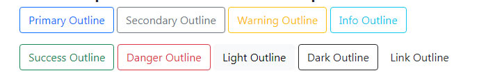
<!DOCTYPE html>

<html>

<head>

<link href="https://cdn.jsdelivr.net/npm/bootstrap@5.0.1/dist/css/bootstrap.min.css" rel="stylesheet" integrity="sha384-+0n0xVW2eSR5OomGNYDnhzAbDsOXxcvSN1TPprVMTNDbiYZCxYbOOl7+AMvyTG2x" crossorigin="anonymous">


</head>

<body>

<div class="container">

  <h3>Bootstrap 5 Outline Button Example</h2>


<p><button type="button" class="btn btn-outline-primary ">Primary Outline</button>

<button type="button" class="btn btn-outline-secondary ">Secondary Outline</button>

<button type="button" class="btn btn-outline-warning ">Warning Outline</button>

<button type="button" class="btn btn-outline-info ">Info Outline</button></p>

<button type="button" class="btn btn-outline-success ">Success Outline</button>

<button type="button" class="btn btn-outline-danger ">Danger Outline</button>

<button type="button" class="btn btn-outline-light ">Light Outline</button>

<button type="button" class="btn btn-outline-dark ">Dark Outline</button>

<button type="button" class="btn btn-outline-link ">Link Outline</button>

</p>

</div>

</body>

</html>
By using a mix of display and gap utilities, you may create block buttons that are fully available width. See an example below:
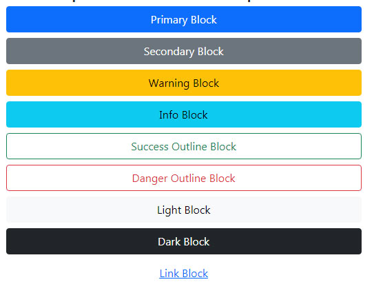
<!DOCTYPE html>

<html>

<head>

<link href="https://cdn.jsdelivr.net/npm/bootstrap@5.0.1/dist/css/bootstrap.min.css" rel="stylesheet" integrity="sha384-+0n0xVW2eSR5OomGNYDnhzAbDsOXxcvSN1TPprVMTNDbiYZCxYbOOl7+AMvyTG2x" crossorigin="anonymous">


</head>

<body>

<div class="container">

  <h3>Bootstrap 5 Block Button Example</h2>


<div class="d-grid gap-2">

<button type="button" class="btn btn-primary ">Primary Block</button>

<button type="button" class="btn btn-secondary ">Secondary Block</button>

<button type="button" class="btn btn-warning ">Warning Block</button>

<button type="button" class="btn btn-info ">Info Block</button>

<button type="button" class="btn btn-outline-success ">Success Outline Block</button>

<button type="button" class="btn btn-outline-danger ">Danger Outline Block</button>

<button type="button" class="btn btn-light ">Light Block </button>

<button type="button" class="btn btn-dark ">Dark Block</button>

<button type="button" class="btn btn-link ">Link Block</button>

</div>

</div>

</body>

</html>
You can see that no button-specific size class is used in the above example while the button takes the full available width.