
What is Collapse Component in Bootstrap 5?
Bootstrap 5 collapse component allows you to show/hide content in your website project by using a few classes and JavaScript Plug-ins.
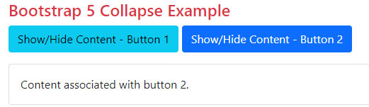
In the following example, we used two buttons and mapped both with separate div elements. As this code is executed, the content of both divs is hidden.
As you click Button 1, it will display its content and upon clicking it again, it hides the content. Similarly, toggle button 2 shows/hides the content:
Online demo and code
<!DOCTYPE html>

<html lang="en">

<head>

  <meta name="viewport" content="width=device-width, initial-scale=1">

  <link href="https://cdn.jsdelivr.net/npm/bootstrap@5.0.1/dist/css/bootstrap.min.css" rel="stylesheet" integrity="sha384-+0n0xVW2eSR5OomGNYDnhzAbDsOXxcvSN1TPprVMTNDbiYZCxYbOOl7+AMvyTG2x" crossorigin="anonymous">

  <script src="https://cdn.jsdelivr.net/npm/bootstrap@5.2.3/dist/js/bootstrap.bundle.min.js"></script>

</head>

<body>

<div class="container">

<h4 class="text-danger">Bootstrap 5 Collapse Example</h4>
<p>

  <button class="btn btn-info" type="button" data-bs-toggle="collapse" data-bs-target="#JAZcollapseExample1" aria-expanded="false" aria-controls="JAZcollapseExample1">

    Show/Hide Content - Button 1

  </button>

  <button class="btn btn-primary" type="button" data-bs-toggle="collapse" data-bs-target="#JAZcollapseExample2" aria-expanded="false" aria-controls="JAZcollapseExample2">

  Show/Hide Content - Button 2

  </button>

</p>

<div class="collapse" id="JAZcollapseExample1">

  <div class="card card-body">

    Content associated with button 1.

  </div>

</div>

<div class="collapse" id="JAZcollapseExample2">

  <div class="card card-body">

  Content associated with button 2.

  </div>

</div>

</div>

</body>

</html>
Also, notice the data-bs-target value is mapped to the id of the corresponding div element. In that way, you may use multiple collapse elements on a single page by using separate buttons.
So how collapse component works?
The collapse component:
- To show/hide the content, a button or anchor is used.
- These buttons/links are mapped to the element like a paragraph that you want to show/hide.
- The collapse animates the height of the target element to 0.
Following Bootstrap 5 classes are used:
- .collapse class hides the content
- The .collapse.show class shows the content
- During transitions, the .collapsing class is applied
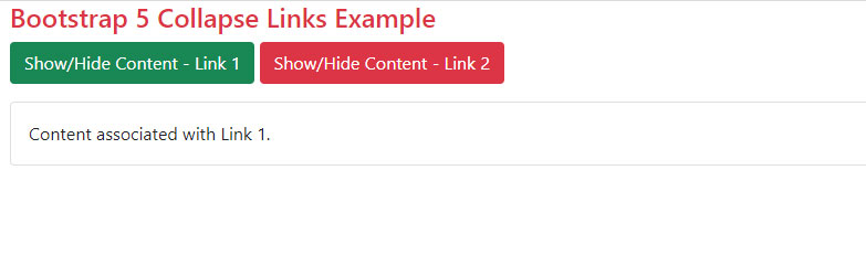
As mentioned earlier, you may also map the content with links. The following example is almost like the above example except we used link tags rather than buttons.
BS 5 Code:
<!DOCTYPE html>
<html lang="en">

<head>
  <meta name="viewport" content="width=device-width, initial-scale=1">

  <link href="https://cdn.jsdelivr.net/npm/bootstrap@5.0.1/dist/css/bootstrap.min.css" rel="stylesheet" integrity="sha384-+0n0xVW2eSR5OomGNYDnhzAbDsOXxcvSN1TPprVMTNDbiYZCxYbOOl7+AMvyTG2x" crossorigin="anonymous">

  <script src="https://cdn.jsdelivr.net/npm/bootstrap@5.2.3/dist/js/bootstrap.bundle.min.js"></script>

</head>

<body>

<div class="container">

<h4 class="text-danger">Bootstrap 5 Collapse Links Example</h4>

<p>

<a class="btn btn-success" data-bs-toggle="collapse" href="#JAZcollapseLink1" role="button" aria-expanded="false" aria-controls="JAZcollapseLink1">

Show/Hide Content - Link 1

</a>

<a class="btn btn-danger" data-bs-toggle="collapse" href="#JAZcollapseLink2" role="button" aria-expanded="false" aria-controls="JAZcollapseLink2">

Show/Hide Content - Link 2</a>

</p>
<div class="collapse" id="JAZcollapseLink1">

  <div class="card card-body">

    Content associated with Link 1.

  </div>

</div>

<div class="collapse" id="JAZcollapseLink2">

  <div class="card card-body">

  Content associated with Link 2.

  </div>

</div>

</div>

</body>

</html>
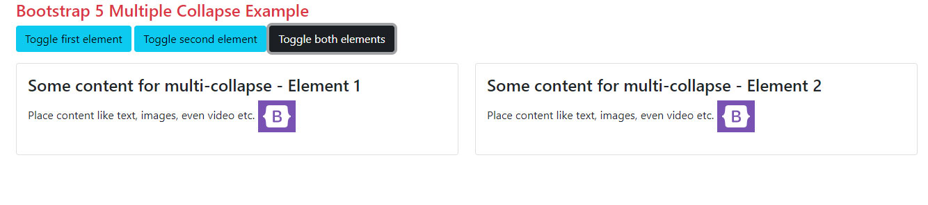
By using data-bs-target attribute or href (in case of link), you may toggle multiple elements by a single button or link.
Online demo and code
<!DOCTYPE html>
<html lang="en">

<head>

  <meta name="viewport" content="width=device-width, initial-scale=1">

  <link href="https://cdn.jsdelivr.net/npm/bootstrap@5.0.1/dist/css/bootstrap.min.css" rel="stylesheet" integrity="sha384-+0n0xVW2eSR5OomGNYDnhzAbDsOXxcvSN1TPprVMTNDbiYZCxYbOOl7+AMvyTG2x" crossorigin="anonymous">

  <script src="https://cdn.jsdelivr.net/npm/bootstrap@5.2.3/dist/js/bootstrap.bundle.min.js"></script>

</head>
<body>

<div class="container">

<h4 class="text-danger">Bootstrap 5 Multiple Collapse Example</h4>

<p>

  <a class="btn btn-info" data-bs-toggle="collapse" href="#JAZMultiCollapseDemo1" role="button" aria-expanded="false" aria-controls="JAZMultiCollapseDemo1">Toggle first element</a>

  <button class="btn btn-info" type="button" data-bs-toggle="collapse" data-bs-target="#JAZMultiCollapseDemo2" aria-expanded="false" aria-controls="JAZMultiCollapseDemo2">Toggle second element</button>

  <button class="btn btn-dark" type="button" data-bs-toggle="collapse" data-bs-target=".JAZmulti-collapse" aria-expanded="false" aria-controls="JAZMultiCollapseDemo1 JAZMultiCollapseDemo2">Toggle both elements</button>

</p>

<div class="row">

  <div class="col">

    <div class="collapse JAZmulti-collapse" id="JAZMultiCollapseDemo1">

      <div class="card card-body">

        <h4>Some content for multi-collapse - Element 1</h4>

        <p>Place content like text, images, even video etc.

        <img src="images/Bootstrap-logo.png">

        </p>

      </div>

    </div>

  </div>

  <div class="col">

    <div class="collapse JAZmulti-collapse" id="JAZMultiCollapseDemo2">

      <div class="card card-body">

      <h4>Some content for multi-collapse - Element 2</h4>

        <p>Place content like text, images, even video etc.

        <img src="images/Bootstrap-logo.png">

        </p>

      </div>

    </div>

  </div>

</div>

</div>

</body>

</html>
Following things are done in the above code:
- First button is an <a> tag with .btn
- Its href value is JAZMultiCollapseDemo1 which is mapped to the first <div> with content and also assigned to aria-controls of the third button.
- Second button data-bs-target is JAZMultiCollapseDemo2 which is mapped to second <div> and also assigned to the aria-controls of the second button.
Showing the content by default example
As shown in the above examples, the default behavior of the collapse component is to hide the content mapped with the toggle button.
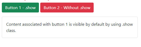
You may change the default behavior so that content is visible as the web page loads.
For that, simply add the .show class to the .collapse in the target div.
See the example below which is just like the first example with buttons. We added the .show class to the first div and it will show the content as the web page loads.
No class is given to the second div, so it remains hidden:
<!DOCTYPE html>
<html lang="en">

<head>

  <meta name="viewport" content="width=device-width, initial-scale=1">

  <link href="https://cdn.jsdelivr.net/npm/bootstrap@5.0.1/dist/css/bootstrap.min.css" rel="stylesheet" integrity="sha384-+0n0xVW2eSR5OomGNYDnhzAbDsOXxcvSN1TPprVMTNDbiYZCxYbOOl7+AMvyTG2x" crossorigin="anonymous">

  <script src="https://cdn.jsdelivr.net/npm/bootstrap@5.2.3/dist/js/bootstrap.bundle.min.js"></script>

</head>

<body>

<div class="container">

<h4 class="text-danger">Bootstrap 5 Collapse</h4>

<p>

  <button class="btn btn-success" type="button" data-bs-toggle="collapse" data-bs-target="#JAZcollapseExample1" aria-expanded="false" aria-controls="JAZcollapseExample1">

    Button 1 - .show

  </button>

  <button class="btn btn-danger" type="button" data-bs-toggle="collapse" data-bs-target="#JAZcollapseExample2" aria-expanded="false" aria-controls="JAZcollapseExample2">

   Button 2 - Without .show

  </button>

</p>
<div class="collapse show" id="JAZcollapseExample1">

  <div class="card card-body">

    Content associated with button 1 is visible by default by using .show class.

  </div>

</div>

<div class="collapse" id="JAZcollapseExample2">

  <div class="card card-body">

  Content associated with button 2.

  </div>

</div>
</div>

</body>

</html>
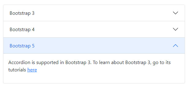
An example of an accordion using Bootstrap 5 Collapse
Bootstrap uses collapse component for creating accordions. We have a detailed tutorial written about it. The link can be seen after this example.
An example of creating a simple accordion using collapse component is given below:
<!DOCTYPE html>
<html>
<head>

<link href="https://cdn.jsdelivr.net/npm/bootstrap@5.0.1/dist/css/bootstrap.min.css" rel="stylesheet" integrity="sha384-+0n0xVW2eSR5OomGNYDnhzAbDsOXxcvSN1TPprVMTNDbiYZCxYbOOl7+AMvyTG2x" crossorigin="anonymous">

<script src="https://cdn.jsdelivr.net/npm/bootstrap@5.0.2/dist/js/bootstrap.bundle.min.js"></script>
</head>

<body>
<div class="m-4">

    <div class="accordion" id="JAZAccordion">

        <div class="accordion-item">

            <h2 class="accordion-header" id="headingOne">

                <button type="button" class="accordion-button collapsed" data-bs-toggle="collapse" data-bs-target="#collapseItemOne">Bootstrap 3</button>

            </h2>

            <div id="collapseItemOne" class="accordion-collapse collapse show" data-bs-parent="#JAZAccordion">

                <div class="card-body">

                    <p>Accordion is supported in Bootstrap 3. To learn about Bootstrap 3, go to its tutorials <a href="https://www.jquery-az.com/bootstrap-tips-tutorials/">here</a></p>

                </div>

            </div>

        </div>

        <div class="accordion-item">

            <h2 class="accordion-header" id="headingTwo">

                <button type="button" class="accordion-button" data-bs-toggle="collapse" data-bs-target="#collapseItemTwo">Bootstrap 4</button>

            </h2>

            <div id="collapseItemTwo" class="accordion-collapse collapse" data-bs-parent="#JAZAccordion">

                <div class="card-body">

                <p>Accordion is supported in Bootstrap 3. To learn about Bootstrap 3, go to its tutorials <a href="https://www.jquery-az.com/bootstrap-4/">here</a></p>

                </div>

            </div>

        </div>

        <div class="accordion-item">

            <h2 class="accordion-header" id="headingThree">

                <button type="button" class="accordion-button collapsed" data-bs-toggle="collapse" data-bs-target="#collapseItemThree">Bootstrap 5</button>

            </h2>

            <div id="collapseItemThree" class="accordion-collapse collapse" data-bs-parent="#JAZAccordion">

                <div class="card-body">

                <p>Accordion is supported in Bootstrap 3. To learn about Bootstrap 3, go to its tutorials <a href="https://www.jquery-az.com/bootstrap-5/">here</a></p>

                </div>

            </div>

        </div>

    </div>

</div>

</body>

</html>
Detailed tutorial: Bootstrap 5 accordion
Reference: https://getbootstrap.com/docs/5.0/components/collapse/