
The range component in Bootstrap 5
- Bootstrap 5 has built-in support for creating a range selector for the user.
- Simply use the <input type=”range”> controls with form range for creating range features in your web pages.
- These custom range inputs provide consistent cross-browser compatibility.
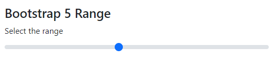
An example of creating a simple range slider in BS 5
In the first example, we used the default style provided by Bootstrap 5 for creating a range. Its range selector is a blue colored circle. Have a look:
Code:
<!DOCTYPE html>
<html>
<head>

<link href="https://cdn.jsdelivr.net/npm/bootstrap@5.0.1/dist/css/bootstrap.min.css" rel="stylesheet" integrity="sha384-+0n0xVW2eSR5OomGNYDnhzAbDsOXxcvSN1TPprVMTNDbiYZCxYbOOl7+AMvyTG2x" crossorigin="anonymous">

</head>

<body>

<div class="container m-4">

<h3>Bootstrap 5 Range</h3>

<label for="customRange1" class="form-label">Select the range</label>

<input type="range" class="form-range" id="customRange1">

</div>

</body>

</html>
Output:
So, how is it done?
- Create an input type “range”
- Assign it the “form-range” class
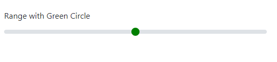
Changing the color from blue to green example
By using custom CSS, you may change the circle color. We have created a CSS class where we changed the background color of the circle. You need to refer range-cust (or name of your choice) class in the style section. Have a look at an example below where we changed the color from default blue to green. (This is only one way of customizing the color)
Code
<!DOCTYPE html>
<html>
<head>
<link href="https://cdn.jsdelivr.net/npm/bootstrap@5.0.1/dist/css/bootstrap.min.css" rel="stylesheet" integrity="sha384-+0n0xVW2eSR5OomGNYDnhzAbDsOXxcvSN1TPprVMTNDbiYZCxYbOOl7+AMvyTG2x" crossorigin="anonymous">
<style>
  .range-cust::-webkit-slider-thumb {
  background: green;
}
.range-cust::-moz-range-thumb {

  background: green;

}

.range-cust::-ms-thumb {

  background: green;

}

</style>

</head>

<body>

<div class="container m-4">

<h3>Toggle button outlined</h3>

<label for="customRange1" class="form-label">Range with Green Circle</label>

<input type="range" class="form-range range-cust" id="customRange1">

</div>

</body>

</html>
Output:
Customizing the runnable track as well as selector color example
In the above demo, we only changed the circle color for selecting the range value. You may also want to change the runnable track – which is grayish by default.
Code:
<!DOCTYPE html>
<html>
<head>

<link href="https://cdn.jsdelivr.net/npm/bootstrap@5.0.1/dist/css/bootstrap.min.css" rel="stylesheet" integrity="sha384-+0n0xVW2eSR5OomGNYDnhzAbDsOXxcvSN1TPprVMTNDbiYZCxYbOOl7+AMvyTG2x" crossorigin="anonymous">

<style>

  .form-range::-webkit-slider-thumb {

  background: #FFE1FF;

}
.form-range::-moz-range-thumb {
  background: #FFE1FF;
}

.form-range::-ms-thumb {
  background: #FFE1FF;
}

@media (prefers-reduced-motion: reduce) {
  .form-range::-webkit-slider-thumb {
    -webkit-transition: none;
    transition: none;
  }
}

.form-range::-webkit-slider-thumb:active {
  background-color: #FF8000;
}

.form-range::-webkit-slider-runnable-track {
  width: 100%;
  height: 0.5rem;
  color: transparent;
  cursor: pointer;
  background-color: #FF8000;
  border-color: transparent;
  border-radius: 1rem;

}

</style>

</head>

<body>

<div class="container m-4">

<h3>Bootstrap 5 Range</h3>

<label for="customRange1" class="form-label">Select the range</label>

<input type="range" class="form-range" id="customRange1">

</div>

</body>

</html>
Output:

The following things are done in the style section:
- form-range::-webkit-slider-runnable-track class is modified for changing the runnable color from gray to orange.
- By using the slider-thumb, the color is also changed from default blue to pink.
- The color of the circle is also changed as you click on it.
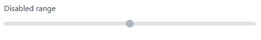
An example of a disabled range in Bootstrap 5
To remove pointer events and give it a grayed-out appearance, simply add the disabled attribute (HTML attribute) to any input type, the input type = “range” in our case. See an example below of the disabled range:
BS5 Code:
<!DOCTYPE html>
<html>
<head>

<link href="https://cdn.jsdelivr.net/npm/bootstrap@5.0.1/dist/css/bootstrap.min.css" rel="stylesheet" integrity="sha384-+0n0xVW2eSR5OomGNYDnhzAbDsOXxcvSN1TPprVMTNDbiYZCxYbOOl7+AMvyTG2x" crossorigin="anonymous">

</head>
<body>
<div class="container m-4">

<h3>Bootstrap 5 Range</h3>

<label for="disabledRange" class="form-label">Disabled range</label>

<input type="range" class="form-range" id="disabledRange" disabled>

</div>

</body>

</html>
Output:
Using min and max values for range
You may specify the min and max values by using min and max attributes for the range control.
Code
<!DOCTYPE html>
<html>
<head>
<link href="https://cdn.jsdelivr.net/npm/bootstrap@5.0.1/dist/css/bootstrap.min.css" rel="stylesheet" integrity="sha384-+0n0xVW2eSR5OomGNYDnhzAbDsOXxcvSN1TPprVMTNDbiYZCxYbOOl7+AMvyTG2x" crossorigin="anonymous">
</head>

<body>
<div class="container m-4">
<h3>Range wiht min/max demo</h3>

<label for="customRange2" class="form-label">Min=0 Max=10</label>
<input type="range" class="form-range" min="0" max="10" id="customRange2">

</div>
</body>

</html>
Output:
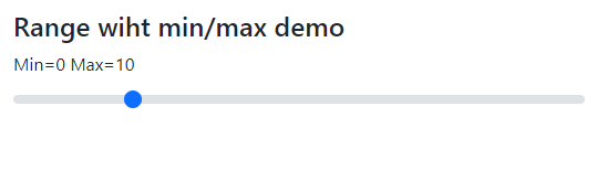
As you execute the above code and move the slider, you can see it consists of 10 steps, unlike the first examples.
Using step attribute in range example
Similarly, you may specify the step attribute for the range control.
See the example below for its usage. The only difference between the above and this example is the step attribute. We used the value for step = 2 with min=0 and max = 10.
<!DOCTYPE html>
<html>
<head>

<link href="https://cdn.jsdelivr.net/npm/bootstrap@5.0.1/dist/css/bootstrap.min.css" rel="stylesheet" integrity="sha384-+0n0xVW2eSR5OomGNYDnhzAbDsOXxcvSN1TPprVMTNDbiYZCxYbOOl7+AMvyTG2x" crossorigin="anonymous">
</head>
<body>
<div class="container m-4">

<h3>Range wiht min/max demo</h3>
<label for="customRange2" class="form-label">Min=0 Max=10</label>
<input type="range" class="form-range" min="0" max="10" step="2" id="customRange2">

</div>
</body>

</html>
In that way, the slider of range should move 20 points with each click.
Note: You may also use Sass variables for customizing the range control. Learn more about it by following the link below:
https://getbootstrap.com/docs/5.0/forms/range/