
Doing Form Validation in Bootstrap 5
Bootstrap 5 provides custom styles by using HTML 5 form validation. Besides, you may also provide feedback/tips to the users via browser default behaviors as well as JavaScript.
The form validation can be applied to input fields like textboxes, checkboxes, radio buttons, or select elements and textarea.
You may show descriptive messages and tooltips as well while validating forms as guiding users submitting the forms.
An example of BS 5 form validation with browser default style
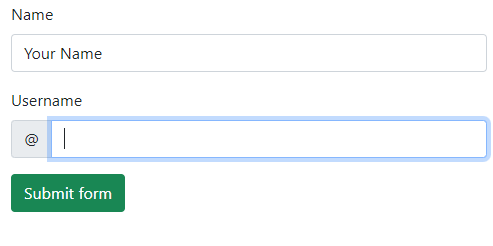
Before creating a form validation with custom CSS and JavaScript, let us have a look at a form with browser’s default style.
So, the style depends on which browser you are using on which OS. A Windows OS form may look different than the form in Mac, Linux etc.
Have a look at the form below and we will describe how it is done:
Online demo and code
<!DOCTYPE html>

<html>

<head>

<link href="https://cdn.jsdelivr.net/npm/bootstrap@5.0.1/dist/css/bootstrap.min.css" rel="stylesheet" integrity="sha384-+0n0xVW2eSR5OomGNYDnhzAbDsOXxcvSN1TPprVMTNDbiYZCxYbOOl7+AMvyTG2x" crossorigin="anonymous">

</head>

<body>

<div class="container">

<h3>BS 5 Form Validation</h3>

<form class="row g-3">

  <div class="col-md-4">

    <label for="validationDefault01" class="form-label">Name</label>

    <input type="text" class="form-control" id="validationDefault01" value="Your Name" required>

  </div>

  <div class="col-md-4">

    <label for="validationDefaultUsername" class="form-label">Username</label>

    <div class="input-group">

      <span class="input-group-text" id="inputGroupPrepend2">@</span>

      <input type="text" class="form-control" id="validationDefaultUsername"  aria-describedby="inputGroupPrepend2" required>

    </div>

  </div>


  <div class="col-12">

    <button class="btn btn-success" type="submit">Submit form</button>

  </div>

</form>

</div>

</body>


</html>
In order to make a form field mandatory, you need to add the required attribute.
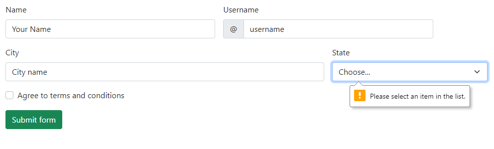
An example of browser default form with more form fields
In this example, we have a select control and a checkbox to be validated. These are given the required attribute as well:
Online demo and code
<!DOCTYPE html>

<html>

<head>

<link href="https://cdn.jsdelivr.net/npm/bootstrap@5.0.1/dist/css/bootstrap.min.css" rel="stylesheet" integrity="sha384-+0n0xVW2eSR5OomGNYDnhzAbDsOXxcvSN1TPprVMTNDbiYZCxYbOOl7+AMvyTG2x" crossorigin="anonymous">

</head>

<body>

<div class="container">

<h3>BS 5 Form Validation</h3>

<form class="row g-3">

  <div class="col-md-4">

    <label for="validationDefault01" class="form-label">Name</label>

    <input type="text" class="form-control" id="validationDefault01" value="Your Name" required>

  </div>

  <div class="col-md-4">

    <label for="validationDefaultUsername" class="form-label">Username</label>

    <div class="input-group">

      <span class="input-group-text" id="inputGroupPrepend2">@</span>

      <input type="text" class="form-control" id="validationDefaultUsername"  aria-describedby="inputGroupPrepend2" required>

    </div>

  </div>

  <div class="col-md-6">

    <label for="validationDefault03" class="form-label">City</label>

    <input type="text" class="form-control" id="validationDefault03" required>

  </div>

  <div class="col-md-3">

    <label for="validationDefault04" class="form-label">State</label>

    <select class="form-select" id="validationDefault04" required>

      <option selected disabled value="">Choose...</option>

      <option>...</option>

    </select>

  </div>

    <div class="col-12">

    <div class="form-check">

      <input class="form-check-input" type="checkbox" value="" id="invalidCheck2" required>

      <label class="form-check-label" for="invalidCheck2">

        Agree to terms and conditions

      </label>

    </div>

  </div>

  <div class="col-12">

    <button class="btn btn-success" type="submit">Submit form</button>

  </div>

</form>

</div>

</body>

</html>
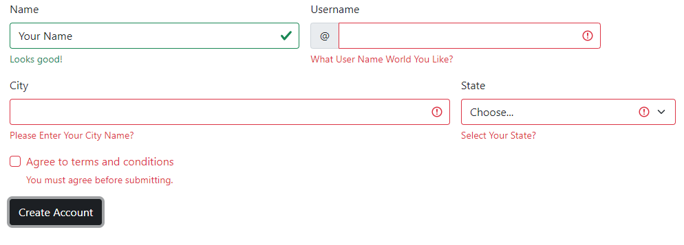
An example of custom CSS and JavaScript-based form validation using BS 5
In order to use the custom styles in Bootstrap 5, you need to do two things:
- In the <form>, you need to add the novalidate This is a Boolean attribute that will supress default feedback tooltips of the browser.
- Use the :invalid and :valid styles (provided by BS 5 and applies automatically or you may customize this as well)
See an example below with various form controls and submit the form. You will see a custom style form validation in action:
Online demo and code
<!DOCTYPE html>

<html>

<head>

<link href="https://cdn.jsdelivr.net/npm/bootstrap@5.0.1/dist/css/bootstrap.min.css" rel="stylesheet" integrity="sha384-+0n0xVW2eSR5OomGNYDnhzAbDsOXxcvSN1TPprVMTNDbiYZCxYbOOl7+AMvyTG2x" crossorigin="anonymous">

<script src="https://cdn.jsdelivr.net/npm/bootstrap@5.2.3/dist/js/bootstrap.bundle.min.js"></script>
</head>

<body>

<div class="container">

<h3>BS 5 Floating Labels</h3>

<form class="row g-3 needs-validation" novalidate>

  <div class="col-md-4">

    <label for="validationCustom01" class="form-label">Name</label>

    <input type="text" class="form-control" id="validationCustom01" value="Your Name" required>

    <div class="valid-feedback">

      Looks good!

    </div>

  </div>

  <div class="col-md-4">

    <label for="validationCustomUsername" class="form-label">Username</label>

    <div class="input-group has-validation">

      <span class="input-group-text" id="inputGroupPrepend">@</span>

      <input type="text" class="form-control" id="validationCustomUsername" aria-describedby="inputGroupPrepend" required>

      <div class="invalid-feedback">

        What User Name World You Like?

      </div>

    </div>

  </div>

  <div class="col-md-6">

    <label for="validationCustom03" class="form-label">City</label>

    <input type="text" class="form-control" id="validationCustom03" required>

    <div class="invalid-feedback">

      Please Enter Your City Name?

    </div>

  </div>

  <div class="col-md-3">

    <label for="validationCustom04" class="form-label">State</label>

    <select class="form-select" id="validationCustom04" required>

      <option selected disabled value="">Choose...</option>

      <option>...</option>

    </select>

    <div class="invalid-feedback">

      Select Your State?

    </div>

  </div>

  <div class="col-12">

    <div class="form-check">

      <input class="form-check-input" type="checkbox" value="" id="invalidCheck" required>

      <label class="form-check-label" for="invalidCheck">

        Agree to terms and conditions

      </label>

      <div class="invalid-feedback">

        You must agree before submitting.

      </div>

    </div>

  </div>

  <div class="col-12">

    <button class="btn btn-dark" type="submit">Create Account</button>

  </div>

</form>

</div>

<script>

// Example starter JavaScript for disabling form submissions if there are invalid fields

(function () {

  'use strict'

  // Fetch all the forms we want to apply custom Bootstrap validation styles to

  var forms = document.querySelectorAll('.needs-validation')

  // Loop over them and prevent submission

  Array.prototype.slice.call(forms)

    .forEach(function (form) {

      form.addEventListener('submit', function (event) {

        if (!form.checkValidity()) {

          event.preventDefault()

          event.stopPropagation()

        }


        form.classList.add('was-validated')

      }, false)

    })

})()

</script>

</body>
</html>
Notice the JavaScript before the </body> tag.
As mentioned earlier, you may also validate checkbox and radio buttons. You have seen checkbox in above example. For example, you need to confirm user if he/she agrees with the term & conditions via the checkbox’s checked/unchecked option.
Similarly, asking the user for the male/female option via radio buttons and so on.
See an example of validating the checkbox and radio button and textarea below:
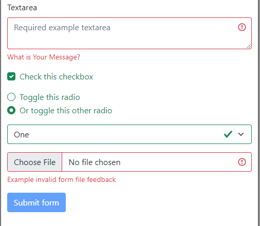
Example code:
<!DOCTYPE html>
<html>
<head>

<link href="https://cdn.jsdelivr.net/npm/bootstrap@5.0.1/dist/css/bootstrap.min.css" rel="stylesheet" integrity="sha384-+0n0xVW2eSR5OomGNYDnhzAbDsOXxcvSN1TPprVMTNDbiYZCxYbOOl7+AMvyTG2x" crossorigin="anonymous">

</head>

<body>

<div class="container">

<h3>BS 5 Form Validation</h3>

<form class="was-validated">

  <div class="mb-3">

    <label for="validationTextarea" class="form-label">Textarea</label>

    <textarea class="form-control is-invalid" id="validationTextarea" placeholder="Required example textarea" required></textarea>

    <div class="invalid-feedback">

      What is Your Message?

    </div>

  </div>


  <div class="form-check mb-3">

    <input type="checkbox" class="form-check-input" id="validationFormCheck1" required>

    <label class="form-check-label" for="validationFormCheck1">Check this checkbox</label>

    <div class="invalid-feedback">Example invalid feedback text</div>

  </div>


  <div class="form-check">

    <input type="radio" class="form-check-input" id="validationFormCheck2" name="radio-stacked" required>

    <label class="form-check-label" for="validationFormCheck2">Toggle this radio</label>

  </div>

  <div class="form-check mb-3">

    <input type="radio" class="form-check-input" id="validationFormCheck3" name="radio-stacked" required>

    <label class="form-check-label" for="validationFormCheck3">Or toggle this other radio</label>

    <div class="invalid-feedback">More example invalid feedback text</div>

  </div>


  <div class="mb-3">

    <select class="form-select" required aria-label="select example">

      <option value="">Open this select menu</option>

      <option value="1">One</option>

      <option value="2">Two</option>

      <option value="3">Three</option>

    </select>

    <div class="invalid-feedback">Example invalid select feedback</div>

  </div>


  <div class="mb-3">

    <input type="file" class="form-control" aria-label="file example" required>

    <div class="invalid-feedback">Example invalid form file feedback</div>

  </div>


  <div class="mb-3">

    <button class="btn btn-primary" type="submit" disabled>Submit form</button>

  </div>

</form>

</div>

</body>

</html>
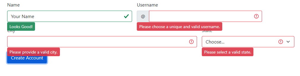
Using tooltips for form validation example
If you want to display validation messages as styled tooltips, you need to swap:
.{valid|invalid}-feedback classes To
.{valid|invalid}-tooltip classes
Online demo and code
<!DOCTYPE html>
<html>
<head>

<link href="https://cdn.jsdelivr.net/npm/bootstrap@5.0.1/dist/css/bootstrap.min.css" rel="stylesheet" integrity="sha384-+0n0xVW2eSR5OomGNYDnhzAbDsOXxcvSN1TPprVMTNDbiYZCxYbOOl7+AMvyTG2x" crossorigin="anonymous">
</head>

<body>

<div class="container">

<form class="row g-3 needs-validation" novalidate>

  <div class="col-md-4 position-relative">

    <label for="validationTooltip01" class="form-label">Name</label>

    <input type="text" class="form-control" id="validationTooltip01" value="Your Name" required>

    <div class="valid-tooltip">

      Looks Good!

    </div>

  </div>

  <div class="col-md-4 position-relative">

    <label for="validationTooltipUsername" class="form-label">Username</label>

    <div class="input-group has-validation">

      <span class="input-group-text" id="validationTooltipUsernamePrepend">@</span>

      <input type="text" class="form-control" id="validationTooltipUsername" aria-describedby="validationTooltipUsernamePrepend" required>

      <div class="invalid-tooltip">

        Please choose a unique and valid username.

      </div>

    </div>

  </div>

  <div class="col-md-6 position-relative">

    <label for="validationTooltip03" class="form-label">City</label>

    <input type="text" class="form-control" id="validationTooltip03" required>

    <div class="invalid-tooltip">

      Please provide a valid city.

    </div>

  </div>

  <div class="col-md-3 position-relative">

    <label for="validationTooltip04" class="form-label">State</label>

    <select class="form-select" id="validationTooltip04" required>

      <option selected disabled value="">Choose...</option>

      <option>...</option>

    </select>

    <div class="invalid-tooltip">

      Please select a valid state.

    </div>

  </div>


  <div class="col-12">

    <button class="btn btn-primary" type="submit">Create Account</button>

  </div>

</form>


<script>

  // Example starter JavaScript for disabling form submissions if there are invalid fields

(function () {

  'use strict'


  // Fetch all the forms we want to apply custom Bootstrap validation styles to

  var forms = document.querySelectorAll('.needs-validation')


  // Loop over them and prevent submission

  Array.prototype.slice.call(forms)

    .forEach(function (form) {

      form.addEventListener('submit', function (event) {

        if (!form.checkValidity()) {

          event.preventDefault()

          event.stopPropagation()

        }


        form.classList.add('was-validated')

      }, false)

    })

})()

</script>

</body>

</html>
For reference and more details: https://getbootstrap.com/docs/5.0/forms/validation/