
The close button is used with different components to give an option to the user to dismiss the content. These components can be:
- Alerts
- Modals
- Popovers etc.
In this tutorial, we will show you how to use the close button in Bootstrap 5. We will also show you how to include the close button in different components. Also, we will show you adding the functionality of closing the modals and alerts in examples.
In the first example, we will only show two simple close buttons without any functionality. To create a close button you just need the following markup:
<button type=”button” class=”btn-close” aria-label=”Close”></button>
That is:
- An element of button type
- Assign a class btn-close
- Use the aria-label=”Close”
The code:
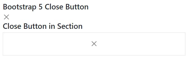
<!DOCTYPE html>
<html>
<head>

<link href="https://cdn.jsdelivr.net/npm/bootstrap@5.0.1/dist/css/bootstrap.min.css" rel="stylesheet" integrity="sha384-+0n0xVW2eSR5OomGNYDnhzAbDsOXxcvSN1TPprVMTNDbiYZCxYbOOl7+AMvyTG2x" crossorigin="anonymous">
</head>

<body>

<div class="container m-4">

  <h3>Bootstrap 5 Close Button</h3>

    <button type="button" class="btn-close" aria-label="Close"></button>
  <h3>Close Button in Section</h3>

  <section class="pb-4">

  <div class="bg-white border">
      <section class="p-4 text-center pb-4 w-100">
      <button type="button" class="btn-close" aria-label="Close"></button>
  </section>

  </div>
</div>
</body>

</html>
Output:
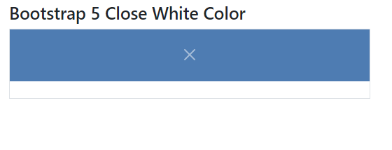
So, if your component like alert, modal etc. has a dark background then the above black close button might not be properly visible. You may easily change the color of the close button to white by using .btn-close-white class.
Code:
<!DOCTYPE html>
<html>

<head>

<link href="https://cdn.jsdelivr.net/npm/bootstrap@5.0.1/dist/css/bootstrap.min.css" rel="stylesheet" integrity="sha384-+0n0xVW2eSR5OomGNYDnhzAbDsOXxcvSN1TPprVMTNDbiYZCxYbOOl7+AMvyTG2x" crossorigin="anonymous">
</head>
<body>

<div class="container m-4">

  <h3>Bootstrap 5 Close White Color</h3>

  <div class="bg-white border rounded-5">
    <section class="w-100 p-4 text-center mb-4" style="background-color: rgba(3, 69, 145, 0.7)">
     <button type="button" class="btn-close btn-close-white" aria-label="Close"></button>
  </section>

  </div>
</div>

</body>
</html>
For dynamic components, you may want to enable/disable the close option for the user for using the close button. You may change the look of close button to disabled state by using disabled attribute of the button.
It also changes the opacity of the button. Have a look at code below:
<!DOCTYPE html>
<html>
<head>
<link href="https://cdn.jsdelivr.net/npm/bootstrap@5.0.1/dist/css/bootstrap.min.css" rel="stylesheet" integrity="sha384-+0n0xVW2eSR5OomGNYDnhzAbDsOXxcvSN1TPprVMTNDbiYZCxYbOOl7+AMvyTG2x" crossorigin="anonymous">

</head>

<body>

<div class="container m-4">

<h3>Close Disabled Button</h3>

<button type="button" class="btn-close" disabled aria-label="Close"></button>

<h3>Close White Color Disabled</h3>
  <div class="bg-white border rounded-5">
    <section class="w-100 p-4 text-center mb-4" style="background-color: rgba(155, 0, 0, 0.7)">
      <button type="button" class="btn-close btn-close-white" disabled aria-label="Close"></button>
    </section>
  </div>
</div>
</body>

</html>
The following example shows using the close button with the Bootstrap 5 alerts. We have created various color alerts with close buttons each.
Functionality is also added, so if you press the close the in any alert, it will close. See the code and output below:
Online demo and code
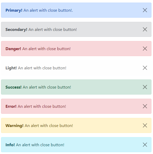
<!DOCTYPE html>

<html lang="en">

<head>


<meta charset="utf-8">

<meta name="viewport" content="width=device-width, initial-scale=1">

<link href="https://cdn.jsdelivr.net/npm/bootstrap@5.0.2/dist/css/bootstrap.min.css" rel="stylesheet">

<script src="https://cdn.jsdelivr.net/npm/bootstrap@5.0.2/dist/js/bootstrap.bundle.min.js"></script>

</head>
<body>
<div class="m-4">


    <!-- Primary Dismiss Alert -->
    <div class="alert alert-primary alert-dismissible fade show">

        <strong>Primary!</strong> An alert with close button!.


        <button type="button" class="btn-close" data-bs-dismiss="alert"></button>

    </div>

    <!-- secondary Alert -->
    <div class="alert alert-secondary alert-dismissible fade show">

        <strong>Secondary!</strong> An alert with close button!
        <button type="button" class="btn-close" data-bs-dismiss="alert"></button>

    </div>
    <!-- danger Alert -->

    <div class="alert alert-danger alert-dismissible fade show">
        <strong>Danger!</strong> An alert with close button!

        <button type="button" class="btn-close" data-bs-dismiss="alert"></button>

    </div>
    <!-- light Alert -->

    <div class="alert alert-light alert-dismissible fade show">

        <strong>Light!</strong> An alert with close button!

        <button type="button" class="btn-close" data-bs-dismiss="alert"></button>

    </div>
    <!-- Success Alert -->


    <div class="alert alert-success alert-dismissible fade show">


        <strong>Success!</strong> An alert with close button!

        <button type="button" class="btn-close" data-bs-dismiss="alert"></button>
    </div>

    <!-- Error Alert -->

    <div class="alert alert-danger alert-dismissible fade show">

        <strong>Error!</strong> An alert with close button!

        <button type="button" class="btn-close" data-bs-dismiss="alert"></button>

    </div>

    <!-- Warning Alert -->

    <div class="alert alert-warning alert-dismissible fade show">

        <strong>Warning!</strong> An alert with close button!

        <button type="button" class="btn-close" data-bs-dismiss="alert"></button>

    </div>

    <!-- Info Alert -->

    <div class="alert alert-info alert-dismissible fade show">

        <strong>Info!</strong> An alert with close button!

        <button type="button" class="btn-close" data-bs-dismiss="alert"></button>

    </div>
</div>

</body>
</html>
How close functionality is added for alert?
Just notice this piece of code in the button tag:
data-bs-dismiss=”alert”
This enables a user to close the alert upon clicking the cross sign.
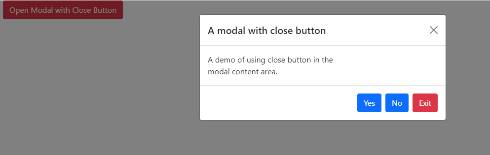
Similarly, you may place the close button in the Bootstrap 5 modals. Just like the alert, we can use the following to enable user to close the modal by the close button:
data-bs-dismiss=”modal”
Have a look at the code and output below.
<!DOCTYPE html>
<html>
<head>

<link href="https://cdn.jsdelivr.net/npm/bootstrap@5.0.1/dist/css/bootstrap.min.css" rel="stylesheet" integrity="sha384-+0n0xVW2eSR5OomGNYDnhzAbDsOXxcvSN1TPprVMTNDbiYZCxYbOOl7+AMvyTG2x" crossorigin="anonymous">
<script src="https://cdn.jsdelivr.net/npm/bootstrap@5.0.1/dist/js/bootstrap.min.js" integrity="sha384-Atwg2Pkwv9vp0ygtn1JAojH0nYbwNJLPhwyoVbhoPwBhjQPR5VtM2+xf0Uwh9KtT" crossorigin="anonymous"></script>
<script>

var myModal = new bootstrap.Modal(document.getElementById('basiceModal'), options)

</script>
</head>

<body>

<div class="container">

<!-- Trigger Modal Component -->

<button type="button" class="btn btn-danger" data-bs-toggle="modal" data-bs-target="#basiceModal">

  Open Modal with Close Button

</button>

<!-- Modal -->

<div class="modal fade" id="basiceModal" tabindex="-1" aria-labelledby="basicModalLabel" aria-hidden="true">

  <div class="modal-dialog">
    <div class="modal-content">
      <div class="modal-header">
        <h5 class="modal-title" id="basicModalLabel">A modal with close button</h5>
        <button type="button" class="btn-close" data-bs-dismiss="modal" aria-label="Close"></button>
      </div>
      <div class="modal-body">

        A demo of using close button in the <br>

        modal content area.

     </div>
     <div class="modal-footer">
        <button type="button" class="btn btn-primary">Yes</button>
        <button type="button" class="btn btn-primary">No</button>
        <button type="button" class="btn btn-danger" data-bs-dismiss="modal">Exit</button>
      </div>
    </div>
  </div>
</div>
</div>
</body>
</html>
Output:
This piece of code under the modal-header div in the above example worked for the close button:
<button type=”button” class=”btn-close” data-bs-dismiss=”modal” aria-label=”Close”></button>
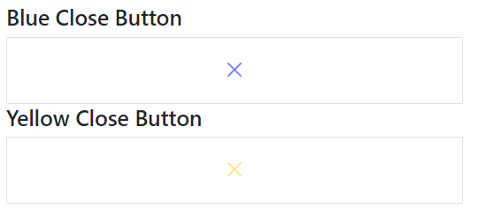
It’s pretty simple if you want to change the color of the close button other than black, and white on dark background.
You simply need to create the CSS for the cross button where you may use the SVG code of color and refer that class in the button markup for the close button.
The example below creates various color close buttons.
<!DOCTYPE html>
<html>
<head>
<link href="https://cdn.jsdelivr.net/npm/bootstrap@5.0.1/dist/css/bootstrap.min.css" rel="stylesheet" integrity="sha384-+0n0xVW2eSR5OomGNYDnhzAbDsOXxcvSN1TPprVMTNDbiYZCxYbOOl7+AMvyTG2x" crossorigin="anonymous">
<script src="https://cdn.jsdelivr.net/npm/bootstrap@5.0.2/dist/js/bootstrap.bundle.min.js"></script>

<style>
.btn-close-yellow {
  background: transparent url("data:image/svg+xml,%3csvg xmlns='http://www.w3.org/2000/svg' viewBox='0 0 16 16' fill='%23fc0'%3e%3cpath d='M.293.293a1 1 0 011.414 0L8 6.586 14.293.293a1 1 0 111.414 1.414L9.414 8l6.293 6.293a1 1 0 01-1.414 1.414L8 9.414l-6.293 6.293a1 1 0 01-1.414-1.414L6.586 8 .293 1.707a1 1 0 010-1.414z'/%3e%3c/svg%3e") center/1em auto no-repeat;
}
.btn-close-blue {

  background: transparent url("data:image/svg+xml,%3csvg xmlns='http://www.w3.org/2000/svg' viewBox='0 0 16 16' fill='%2300f'%3e%3cpath d='M.293.293a1 1 0 011.414 0L8 6.586 14.293.293a1 1 0 111.414 1.414L9.414 8l6.293 6.293a1 1 0 01-1.414 1.414L8 9.414l-6.293 6.293a1 1 0 01-1.414-1.414L6.586 8 .293 1.707a1 1 0 010-1.414z'/%3e%3c/svg%3e") center/1em auto no-repeat;
}
</style>
</head>
<body>

<div class="container m-4">
  <h3>Blue Close Button</h3>

  <div class="bg-white border">
      <section class="p-4 text-center pb-4 w-100">
      <button type="button" class="btn-close btn-close-blue" aria-label="Close"></button>
  </section>
  </div>
  <h3>Yellow Close Button</h3>
  <div class="bg-white border">
          <section class="p-4 text-center pb-4 w-100">

      <button type="button" class="btn-close btn-close-yellow" aria-label="Close"></button>

  </section>
  </div>

</div>
</body>
</html>
Reference: https://getbootstrap.com/docs/5.0/components/close-button/