
Bootstrap 5 Badges – A Count and labeling component
The badges in Bootstrap 5 can be used for:
- A small component to show the count of something. For example, showing the number of messages in the inbox with a button.
- A generic indicator, e.g. showing an indication of new posts in the newsfeed.
- Can also act as a labeling component etc.
How to create badges?
Badges can be created by assigning .badge class to an element, normally span. This span tag can be used separately or attached with other elements like buttons, heading tags, etc.
See the examples below for badges in Bootstrap 5 with various styles.
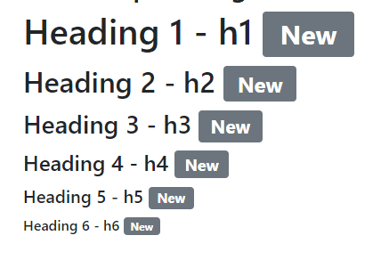
Using badges with headings example
Badges can be used with headings tags (h1 to h6) as a way to show some information standing out with the heading.
See an example below where all six headings are used with the badge. A span tag with .badge class is used as follows:
BS 5 code:
<!DOCTYPE html>

<html>

<head>

<link href="https://cdn.jsdelivr.net/npm/bootstrap@5.0.1/dist/css/bootstrap.min.css" rel="stylesheet" integrity="sha384-+0n0xVW2eSR5OomGNYDnhzAbDsOXxcvSN1TPprVMTNDbiYZCxYbOOl7+AMvyTG2x" crossorigin="anonymous">

</head>

<body>

 <div class="container">

<h2>Bootstrap 5 Badges</h2>

<h1>Heading 1 - h1 <span class="badge bg-secondary">New</span></h1>

<h2>Heading 2 - h2 <span class="badge bg-secondary">New</span></h2>

<h3>Heading 3 - h3 <span class="badge bg-secondary">New</span></h3>

<h4>Heading 4 - h4 <span class="badge bg-secondary">New</span></h4>

<h5>Heading 5 - h5 <span class="badge bg-secondary">New</span></h5>

<h6>Heading 6 - h6 <span class="badge bg-secondary">New</span></h6>

</div>

</body>

</html>
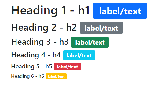
Using a few context classes to colorize badges
In the above example, the .bg-secondary class is used as the background color for the badge. In this example, we used various available context classes to colorize the badges. See the code/output below:
<!DOCTYPE html>

<html>

<head>

<link href="https://cdn.jsdelivr.net/npm/bootstrap@5.0.1/dist/css/bootstrap.min.css" rel="stylesheet" integrity="sha384-+0n0xVW2eSR5OomGNYDnhzAbDsOXxcvSN1TPprVMTNDbiYZCxYbOOl7+AMvyTG2x" crossorigin="anonymous">

</head>

<body>

 <div class="container">

<h2>Bootstrap 5 Badges</h2>

<h1>Heading 1 - h1 <span class="badge bg-primary">label/text</span></h1>

<h2>Heading 2 - h2 <span class="badge bg-secondary">label/text</span></h2>

<h3>Heading 3 - h3 <span class="badge bg-success">label/text</span></h3>

<h4>Heading 4 - h4 <span class="badge bg-info">label/text</span></h4>

<h5>Heading 5 - h5 <span class="badge bg-danger">label/text</span></h5>

<h6>Heading 6 - h6 <span class="badge bg-warning">label/text</span></h6>

</div>


</body>

</html>
Output:
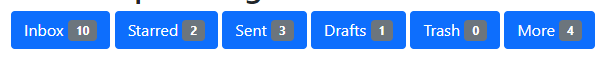
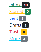
You may also use badges with buttons. See an example below where we used single color for buttons and badges:
<!DOCTYPE html>

<html>

<head>

<link href="https://cdn.jsdelivr.net/npm/bootstrap@5.0.1/dist/css/bootstrap.min.css" rel="stylesheet" integrity="sha384-+0n0xVW2eSR5OomGNYDnhzAbDsOXxcvSN1TPprVMTNDbiYZCxYbOOl7+AMvyTG2x" crossorigin="anonymous">

</head>

<body>

 <div class="container">

<h2>Bootstrap 5 Badges</h2>

<button type="button" class="btn btn-primary">

  Inbox <span class="badge bg-secondary">10</span>

</button>

<button type="button" class="btn btn-primary">

  Starred <span class="badge bg-secondary">2</span>

</button>

<button type="button" class="btn btn-primary">

  Sent <span class="badge bg-secondary">3</span>

</button>

<button type="button" class="btn btn-primary">

  Drafts <span class="badge bg-secondary">1</span>

</button>

<button type="button" class="btn btn-primary">

  Trash <span class="badge bg-secondary">0</span>

</button>

<button type="button" class="btn btn-primary">

  More <span class="badge bg-secondary">4</span>

</button>

</div>


</body>

</html>
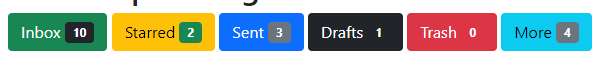
The following example uses different color buttons with badges:
<!DOCTYPE html>

<html>

<head>

<link href="https://cdn.jsdelivr.net/npm/bootstrap@5.0.1/dist/css/bootstrap.min.css" rel="stylesheet" integrity="sha384-+0n0xVW2eSR5OomGNYDnhzAbDsOXxcvSN1TPprVMTNDbiYZCxYbOOl7+AMvyTG2x" crossorigin="anonymous">

</head>


<body>

 <div class="container">

<h2>Bootstrap 5 Badges</h2>

<button type="button" class="btn btn-success">

  Inbox <span class="badge bg-dark">10</span>

</button>

<button type="button" class="btn btn-warning">

  Starred <span class="badge bg-success">2</span>

</button>

<button type="button" class="btn btn-primary">

  Sent <span class="badge bg-secondary">3</span>

</button>

<button type="button" class="btn btn-dark">

  Drafts <span class="badge text-white">1</span>

</button>

<button type="button" class="btn btn-danger">

  Trash <span class="badge text-white">0</span>

</button>

<button type="button" class="btn btn-info">

  More <span class="badge bg-secondary">4</span>

</button>

</div>


</body>

</html>
Using badges with links
Similarly, you may create badges with links and style them by using available contextual classes. An example below shows how:
<!DOCTYPE html>

<html>

<head>

<link href="https://cdn.jsdelivr.net/npm/bootstrap@5.0.1/dist/css/bootstrap.min.css" rel="stylesheet" integrity="sha384-+0n0xVW2eSR5OomGNYDnhzAbDsOXxcvSN1TPprVMTNDbiYZCxYbOOl7+AMvyTG2x" crossorigin="anonymous">

</head>
<body>

 <div class="container">

<h2>Bootstrap 5 Badges</h2>

<a href="#" class="link-success">

  Inbox <span class="badge bg-dark">10</span>

</a><br>

<a href="#" class="b link-warning">

  Starred <span class="badge bg-success">2</span>

</a><br>

<a href="#" class="link-primary">

  Sent <span class="badge bg-secondary">3</span>

</a><br>

<a href="#" class="link-dark">

  Drafts <span class="badge bg-dark text-white">1</span>

</a><br>

<a href="#" class="link-danger">

  Trash <span class="badge bg-warning text-dark">0</span>

</a><br>

<a href="#" class="link-info">

  More <span class="badge bg-secondary">4</span>

</a>

</div>

</body>

</html>
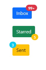
In this example, the badges are set toward different positions. One is towards the right top, another is right bottom and the third one is top left.
You may set the position by using utilities as shown in the example below:
<!DOCTYPE html>

<html>

<head>

<link href="https://cdn.jsdelivr.net/npm/bootstrap@5.0.1/dist/css/bootstrap.min.css" rel="stylesheet" integrity="sha384-+0n0xVW2eSR5OomGNYDnhzAbDsOXxcvSN1TPprVMTNDbiYZCxYbOOl7+AMvyTG2x" crossorigin="anonymous">

</head>

<body>

<div class="container">

<h2>Bootstrap 5 Badges</h2><br>

<button type="button" class="btn btn-primary position-relative">

  Inbox

  <span class="position-absolute top-0 start-100 translate-middle badge rounded-pill bg-danger">

    99+

    <span class="visually-hidden">Inbox</span>

  </span>

</button>

<br><br>

<button type="button" class="btn btn-success position-relative">

Starred

  <span class="position-absolute top-100 start-100 translate-middle badge rounded-pill bg-warning">

    5

    <span class="visually-hidden">Starred</span>

  </span>

</button>

<br><br>

<button type="button" class="btn btn-warning position-relative">

Sent

  <span class="position-absolute top-0 start-0 translate-middle badge rounded-pill bg-info">

    3

    <span class="visually-hidden">Sent Items/span>

  </span>

</button>

</div>
</body>

</html>
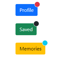
Creating a circle badge example
You may also create a circle badge as well.
<!DOCTYPE html>

<html>

<head>

<link href="https://cdn.jsdelivr.net/npm/bootstrap@5.0.1/dist/css/bootstrap.min.css" rel="stylesheet" integrity="sha384-+0n0xVW2eSR5OomGNYDnhzAbDsOXxcvSN1TPprVMTNDbiYZCxYbOOl7+AMvyTG2x" crossorigin="anonymous">

</head>

<body>

<div class="container">

<h2>Bootstrap 5 Badges</h2><br>

<button type="button" class="btn btn-primary position-relative">

  Profile

  <span class="position-absolute top-0 start-100 translate-middle p-2 bg-danger border border-light rounded-circle">

    <span class="visually-hidden">New alerts</span>

  </span>

</button>

<br><br>

<button type="button" class="btn btn-success position-relative">

  Saved

  <span class="position-absolute top-0 start-100 translate-middle p-2 bg-dark border border-light rounded-circle">

    <span class="visually-hidden">New alerts</span>

  </span>

</button>

<br><br>

<button type="button" class="btn btn-warning position-relative">

  Memories

  <span class="position-absolute top-0 start-100 translate-middle p-2 bg-info border border-light rounded-circle">

    <span class="visually-hidden">New alerts</span>

  </span>

</button>

</div>
</body>

</html>
An example of using the rounded-pill utility for a pill badge
By using .rounded-pill utility class with .badge, you may create badges more rounded with a larger border-radius. Have a look at an example below:

<!DOCTYPE html>

<html>

<head>

<link href="https://cdn.jsdelivr.net/npm/bootstrap@5.0.1/dist/css/bootstrap.min.css" rel="stylesheet" integrity="sha384-+0n0xVW2eSR5OomGNYDnhzAbDsOXxcvSN1TPprVMTNDbiYZCxYbOOl7+AMvyTG2x" crossorigin="anonymous">

</head>


<body>

 <div class="container">

<h2>Bootstrap 5 Badges</h2>

<span class="badge rounded-pill bg-primary">Primary</span>

<span class="badge rounded-pill bg-secondary">Secondary</span>

<span class="badge rounded-pill bg-success">Success</span>

<span class="badge rounded-pill bg-danger">Danger</span>

<span class="badge rounded-pill bg-warning text-dark">Warning</span>

<span class="badge rounded-pill bg-info text-dark">Info</span>

<span class="badge rounded-pill bg-light text-dark">Light</span>

<span class="badge rounded-pill bg-dark">Dark</span>

</div>


</body>

</html>